+22 %
Engaged Sessions
Retail & Products
Blenz
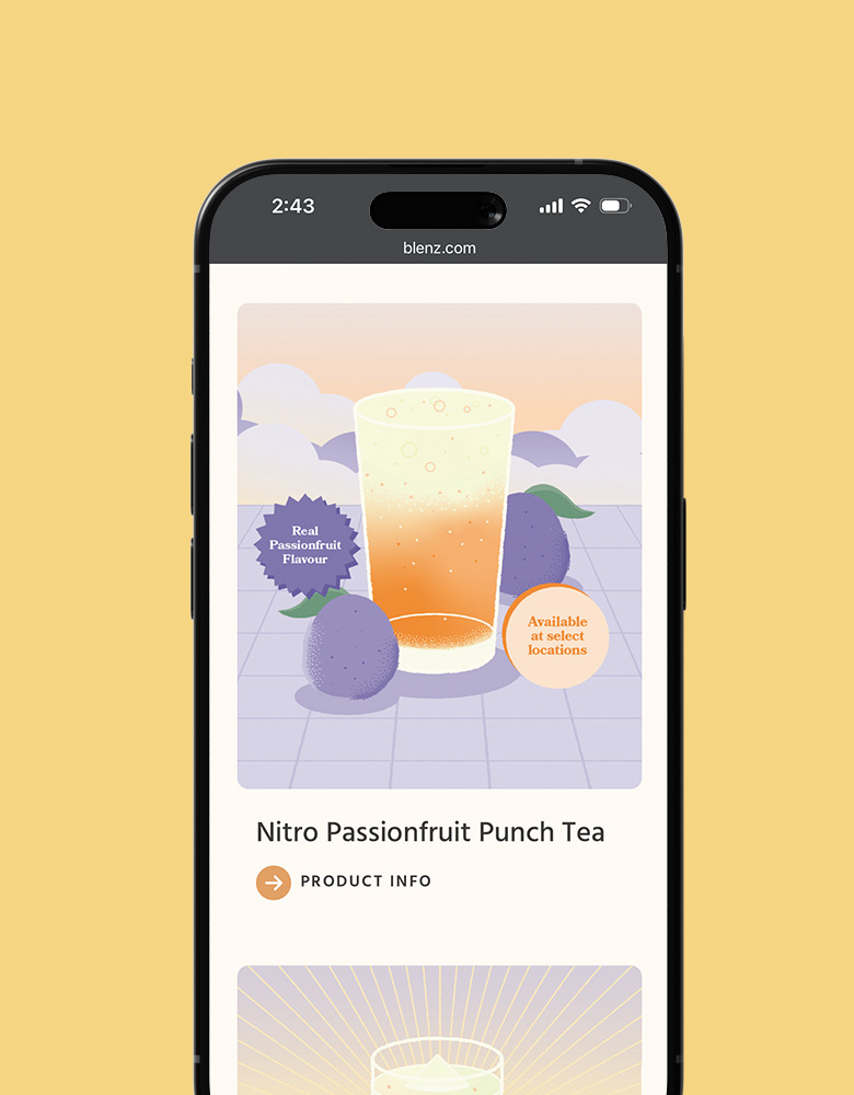
Blenz needed a fresh new website to reflect their updated branding, and to help customers more easily find their way to online orders, app downloads, and perks.
Keep ReadingBlenz needed a fresh new website to reflect their updated branding, and to help customers more easily find their way to online orders, app downloads, and perks.
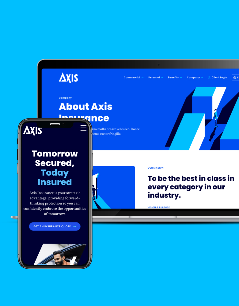
Keep ReadingAxis Insurance needed an all-new website to support a huge rebrand. The goal was to launch a visually powerful site that would significantly improve usability, navigation, and showcasing their specialized expertise.
Keep ReadingOur website redesign helped SISU’s visitors quickly and easily find where to buy their products, while showcasing their wellness blog as a resource.
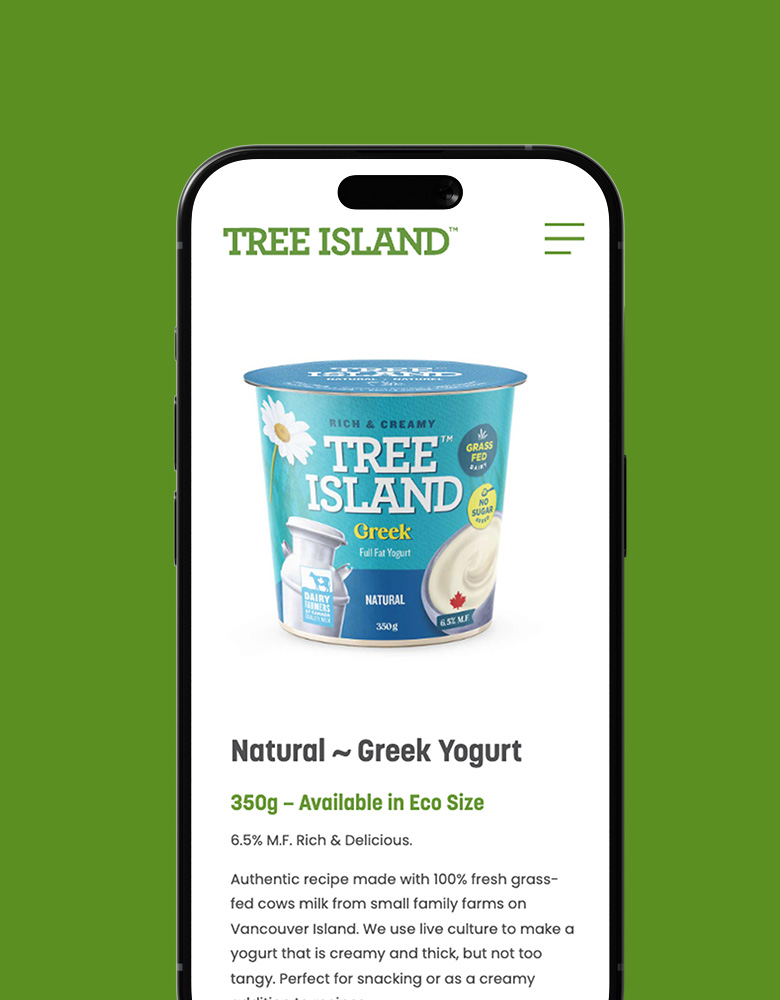
Keep ReadingTree Island Yogurt needed a way more polished business website, with engaging product pages and brand storytelling to draw potential customers into their values.
Keep ReadingA new web design with vastly improved structure and navigation help BC Dairy’s different audiences discover their array of tasty content.
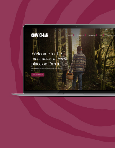
Keep ReadingTourism Cowichan needed a new website to get visitors excited about all this earthy, welcoming region has to offer. This project required a strong architecture with emphasis on featured and related content, for easy browsing and content discovery.
Keep ReadingHill & Ponton’s massive resource site used a lot of custom code that required a developer to make even small changes. They needed a full redesign to improve content management, and also the discoverability and navigability of all those resources to drive conversions.
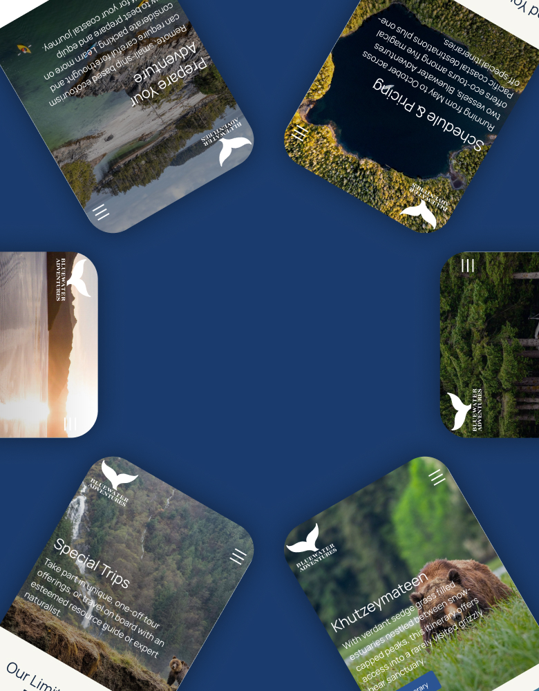
Keep ReadingMaple Leaf Adventures needed a fresh website to improve their ecotourism storytelling, and to help their affluent audience more easily search and discover all of the exciting experiences that await.
Keep ReadingField Dynamics needed an all-new website to improve content discovery, and to support easy management of their many educational resources. At the same time, SEO was deeply important to every step of the project.
Keep ReadingMISIM needed a brand new website to showcase their complex offering and vast experience – and they also needed cohesive brand strategy to make their digital presence stand out.
Keep ReadingSouthern Explorations needed full redesign, including development of some fancy advanced filters, to improve the user experience of browsing their high-volume itineraries and drive more conversions.
Keep ReadingHasler Homes needed a serious upgrade to their website to better reflect the high-end quality of their award-winning work, and to boost their SEO efforts in the competitive North Shore construction market.
Keep ReadingSPI Logistics needed a big redesign to bring three company websites together on one uncluttered, modern platform – without compromising usability for those three distinct audiences.
Keep ReadingOur tantalizing website redesign helped CRAFT Beer Market achieve huge increases in their search traffic, impressions, and page speeds.
Keep ReadingPPHF’s resource and campaign content had become difficult to navigate. They needed a full website redesign to improve site architecture and content discoverability – and on a short timeline.
Keep ReadingTaylor Ryan is experiencing rapid growth, and their old website was lagging behind. They needed a full redesign to deepen their service content for SEO, while making the site easier to update as their locations and teams expand.
Keep ReadingPacific Spirit Dental had recently merged two practices, and were adding a new business-within-the-business. They needed a single website that could serve two distinct patient audiences, while clearly communicating the available services to each.
Keep ReadingHighline Forming needed a polished, professional new website with significantly deeper content to help them stand out in a highly competitive industry and region.
Keep ReadingThis new website was focused on helping SHARE capture their rebrand, expand their offering, and make their content more conversational.
Keep ReadingThis redesign helped Tourism Prince Rupert earn significantly more search traffic and engagement, while making it easier for their team to manage their ever-evolving content
Keep ReadingSandstorm Gold needed a complete redesign to increase investor appeal. We designed and built multiple new custom features to give the site engaging movement, and help drive content discovery.
Keep ReadingOutward Bound’s outdoor training academy had grown too big for their main website, and needed a home of its own. We designed an all-new website to showcase their programs and courses.
Keep ReadingMIRA’s high volume of resources had outgrown their old site. They needed a full redesign to drastically reorganize all that content around multiple newly clarified audiences – while meeting high accessibility standards.
Keep ReadingBackpack Buddies needed a full redesign to help their organization raise awareness, and to significantly improve their visual storytelling to create that emotional connection needed to drive donations.
Keep ReadingThe BC Burn Fund had a heavily outdated website that was difficult to use, and failed to capture their important programs and services. They needed a massive redesign to help drive awareness, attract donors, and support campaigns – starting with proper brand guidelines.
Keep ReadingPCRS needed a redesign to make their website much easier to search and browse, to help make their critical services more accessible to vulnerable communities with limited online access.
Keep ReadingLGM needed a website redesign to showcase their new products and services, and bring their rebrand to life. Our project helped them drive traffic, boost engagement, and speed up their site.
Keep ReadingWe designed an all-new website for BRIA to launch their new virtual mental healthcare service for women and start building their patient list.
Keep ReadingThis brand new web design helped Nexii double their search traffic and content views, and drastically increase website visits from their U.S. audience.
Keep ReadingUnder the Same Sun needed a fresh website that could better convey their impact and tell their story, to help drive awareness and – ultimately – donations.
Keep ReadingOur website redesign helped RCBC organize their massive volume of important resource content for multiple competing audiences, while making it easier for their team to keep content up-to-date.
Keep ReadingVersamet Royalties needed a brand new website to launch their company into the market, and immediately begin to attract investors. It had to be uncomplicated yet highly professional.
Keep ReadingThis huge website redesign project required organizing a vast amount of content for multiple audiences into an efficient architecture, building a highly usable backend, enabling tailored user experiences by location, and supporting two languages – all on a tight turnaround.
Keep ReadingLindome needed a major website redesign to properly showcase their product library and accessories, to help facilitate lead generation and conversions. We went with a bold, visual design to showcase real life applications of their structures.
Keep ReadingWe crafted a new web design for Delta-Q to help them showcase their innovative solutions and capabilities, and deepen their company storytelling, while drastically improving visitor engagement.
Keep ReadingHorizon Copper needed a spacious new website to showcase their brand, while making it easier for investors and the public to find critical information about their asset portfolio.
Keep ReadingOur brand new website for Kitimat Bound helped capture the region’s breathtaking natural beauty and entice travellers, as evidenced by the rapid climb in search traffic and engagement each month since launch.
Keep ReadingThe all-new website we designed for CHCI’s Placemaking Community find its audience, so the organization can share resources and showcase community projects to make others want to get involved.
Keep ReadingThe clean, welcoming new website we designed for the YVR Art Foundation helped them double their traffic and on-page engagement, significantly increasing their reach about opportunities and exhibits.
Keep ReadingWe crafted a new website structure and design for Western Group and its two divisions. The new sites are straightforward for their customers to use, while broadening their company story.
Keep ReadingA clean, uncluttered design helped Equinox Gold showcase investor information about their mining portfolio, and while keeping the public informed about their responsible practices.
Keep ReadingOur total website redesign for Surrey Hospitals Foundation helped them showcase their rebrand, deepen content about their community impact, and drastically increase website traffic and conversions.
Keep ReadingThe new website we designed for SUMM! Foods helped them better tell their heartwarming brand story, and to achieve huge improvements in their website engagement.
Keep ReadingOur design project for Able & Howe was focused on helping them reposition their brand, deepen their content, and highlight their unique business approach.
Keep ReadingOur fresh web design helped BuilderWorks achieve impressive page speeds and a high conversion rate right after launch.
Keep ReadingWe crafted a new website to help Smart, Savvy capture their recent rebrand, and to create a more usable experience for their two distinct audiences.
Keep ReadingWe built a brand-new website for CHBC BC to house their high volume of educational content, driving significantly more organic search content within a few months after launch.
Keep ReadingThis redesign helped Vivreau dramatically increase search traffic and engagement, while showcasing their product offering and environmental impact.
Keep ReadingWe redesigned Braintrust Group’s website to create a more welcoming, motivating user experience that would improve their conversion rate – and it worked.
Keep ReadingWe redesigned MRS Lumber’s website to create a much more usable product catalogue, drive more traffic, and to improve sales.
Keep Reading
Tree Free Sourcing had a tiny website, so we crafted a new design that would help them deepen their content, showcase their B2B offering, and drive sales.
Keep ReadingFour Points Insurance needed to move their commercial offering to its own domain. We designed a new website that earned huge traffic, engagement, and page speeds right after launch.
Keep ReadingOur ongoing partnership with Miracon resulted in not only a fresh website for their business, but also several sub-sites for their new developments and massive monthly leaps in traffic and conversions.
Keep ReadingThis redesign project was about helping Stanscott distinguish their product portfolio from the parent company, and highlight opportunities for potential clients in the Caribbean and beyond.
Keep ReadingAs part of our ongoing partnership with ISSofBC, we redesigned the website for their Language & Career College to create a welcoming experience with clear paths to their many language programs and services.
Keep ReadingThe UBC Centre for Brain Health creates a massive amount of important content, and it was our job to help them organize it into a well-structured new website.
Keep ReadingA Better Life Foundation needed a website redesign so they could better communicate their meaningful work, create community connections, and drive their digital campaigns.
Keep ReadingThe new website we designed for Beacon Group involved a total brand reinvention and improved content strategy to showcases their unique approach to consulting
Keep ReadingWe crafted a new website for Fraser Valley Conservancy to help them tell their story, clearly convey their impact, and better engage with potential donors.
Keep ReadingSpur Communication had grown way beyond their one-page website, and hired us for a redesign that included deeper content and a custom Shopify theme for an all-new digital downloads store
Keep ReadingWe redesigned the website for the BC Non-Profit Housing Association help make their valuable resources much more easily discoverable, while aligning with a recent rebrand.
Keep ReadingOur website redesign helped CHÉOS boost search traffic and engagement, and drastically improve the organization of their critical health research content.
Keep ReadingThe new Naturally:Wood website was a huge challenge that we enjoyed: folding two large, resource-heavy sites into one usable structure and rebranded design.
Keep ReadingThe new website we crafted for Forestry Innovation Initiative helped them significantly improve their page speeds, engagement, and traffic – but most importantly, it made it easier for their team to manage their content.
Keep ReadingWe redesigned the DeMello’s Spirituality Center’s website to refresh the user experience, and to improve content discoverability.
Keep ReadingThis project was a joint venture for several communities that needed an engaging and interactive website experience to showcase jobs and regional attractions in Northwest BC.
Keep ReadingThe CTN needed a new website to help their underserved audiences access vital resources and information. Our design helped them increase search traffic and engagement, too.
Keep ReadingThis fresh web design helped the North Vancouver Chamber achieve a huge increase in conversion rate, as well as improved on-site engagement.
Keep ReadingMarion Scott Gallery has showcased contemporary art from Northern Canada since 1975.
Keep ReadingOne World Education helps learners of all ages develop critical thinking and writing skills.
Keep ReadingSemios tasked us with a full website redesign for their global expansion, to facilitate improved navigation and deeper content about their expanding capabilities.
Keep ReadingBarbican Property Management needed a new website to improve their content and search capabilities for potential tenants browsing hundreds of residential and commercial properties.
Keep ReadingBBS Pro needed our help to drastically improve the usability of their technical product catalogue, while increasing traffic, engagement, and page speeds
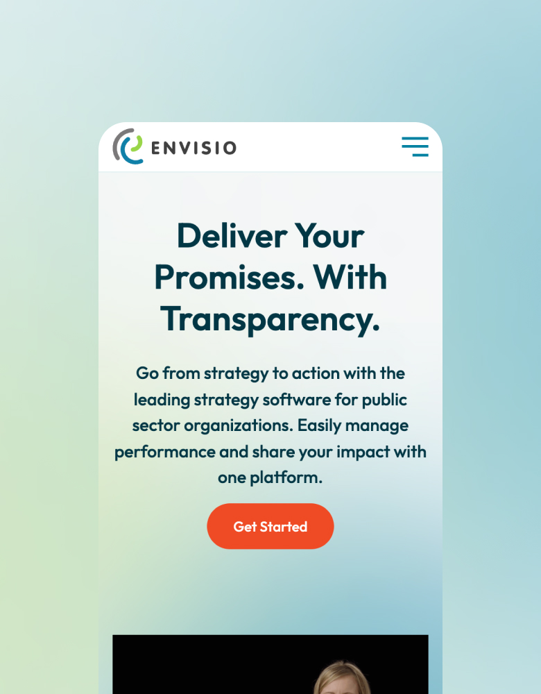
Keep ReadingEnvisio came to us looking for a a total website overhaul to reflect their visual rebrand. At the same time, they wanted to improve their storytelling, SEO, and conversions.
Keep ReadingBinnie’s website redesign was about reflecting their rebrand, deepening their content, and demonstrating their impressive experience and capabilities to both customers and potential recruits.
Keep ReadingWe crafted a highly visual website for Adrenaline Studios, improving their storytelling content while increasing their search traffic and engagement.
Keep ReadingArchetype hired us to create a polished new web design to match their premiere products, plus a complex product catalogue and tiered content filtering.
Keep ReadingThe new website we built for PHS helped them better convey their vital community services for donors – and drove a massive conversion rate increase.
Keep ReadingThis redesign was a fun challenge involving a complete rebrand and name change, deepening content while reducing clutter, and creating micro-sites for products. The new site more than doubled their organic search traffic.
Keep ReadingKenorah’s website redesign was all about better showcasing their breathtaking dream-home projects through a more visual experience, while amplifying their intimate process to help potential clients fully envision the smooth work and results.
Keep ReadingRDH tasked us with a full website redesign to migrate three sites into one interface, while keeping the content from three blogs and their services clean and usable for distinct audiences.
Keep ReadingWe were thrilled to help the Quantum Matter Institute with a complete redesign of their content structure and site design, to organize a vast volume of content into a usable experience.
Keep ReadingOne Coffee hired us for a website redesign to reflect their products’ new look, and to deepen their content for improved SEO. We also helped them significantly boost page speeds.
Keep ReadingWe designed an all-new, strategic website to help Herstasis™hit the market running, raise awareness, attract investors, and build an audience ready to use their product.
Keep ReadingHost Defense needed an all-new website to launch their brand in Canada, with a shoppable product catalogue and ample educational resources for existing and potential customers.
Keep ReadingSecure IT Systems approached us about a redesign to create a deeper website experience that accurately showcases their capabilities, and feels as professional as their customer care.
Keep ReadingCopperTree needed a fresh web design and structure to make their high volume of technical information easier to digest, while building out stronger areas for their trust and credibility content.
Keep ReadingSoftlanding’s website redesign was all about improving their complex user experience, especially navigation. At the same time, we improved their conversion rate, engagement, and site speed.
Keep ReadingThe new website we crafted for Botanica was focused on helping users find content quickly and effortlessly, and communicating their dedication and commitment to wellness while boosting SEO, conversion rate, and mobile performance.
Keep ReadingNeighbourhood Small Grants needed a total website redesign to deliver more customized multilingual audience experiences, and to capture their exciting rebrand.
Keep ReadingThe Dakeryn group of companies needed a fresh website to add more depth to their content, flesh out their product directory, and build up their sustainability storytelling.
Keep ReadingThe Sound came to use for a full revamp of their user experience, needing more content for SEO, improved content discovery, and a much stronger and easier-to-manage CMS.
Keep ReadingWe crafted a new website for Equinox Gallery to recreate the in-person experience through clean, minimal design and new areas for content discovery and virtual viewings.
Keep ReadingPopulation Health Research Institute needed a full website redesign to help make their huge volume of critical research content much easier to search and explore.
Keep ReadingTourism New Westminster serves both tourists and residents, so they needed a total redesign to make all of their local content more visually appealing and browsable to help drive business.
Keep ReadingInclusion BC tasked us with designing a highly usable and welcoming new website to help their audience find critical resources and opportunities.
Keep ReadingThe fresh website we built for BluEarth Renewables boasts an exceptionally strong information architecture and navigation, with clear paths to key content for each of their many diverse audiences.
Keep ReadingTourism Langley wanted a custom web design focused on rich photography, with a powerful user experience tailored to helping people quickly find events, guides, and local tips to get them excited about the township.
Keep ReadingStella Custom Glass Hardware needed their new website to be rooted in a quick, intuitive mobile experience, to help their B2B audience find parts and specs while working on job sites.
Keep ReadingThe Nature Trust of British Columbia needed a new web design to better tell their brand story and the value of their work, to help drive conversions.
Keep ReadingThe First Nations Summit needed a brand new website to make information, tools, and resources about the BC treaty process more accessible.
Keep ReadingOur years-long partnership with ISSofBC has included two full redesigns of their main site, as well as building separate sites for their services and programs.
Keep Reading