

About the Company
CRAFT Beer Market is a premium casual restaurant with fresh local comfort food, a welcoming vibe, and Canada’s largest and best-loved craft beer list.
Objectives
- Fully align the new website to recent rebranding work done to harmonize the online and offline environments
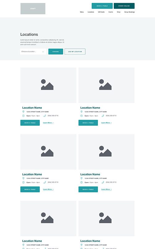
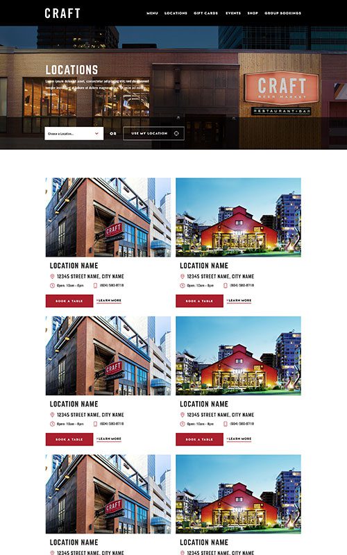
- Implement a powerful location-based filter to ensure user navigation to ordering online, booking, and conversion are accessible and clear
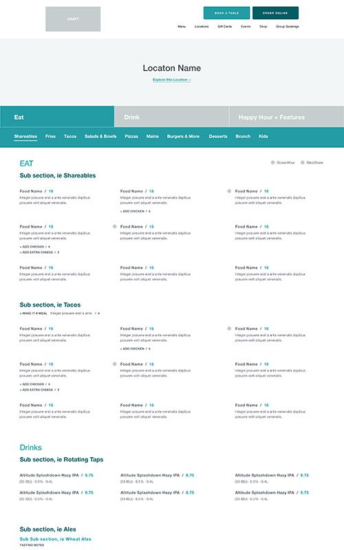
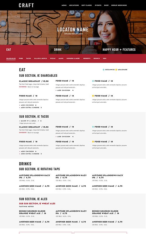
- Create an in-restaurant ordering menu to segment in-person diner traffic as well as maintain required COVID-19 policies
- Build on SEO foundations to increase search engine traffic and drive future growth
- Craft a fully responsive content solution backed by WordPress CMS for easy management
Results
Faster Page Loads
+
0
%
Year-Over-Year
Organic Impressions
+
0
%
Year-Over-Year
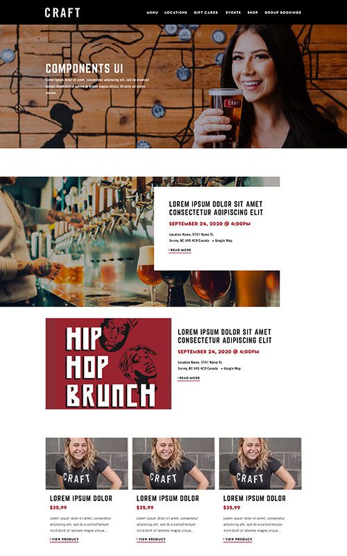
Phase 1
Prototyping
With slow site speeds and the need to constantly rotate food, beverage, and happy hour menus across several locations, CRAFT Beer Market’s Dunkel glass was quickly overflowing. After going through a full brand refresh, they needed a new website that would incorporate dynamic and inviting video, fresh images, and strategic event content – plus meet COVID requirements for an online-only menu for in-person dining.
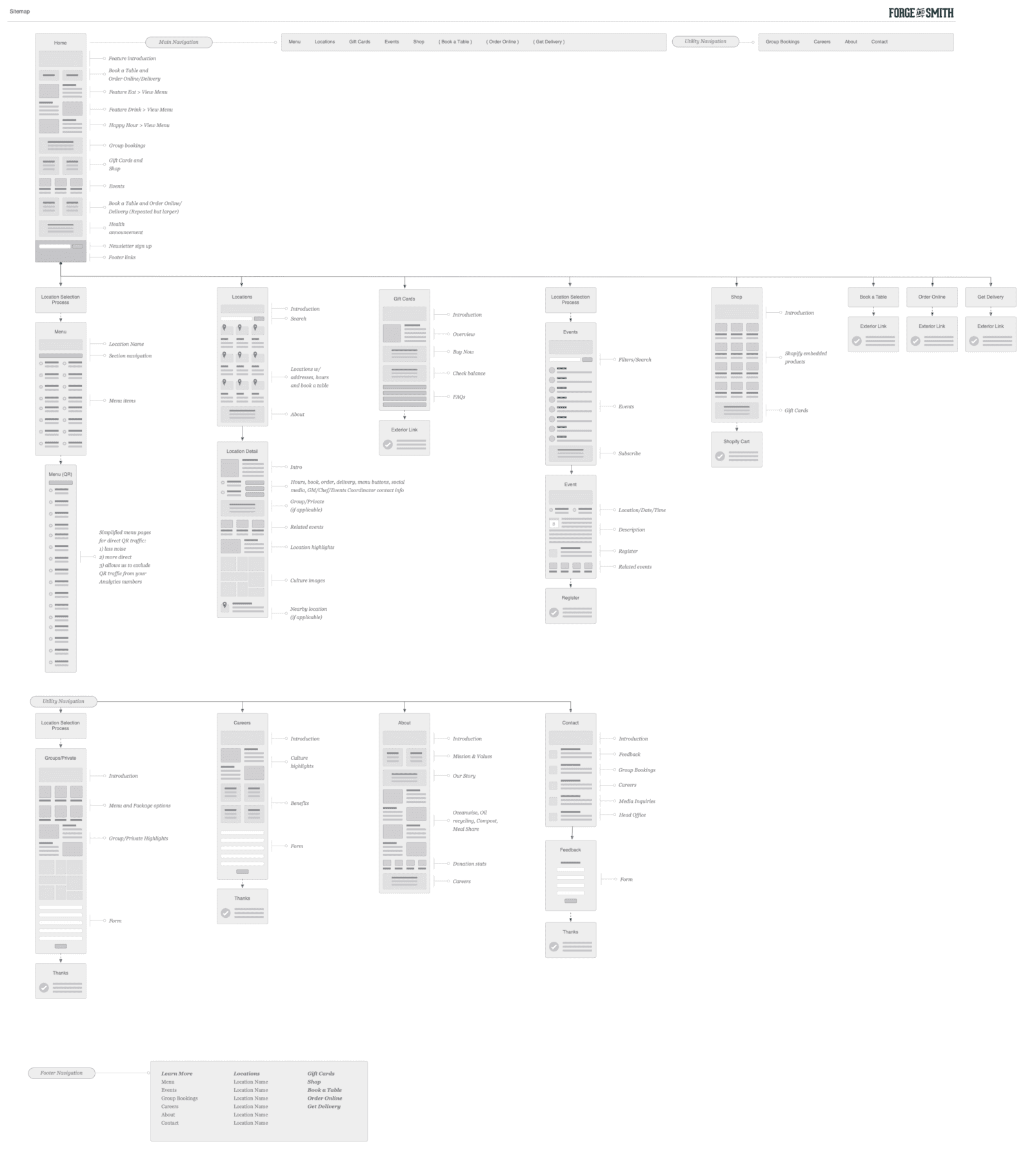
This web design project was driven by a deliberate mise-en-place-like content strategy, with a dash of fresh vibes and a heavy pour of information architecture. The reenergized content needed to be filtered for location-specific audiences, with clear paths to order online, book a table, access the dine-in menu, and more.
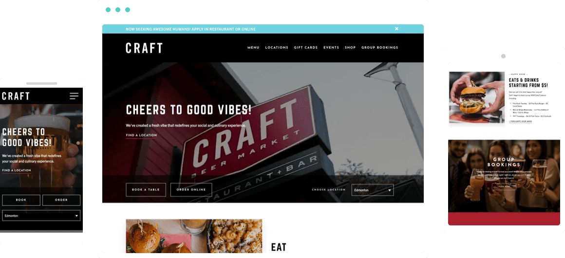
Phase 2
Style
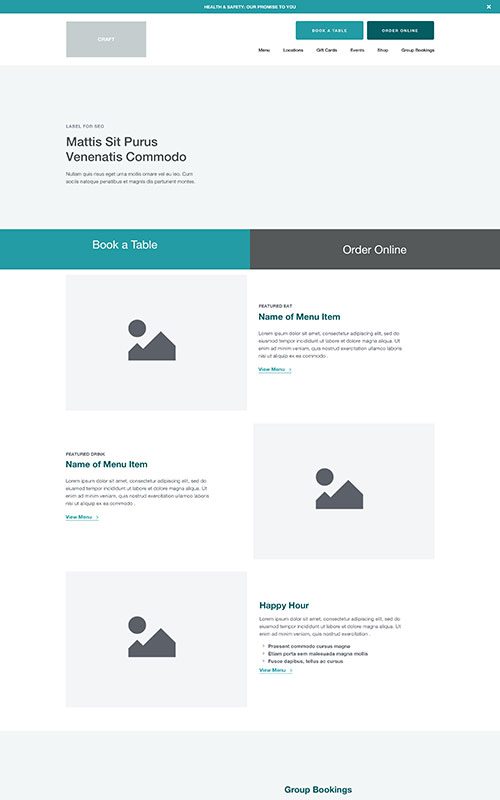
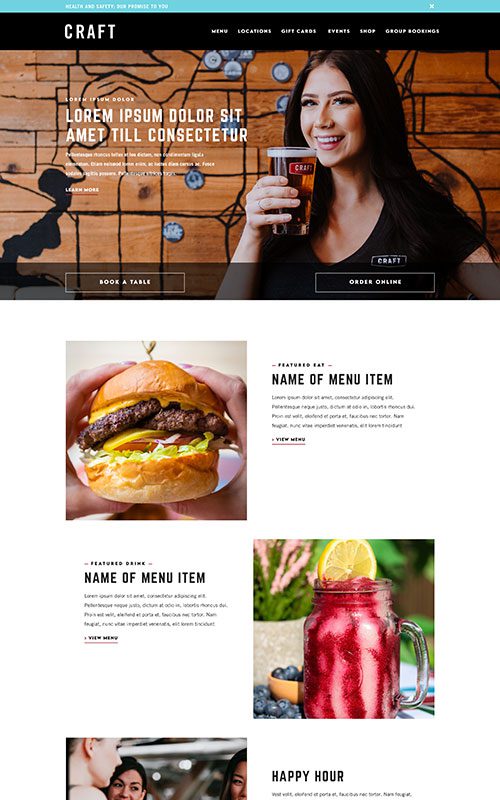
CRAFT’s videos and images are now housed in straightforward, black and white components with red detailing, ensuring the focus remains on the warm colours, loads of welcoming faces, and delicious offerings pictured. Navigation is as breezy as the blue when hovering over menu items, with bold typefaces and minimalist iconography creating clear visual prompts for the user.
Phase 3
Bringing It Together
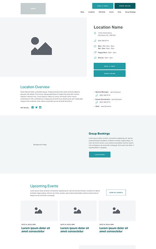
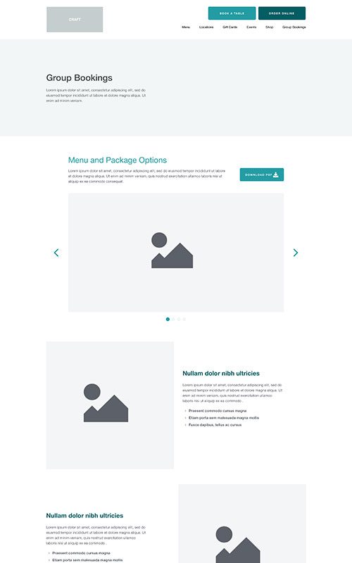
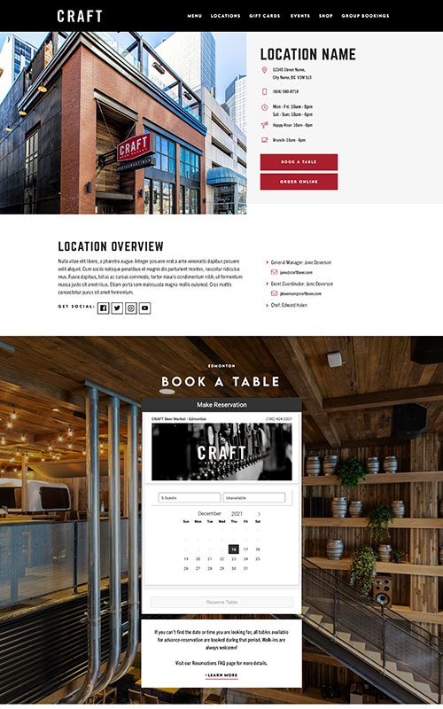
The all-new banner button callouts give clear paths to booking online or ordering to-go, while homepage callouts lead visitors to separate menu sections – and it’s all filtered by user location. Site visitors can set their location to see local menus and events. Each location’s landing page houses relevant contact information, and has clear paths to booking, ordering, and location-specific social feeds. The new and improved customer experience is like a thoughtfully paired pilsner, while content is kept up-to-date with a fully responsive WordPress CMS.
Related Case Studies
Check out more of our web design case studies, to see the results we’ve helped our clients achieve.
+22 %
Engaged Sessions
Retail & Products
Blenz
Blenz needed a fresh new website to reflect their updated branding, and to help customers more easily find their way to online orders, app downloads, and perks.
Keep ReadingRetail & Products
Sisu
Our website redesign helped SISU’s visitors quickly and easily find where to buy their products, while showcasing their wellness blog as a resource.
Keep Reading