
About the Organization
The BC Professional Fire Fighters’ Burn Fund has supported burn survivors across BC and the Yukon since 1978. They are dedicated to assisting burn survivors through meaningful connections, supportive programs, and enhanced care.
Objectives:
- Improve brand equity and online reach through branded storytelling with an emphasis on Campaigns
- Improve site architecture and navigation to enable easier browsing and a more frictionless experience
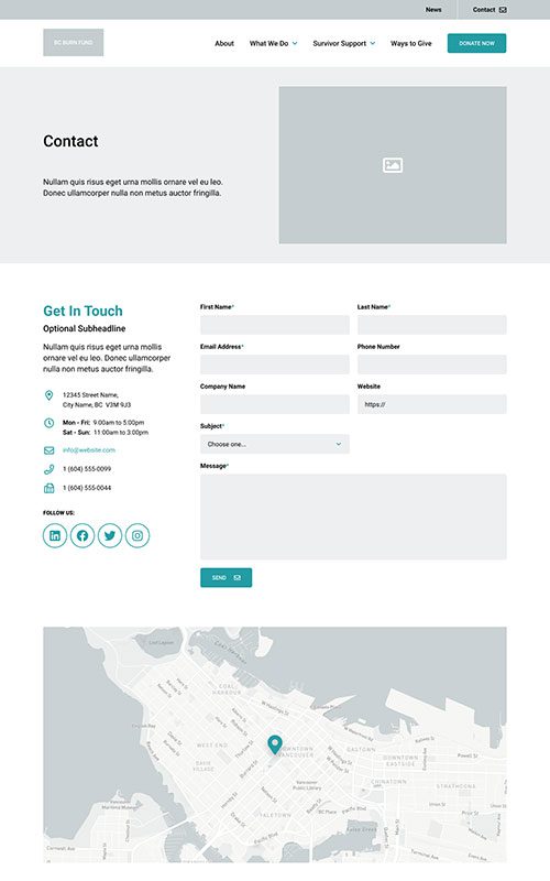
- Drive conversion of site visitors into contacts and ultimately donors
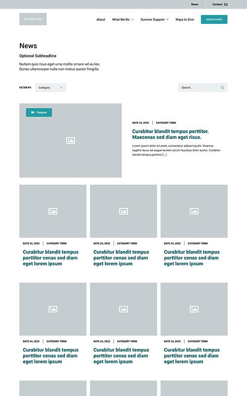
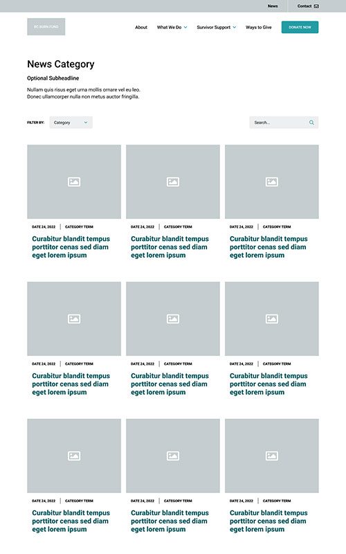
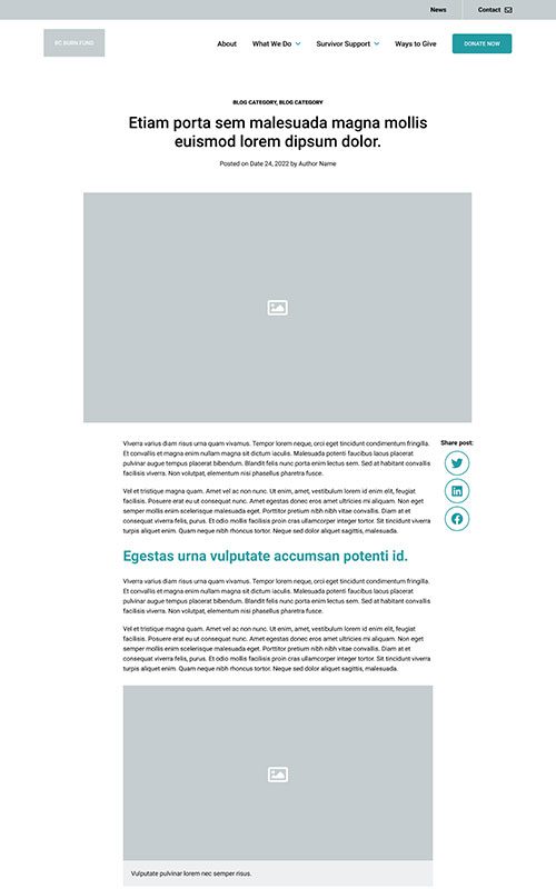
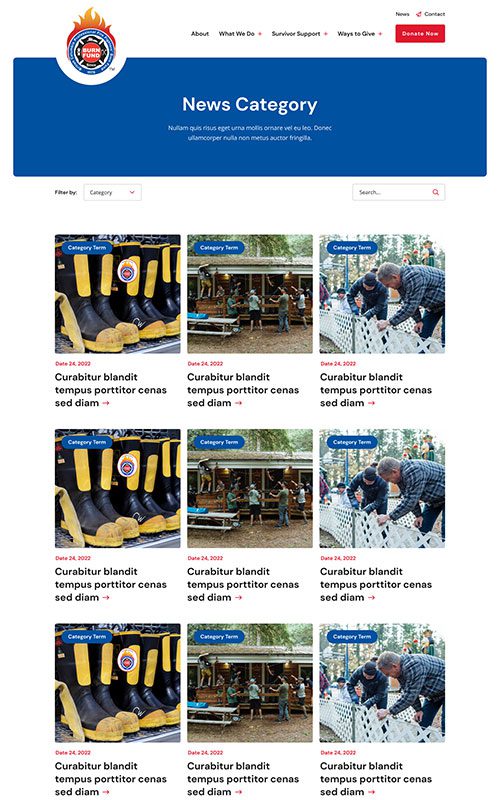
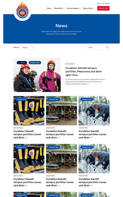
- Reorganize and expand the current Blog for more accessible browsing and searching
- Build on SEO foundations to increase search engine traffic and drive future growth
- Implement a fully responsive solution backed by WordPress CMS for easy content management
Results
Engaged Sessions
+
0
%
First 3 Months Post Launch
Donations
+
0
%
First 3 Months Post Launch
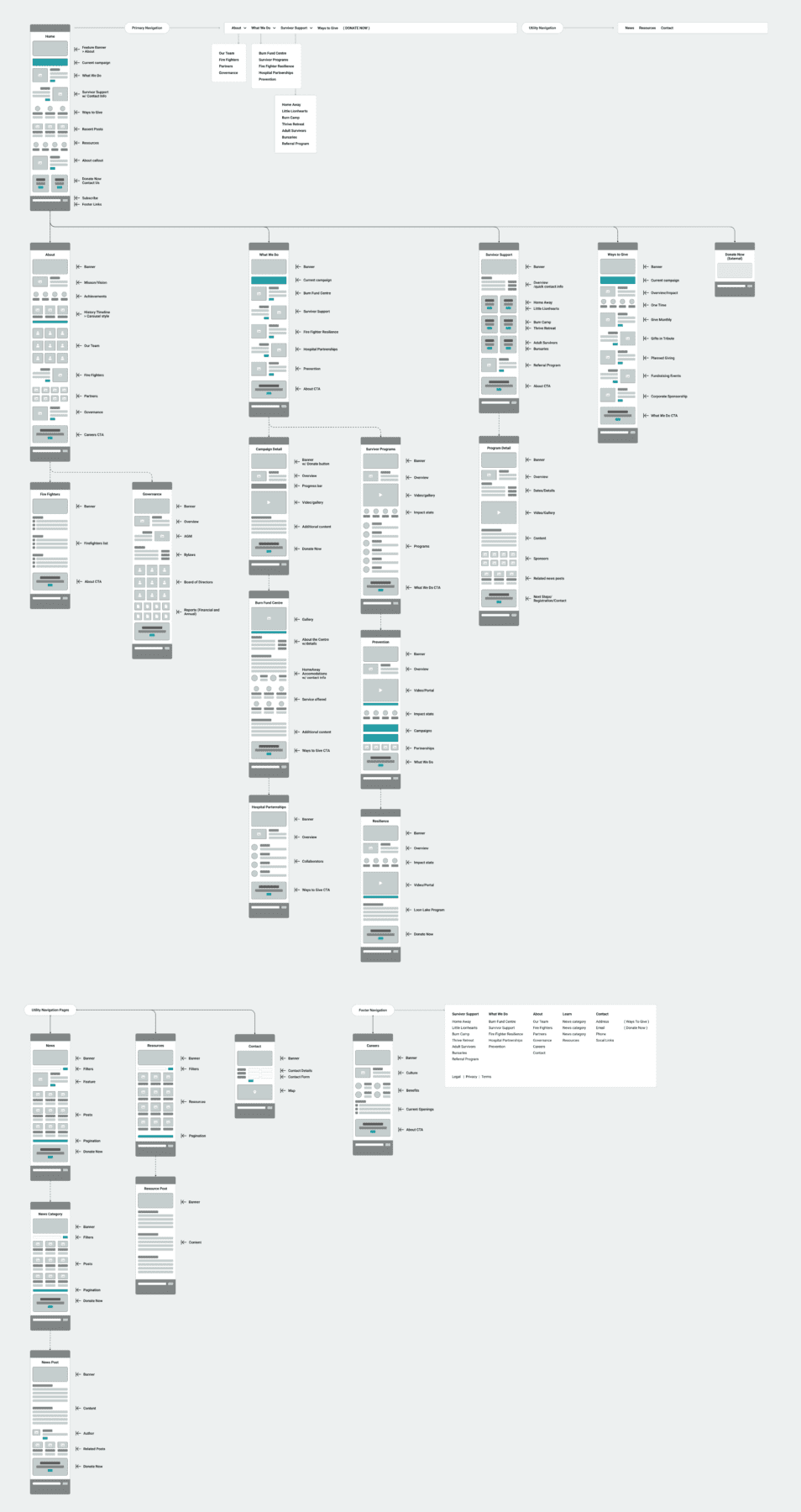
PHASE 1
Prototyping
The BC Burn Fund came to us with a heavily outdated website that wasn’t supporting their incredible programs and services – and not appealing to donors. They were looking for a massive website redesign. At the same time, their organization needed formal brand documentation to drive the project forward and support their ongoing marketing initiatives.
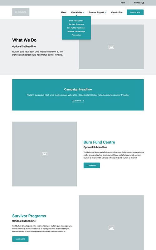
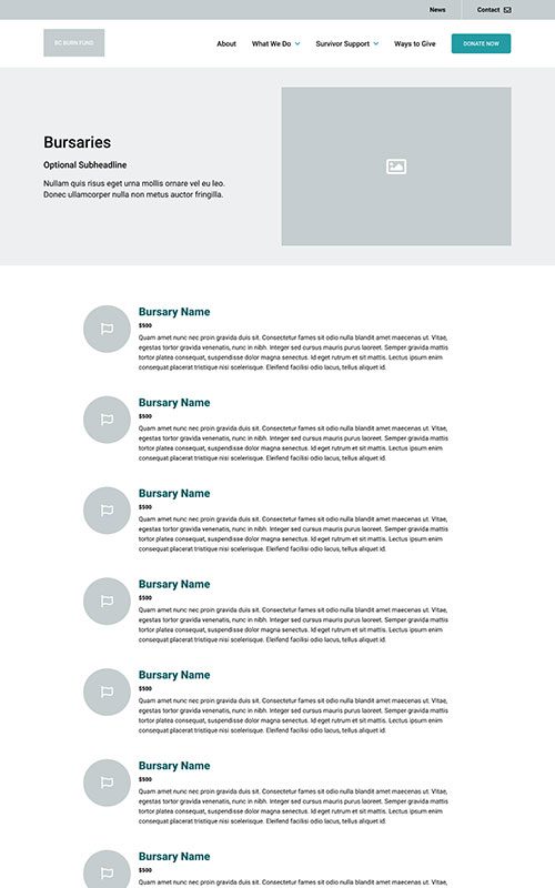
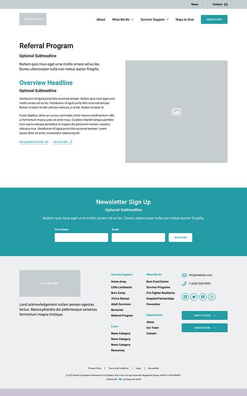
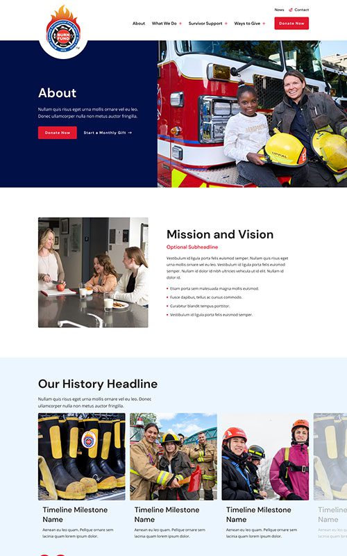
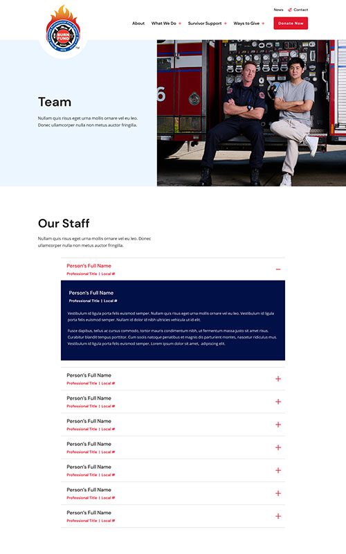
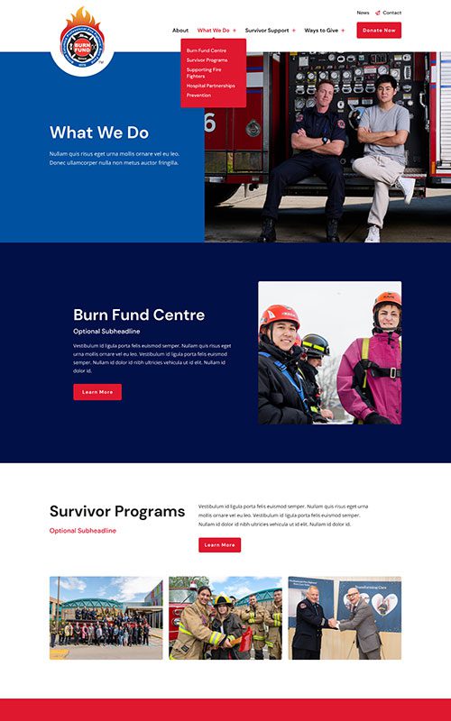
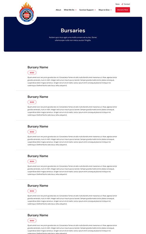
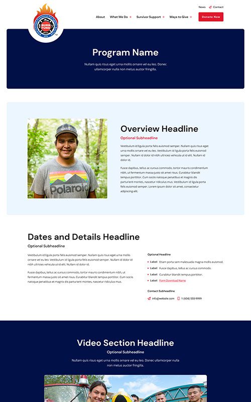
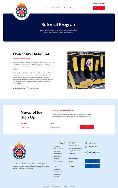
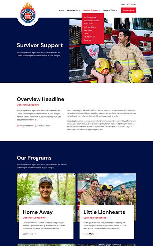
In tandem with our usual kickoff research, we guided their team through a brand strategy workshop and crafted clear brand guidelines for them. Then we set about creating an entirely new information architecture to facilitate both communicating their impact and helping burn survivors find resources. This included planning for program and service content that didn’t yet exist on their site.
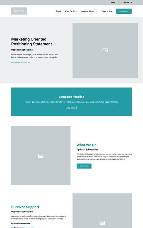
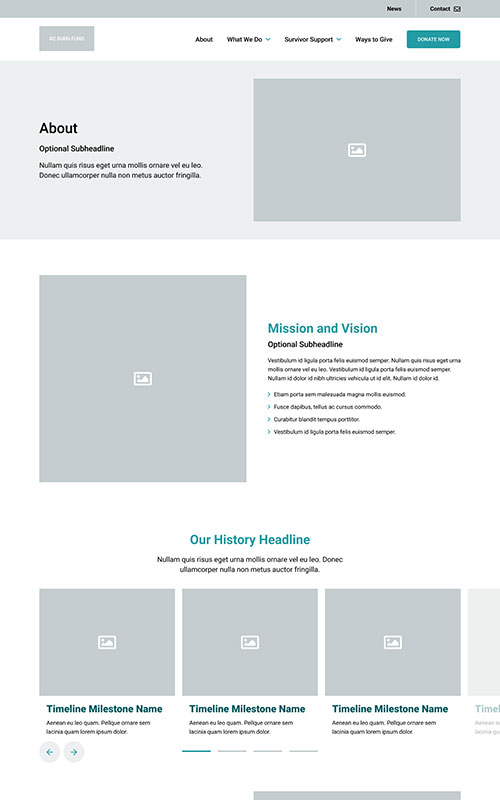
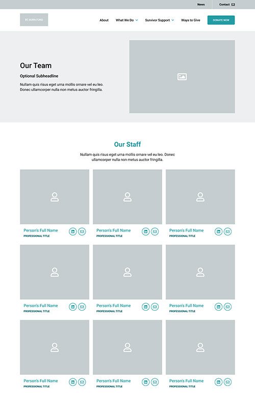

PHASE 2
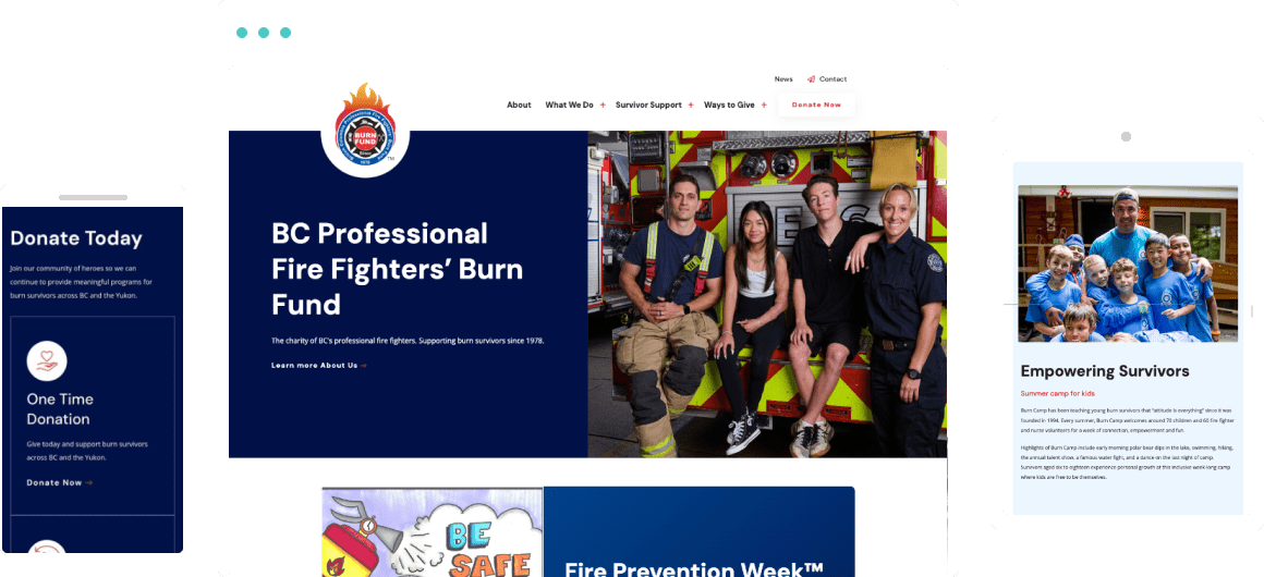
Style
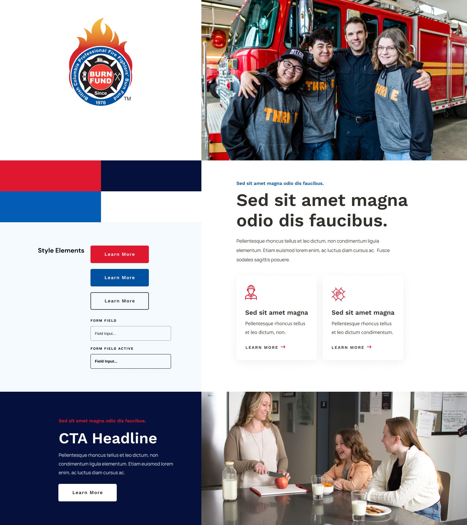
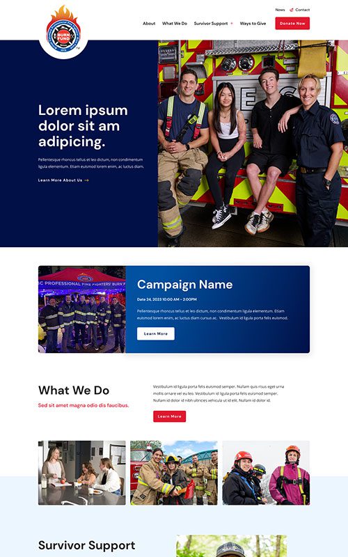
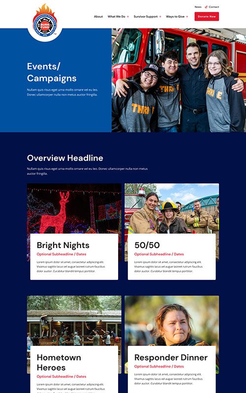
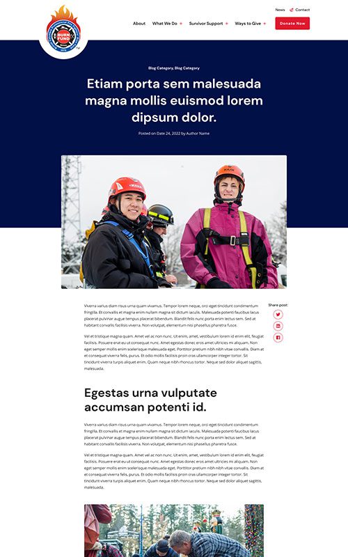
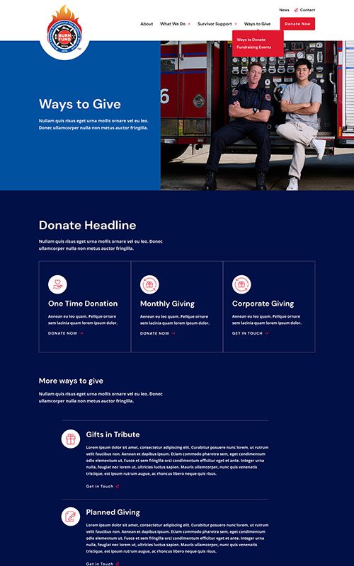
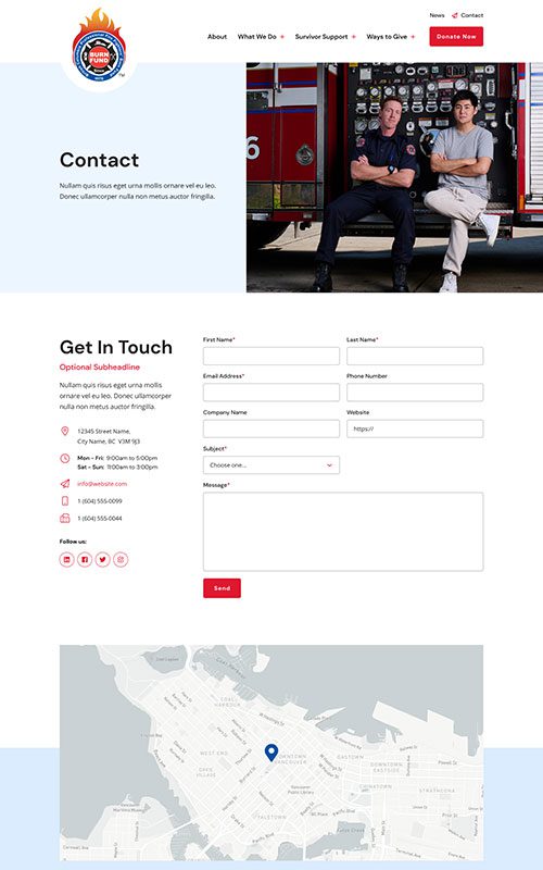
BC Burn Fund has great brand colours, using a vibrant primary colour palette, and they also got all-new photography to enhance their storytelling. We worked on crafting designs that balance the darker blue shades with light blue and white to make sure key content didn’t get swallowed up. Red draws the eye to navigation and CTAs.
Phase 3
Bringing it All Together
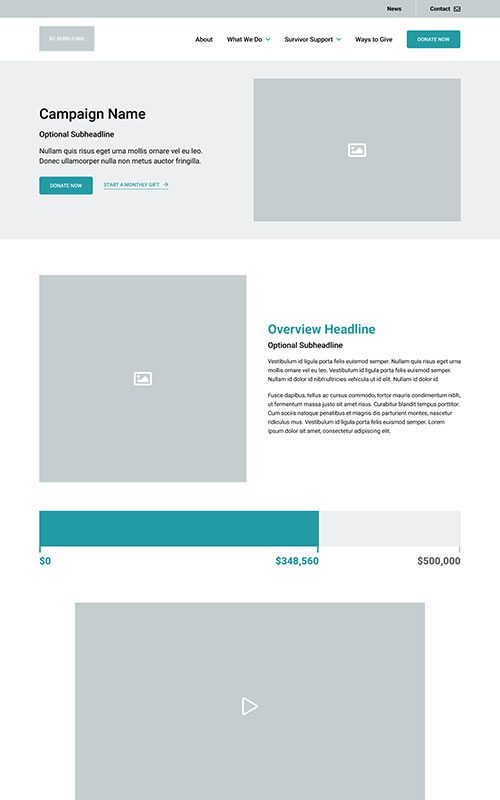
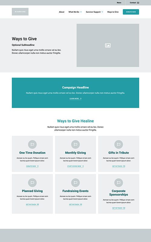
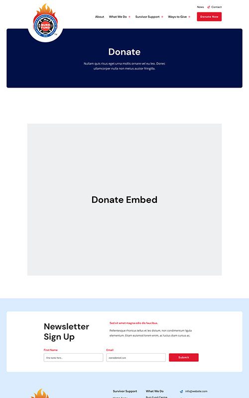
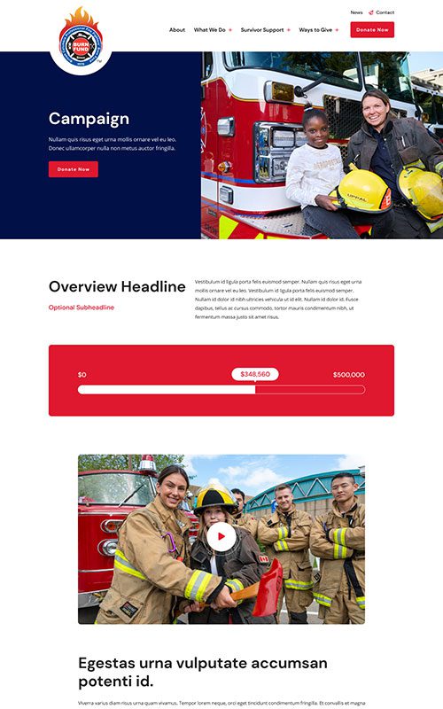
The new BC Burn Fund website is a significantly stronger testament to the organization’s work. A clean menu and clear paths to resources or learning more about their efforts make it easy for their audiences to discover content. We also created custom trackers that their team can implement in active campaigns, to show how much has been raised toward the campaign goals and help create a sense of urgency for donations.
Related Case Studies
Check out more of our web design case studies, to see the results we’ve helped our clients achieve.
Non-Profit
BC Dairy
A new web design with vastly improved structure and navigation help BC Dairy’s different audiences discover their array of tasty content.
Keep ReadingNon-Profit
Pacific Public Health Foundation
PPHF’s resource and campaign content had become difficult to navigate. They needed a full website redesign to improve site architecture and content discoverability – and on a short timeline.
Keep Reading