A while back I wrote an article about web design mistakes, including a bad website checklist. But why focus only on the negative? There’s enough of that these days. Let’s talk about something better: how to make a great website.
Now, whether or not your business website is great isn’t up to you. You can’t force your site’s visitors to have a good time. Websites are subjective in the much same way as art. What makes a great website is going to be a little different for everyone.
The good news is that there are many website functionalities that are universally awesome, for any audience, branding, or design. It all comes down to the user experience.
First, you need to understand what ‘user experience’ means in relation to your business website, and why it matters this year more than ever before. Then we’ll dig into the key elements of UX design that will help you make a great website.
Feel free to use the table of contents to skip straight to the list!
UX design 101
You don’t have to learn to be a user experience (UX) designer to have a great website. But if you don’t understand the basics of UX, you aren’t equipped to make the best decisions about your site’s design and content.
Fact: UX design moves people through the sales funnel
Fact: UX design directly impacts your bottom line
Fact: UX design affects your search ranking
This section will give you a high-level introduction to UX design, from a business perspective.
What is UX Design?
User experience design, also known as ‘interaction design’, is about crafting a website based on usability.
UX design is like the blueprint of a house. A blueprint covers everything from the number of rooms, window placement, and which way doors open to where appliances should go. It makes sure the house is going to be livable, and has enough room for all your stuff.
UX design does the same thing, but for your website!
A UX design process typically starts with research on the intended audience for a website:
- Their pain points
- Their motivations
- Their goals
- What they need to achieve on the site
- Even what they’ll probably be doing and in which emotional state when they encounter different pages
Oh yeah, UX design goes deep.
It also considers your content – what content you have, if any should be pruned, and if any major content is missing from the ideal user experience for your business.
Then it sets out to create a logical architecture for all of that content. Like a librarian, it files everything in a place where the target person would expect to find it, while creating lateral paths for alternate journeys toward the same end goal. Good UX design considers the paths of primary, secondary, and even tertiary audiences.
This is all accomplished through the decisive placement and structure of menus, callouts, call-to-action (CTA) buttons, featured or related content suggestions, and the order of content on a page. The deliverable is an interactive wireframe prototype of your website, so you can test its usability before you add colour and content.
The overarching goal of a good UX design is to deliver the right information at the right time, to keep a visitor moving through the website to reach their intended goal.
That’s a nutshell version of UX design. There’s a heck of a lot more to it than that, and you should also understand the difference between UI and UX design, but as long as you focus on usability, you’ll make good choices and end up with a great website.
Why UX Design Matters
It’s all well and good for me to say that UX design is important – but WHY? Where’s the tangible proof that UX design needs to be a business consideration?
Let’s review the facts I presented at the top of this section.
UX Design Moves People Through the Sales Funnel
There are tons of ways a person could land on your website.
- Through finding one of your pages in the search results
- From a search ad
- From social media
- From an email
- From a link shared in a message from a friend or family member
- By typing your URL from seeing it on a print ad
How someone finds you says a lot about where they are in the buyer’s journey (and I highly recommend learning about search intent!).
UX design considers all of those options and more, and ensures that wherever a person lands, there is clear messaging, navigation, and content to help them take the next step.
This could be from top-of-funnel into the middle, like reading a blog post and being guided to view your case studies. It could also be middle to bottom, like what messaging and functionality helps a person enter and complete the checkout process. You also want to gently encourage lateral moves around the top and middle, to build up more trust among those not ready to convert.
UX Design Directly Impacts Your Bottom Line
Whether it’s making a sale or earning a lead, every business website has a profitable end goal. A great website has such a simple and satisfying experience that it’s natural to reach that goal.
UX considerations that directly impact leads and sales include:
- Menus – size, locations, options, copy
- CTA buttons – context, placement, copy
- Cart – number of steps to purchase, copy, error messaging
- Forms – placement, number of fields, copy in and around fields
- Trust and credibility content – location, prominence
- Gated content – location, form considerations
- Reliability – visible signs of data security, messaging
- Mobile-friendliness – easy to complete tasks on any device
Having a weakness in any one of these UX elements can cost you sales. Period.
UX Design Affects Your Search Ranking
Google is all about creating their own happy user experiences. That’s how they dominate the search engine market share. Google and other search engines strive to deliver effective search results ranked using machine learning, AI, and natural language processing.
What is Google looking at? Among its 200+ ranking factors you’ll find several that come from human interaction with your site. Remember that UX design is also known as interaction design, so this is literally planning for positive interactions that will be noted by search engines.
Even though a page’s title and meta description might be what earn a click from the search results, it’s the experience once the reader lands that tells Google if you’re a good site and should rank higher for that search – or lower.
Some aspects of a good user experience are controlled at the site level, while others are a part of the page design:
- Fast to load (read up on Core Web Vitals as a new ranking factor)
- Mobile-friendly, responsive content
- Secure site (HTTPS)
- Free from intrusions that impede user flow
- Compelling presentation of content that entices longer sessions
- Right messaging at the right time and clear paths to next steps, to encourage more content viewed per session (and reduce bounce rate)
- Designed for accessibility
UX in action: how to make a great website design
Now you’re sold on how UX design helps business. Let’s get down to the most important UX factors your website needs to be a truly great website.
- Focus on one main audience
- Plan for multiple paths through the site
- Place menus in logical places
- Be judicious with menu choices
- Be judicious with all options!
- Ensure clear wording on menus and CTA buttons
- Harness the power of your footer menu
- Know when to click and when to scroll
- Allow complex details to be hidden behind clicks
- Allow your website to start a conversation
- Place social proof near CTAs to conversion pages
- Be strategic with related content
- Be extra strategic with callouts and footer CTAs
- Your page flow should tell a story
- Give your hidden pages some love
1. Focus on One Main Audience
While most businesses have two or three website audiences, it’s just not possible to plan content that appeals to all of them equally. A strong website has a content structure, navigation, and messaging that’s mostly focused on helping a primary audience achieve their goals.
This will get stronger on-page interaction signals (the ones that talk to search engines) and result in more conversions.
That isn’t to say you should ignore everyone else. You can have navigational tools like CTAs and menu options guiding secondary and tertiary audiences to pages with their own messaging and user flows.
2. Plan for Multiple Paths Through the Site
Your website isn’t a simple A-to-B line. There are lots of ways your customers could move from an entrance to a conversion. With B2B audiences, we also know that they have to visit our sites several times before converting.
A great UX design will think of as many little paths as possible, and plan a logical information architecture to keep those visitors flowing toward the end goals.
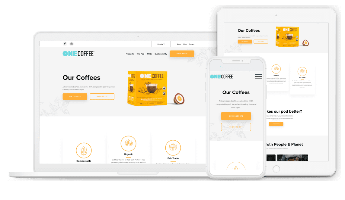
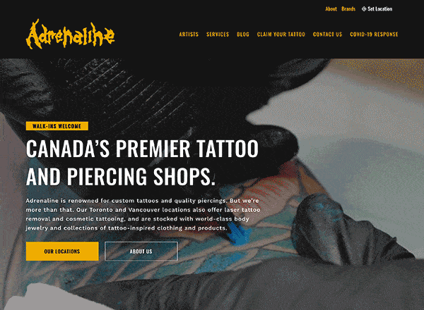
3. Place Menus in Logical Places
Whether it’s on a laptop, a tablet, a desktop, or a phone – you want your website’s content discovery to be a breeze. People expect to use menus, and they expect to find them in ‘normal’ places.
Obscured hamburger menus on a desktop site are “like putting car doors on the roof because the sides of the car look nicer without lines on it,” says our founder and lead UX designer Shawn Johnston.
Save the hamburgers for mobile, and make sure you have highly visible, easily-clicked or tapped menus. That applies to your main menu and footer menu, including search bars or filtering menus to help visitors find that content. Learn more in our full article on website navigation best practices.
4. Be Judicious with Menu Choices
This is a point we raise in every article we write about UX design – too many options can cause a visitor to pick nothing. A good menu should have a clear selection of options, neatly categorized into logical groups.
If you have a large number of pages, consider dividing your content into two menus, with the most important content to the primary audience featured more prominently and in the main menu.
5. Be Judicious with All Options!
As with menu options, you want to choose all options with a focus on what’s going to create a logical user flow. Barriers to visitors achieving their goals include:
- Too many callouts to different types of content
- Too many intrusions (pop-ups, other lead generation requests)
- Too many menus
If your website has a good UX design, your content will still be highly discoverable without overwhelming the visitor.
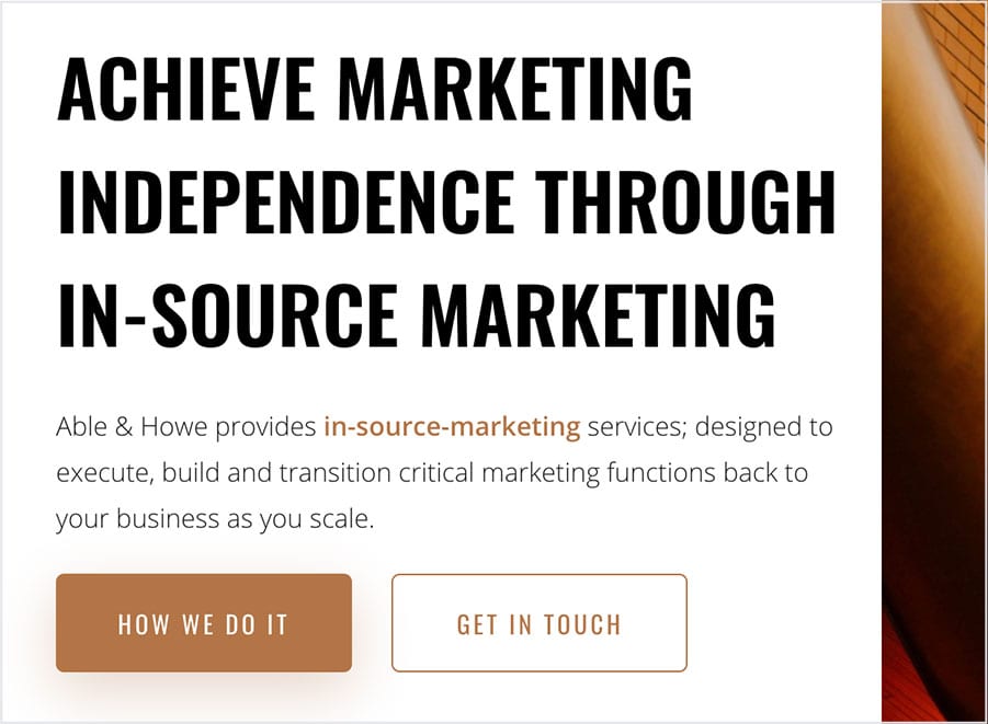
6. Ensure Clear Wording on Menus and CTA Buttons
Any time we ask a visitor to click through to another page, we’re asking them to trust us that it’s worth it. That’s a big ask!
The best way to keep a person moving around your website is to have clear microcopy – the words that appear on menus and buttons. Although these navigational tools often only have one or two words, those words have a HUGE impact on your conversion rate.
You can use simple language like “view all” or “sign up”, but don’t be afraid to give it more personality if that suits your audience. Just be sure that it’s still clear what will happen when they click.
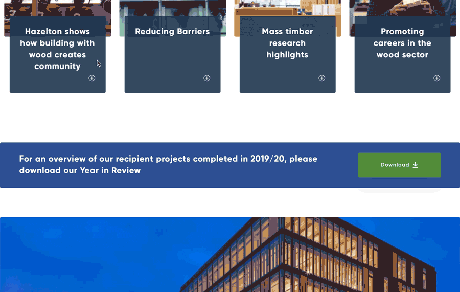
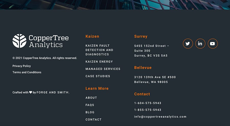
We’ve spent the last 10 years building usable websites. In that time, we’ve had access to powerful UX tools like heatmaps, which capture where clicks and taps happen on a page. What we’ve seen is a lot of action happening on footer menus.
Some companies even use the footer menu to provide options not visible in the main menu, to keep it uncluttered. This might include a list of locations, blog categories, or industries relating to projects and case studies.
8. Know When to Click and When to Scroll
It’s a major UX myth that clicking is bad, and you should cut down on clicks. Ideally there is a minimal amount of clicking required to complete a task, but a healthy balance between clicking and scrolling is still good UX.
Make sure your clicks are worthwhile. The kind of content you’d find on interior website pages is an acceptable place for clicks, because the visitor is already deeper into the website and more committed. For example: products, blog landing pages, and callouts to move between related content.
Primary pages, on the other hand, should use scrolling.
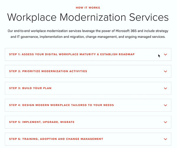
9. Do Allow Complex Details to Hide Behind Clicks
There’s some content that’s just too hard on the eyes. Scrolling is pleasant if there’s lots to look at along the way. But if you have complex tech specs to convey, you can benefit from placing those behind clicks.
Clicks to view more detail on a subpage are perfectly okay to use in this case. A person who wants that technical information is going to click. Another great method is to use accordion content, where the details are hidden unless clicked to expand. That way the reader controls how much they see on the page. This is especially good for FAQ pages.
10. Allow Your Website to Start a Conversation
On that note – it’s always a good idea to ask yourself if all that complex information needs to be on that page.
Websites are no longer brochures for everything your company does. It’s common for a B2B website to provide a good overview of your product, service, or process, and encourage the visitor to make contact for more details.
11. Place Social Proof Near CTAs to Conversion Pages
Social proof is a powerful tool. Statistics show that a huge majority of people read multiple reviews before making a purchase. Why do you think influencer marketing is so successful? Seeing a human just like you enjoying a product makes it much more appealing.
And this is equally applicable to B2B sales. A G2 study found that 92% of B2B buyers are more likely to purchase after reading a trusted review. Testimonials can actually boost conversions by 34%!
The best place to put this super-convincing content is right near CTA buttons that lead to conversion pages.
12. Be Strategic with Related Content
This bears repeating: the way visitors engage with your site sends ranking signals to search engines. Keeping a person moving around, viewing more content, is good for your sales funnel and good for your SEO.
We highly recommend using attractive callouts to related content, on your top- and middle-of-funnel pages. The obvious placement is on products or blog posts. There’s also a benefit to showing case studies or projects related to a service you offer, and case studies are great conversion-driving content.
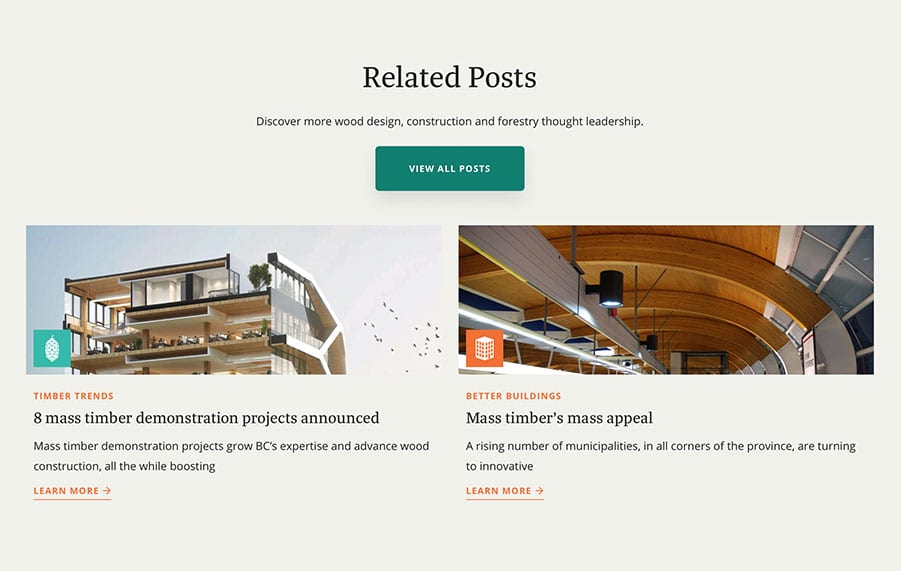
Another website feature that aids the user experience – when used effectively – is a callout. This block usually features copy, an image, and at least one CTA button leading to another part of your site. When placed at the end of a page, these are commonly called ‘footer CTAs’.
The thing about callouts and footer CTAs is that they have to offer a natural next step. If the callout doesn’t make sense for that stage of the buyer’s journey, it’s not going to get clicked.
It’s probably asking too much for someone reading a blog post to contact you about a custom agency-quality website. It also doesn’t make sense to call out your Careers page when the person is viewing samples of your work – that content is typically for two different audiences.
Here are examples of natural next steps:
- Blog Post – related posts, Newsletter signup, gated content
- About Page – Team page, Careers page, other content about your company story
- Services – related projects or case studies, Contact page
- Case Studies – Contact page, Book a Demo
14. Your Page Flow Should Tell a Story
I keep throwing out words like ‘user flow’ and ‘buyer’s journey’ – here’s how to understand that. Imagine you’re the main character in a story, the hero. Your quest is determined by what you encounter on each page of the website.
Read each page from top to bottom. A great website is going to roll out like a story. If it feels disjointed because the content doesn’t flow together in a logical order, or random topics and pages are called out, you need to revisit your story.
15. Give Your Hidden Pages Some Love
When a company puts thought into details you almost expect them to overlook, it creates a fantastic user experience. We expect all the main pages of a website to be usable, that’s a given. But what does a visitor experience when they find one of your website’s hidden pages?
- Thank-you page, seen only after filling out a form
- Newsletter signup confirmation
- Content download confirmation
- 404 error page
- 0-result page, seen when no results match your search
These pages are too often left with short, generic text that doesn’t even feel on-brand. You have an opportunity to do something fun or rewarding, like feature a piece of content not found anywhere else on your site, display a little game or a meme, even offer a coupon code.
Share post:
About the Author
More by This Author