How your audience perceives your brand hugely impacts your ability to attract, convert, and retain customers. In fact, research shows that branding plays a majorly important role in enabling business success.
- The 2019 Trust Report from Edelman discovered that 81% of consumers need to trust a brand to consider buying from it.
- The 2020 Zeno Strength of Purpose Study revealed that consumers who think a brand has a strong purpose are 4 to 6 times more likely to purchase and champion the company (even in the event of a misstep).
- And it’s worth noting that even when researching solutions for their pain points online, 82% of people will click on a Google SERP result by a brand they’re already familiar with.
Now, the one thing you need to understand about brand perception is that it’s greatly influenced by web design.
Scientific research data shows that how your site looks doesn’t just impact your audience’s perceived quality of information and user experience. It also affects their overall shopping experience and their intention to buy again from you – whether you’re selling professional services or a tangible product.
This means that you can effectively use your website visuals to shape audience perception and grow your brand.
The Elements of Your Brand’s Visual Identity
There are several effective methods you can use to develop a visual brand strategy that will encourage your audience to fall in love with, shop from, and champion your business. But before you start implementing those, you need to understand what the elements of your brand’s visual identity are in the first place.
On the whole, there are five elements you need to consider when using web visuals to shape audience perception. These include:
- Your company logo. As the most recognizable brand visual identifier, your logo has to be well-designed. More importantly, you need to use it across all your distribution channels to ensure your audience is well-acquainted with the visual symbol representing your organization.
- Your brand’s colour palette. Research shows that colour improves brand recognition by as much as 80%. Developing and sticking to a colour palette makes it significantly easier to build brand awareness.
- Typography. Using a predetermined set of fonts in all your communications with your audience demonstrates professionalism (unless, of course, Comic Sans is your font of choice). But even more, how the text in your visuals appeals to your target audience hugely impacts UX and can affect conversion rates.
- Images, illustrations, and other visuals. People process images 60,000 times more quickly than they do words. So, if you want to encourage your audience to perceive your business in a specific manner, the best way to do it is to expose them to visuals that align with your brand’s mission, vision, and values.
- Page layout. Visual branding is not only about what elements you use – it’s just as much about how you organize those elements. For instance, knowing that your site’s header plays a crucial role in forming web visitors’ impressions of your brand, it’s clear that you need to optimize this area of your site to communicate the right message about your organization.
How to Use Website Visuals to Shape Brand Perception
Once you’ve determined how you want prospects to see your brand and have all the elements in place to shape their perception, it’s time to start implementing visual branding strategies to reach your goals.
1. Practice Consistency With Colours and Typography
One of the most commonly overlooked reasons for staying true to your brand’s visual identity is that most people don’t invest in products the moment they discover them. On the contrary, research shows it takes an average of eight touches for consumers to go from awareness to conversion. The B2B buyer’s journey can be even longer.
If you want your audience to notice and remember your business from the moment of the first encounter until the time they’re ready to convert, you need to develop a recognizable visual identity for your brand and use it consistently across all platforms.
The easiest way to do this is with colours and typography. The right palette and font can instantly become synonymous with your organization. Not convinced? Just think about Coca-Cola’s cursive logo on a bright red background, or the golden McDonald’s arches.
For this visual branding strategy to work in your favour, you don’t have to be an international company or design one of the world’s most recognized logos. You just need to decide on a visual theme for your business and stick to it to profit from brand familiarity.
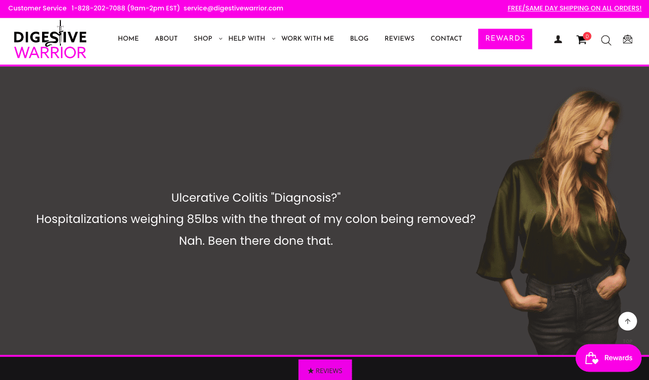
For instance, if you check out the homepage of digestive wellness brand Digestive Warrior, you’ll notice that the business employs a unique shade of magenta for its logo, specific site elements, and CTA buttons, making it the brand’s calling card. If you look across the supplements industry, you’ll be hard-pressed to find a business that uses a similar colour palette, which is a brilliant move as it ensures a standout appearance in a market that’s saturated with green, white, and blue logos trying to evoke dependability or nature.
2. Use Authentic Visuals That Revolve Around a Specific Theme
Visuals are super effective at conveying messages. In fact, if you can use images or illustrations to communicate your unique value proposition, you’re much more likely to convince your audience to convert than if you relied solely on text.
However, if you want to use visuals to shape audience perception and grow your brand, stay away from generic images like stock photos. Instead, opt for visuals that genuinely have to do with the solutions your brand offers, that create an immediate emotional connection for the viewer, and that bring a sense of authenticity to your online presence.
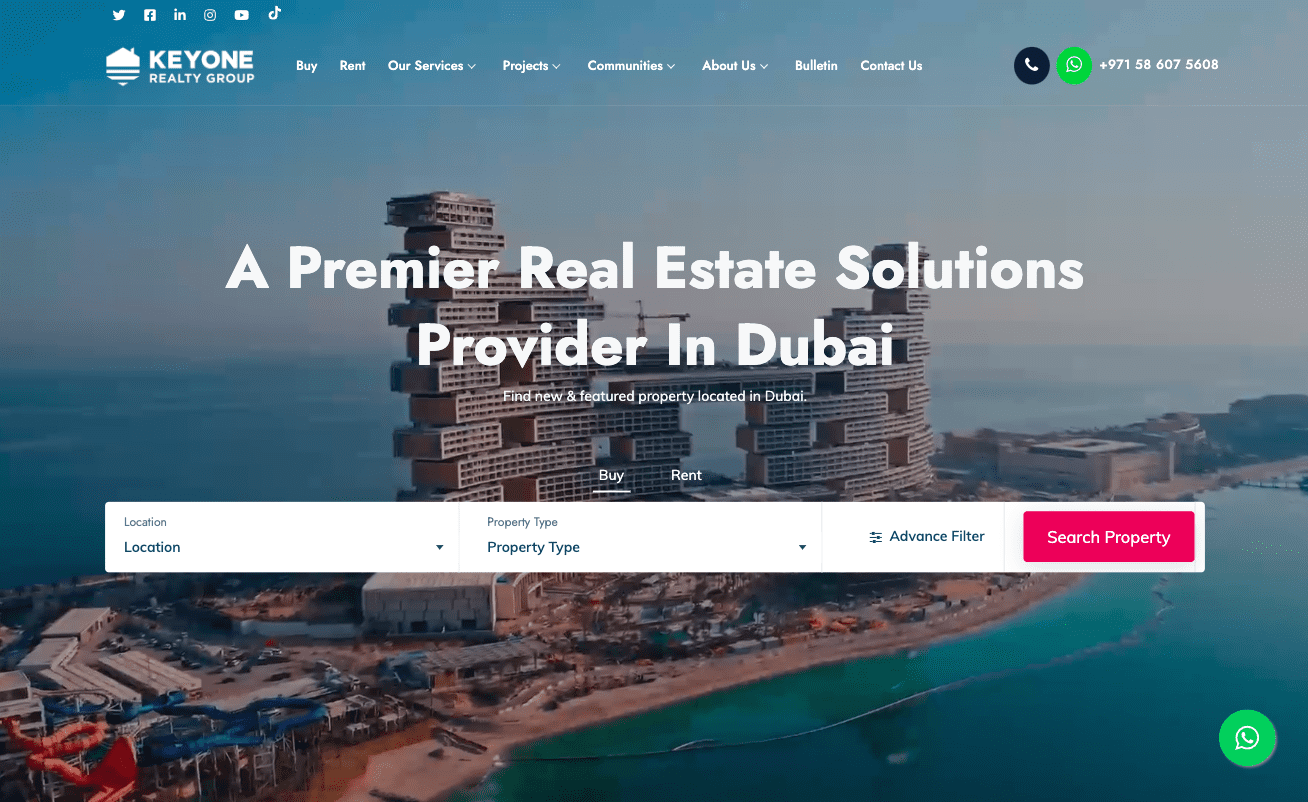
If you check out the Key One Realty Group website, you’ll see that the hero section features a series of short clips representing the properties managed by their team. This design choice does a spectacular job of setting web visitors’ expectations regarding what they can get from Key One. The appeal encourages prospects to take a closer look at Key One’s offer to find the type of property they require.
Alternatively, you could also take a more user-centric approach to selecting website visuals. You can use the hero image on your homepage to visually represent some of your audience’s main pain points, or to show authentic imagery of your actual users.
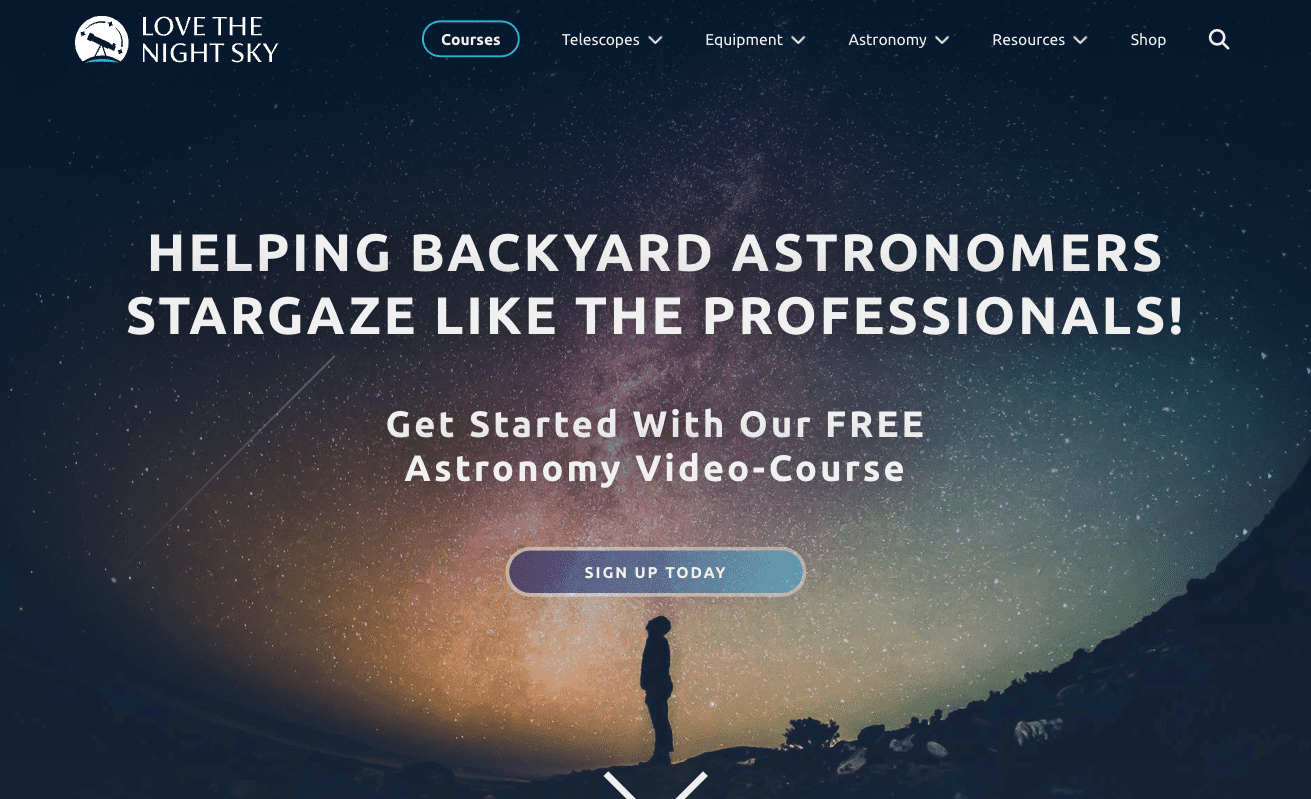
Or, you could do what amateur astronomy site Love the Night Sky does and use the website visuals as an opportunity to show off the aspirational lifestyle your solutions unlock to your customers.
3. Understand the Importance of Negative Space
Web visuals significantly impact how your target audience perceives your business (and their willingness to invest in your solutions). However, remember that for any of your design decisions to yield results, you can’t allow them to completely overwhelm your website visitors.
In fact, if you look at the basic rules of good web design, you’ll find that visual hierarchy plays a major role in allowing you to successfully communicate any message or position your business in a specific manner.
For this reason, when choosing visual elements to display on your homepage – or any page, for that matter – you need to give them enough room to attract web visitors’ attention and make a lasting impression. And the easiest way to do this is to surround high-value webpage elements with plenty of negative space.
Because negative space speaks just as (if not more) loudly as any other visual element, you’ll want to use it to the maximum of its potential.
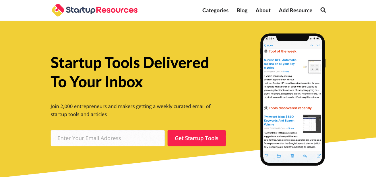
For instance, on the Startup Resources homepage, the negative space actively guides web visitors’ attention toward the brand’s value proposition. In doing this, the business maximizes conversions through the lead capture element. But more importantly, this unwavering focus on what Startup Resources offers establishes and cements the brand’s identity in the reader’s mind.
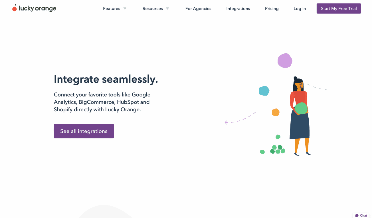
If you check out the homepage of conversion optimization brand Lucky Orange, you’ll notice how this brand uses negative space to remove distractions from the benefits section. This minimalistic approach, where a single means prospects naturally take a slightly longer time to scan each benefit, maximizing their chances of concluding that the solution is worth an investment and of perceiving the brand as an entity that’s competent enough to remove their pain points.
4. Rely on Badges and Illustrations to Boost Credibility
Because brand trust is essential in determining your audience’s willingness to invest in your solutions, one of the best ways you can use website visuals to grow your business is to help prove your brand’s credibility. And the best thing about this brand strategy is that it’s super easy to achieve by adding a few badges or illustrations to your existing design.
For example, by showing off trust elements on your homepage – like product ratings, media mentions, or third-party certifications – you can influence web visitors to view your business as dependable and competent and maximize their chances of converting into customers.
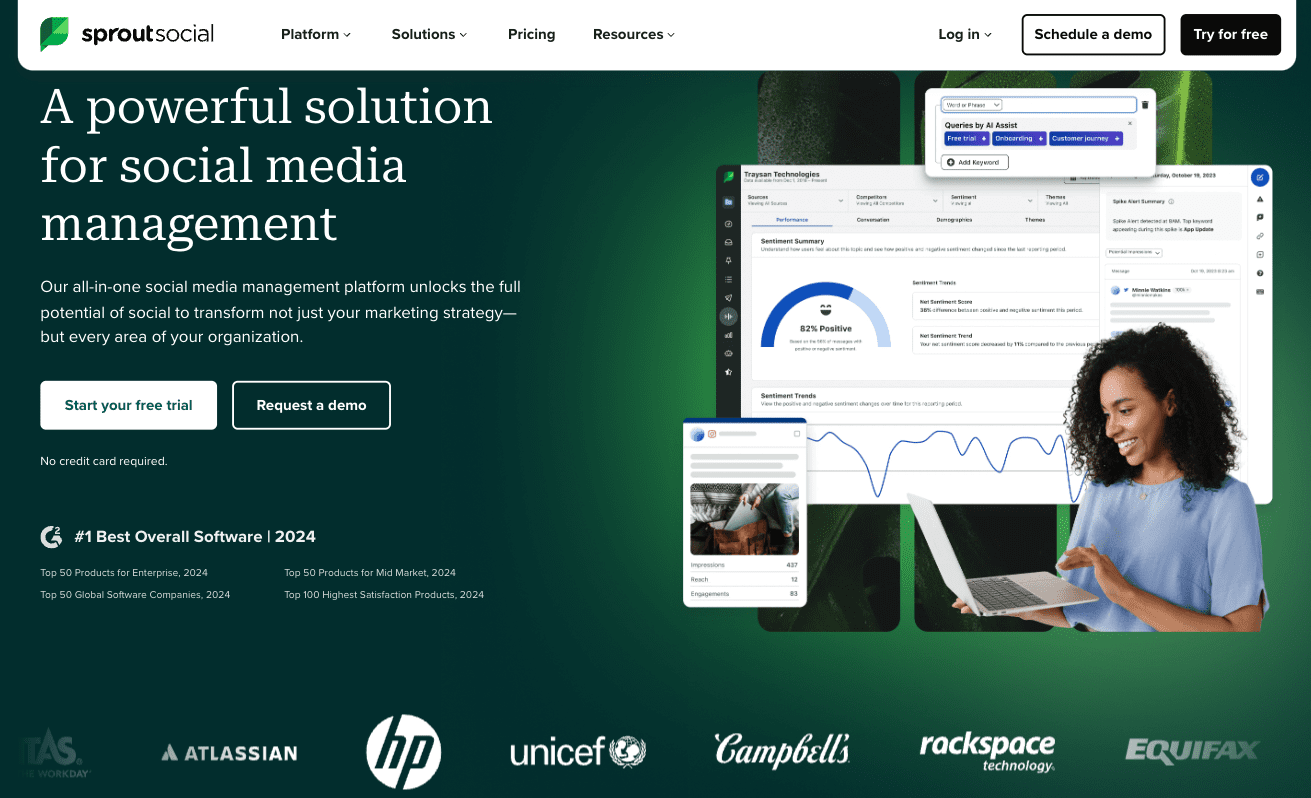
Check out what social media management brand Sprout Social does in the hero section of its homepage. The business emphasizes that it was the 2024 winner of G2’s Best Overall Software category. And knowing that it’s possible to build credibility through association, it also shows off the logos of some of its most famous clients, including HP, Unicef, and Campbell’s.
5. Experiment with Interactivity and Multimedia
Capturing and retaining your prospects’ attention requires encouraging them to engage with your content. There’s no better way to achieve that than to use interactive and multimedia website visuals.
In 2022, a study conducted by Mediafly discovered that interactive content attracted 94% more views and 52.6% more engagement than its static counterparts. Hence, if you want to guarantee that web visitors notice and remember your brand’s message, it’s a good idea to explore different ways to add a dose of movement to your web visuals.
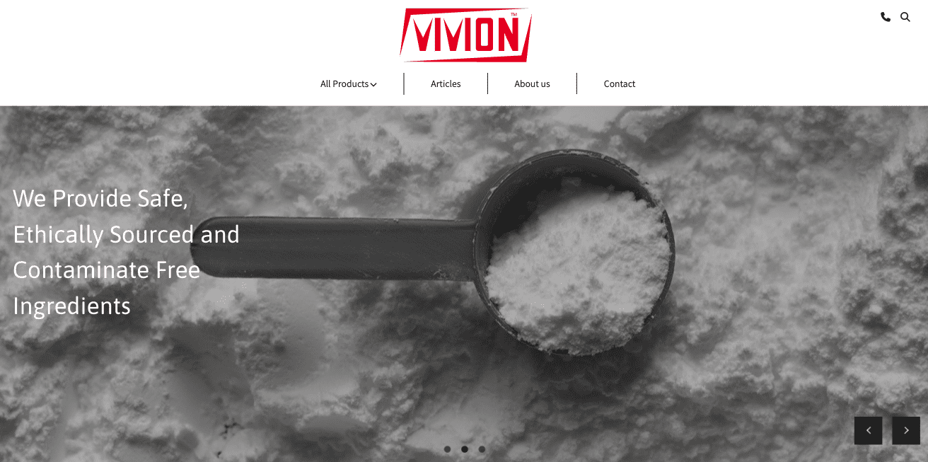
Doing this can be as easy as presenting your main unique value propositions in a carousel format, like on the homepage of Vivion, a bulk ingredients manufacturer, where each header slide communicates a different selling point.
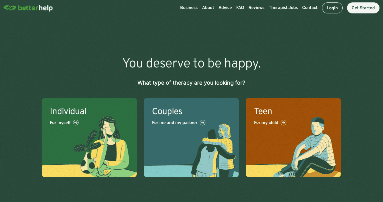
Of course, you can opt for far more complex visual solutions. For instance, BetterHelp, an online therapy brand, has a header that encourages web visitors to pick the type of therapy they wish to try before presenting them with any other written or visual content.
Finally, if you want to form your audience’s opinions about your business or your products, don’t underestimate the power of video content, which remains one of the best formats businesses can use to explain their products, boost brand awareness, or encourage consumers to convert.
Just make sure that you consider page load speed when using video, use it judiciously, and take measures to speed up the page (such as using a CDN and only using embedded video that’s hosted on another platform).
Over to You
Convincing your audience that your brand is a competent and dependable business they can rely on to remove their pain points is not rocket science. Especially if you use web visuals to subconsciously shape their perception of you and your work.
Regardless of whether you decide to implement one or all of the strategies discussed in this article, remember that convincing your prospects to give your brand a chance is one thing. Retaining them as loyal customers is what you’ll have to work extra hard for.
Ultimately, people may give a business a chance based on the feeling they get from your website and what you’ve promised them. But unless you can meet their expectations through exceptional customer experience, they’re not likely to give your brand a second thought.
Even more, failing to keep your promises may do irreversible damage to the brand reputation you tried so hard to build. Be sure to back up your compelling brand visuals with customer service to match.

