This article was fact checked and updated on June 8, 2023.
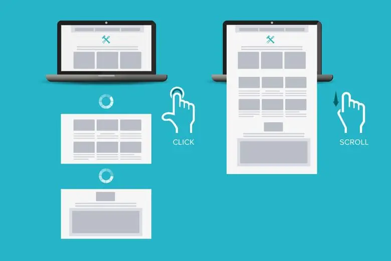
Scrolling vs clicking: which website navigation is the best choice for your audience? That is the big debate in a web design.
It all comes down to two things: your content and your audience. Some content is better managed with pagination and clicking, while some audiences expect continuous content.
Scrolling and clicking each have their place in a strong web design. Let’s look at the pros and cons, and which website navigation experience is ideal for the different areas of your site!
Scrolling vs. Clicking: The Pros and Cons
Scrolling vs. clicking is a decision made almost daily by the Forge and Smith UX designers, because it plays a big role in a site’s user experience.
Why and how your website’s visitors engage with content and interfaces, including navigation, is the key to designing a highly usable site – and avoiding a bad web design.
When it comes to navigation, the more you understand about your users’ needs and preferences, the better you can help them quickly and easily find what they want. And that is the best way to earn repeat visitors, better on-page ranking signals, and most importantly, conversions.
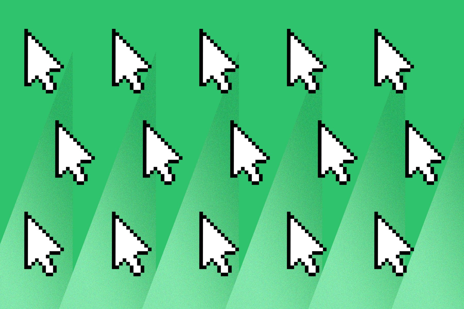
1. Scrolling
Let’s start with the pros. Almost everyone has learned scrolling from years spent cruising the digital landscape. Our favourite social media feeds scroll endlessly, and the websites we use for research or to do shopping also have scrolling functionality. Google even released continuous scrolling mobile search results in 2021, so you can go hours-deep into that research spiral.
From Gen Z to Boomers, scrolling is the most comfortable and intuitive type of navigation for most users. As smart phones get bigger and heavier, the importance of making navigation simple and accessible within thumb’s reach is critical to whether your visitors engage with your content — or bounce from your site. Scrolling is easily done with the thumb, while clicks can sometimes be unreachable.
“Everything is designed. Few things are designed well.”
– Brian Reed
When it comes to channelling your site’s content structure down into an engaging on-page experience, scrolling is a natural and efficient means of navigation.
More pros of the scroll:
- It delivers content more quickly, because there is no need to wait for pages to load
- It doesn’t require a commitment by forcing users to choose a button — or pick between multiple buttons — and abandon their current page
- It allows visitors to dive deep into content or website exploration without visual boundaries
And now the cons.
Not being able to see the bottom of a page can be concerning for users. They might want something they expect to find in the footer, or they just might want to know how much information is left so they don’t miss anything. On the flipside, this is also a problem for you, because users are unable to get to the helpful, valuable links and other options in your footer. Many users rely on the footer to re-orient themselves and for wayfinding, so not being able to reach it (or the main menu) creates frustration.
2. Clicking
Even though scrolling is a natural method for digesting information, clicks are an integral part of both mobile and desktop website navigation experiences.
All websites have clicks or taps as part of the user experience. Menus, links, form fields, and CTA buttons all require clicking, and users are perfectly okay with that. Here are the pros of clicking:
- Pagination is reassuring: At a quick glance, a user can understand if there are two more pages of products or case studies, or 15 pages. They can decide to keep clicking to browse, or go back and add more filters to reduce the results.
- Footer content is reachable: A well-designed footer is a safety anchor for users. It helps them understand the structure of a site and where they are, potentially increasing time on site, reducing bounces, and increasing conversions.
- Users can bookmark: With high-volume content, it’s helpful for users to be able to bookmark where they left off, and return later to continue their search. This is not possible with continuous scroll.
- Microcopy drives results: The copy on a clickable element, such as a menu item or CTA button, can be extremely enticing! A visually appealing button with great copy can bring your user to another page that’s closer to conversion, while scrolling only reveals the results on the same page.
It’s important to make all clicks easy and intuitive, so that your audience can always tell where they are going and what they’ll find when they get there. When not designed well, clicks can sometimes become a barrier between your user and their goal. For example, clicks ask the visitor to make a decision and leave some content behind, so placing clicks too early in their journey can also be a deterrent.
Tips to improve the clicking experience:
- Use clear, concise copy on all CTA buttons
- Minimize the number of clicks required to complete a transaction, fill out a form, or reach the end step in another process — each click is a potential drop-off point
- Make clickable content easy to tap on mobile devices — even with big fingers
- Use clicks sparingly within content that should be scrolled (ex. a table of contents within a blog, or expandable buckets of copy on a services page)
- Avoid forcing the user to click to finish reading one piece of content — pagination within articles is no fun!
Which content should be scrolled, and which should be clicked?
We asked our awesome team of designers and developers to break down exactly where you should use scrolling website navigation for a winning user experience, and where you should use clicking.
For a typical website, this is what we recommend:
- Top-level content should be scannable, CTA-focused, accessible, and be a decision-making tool. Scrolling navigation is optimal for your primary landing pages like your homepage, About page, and Contact page.
- Secondary content is more specific, but still has the same needs as far as accessibility. Scrolling is also ideal for interior landing pages, such as a services overview, ‘how it works’ content, and product categories.
- Tertiary content is typically accessed when the user is fully committed and ready to get down to business. Clicking works well on pages like individual products or services, and for lateral navigation between related content to facilitate content discovery.
Part of our job as a web design and development agency is to understand who your audience is, what they need, and how best to deliver it to them at each stage of their journey — and then bring that to life in website design. Whether it’s scrolling or clicking, it’s always about crafting that great user experience.
Keep learning – read UX Vs. UI: How They Work Together In Web Design.
Share post:
About the Author
More by This Author