
Have you ever wondered how a website seemingly effortlessly captures your attention and guides you instinctively toward a click? That’s the perfect call-to-action (CTA).
If you want people to reach your website’s conversion points, you need to master CTA best practices. Optimizing your CTAs helps to transform casual visitors browsing your content into customers or leads.
But how do you create a CTA that catches the eye and compels action? Stick around as we dive into the world of CTAs, where every click counts and every detail matters.
A call-to-action does exactly what it says: it calls the user’s attention to take an action. In marketing, “call-to-action” or “CTA” are used to describe a variety of page elements designed to prompt a user interaction. It’s most often a button, but it can take any form, like a page-width block of content, a line of text, or an image.
It’s a straightforward prompt that guides users on what step to take next, and that step is typically a profitable or beneficial action. Popular examples are downloads, sign-ups, booking a demo, making contact, adding an item to a cart, or completing a purchase.
A CTA may look slightly different on desktop and mobile devices, and should always be responsive.
Why is a CTA button so crucial? A good CTA button has the power to transform your website from a static brochure into an interactive hub of engagement and activity. And with a typical human’s attention span of just eight seconds, a CTA is your best bet to turn a passive browser into an active participant.
Ultimately, it leads users deeper into your marketing funnel.
Whether you’re crafting websites for manufacturers, retailers, or tech companies, the inclusion of a clear and compelling call-to-action is critical to driving business. Your primary aim is to direct visitors towards those engaging actions, such as requesting a quote or exploring product demos.
Without a clear CTA, visitors are left to find your conversion content on their own – and they might, or they might give up and seek a competitor instead. Don’t forget to optimize the path to conversion, too! Read the guide: 7 Best Practices for Conversion Rate Optimization!
Seven CTA Best Practices for a User-Centric Experience
Now that we’ve covered the importance of these buttons, let’s explore the CTA best practices that can turn simple buttons into powerful tools for your website.
1. Make Sure the Button is Obvious
For a CTA button to be effective, it must be immediately noticeable to visitors. But how do you achieve this spotlight effect? Start with size and placement.
The button should be large enough to be easily seen, but not so large that it overwhelms other content or looks tacky. Placing it in a central or eye-catching position helps it grab attention. Many websites have a CTA “above the fold”, which is an old newspaper industry term that now refers to the area users see before having to scroll.
Also keep in mind the flow of UX and reading. The button should be an obvious click-me signal, inviting and clear, and in a location the user expects to find it. Here are typical options for placement with high conversion potential:
- The top of a page or within the menu
- The middle or end of blog posts
- Adjacent to social proof
- The bottom of a page or in the footer menu
- A pop-up box
2. Don’t Go Overboard
Too many CTAs on a page can overwhelm and confuse users, resulting in none being clicked. You need to strike the right balance to ensure a user-friendly experience.
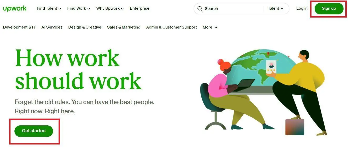
Upwork positioned two CTAs so that they’re both visible at once, but the page doesn’t look cluttered because of their size, placement, and harmonious colour.
The two CTAs actually enhance the user experience because they fulfill different user goals: one helps visitors sign up to their account, while the other helps them get started on Upwork.
3. Create a Sense of Urgency
Ever felt the rush to grab something before it’s gone? That’s urgency at play, and it’s a powerful tool for your CTAs. This is often referred to as the FOMO effect, or “fear of missing out.”
FOMO taps into our worry of being left out or missing a great opportunity. By creating a sense of urgency, you’re nudging your users to act now rather than later. But how do you weave urgency into a CTA without sounding pushy? The answer lies in finding the right words and context.
CTA button phrases with urgency include “Now,” “Last Chance,” “Limited Availability,” and “Today,” among others. These phrases create a psychological nudge, suggesting one may miss out if they don’t act quickly.
See how Levi’s does it.

For the best results, incorporate site copy that supplements the CTA. In the example above, Levi’s highlights how its product is limited-edition and was “meticulously recreated by hand.” With that kind of copy and the CTA that sounds exclusive, shoppers can’t help but click.
Overdoing urgency can backfire, though. People might think you’re all about just selling your product if you incorporate too many words that connote urgency on and around your CTA button. CTA buttons are a copywriting skill! Read Copywriting vs. Content Writing to learn how it works.
4. Pick CTA Colours Wisely
To choose the best CTA for your website, you need to understand colour psychology in design.
Different colors evoke different emotions and actions. For instance, red can create a sense of urgency, while blue can instill trust and security. Green, often associated with traffic lights, can encourage users to take the next step.
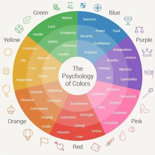
The key is to choose a bold colour that aligns with the action you want users to take.
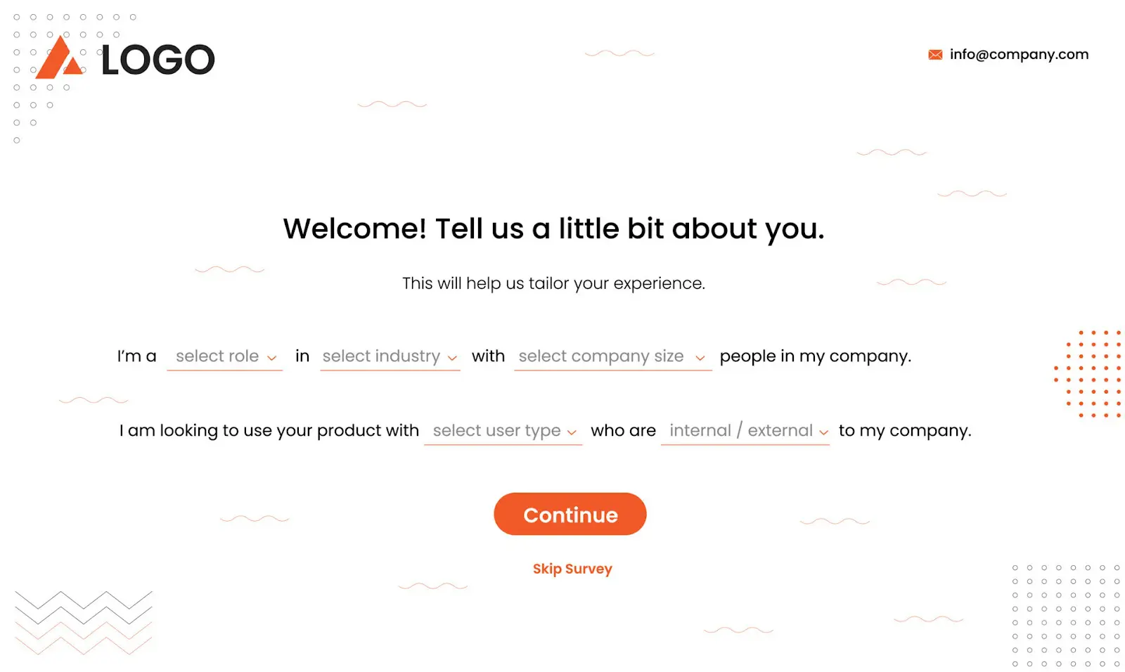
For example, you might be creating assessments to help your audience figure out which service or plan they need. A brightly coloured CTA like red or orange encourages users to immediately begin the process:
Or, if you want potential customers to connect with you, you can use a blue CTA to instill that sense of trust, just enough for them to agree to talk to a complete stranger:

Colour contrast also plays a key role in both visibility and web accessibility. Use shades that stand out against your website’s background colour.
This doesn’t mean you need to choose colours that clash with the overall design to make CTAs stand out. The aim is to make the button enticing and eye-catching, but still in harmony with your palette. If your site has a cool blue theme, an orange CTA button could be striking yet complementary. Even better if it has plenty of white space.
Still not sure what CTA color to use? The most commonly used CTA colors are blue, yellow, orange, and black. Choosing one of these is a safe bet. And make sure your button text is in a colour that’s easily legible against the button itself.
5. Use Words that Encourage Action
The right phrasing on your CTA can turn a hesitant visitor into a customer. But what makes a phrase effective?
First of all, the words on your button need to communicate action. Your CTA should say exactly what you want the user to do, and it should do so compellingly. And keep in mind that for accessibility, the copy should accurately describe what will happen when the button is clicked – and avoid being vague.
Start by picking strong action verbs. Verbs like “Discover,” “Start,” “Get” or “Join” are straightforward and powerful.
The Pet Supermarket online store is an example of a brand that uses powerful CTAs on its homepage. Instead of a broad “Learn More,” the brand opted for “Discover Wellness.” It promises a benefit and an experience, making the user feel that by clicking, they’re starting a valuable journey.

For the best results, you can also add words that imply urgency to your chosen powerful verb.
“Join Our Community Today,” for example, is more compelling than simply “Join.” The first option is an invitation to become part of something exciting now. The second one, meanwhile, is just a suggestion.
If you’re not a copywriter, it can be difficult to come up with the right CTA button text. There’s technology you can use to generate ideas, like a generative AI platform. Just specify the criteria you’re looking for in a CTA button, and it will give you suggestions. You can even use the platform to generate the accompanying site copy for your CTA.
6. Provide Descriptive Alt Text
Many site owners don’t realize that CTA buttons fall under the images category of page elements. And like every image on your website, every CTA should have alt text.
Alt text, or alternative text, is the copy that appears in place of an image if it fails to load. More importantly, it’s used by screen readers to describe images to users with visual impairments. Therefore, providing an alt text for your CTA buttons ensures that your website is accessible to all users. If a person with a visual impairment can’t find the button, they can’t convert.
When crafting alt text, be clear and descriptive. A simple “Click Here” doesn’t tell the user anything about what the button does. “Sign Up for Our Newsletter” or “Download Our Free eBook” do. Remember, your goal with the alt text is for users to know what action they’re taking even if they can’t see the CTA button. You can’t achieve that if you use vague phrases as your alt text.
Crafting the right alt text is actually easy. All you need to do is determine what the purpose of your CTA is.
Say you’re running an online fashion store. If you have a CTA button that encourages users to explore products that are trending, your alt text can be “Discover the Latest Makeup Trends.” If your CTA’s purpose is to get visitors to register as subscribers, your alt text can be “Sign Up for Our Monthly Emails.”
7. Test Your CTA Buttons
The final step in optimizing your CTA buttons is testing them. Why? Because what works for one website might not work for another. Testing allows you to understand how your specific audience reacts to different CTA elements like colour, placement, wording, and size.
A/B testing is an effective way to do this. Your audience is split and shown two different versions of your button. The right platform enables you to compare two versions of a CTA to see which one performs better.
There are several powerful tools available, such as Google Optimize, Optimizely, or even the built-in A/B testing features provided by website builders like WordPress. These tools enable you to experiment with various design elements.
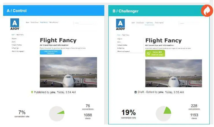
Start by changing one element at a time. For instance, test two different button colours or two different phrases – not two changes at once. Otherwise you won’t know which change was what improved results. Keep everything else on your page constant, too, so you know that any change in user response is due to the CTA variation.
Measure the success based on click-through rates, conversions, or whatever metric best aligns with your goals.
Testing is an ongoing process. User preferences and behaviours evolve, and so should your CTAs. Regular testing ensures that your CTAs remain effective and continue to resonate with your target audience. Rather than just guessing what works, you’re using real data to make informed decisions, leading to a more successful, user-centric website.
In Closing
Your CTA is one of the most important elements on your site. If you’re building your website from scratch or redesigning it to improve conversions, use these proven CTA best practices to drive results. They offer a roadmap to transform underperforming sites into dynamic, user-friendly platforms.
Crafting an effective CTA requires knowledge of psychology and design, and also of your audience’s preferences and goals. Test, learn, and evolve to lead your business to greater heights of digital success.
Here’s to CTAs that don’t just look good, but perform brilliantly.
Share post:

About the Author
Ian Loew
With decades of experience in B2B web design, Ian Loew is Lform’s Owner, Creative Director, and Head of Business Development, which he founded in 2006. Ian has worked with a diverse range of clients, including small startups and large corporations. He takes great pride in truly understanding and translating what clients want into actionable results.
Contact Us More by This Author