What do all potential customers visiting your website have in common? They’re interested in what you offer. Regardless of their different ages, backgrounds, needs, and tastes, you need them all to take the same steps and click the same buttons to turn that interest into a conversion.
But how do you help that journey happen?
This is where user experience (UX) design and conversion rate optimization (CRO) join forces. UX and CRO work together to move potential customers through the sales funnel.
By 2025, 80% of B2B sales interactions will occur in digital channels. This offers businesses a golden opportunity: a strategic website can yield abundant returns.
In this article, we’re going to explain how you can use UX and CRO in partnership to increase your conversion rate.
What is User Experience Design?
UX design is crucial to a successful website. It focuses on usability to help someone navigate a site, suggest related content, strategically place CTA buttons, and build a better overall experience.
Good UX design ensures that wherever a website visitor lands, there is strong messaging, clear navigation, and relevant content to lead them to the natural next step in the process.
The four main categories of UX design strategy are:
- Experience strategy
- Interaction design
- User research
- Information architecture
Research and data analysis drive UX, rather than aesthetics and personal viewpoints, which characterize user interface (UI) design. Products and services are developed in reaction to a user’s needs and interactions.
What is Conversion Rate Optimization?
CRO is the process of enhancing your website to increase the percentage of visitors who perform desired actions. These actions might be signing up for a newsletter, clicking “add to cart,” or registering for a service. It’s critical in driving lead generation.
Let’s dive into our top seven UX tips and tricks to help you develop a user-centric online strategy, increase customer engagement, and watch your leads multiply.
Seven UX Practices to Boost your CRO Efforts
1. Provide Multiple Forms of Credible Social Proof
Human psychology is the basis of both CRO and UX, so where better to start than by demonstrating strong customer satisfaction? Varied, relatable social proof will make your customer much more likely to trust your product or service.
Humans are prone to herd mentality — and the stats prove it. The average person reads a minimum of 10 online reviews before making a purchase, and 57% of customers will only buy or use a business service if it has at least a 4-star rating. Social proof is essential to a high conversion rate. It’s trustworthy, informative and low (or zero!) cost.
Your various forms of social proof might include:
- Customer testimonials
- Trust badges
- Reviews and ratings
- Social media presence
- Case studies
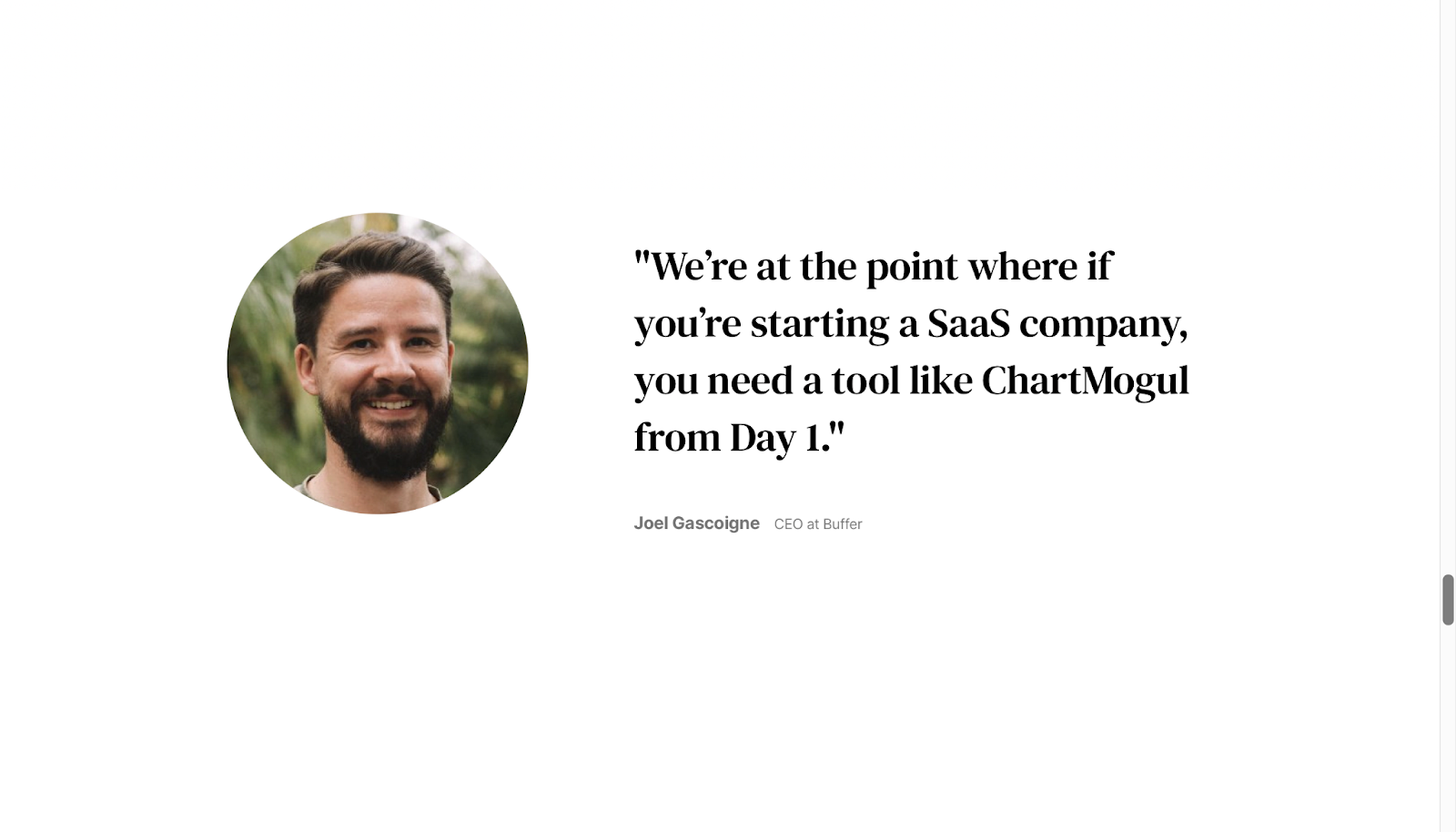
Showcase the best reviews you have to make sure your audience doesn’t miss them. For example, ChartMogul uses big, bold customer quotes which fill the screen as you scroll down the homepage:
Of course, you’ll need to earn these stellar reviews first. If you’re starting out, there are lots of ways to encourage reviews and testimonials. The quicker and easier it is for a customer to leave a review, the more likely they are to do so. Get in touch directly with happy clients.
You can also offer incentives, such as a free trial of a new feature or discounts, in exchange for honest reviews. Just be careful to never exchange money or goods for a positive review, or to barter with negative reviewers to increase their rating. This goes against Google’s guidelines.
2. Run User Experience Tests
When it comes to building a website or preparing for a website redesign, try starting with card sorting and information architecture exercises, as well as your site mapping, before any UX prototyping takes place.
You may be asking, “what is card sorting?” It’s essentially a UX research method used to evaluate the information on a website. Users are asked to organize information into logical groups, using cards that each represent a concept or item.
The results should show how people understand information, helping website designers to optimize information architecture (IA). Card sorting is popular as a cost-effective, accurate, and simple way to gain insights about how your users think and where they expect to find specific content.
Focus group testing is ideal, but it’s not always an option for SMB companies due to time or budget constraints. Other forms of audience research include interviews, surveys/questionnaires, usability testing, and A/B testing.
3. Use a Dedicated Landing Page for Ads
Although 77% of top ad landing pages are homepages, the ‘save time’ rationale behind it may be costing leads and lowering conversion rates.
Here’s why:
- The homepage is a gateway to your site that’s full of distractions like menus, callout blocks, social media links, and pop-ups
- All content on a dedicated landing page is united in its goal: moving visitors toward a single, specific (and usually profitable) task
The problem with using a homepage as a landing page is that website visitors from all traffic sources will be directed to the same place. This means that the nuances of each target customer group (i.e. pain points or aspirations) are lost in the grouping together. It also places the work of choosing a path to conversion on the visitor, leaving too much room for them to get lost or simply bounce.
It’s much more effective to have different landing pages for each customer segment, and each conversion goal.
The ideal landing page is simple and clear. Make sure your landing page has minimal outward links, a subtle navigation bar, strong sales copywriting, and colors that don’t distract from the CTA.
4. Create Enticing CTAs
Call-to-action buttons are one of the most important features of your website when it comes to CRO. Their appearance, copy, and placement are each UX decisions that impact conversions.
Optimizing your CTAs is a quick and sure-fire way of increasing that conversion rate.
Did you know that 54% of marketing experts believe that a cluttered website is the biggest obstacle to a good UX? Be judicial with popups and videos, and ensure that CTAs are clear, enticing, and feel like a natural step.
Returning to the importance of human psychology — colour is key. Done well, colour use in web design can significantly increase conversions. Colour psychology is growing in popularity, and there’s a lot of information out there about how you can use it to your advantage on your company website.
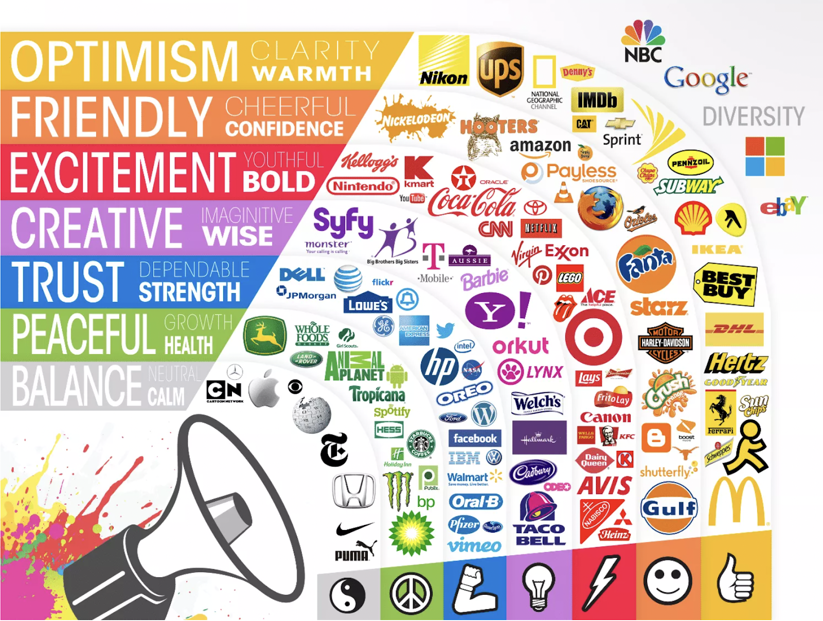
For example, you might use an urgent-feeling red ‘Buy’ button during a sale. There are many theories about which colours work best for which industries or which target customers, but the solutions are case-by-case and really depend on your branding and audience.
For example, MailChimp uses yellow to make their CTA buttons stand out. The ‘Sign Up’ button is also bang in the middle – you’re unlikely to miss it.

In terms of placing your CTA button, ideally, you want to have at least one CTA ‘above the fold.’ This applies to blogs and landing pages alike.
‘Above the fold’ means the content at the top of a web page, visible without needing to scroll down. This is a CRO priority, as customers tend to spend 74% of their viewing time in the first two ‘screenfuls,’ spending 57% of their time ‘above the fold.’
5. Ensure Your Website is Accessible
Website accessibility is vital, not only for improving CRO but also for respecting the varied needs of users who come to your website. There are many steps you can take to ensure your website is as accessible as possible, from using proper alt text for images to allowing keyboard navigation.
Ensure site readability is the best it can be, and choose a content management system that supports accessibility. You may need to work with a developer or agency to update your website for accessibility standards.
An inclusive website will improve conversions by creating more positive user experiences, making visitors more likely to spend their time and money with your business than with one that has a frustrating website.
6. Stay on Top of Analytics, Tracking, and Testing
It might seem obvious, but using the data you collect is a simple, high-return CRO tactic. Use digital analytics and user qualitative feedback at your disposal to improve your CRO. For example, if there’s a page or even a CTA button on your site that’s not driving conversions the way it should, examine the data and work out why.
Google Analytics is a goldmine for insights, used by over 29 million websites. It’s free, and uncovers key trends and patterns. Even a basic understanding of how it works can give you invaluable insights into how potential customers are interacting with your website.
For this kind of UX research, you should also install a heatmap. These tools create visual representations of how users engage with every element on a page. Most heatmap tools can even anonymously record sessions, so you can watch videos and learn where users get stuck and abandon conversions.
Make sure you’re conducting sufficient UX research. It also helps to unite users into audiences rooted in pain points or needs; this makes it easier to understand your customers and direct relevant information toward each customer type.
Don’t forget to test: usability is the most important UX design principle to CRO. Test your website before it’s launched: with as few as five users, it is possible to prevent up to 85% of website issues.
7. Conversion Copywriting
Copywriting in marketing is writing that aims to persuade a person to take a specific action — in this case, a step towards buying a product or service. Microcopy writing, on the other hand, is creating the snippets of copy that tell users what to do on your site, such as menu labels, CTA buttons, forms labels, and messages as a user completes steps (or runs into trouble).
All of these types of copy are essential to conversions.
Your writing will need to be clear and concise, focused on one, simple conversion goal. Many conversion copywriters find that it helps to start at the end by asking, “What do I want this to achieve?”
Customer-centric messaging is the way to go when it comes to earning trust and generating the interest and excitement needed to finish a transaction. Work out which stage of the buying process the customer is at, so you get your messaging right:
- Awareness: help potential buyers diagnose their problems
- Consideration: showcase the benefits of your product or service
- Decision: prove that you’re the right company, use social proof to gain trust
Use clear headlines and subheadings, include helpful FAQs, and focus on readability. Find out how to optimize your blog posts for conversion, and incorporate persuasive writing into every feature of your website. Hotjar does a great job of this.

Top Takeaway
Successful conversion-focused UX boils down to exceptional clarity in both navigation and messaging, and thorough testing.
Work to understand your potential customers and ensure your website is created with them in mind. A customer-centric approach is key to creating an intuitive website that fulfills your CRO targets.
CRO and UX are best thought of as complementary practices: use them together to achieve the best possible results. Design, layout and functionality all contribute toward convincing users to convert. Even if you boast best-in-class design, if your functionality isn’t up to scratch you’re not going to be hitting those conversion targets.
The bottom line is that you need to use UX data and practices to optimize your site for more conversions. Take action on the research you conduct, and keep testing and analyzing to ensure your website is up to speed. Reduce your website’s friction points, streamline the buying process and watch your conversion rate increase.
Share post:

About the Author
Olivia Millard
Olivia Millard is a writer and assistant editor at DSLX, an SaaS content writing agency. Olivia has several years’ experience in writing and editorial, from newspaper articles to SEO blogs. Having recently graduated from the University of Cambridge with a first class degree in Modern Languages, she is currently living in Barcelona and learning her next language: Catalan.
Contact Us More by This Author