Strategic Insights
We share practical tips on web design, content, SEO, branding, and so much more.
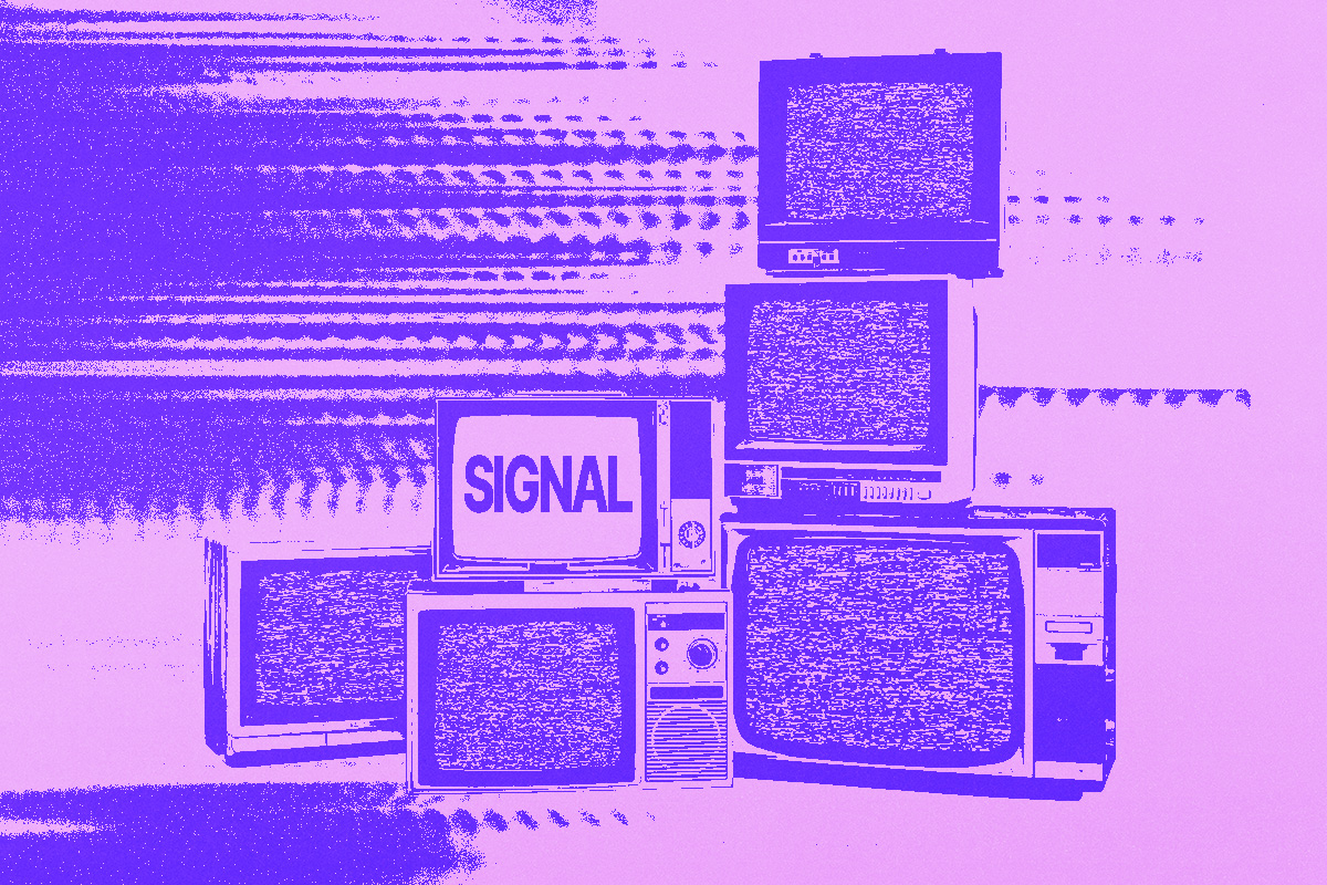
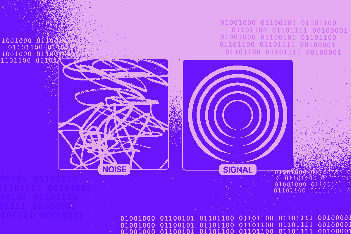
Our latest AI insights and reports newsletter: Noise vs. Signal
SubscribeWe share practical tips on web design, content, SEO, branding, and so much more.
Our latest AI insights and reports newsletter: Noise vs. Signal
Subscribe