
Your website’s visitors read about 28 percent of the words on a page during an average visit. That share falls further as the page gets longer. Nielsen Norman Group arrived at that ceiling by measuring how little visitors read.
The number reframes the problem that most businesses think they have—that their content is to blame for killing their conversion rate.
Your content is probably fine. The structure around it is quietly deciding whether anyone reaches the details that would have sold them.
On-site search statistics support this finding.
- B2C and B2B eCommerce visitors who use on-site search convert at nearly double the rate
- The average conversion rate for service-based B2B sites with site search is lower, but it’s still typically stronger than sites without it
- That thin slice of site-search traffic tends to drive a share of revenue far larger than its size
The searchers are not better customers. They are the customers who found a faster path to what they wanted. Everyone else is working through the same content by menu, link, and heading, and every extra step is a chance to lose them.
This is a five-step framework for structuring content around how people actually look for it on your site, so that the path from landing page to conversion gets shorter for your potential customers.
Findability is a Revenue Metric, Not a Design Preference
You need to be strategic in how you approach your website’s UX design.
If structure gets treated as an after-thought, with the primary focus on visual design and content, that approach is backwards. Findability is conversion infrastructure, and it directly impacts revenue.
The definition is plain: findability is the share of visitors who reach what they came for without friction.
When it runs high, a session ends in viewing key pages and, ideally, a microconversion or conversion. When it runs low, people leave with the answer still one layer down within your site, and your analytics appear to file it under low engagement rather than structural failure.
That mislabeling is the expensive part. Too often, teams misinterpret weak engagement numbers as a content shortage and respond by publishing more. This buries the good material deeper on the same broken frame.
Forge and Smith’s rundown of the signs that a site is costing you leads makes the point from the design side: the leak is rarely the words themselves.
Run the arithmetic on a modest site and the leak stops feeling abstract.
Take 20,000 monthly visitors and a 2 percent conversion rate, which is 400 conversions. Suppose a fifth of that traffic hits a dead end—a category label that does not match the visitor’s goal or a key page buried four clicks down, and half of those people give up rather than dig.
That is 2,000 visitors who arrived with intent and left before reaching the page built to convert them. At the same 2 percent rate, those abandoned sessions work out to roughly 40 conversions a month, close to 480 a year, lost to structure alone.
Nobody wrote a bad paragraph to lose them. The paragraph was simply too far from where they landed.
The Five-Step Framework
Step 1: Audit What Visitors Actually Look For
The fastest read on demand is your internal site-search log, a running record of exactly what people typed when unclear navigation failed them. Set that list of queries beside your top-task list and your highest-traffic pages in GA4, and a pattern surfaces almost immediately.
A small set of questions accounts for most of the intent, but those questions might not map cleanly to the way your team names things internally (and what’s reflected in menus, headings, and buttons).
Top-task analysis sharpens the same picture from the other direction. Ask a sample of real visitors to name the one thing they came to do, and the list collapses fast, usually to five or six tasks that carry the traffic and a long tail that does not.
Structure your site for the short list. The tail can wait behind a search box and a clear label, where the few people who want it will still find it.
The businesses that organize content well build it around a specific audience’s real questions. For example, an accounting-firm content strategy that maps every page to a query a prospect would actually search is a useful model, because it starts from the searcher and works backward to the sitemap.
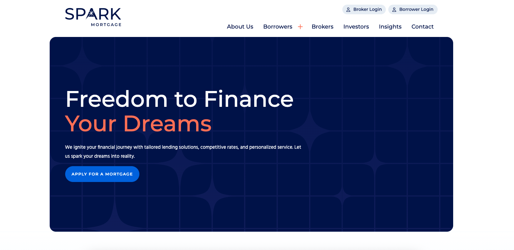
Spark Mortgage does this with a menu that immediately provides desirable actions for borrowers, brokers, and investors.
Whatever your industry, the discipline is the same. Let the search data name your priorities before you decide where anything lives.
Step 2: Build the Hierarchy Around Demand, not Internal Structure
Once you know what people want most, the hierarchy nearly writes itself. The most-wanted content sits closest to the entrance. Everything else earns its depth by how often visitors ask for it.
Group related pages into clusters, sometimes called content silos, so a visitor who lands on one page finds the neighboring answers close by instead of scattered across the site. Give every page a single primary job. A page that tries to answer five questions answers none of them cleanly, and it competes with your other pages for the same attention.
Resolute Legal does a great job of this. The first content they showcase is their extensive library of free legal resources. These demonstrate their expertise for anxious users looking for quick help, and, in turn, guide those users to their service pages and free evaluation CTA.

Shallow wins over deep. When important content sits three or four clicks from the homepage, most visitors never see it, and your analytics will show a page that looks unpopular when it is simply unreachable.
The fix is not more promotion. The fix is moving it up.
Navigation is the map, and internal links are the roads between destinations. Both should track how visitors think, not how your departments are drawn. Label menu items with the words your audience actually uses, pulled straight from the search log in Step 1. Keep anchor text short and descriptive, so a link reads as a promise about where it goes rather than a guess.
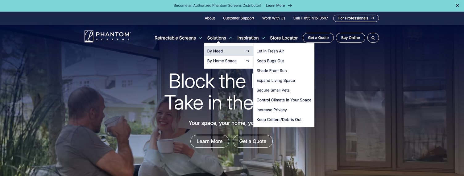
Phantom Screens demonstrates this with subpage menus that use phrasing their primary audience would use, driven entirely by their intent.
Internal links do the quiet work of carrying someone to their next logical step. When a visitor finishes reading about a service, the case study, the pricing page, and the contact form should each sit one click away, placed where the reader’s attention already rests.
Forge and Smith offers internal links to related services at the top of its case studies:

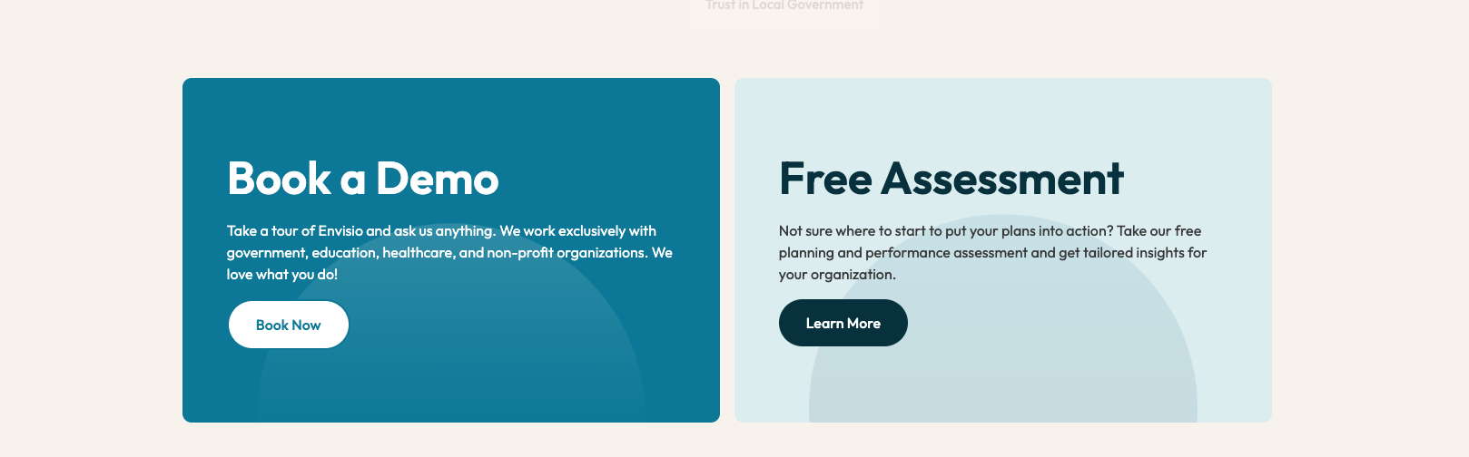
Meanwhile, Envisio’s service pages all have clear CTAs for a hard conversion (book a demo) and a softer option (get a free assessment). This gives users control over their next step in the buying process.
Forge and Smith’s playbook for using a site to guide the customer journey shows how that sequencing keeps momentum from stalling between interest and action.
Descriptive links and a logical path carry a second benefit that’s worth naming. The structure that helps visitors find your content is the same structure that helps search engines crawl it, so findability inside the site and findability from outside it improve together.
Step 4: Write for Scanning, Not Reading
People do not move through a page in the orderly line that writers imagine.
Eye-tracking work from Nielsen Norman Group documented an F-shaped reading pattern: readers take in the top of the content, drop down and scan a shorter stretch, then run their eyes down the left edge, hunting for the word or heading that matches their goal. They are reading for speed, not for depth, and no amount of good prose changes that behavior.
Structure the page for how they scan. Front-load the answer in the first line of every section, because that line is the one that gets read. Write subheadings that state the point instead of teasing it or using overly conversational phrasing, so that a reader skimming the left margin can move through the page by headings alone. A table of contents is a great way to further support this strategy.
Keep paragraphs short, lift lists out of prose, and bold the phrases a scanner would look for.
Forge and Smith’s breakdown of closing the website messaging gap covers the copy side of the same discipline, where clarity in the first few words decides whether the rest gets a chance.
Step 5: Measure Findability and Iterate
Structure is testable, which makes it improvable. A handful of metrics tell you whether visitors are finding what they need. Internal-search exit rate and zero-result rate expose your content gaps and your labeling failures.
Time-to-content and pages-per-session show whether the path is getting shorter or longer. Task-completion and assisted-conversion data connect the structure back to revenue, the number that funds the next round of work.
Watch those metrics move after each change, and let them set your next priority in order.
- A high zero-result rate on a common query is a page you have not written yet
- A high exit rate from a category page is a hierarchy that no longer matches demand
- A rising search-to-conversion rate tells you the last change worked
Give each metric a target so that a change has something to beat.
On a site that has never audited its search, failed queries pile up fast, and every one is a question your content or your labels are not answering. Treat that list as a backlog ranked by search volume, and work it from the top. The data keeps naming the fix, one at a time, as long as you keep it in view.
You Can’t Improve What You Don’t Measure
The sites that win are rarely the ones with the most content.
They are the ones where the right content sits one step from the visitor who needs it, and where someone is tracking the numbers that prove it. Structure is the cheapest conversion lever that most businesses own, and it is the one they are most likely to leave alone while they pour budget into more traffic and more pages.
The audience already on your site is reading 28 percent of the words and scanning for a way out. Shorten the path to the answer, and that same audience starts converting like the searchers who found it more quickly and easily.
Share post: