
Your website confuses people, and your analytics have been trying to tell you this for months. Visitors land on your homepage, scan your headline, squint at your subhead, and click away before your value proposition ever reaches their brain.
Before we continue with our point, remember that design can be expensive and time-intensive. Yet, the words that actually explain what you do got cobbled together in a single afternoon by people who already understand your business too well to describe it to someone who doesn’t.
That internal knowledge is the root of the problem. You and your team carry around a dense mental map of your services, your differentiators, and your industry context.
But it’s very easy to forget that new visitors arrive without any of that scaffolding. They need you to build it for them in real time, using words they recognize and logic they can follow without effort. When you fail to do that, you hand them a puzzle they never asked for, and they leave.
With that in mind, we’ll take you through the specific places where your messaging loses people and give you the tools to fix each one.
Let’s dig in.
Make Your Value Instantly Obvious
We’ll begin with the space that determines whether anyone ever sees the rest of your site.
Research tells us that visitors form lasting impressions within a fraction of a second, and your above-the-fold area carries the weight of that snap judgment. If that prime real estate fails to communicate what your product does and why someone should care, you’ve already lost most of your audience before they scroll an inch.
The fix starts with ruthlessly clarifying your value proposition:
- Strip your hero section down to a headline that names the outcome you deliver and body text that removes any remaining ambiguity.
-
Every word in that visible zone needs to justify its presence by answering one of three visitor questions:
- What is this?
- Why should I trust it?
- What do I do next?
- Cut out anything serving your ego rather than their understanding.
- Test a version where you swap internal terminology for the exact phrases your customers use in support tickets and reviews, then watch what happens to your bounce rate.
Here’s a brand that does this exceptionally well. Sky and Sol, a natural skincare brand focused on clean, toxin-free formulations, demonstrates this principle beautifully. The moment you land on their page, you encounter bold messaging that positions their entire brand promise without a shred of ambiguity.

Source: Skyland
Their headline confronts you with a problem you probably never considered (having a skincare routine might expose you to hidden toxins you didn’t know existed). Then they immediately establish themselves as the alternative that formulates without those ingredients.
You don’t need to click deeper to grasp what they sell or why their approach matters. The value lands fully formed, and you can decide whether to engage further based on genuine interest rather than lingering confusion.
That upfront confidence transforms a casual visitor into someone who already understands the stakes and sees this brand as the logical solution.
Lead with Outcomes, Not Features
Feature lists comfort the people inside your company because they represent effort, investment, and differentiation.
But your visitor arrived with a problem, not a shopping list of specifications. They’ll stick around only when you demonstrate that you understand what they’re actually trying to accomplish.
Most visitors care about results before they care about mechanics. They want to know how a product changes their work, health, revenue, or daily routine. Features help support a decision later, but outcomes create the initial interest that keeps people reading.
Outcome-led messaging reorients your copy around the transformation your product delivers:
- Audit your current website and highlight every sentence that describes what your product contains or does.
- Then, rewrite each one to answer the visitor’s unspoken follow-up: “Which means I get to…?” That exercise forces you to connect features to lived results.
- Your headline should describe the destination, and your supporting copy should map the route using benefits your customer can feel rather than specs they’d need to interpret.
- When you must mention a feature, tether it immediately to the outcome it produces.
As an example, Mind Lab Pro uses outcome-first messaging in the nootropic space, where brands often drown visitors in ingredient panels and dosage charts before anyone even understands the point.
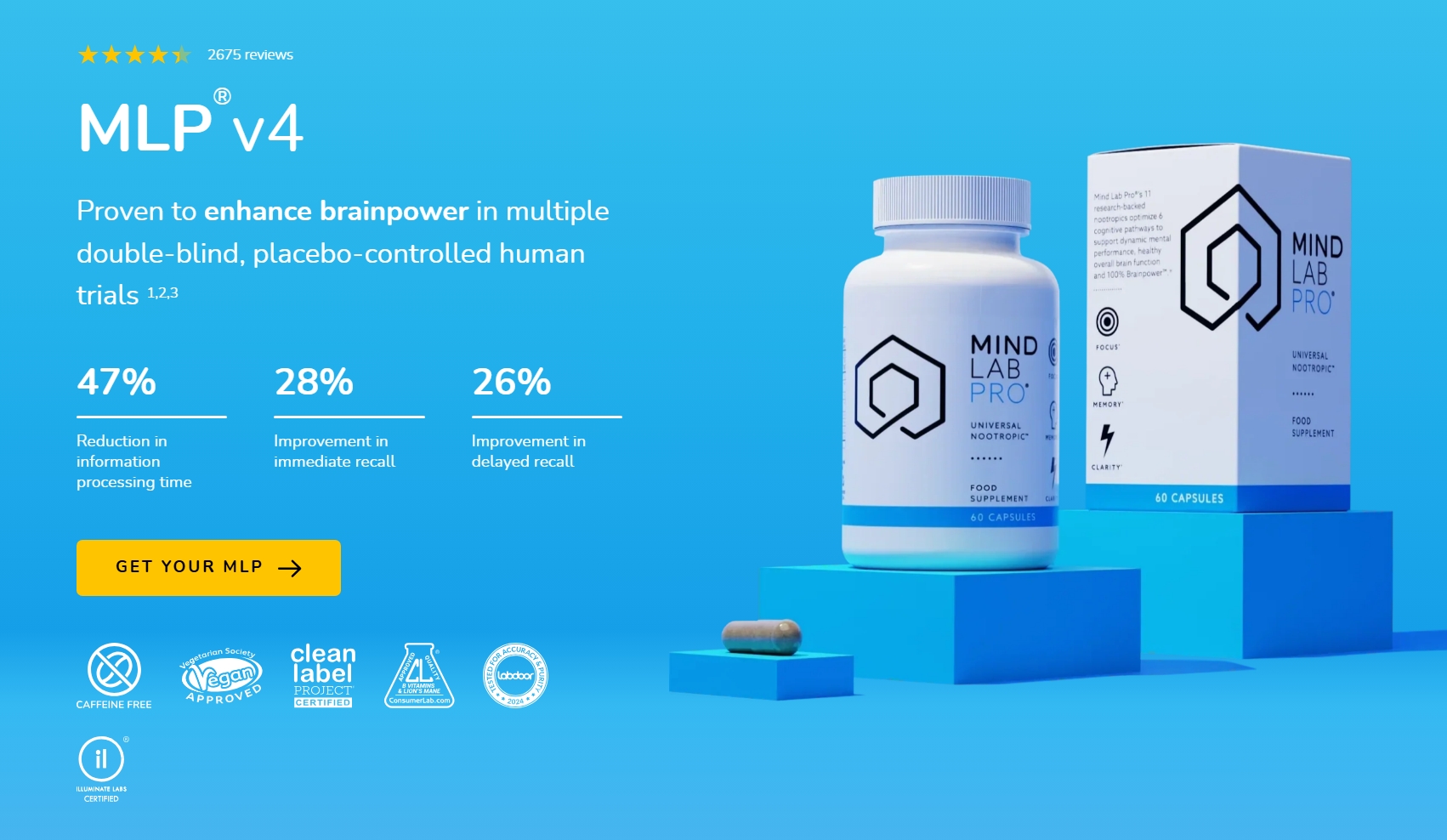
Their approach flips the script entirely by foregrounding the cognitive improvements people actually want, like sharper focus, better memory retention, and sustained mental clarity throughout the day. Those results sit front and center in their messaging hierarchy, and only after the benefit registers do they introduce the research and ingredient quality that make those outcomes credible.
The scientific backing functions as support for the promise rather than the promise itself, which means a visitor grasps the product’s value within seconds and spends their remaining mental energy confirming it’s legitimate.
That seamless progression from immediate understanding to deeper trust dramatically reduces the cognitive effort required to evaluate the supplement. This translates directly into confident purchasing decisions.
Answer “Is This for Me?” Fast
Visitors constantly filter websites by wondering if their offers are suitable for them. They may not say it out loud, but they make that judgment within seconds.
When the answer feels unclear, attention drops quickly. People don’t spend much time decoding vague positioning or trying to guess whether a product, service, or platform fits their situation.
Strong website messaging immediately removes that uncertainty. It signals the intended audience early and clearly through direct language, recognizable problems, and relevant examples. Visitors should feel seen before they feel persuaded.
Effective messaging handles this identification work on the visitor’s behalf:
- Look at your homepage and ask yourself whether a stranger could determine exactly who you serve within three seconds of landing.
- If you spot vague language like “we help everyone” or “for all your needs,” you’ve identified the problem.
- Replace those fuzzy statements with specific audience markers that trigger instant recognition.
- Name the role, the situation, or the pain point that defines your ideal customer, and do it upfront where skimmers will catch it.
Mesothelioma.net demonstrates audience signaling with remarkable precision. Their site exists for patients and families navigating a mesothelioma diagnosis, and they refuse to let anyone wonder whether they’ve found the right resource.
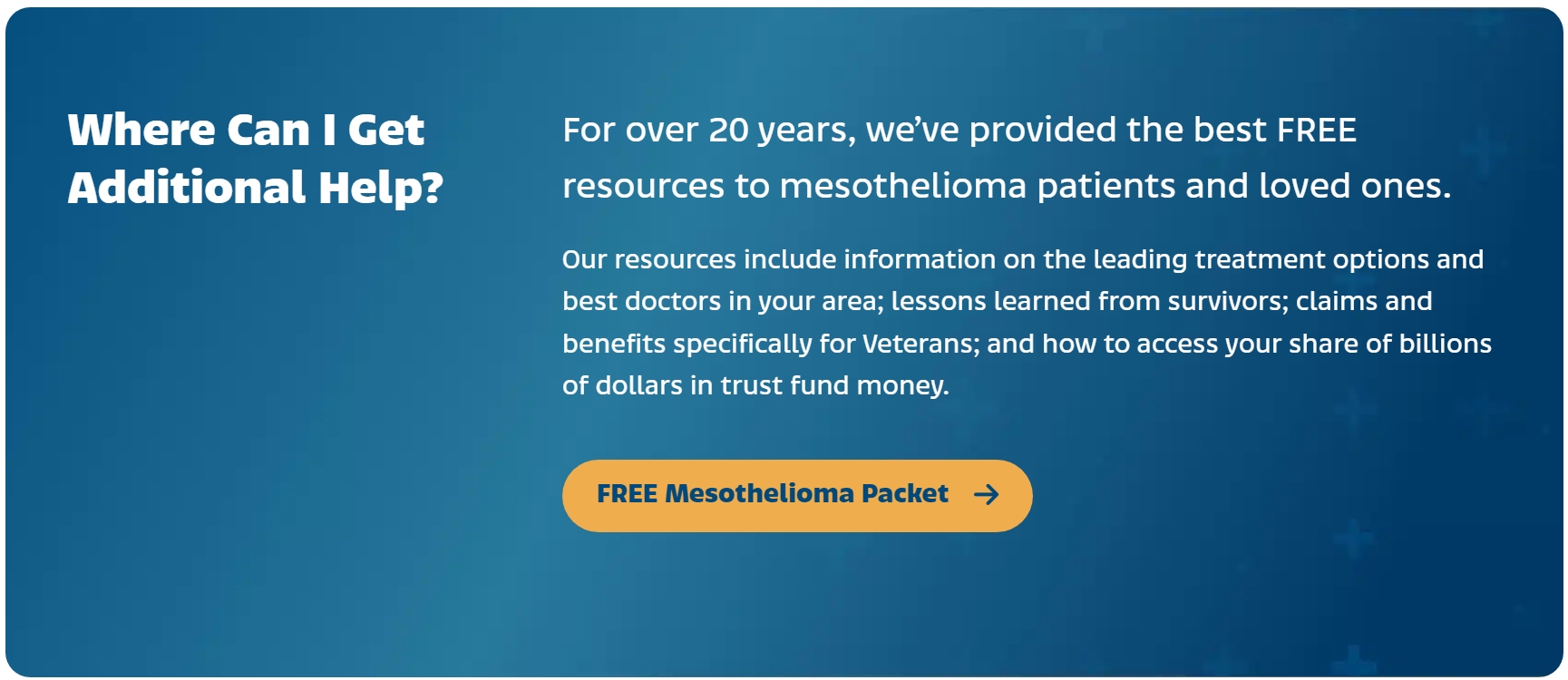
Their homepage immediately addresses the exact people they serve through language that names their circumstances without hesitation. A visitor who matches their descriptions feels an immediate click of recognition – a quiet confirmation that this organization understands their reality. Someone who doesn’t match self-selects out just as efficiently, which prevents wasted browsing and preserves the brand’s focus for the audience that matters.
The messaging then reinforces that sense of belonging by detailing tangible resources patients and families might not have known existed, from survivor stories to trust fund access.
That combination of instant audience clarity and unexpected helpful information transforms a first-time visitor into someone who believes they’ve landed somewhere that genuinely supports people like them.
Guide the Scroll Toward Action
Your website can deliver perfect clarity about your value, outcomes, and audience, and still lose people if that understanding arrives in the wrong order. A visitor who grasps your headline but then encounters disconnected sections of content will drift sideways, rather than moving confidently toward conversion.
Strategic content architecture solves this by arranging your messaging so each piece naturally hands the reader to the next.
Brands can improve this by mapping their website around customer decision-making instead of internal priorities:
- Outline the logical sequence of questions a visitor needs answered before they’ll act. They typically want to know what you do, why it matters, who it serves, what proof you have, and how to proceed.
- Structure your homepage sections to answer these in exactly that order, with each block resolving one question while creating curiosity about the next.
- Your CTAs should similarly escalate from low-commitment exploration to conversion-oriented action as visitors progress down the page.
- Review your current layout and identify any section that interrupts this forward momentum with information that belongs elsewhere or repeats something already established.
Highline Forming, a company specializing in concrete formwork for large-scale construction projects, structures its messaging effectively around progression. Their homepage opens with a bold declaration about their achievements, immediately establishing their ambition and sector before a visitor can wonder what the company does.
The supporting metrics that follow convert that ambition into concrete proof through specific numbers that carry weight in their industry. Those figures anchor their expertise claim with evidence rather than letting it float as empty marketing language.
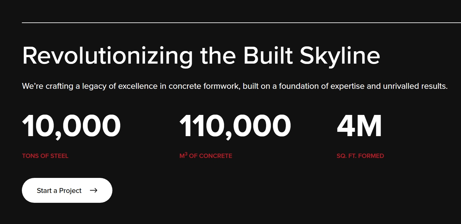
As visitors continue scrolling, each subsequent section builds naturally on the last: from identity to capabilities to partnerships to recruitment. This sequencing means someone evaluating them as a potential contractor encounters information in the exact order their decision-making process requires.
That deliberate flow transforms what could have been a static information page into a guided journey that ends precisely where the company wants it to end.
Remove Doubt Before It Grows
Visitors rarely arrive at a website fully convinced. Some worry about pricing. Others question credibility, quality, responsiveness, or ease of use. When those concerns go unanswered, uncertainty expands quickly.
Strong website messaging addresses hesitation early instead of waiting for visitors to ask. It recognizes the doubts people already have and responds with clarity, reassurance, and proof.
Many brands avoid this step because they fear drawing attention to objections. In practice, the opposite happens. Visitors already think about these concerns privately. A website that acknowledges them directly feels more transparent and trustworthy.
Your first move is to understand your audience:
- Gather your sales and support teams and ask them to list every concern they hear during calls, emails, and chats.
- Then rank those concerns by how frequently they surface. Your website should tackle the most common ones directly within your messaging rather than burying them in an FAQ page that few visitors will seek out.
- Frame each reassurance as a calm, factual statement that normalizes the worry while dissolving it.
- If price anxiety tops the list, clarify what factors determine cost and why your model works the way it does.
- When trust barriers appear, surface credentials, guarantees, or transparent processes that demonstrate reliability.
Pacific Spirit Dental is a professional dental practice, serving patients who may carry years of avoidance or uncertainty.
They fill their pages with language that directly addresses comfort during procedures, the experience level of their practitioners, accessibility for different schedules and needs, and affordability concerns that often prevent people from booking appointments.

A potential patient reading through their content encounters reassurance at every potential sticking point. The practice has already removed the possible obstacles before the visitor picks up the phone, which means the decision to book becomes smaller and simpler.
That preemptive clarity converts anxious browsers into scheduled customers by removing the emotional friction that typically stalls action.
Choose Clarity Over Cleverness
Clever wordplay and intricate metaphors feel satisfying to write, but they ask your visitor to process a puzzle before they can access your meaning. That tiny cognitive delay, multiplied across thousands of visitors, exacts a measurable toll.
Brands with clear, consistent messaging experience 23% higher revenue growth on average than those with unclear messaging. This confirms what common sense already suggests – people buy from companies they understand immediately.
Implementing clarity requires you to audit your website with fresh eyes:
- Flag every instance of wordplay, industry jargon, or overly abstract language that might force a visitor to pause and decipher.
- Read each sentence aloud and ask whether a distracted stranger would grasp its meaning on the first pass.
- Replace clever headlines with direct ones that state exactly what you do and for whom.
- Swap internal terminology for the plain language your customers actually use in conversation.
- Test your revised messaging on someone outside your industry and watch where their understanding breaks down.
- Revise those friction points until the meaning flows effortlessly.
GrammaTech operates in a technically complex field that could easily justify dense, jargon-heavy copy. As a cybersecurity research company, they work with concepts that most audiences would struggle to parse.
Their messaging makes a deliberate choice to prioritize straightforward communication over technical showmanship. They describe their capabilities in plain terms that connect directly to the security outcomes their clients need, avoiding the temptation to build walls of impenetrable terminology.
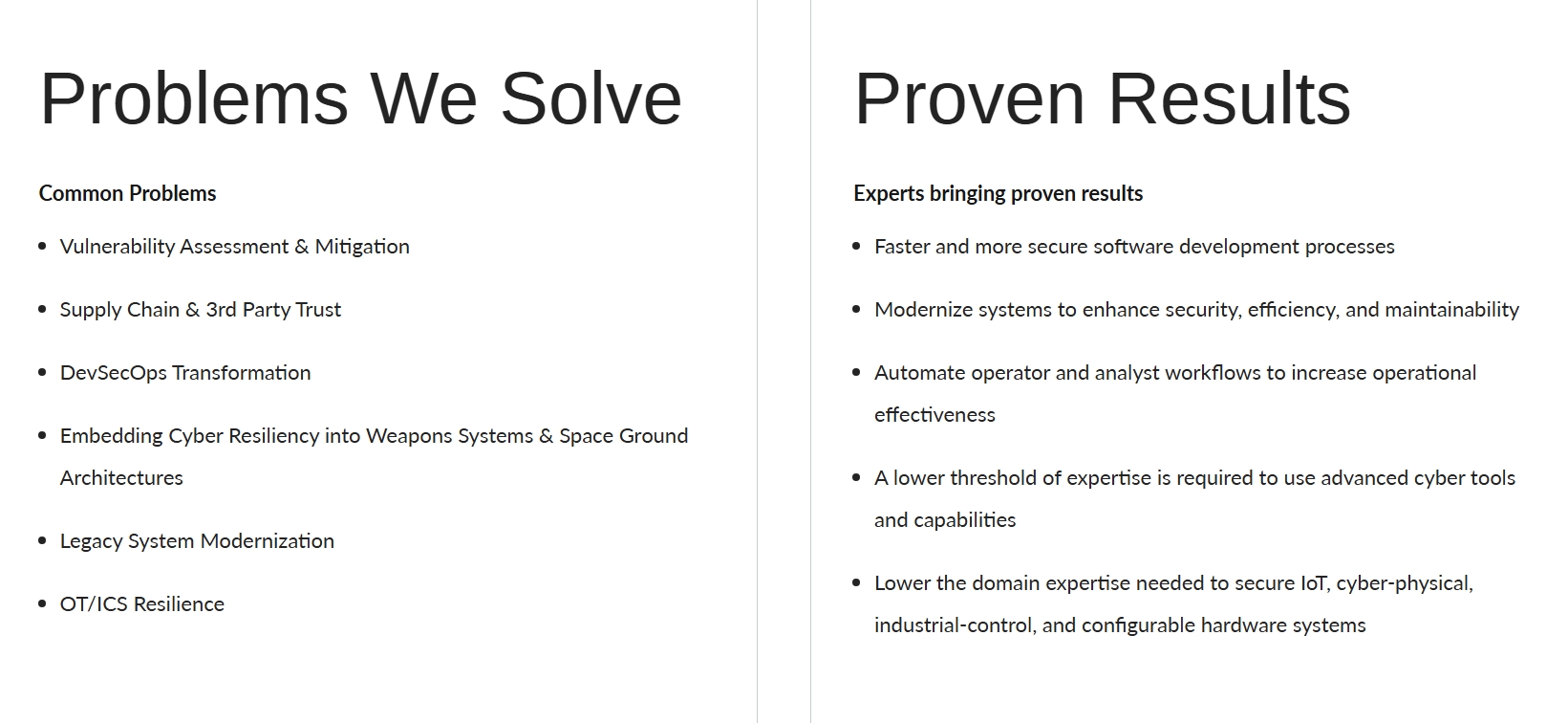
A visitor evaluating their services doesn’t need to decode what the company does or translate specialized vocabulary into business relevance. The meaning lands clearly and quickly, which respects the visitor’s time and reduces the cognitive effort required to reach a decision.
This approach proves that complex products benefit from simple messaging and that technical expertise communicates more powerfully when stripped of unnecessary complication.
Build Trust in Every Line
Trust operates as a quiet undercurrent beneath every purchasing decision. For high-stakes services, it becomes the deciding factor that overrides price, convenience, and even features.
Your website can nail clarity, outcomes, and audience identification, yet still lose conversions if visitors sense even a subtle gap in credibility.
Building trust demands more than displaying a few testimonials and hoping they work. It requires weaving reassurance into every line of your messaging so visitors accumulate confidence as naturally as they scroll.
Examine your website for trust signals that currently exist and identify where they fall thin:
- Quality indicators like years of experience, relevant certifications, awards, and specific expertise belong near your headline and throughout your body copy, not isolated on a separate credentials page that few visitors will find.
- Your language itself must convey competence through precision and authority rather than vague enthusiasm.
- Describe your work processes openly so potential clients understand exactly what working with you entails and feel the transparency reduces uncertainty.
- Include concrete details about who performs the work, what standards guide it, and how you handle the unexpected.
Hasler Homes employ comprehensive trust-building across their entire website. As a custom home builder and renovation firm, they operate in a space where clients make enormous financial and emotional investments, and the cost of choosing poorly runs devastatingly high.
Their messaging consistently reinforces quality construction, award-winning work, and collaboration with top-tier architects and interior designers, establishing competence through association with other respected professionals. They emphasize their skilled carpenters and tradespeople by trade designation, which signals that actual qualified humans perform the work rather than anonymous subcontractors.
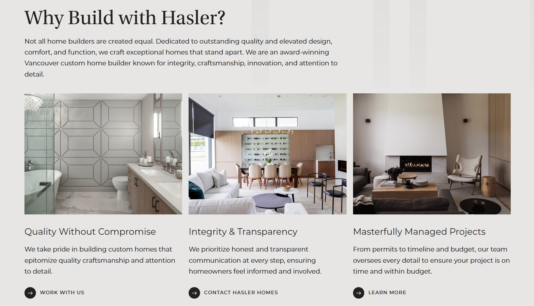
Their commitment to open communication and exceptional service addresses the relational anxiety that accompanies custom builds, where poor communication can derail a project regardless of technical skill.
A visitor considering a custom home project reads through this site and finds their unspoken fears systematically addressed before they even articulate them.
Make CTAs Feel Safe to Click
A call to action points to the final step in a conversion path. It’s the moment your visitor decides whether the entire journey feels worth completing. Every hesitation, every unaddressed doubt, and every flicker of commitment anxiety surfaces right there at the button.
Your CTA copy can either amplify that tension or dissolve it. First-person CTA copy can lift click-through rates by up to 25%, a shift that makes sense once you recognize how deeply personal the decision to click actually feels.
Reducing CTA friction starts with reframing what you’re asking visitors to do:
- Replace transactional language that implies obligation with invitational language that suggests exploration.
- Swap generic commands like “Submit” or “Sign Up” for phrases that describe what happens next from the visitor’s perspective, such as “Start My Project” or “Explore My Options.”
- Remove any implication of permanence or commitment from your microcopy.
- Add brief clarifying text beneath buttons to address lingering concerns about cost, obligation, or what follows the click.
- Test different levels of formality and watch your analytics for shifts in engagement.
An example of friction-free CTAs is Drift, a car and home air freshener brand. Their products themselves are low-stakes, so the browsing experience should match that ease.
When visitors encounter their scent exploration quiz, the buttons present two simple, personal options that read like natural speech rather than marketing directives. A visitor sees “My car” and “My home” and instinctively recognizes which path applies to them without needing to process abstract category labels.

That possessive first-person framing transforms the click from a commitment to a statement of identity. It feels like answering a casual question rather than triggering a sales funnel. The language carries zero pressure, zero formality, and zero suggestion that clicking commits anyone to anything beyond seeing what comes next.
That informal, reversible quality keeps visitors moving forward because the perceived risk of each click stays at zero. Forward momentum is exactly what a well-designed conversion path needs to maintain.
Turn Value Into Clickable Options
General enthusiasm doesn’t convert. A visitor can nod along with your headline, appreciate your value proposition, and feel genuinely interested in what you offer, yet still click away because you never handed them a specific, tangible next step.
Your messaging needs to translate broad interest into discrete choices that feel graspable enough to pursue.
Product granularity means breaking your offer into distinct, clickable components rather than presenting one amorphous mass of value. Each component should feel like a complete, self-contained option that a visitor can evaluate and select without needing to understand your entire ecosystem first.
- Audit your current site for places where you’ve summarized an offer category when you could have named the specific options within it.
- Replace sweeping descriptions with individual entries that carry their own headlines, their own value statements, and their own pathways forward.
This approach honors how people actually browse – they scan for something that matches their immediate need and dive deeper only once they’ve found it.
Tourism Cowichan demonstrates granularity’s power within the destination marketing space, where organizations often default to panoramic lifestyle imagery and vague promises of natural beauty.
As a non-profit promoting tourism in British Columbia’s Cowichan region, they can easily fill their site with sweeping descriptions of vineyards, coastlines, and charming communities while hoping visitors figure out the specifics themselves.
They choose a sharper path instead. Their site transitions visitors from high-level regional inspiration into concrete activities, each presented as a discrete, clickable experience with its own dedicated page. That way, someone arriving with general curiosity about the area discovers immediate, specific answers to the question every traveler has about what exactly they can do there.
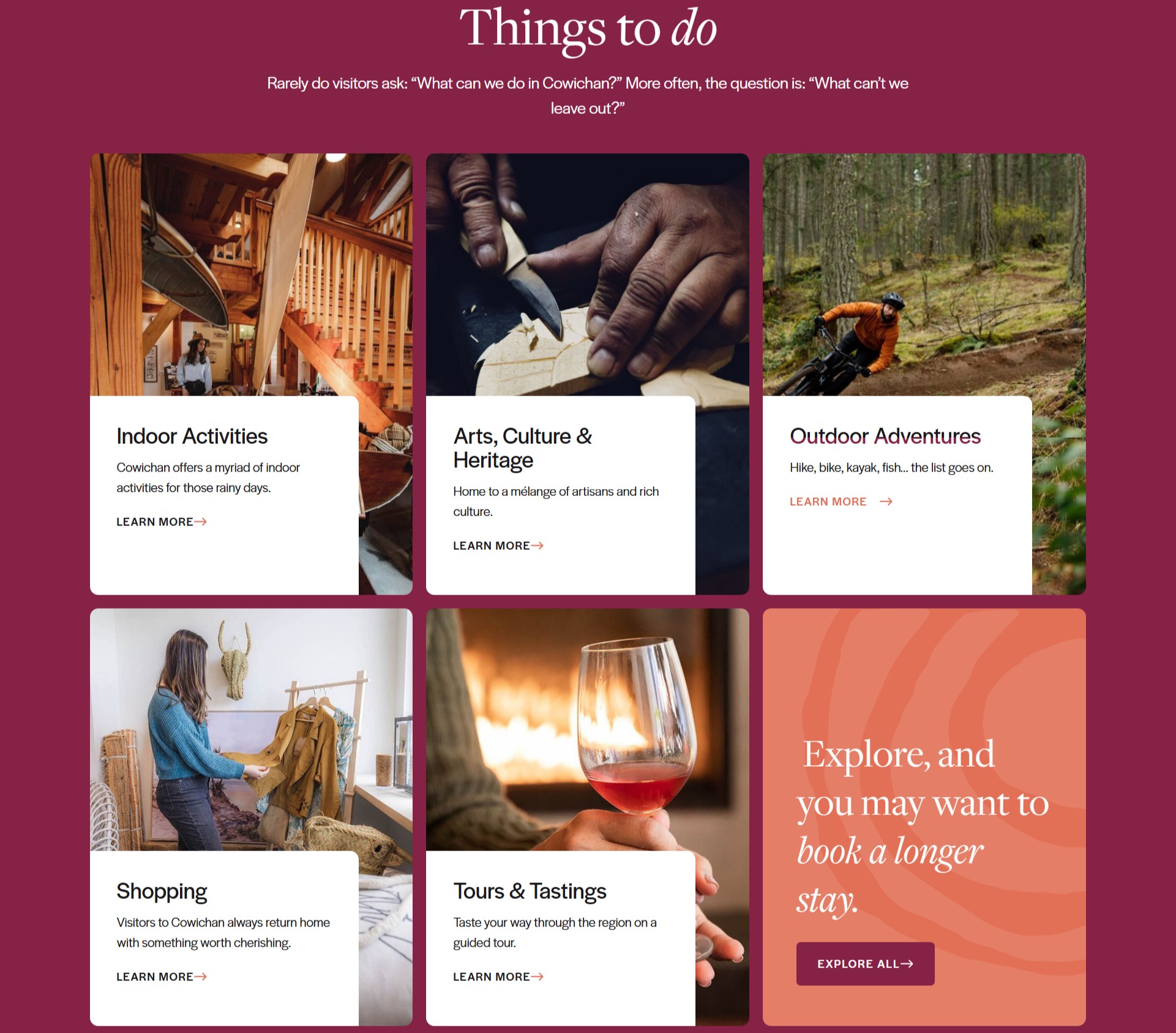
Each activity listing functions as a self-contained invitation that carries its own value and doesn’t depend on the visitor having absorbed every other part of the site first. That structural choice turns passive interest into active exploration, because clicking on a specific hiking trail or vineyard tour feels far more actionable than lingering on a pretty homepage.
Simplify the Decision to Yes
Complexity kills conversion. When a visitor faces too many options, unclear pricing, or a multi-step decision path that feels mentally taxing, they’ll often choose nothing at all rather than risk choosing wrong. Your messaging needs to do the cognitive heavy lifting so the path to yes feels obvious and effortless.
Simplifying the decision starts with examining every step your visitor must take between interest and purchase.
Count those steps honestly and eliminate any that aren’t absolutely necessary. For subscription models or multi-component services, distill your process into a visual sequence of three or four steps that a visitor can absorb in seconds. Give each step a brief, action-oriented label and pair it with a visual cue that reinforces understanding without requiring reading effort. Remove any pricing ambiguity that forces visitors to calculate or guess.
Structure your messaging so that at every point on the page, the visitor knows exactly what comes next and feels confident that it won’t surprise them.
A fragrance subscription service, Scentbird, applies this simplification masterfully. In their industry, the traditional buying experience involves overwhelming department store counters, dozens of bottles, and no clear way to test a scent beyond a single spritz.
However, their subscription model transforms that scattered, high-commitment process into three transparent steps that their homepage illustrates with visual clarity. A visitor lands and immediately sees how the service works: discover your scents, select matching fragrances, and complete your order. Each step carries a concise explanation stripped of marketing embellishment, and the visual presentation lets someone grasp the entire model without reading a full paragraph.
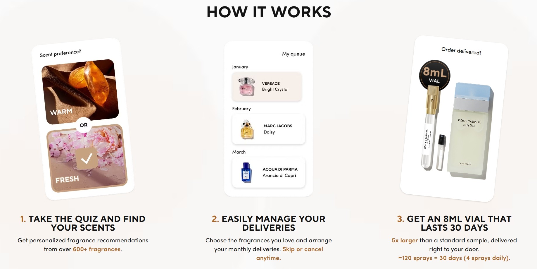
That clarity reduces the perceived risk of subscribing because there’s no hidden complexity waiting to ambush the buyer later. The decision to try a new fragrance shrinks from an intimidating investment into a simple, reversible choice.
This kind of messaging succeeds because it doesn’t ask customers to trust a confusing process. It simply shows them a simple one and lets that simplicity speak for itself.
Final Thoughts
You started this article with a website that confused people and lost them in the gap between your expertise and their understanding. Now you have the tools to close that gap permanently.
Apply what you’ve learned here, watch your analytics shift, and keep refining until every visitor who lands on your site knows exactly what you do, why it matters, and what to do next.
The difference between confusion and conversion is one clear sentence at a time. Now you’re ready to start writing them.
Share post:

About the Author
John Hurley
John Hurley is a marketing consultant, freelance writer and professional geek. He loves overdelivering to his mostly SaaS & e-commerce clients. And romantic comedies are his not-so-guilty pleasure.
Contact Us More by This Author