From the moment a potential customer lands on your website, how long do you think you have to grab their attention and convince them that your business is authentic and trustworthy?
Research shows that first impressions on websites and landing pages are formed in just a few milliseconds. And the opinions visitors form about your brand directly impact whether they will continue to interact with your site, perceive your brand as an industry authority, and, ultimately, convert.
But what exactly influences people’s opinion on a brand’s website? And what do they first notice when landing on a page? It’s the content at the top – your header.
- Research suggests that the most valuable section of any website is the content placed above the fold
- A 2018 study from the Nielsen Norman Group discovered that web users spend as much as 57% of their browsing time interacting with the elements within the first screenful
Knowing this is the case, it’s only logical that you should look for ways to supercharge your website header.
This article will teach you how to compose your site’s most visible piece of real estate, and design a header guaranteed to impress and convert.
1. Hero Image
Your most important header design task is to choose a hero visual that will appeal to your audience (and present your brand in a positive light). And, truth be told, this will be one of the more difficult tasks.
You see, no formula will help you pick the perfect hero image. With so many possibilities out there, you will instead have to make your choice of website visuals based on two factors:
- The aesthetic direction you want to take your design in. Remember, despite the appeal of a beautifully designed website, research shows that users usually prefer websites that are simple and familiar. Do make sure that your site looks good – just don’t be tempted to reinvent the wheel, as this could lead to bad UX, user frustrations, and (worst case scenario) high bounce rates followed by poor brand perception.
- The impression you want to leave on your customers. The visuals you include in your hero section will automatically inform the perception your audience forms of your brand. So, before you start choosing images, define your brand identity and know how you want your audience to see you.
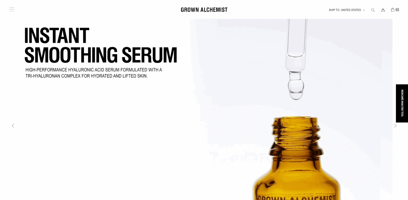
For example, a pared-down web design with minimal or no imagery is a popular choice in 2022 and with good reason – check out how beautifully Grown Alchemist implements it in its hero section.
This brand uses a single GIF to communicate the quality and refinement of its products. This choice shows that the brand is committed to a trendy minimalist aesthetic, but that’s not all. It also displays its commitment to prioritizing an exceptional user experience over visuals (without sacrificing aesthetic appeal).
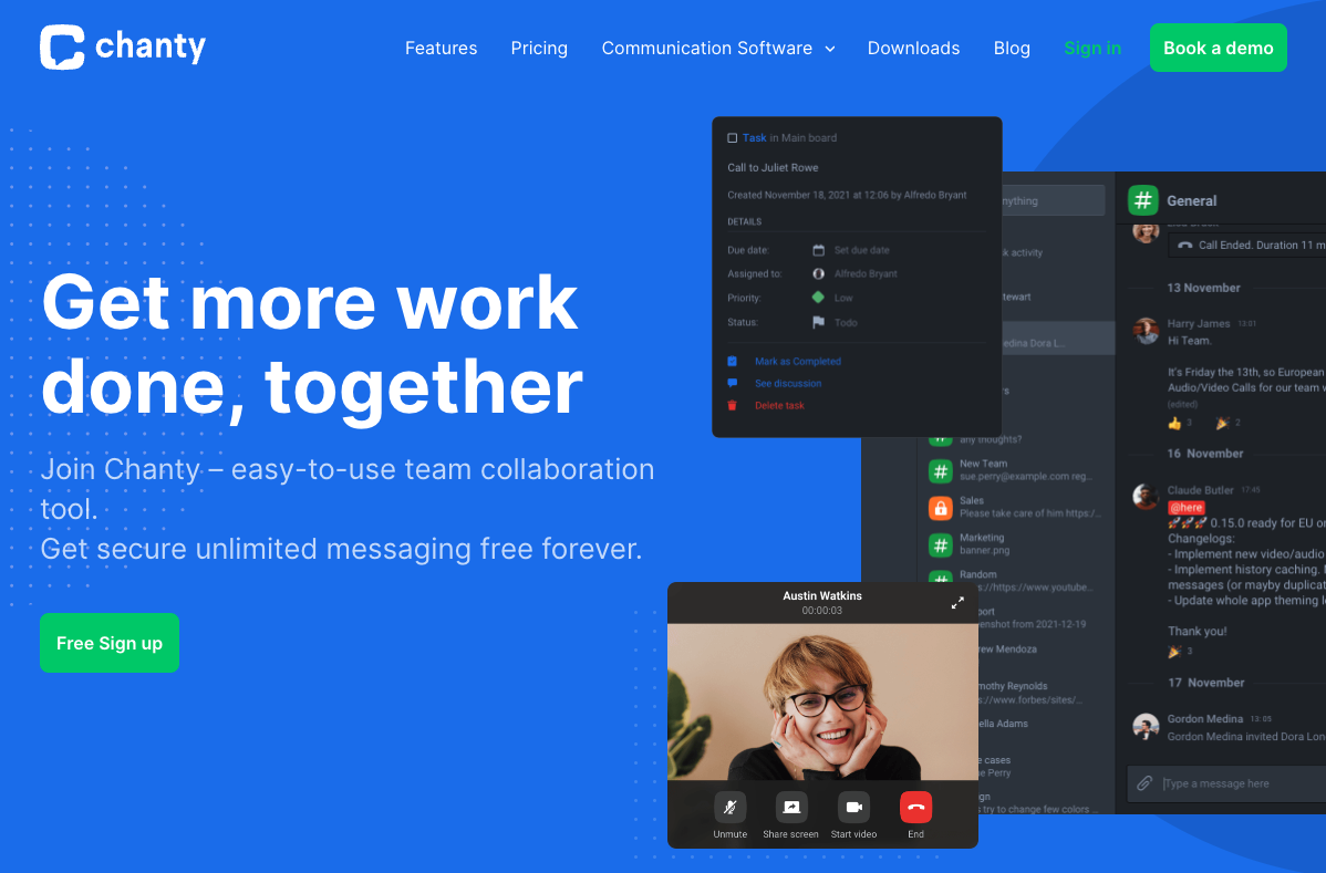
Or, you could use your website header in a completely different manner. You could employ hero imagery that includes people.
A study from 2009 revealed that sites that include images of people’s faces lead visitors to perceive the brand as appealing, warm, and user-oriented. This is why many SaaS companies, like Chanty, choose such imagery for their header sections.
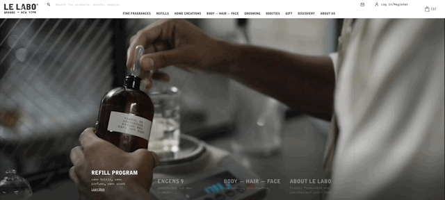
To drive a superb user experience, you don’t actually have to use hero imagery at all. You can get results that are just as positive by playing around with typography or by going with more advanced content formats such as video, as done on the Le Labo homepage.
2. The Value Proposition
Once you’ve perfected your hero image – the visual foundation for communicating your brand’s expertise and trustworthiness – you can start focusing on the second most essential website header element for driving conversions: the value proposition.
Also known as an elevator pitch, this is the promise that concisely conveys the value you offer to your target audience, and needs to hit the right balance.
On the one hand, it needs to be sufficiently impressive, unique, and attractive. But, on the other hand, it also has to be truthful and believable. And let’s not forget that you should also ensure that you always deliver on your promises.
If you want to make sure that your unique sales proposition converts, here are the ways to boost it so that it drives results.
Keep it Simple and Relevant
For a value proposition in the header to be eye-catching and effective, it doesn’t have to be cute or clever.
Instead, it needs to communicate the value you offer to your customers directly and understandably, ensuring that every single person who lands on your website knows what you do within the first couple of seconds spent on your homepage.
For inspiration on how to inspire conversions by being direct, check out Ultimate Meal Plans’ value proposition, which promises “Meal planning made simple. Customized meal plans, grocery lists and recipes delivered every week.”

Focus on Customer Rewards, NOT Your Product
If you study consumers’ decision-making process, you’ll realize that people don’t care about advanced features and technical details.
As a rule, they always choose to invest in the solution that benefits them the most (whether by offering the most value for money, being convenient, or respecting their privacy).
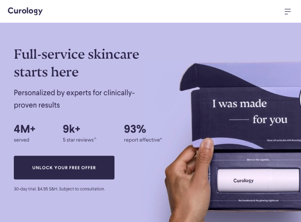
So, when composing your unique value proposition, do so in a way that focuses on your customers, as done by Curology, a brand that promises “Full-service skincare […] personalized by experts for clinically-proven results.”
Differentiate Yourself From Competitors
Finally, as you try to compose a value proposition guaranteed to drive conversions, don’t forget that your website header offers a prime opportunity to highlight the uniqueness and superiority of your products.
Try to use this section to immediately differentiate your brand from your competitors.
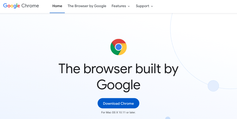
For example, Google does it on the Chrome landing page by pointing out that the app is “The browser built by Google.” Simple? Definitely. But it works.
When thinking about how website header design contributes to good UX and UI, you’ll realize that one specific part of that topmost area — the navigation menu — determines how well your website performs in your audience’s eyes.
In fact, a well-designed and user-oriented navigation menu is an absolute must if you want your website to drive success.
But while you may have read about navigation best practices — like the 3-click rule — you may still wonder: what does UX research have to say about navigation?
As user-friendliness is concerned, there’s no definitive rule about the best way to structure your site. There are, however, a couple of tips you should try and stick to when optimizing your website header.
Don’t Prioritize Form Over Function
UX research shows that what matters most in a web design is discoverability and ease of use.
Understand the difference between mobile-first and responsive web design, and do your best to favour visibility and usability over trends or conventions.
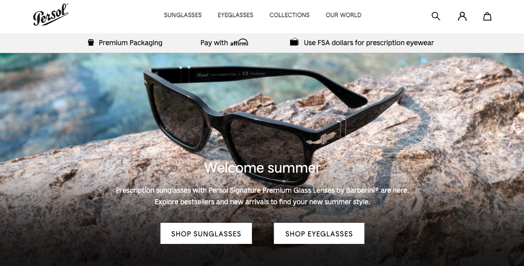
For an excellent example of a responsive header design, check out Persol. This brand’s header changes based on the user’s screen size, with anything below 1,025 pixels wide triggering the traditional horizontal navigation bar to switch to the more mobile-friendly hamburger menu.
Determine Menu Items Based on Needs, Not Rules
Some best-practice advice will tell you that your navigation menu shouldn’t include more than seven items. However, you need to know that this isn’t exactly true.
Your navigation menu can include paths to all of your key content, as long as the menus are properly structured. You might separate pages into a main menu and a smaller utility menu stacked above it, or make strategic use of drop-downs. To avoid menu clutter that causes confusion and decision paralysis, it’s still ideal to keep menus clean and usable.
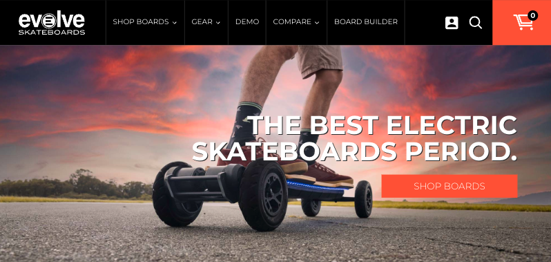
If your organization specializes in one thing, don’t try to cram too many elements into a horizontal menu. Instead, prioritize links to pages that benefit your potential buyers, as done by Evolve Skateboards.
Experiment With Design
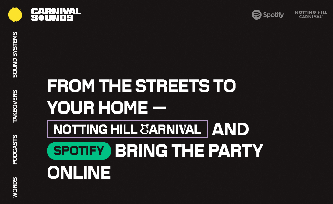
While designing the navigation menu on your website header seems like a pretty straightforward task, don’t allow yourself to be limited by conventions.
Yes, you should meet web visitors’ UX expectations. But, as long as those are respected, you can do whatever works best for your brand – even if it means placing the menu in a slightly more unconventional spot, as done on the Carnival Sounds website.
4. Site Search
Despite being an often-overlooked website header element (or at least an afterthought), a well-placed and optimized site search function is crucial for ensuring high performance from your website.
According to research from Econsultancy, not all website visitors use the search function. Nonetheless, when they do, they are 1.8x more likely to convert and contribute to an average of 13.8% of total revenue.
Considering this information, getting the search function in your website header just right is of the utmost importance.
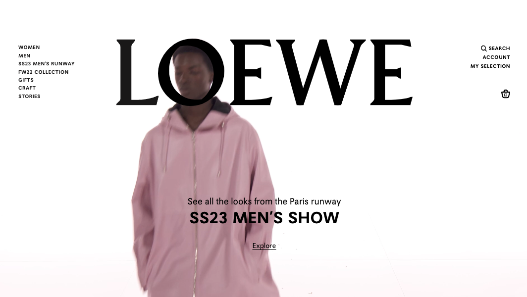
To ensure visibility, place the search button in an expected position. The top right corner of the navigation bar, as used on the Loewe site, is the traditional choice.
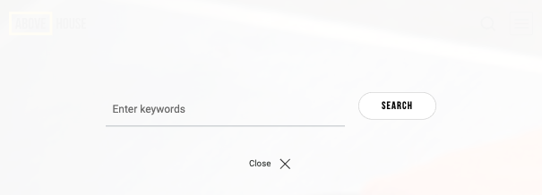
You can also display the search bar more prominently, especially if your business relies on a lot of content marketing.
For example, the Above House website has a search trigger button that launches an overlay. This shows the brand’s commitment to giving readers agency regarding the content they consume, without forcing them to deal with unwanted distractions.
5. Important Calls to Action
As you probably already know, a fully optimized call-to-action button is essential for ensuring your website converts.
But have you considered that the best way to display CTAs, especially high-value ones, is to place them in multiple prime positions on your website? That’s right. Using your website header to display calls to action can help you attract user attention and ensure your web visitors convert into customers.
What are the rules for placing important calls to action in your website header? Well, there are a few that you’ll want to pay attention to when designing your site.
Draw Attention with Eye-Catching Design Choices
The prerequisite for achieving high conversion rates with website header CTAs is to make the right design choices.
Your best bet will be to choose an aesthetic direction that fits in with your site’s overall look, while still standing out.
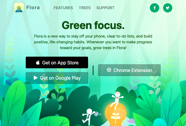
A quick glance at the Flora website shows just how well the black and dark green CTA buttons stand out without disrupting the overall look of the site or feeling out of place.
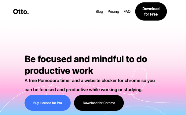
Show CTAs in Prime Positions
Another proven CTA button placement strategy you can implement in your header design is to place these elements in the spots they’re most likely to be noticed by web visitors.
The traditional choice is, naturally, right below your value proposition.
However, you could also reserve a spot for high-value CTAs in your site’s navigation menu, as done by Otto.
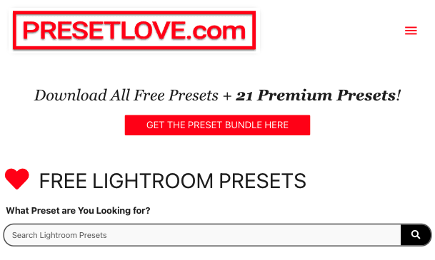
Communicate Who You Are and What Visitors Can Do
Lastly, as you work to optimize website header CTAs to boost conversion rates, don’t underestimate the role of UX copy in getting visitors to take action.
Make sure your calls to action clearly (and enticingly) communicate instructions for what happens when the button is clicked, as done on the Preset Love header CTA, which invites visitors to “Get the preset bundle.”
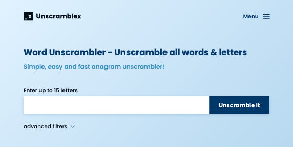
6. Critical Site Functions
While the goal of certain web pages is to convert web visitors into leads or customers, the objective of others is to prompt users to take a specific action. In these cases, using the website header to display critical UX elements is an excellent choice.
This allows those functionalities to stand out by establishing their importance through a visual hierarchy. The design choice also leads to higher conversions, because critical site functions aren’t hidden somewhere behind a CTA. They are displayed in the section of the website that visitors are most likely to notice first.
Brands like UnscrambleX do this particularly well by using colours, layout, and visual cues to make user input a vital part of the website header.
By using the same blue background to house both the company logo, navigation menu, and interactive element, this brand ensures that the first-time web visitors instantly see the value they stand to gain by using the tool, which maximizes their chance of converting.
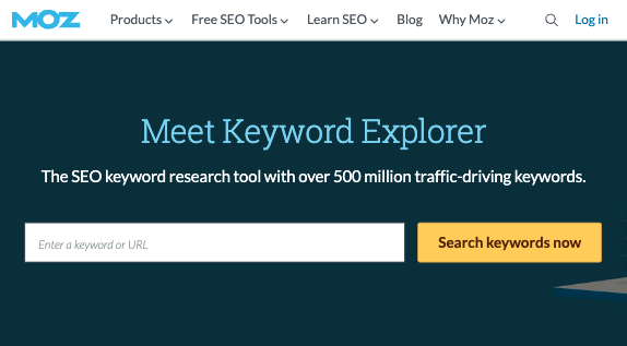
There is also an alternative approach of using the website header to present key UX features, as seen on the MOZ Keyword Explorer landing page.
Here, the purpose of placing the interactive element isn’t to provide instant value to web visitors. Instead, it’s to establish the brand as an authority, and to get first-time users to create a free account. From there, Moz uses a combination of retargeting and email marketing to turn these leads into paid customers.
7. Shopping Cart
As of November 2021, the average cart abandonment rate is 69.82%, which means that businesses are losing approximately two-thirds of their potential buyers due to poor UX design.
In fact, according to the Baymard Institute:
- 17% of cart abandonments happen due to complicated checkout processes.
- 16% because users can’t calculate total order costs up-front.
- And 13% occur due to website errors and crashes.
Now, you may be thinking: what does this have to do with my website header? The answer is quite simple.
Something as elementary as adding a cart navigation button to the top section of your website can help you regain some of that lost revenue, by making it easier and more convenient for web visitors to complete their purchases.
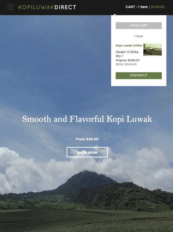
And, for an even more advanced approach to making the most of this UX element, you can do something similar to Kopi Luwak Direct.
On this site, clicking on the cart icon doesn’t navigate the user away from the page. Instead, it presents them with a flyout that gives them a handy overview of their shopping cart while allowing them to continue adding items to their bag.
8. Contact Details
Finally, as you look for ways to make the most of your website header design, don’t forget that you can use this webpage element as an instant credibility booster by doing something as simple as including your contact details.
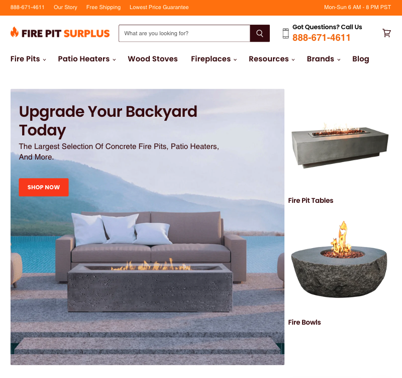
If you know that your biggest chance of converting audiences is by having your sales team communicate with them, make sure that your website header includes information such as your phone number, social links, address, and operating hours, as done on the Fire Pit Surplus homepage.
This won’t just show first-time web visitors that your brand is a genuine and credible business – it will also make them more likely to reach out to your sales team, giving you a valuable opportunity to turn them into loyal supporters of your brand.
The Takeaway
Even though they have been proven time and again to be the prime piece of real estate on any website, headers are still commonly treated as an afterthought.
By implementing the simple tips from this article, you can ensure that every single inch of your site’s header area plays its part in driving conversions.
Don’t hesitate to make changes. Experiment with alternative design solutions, and optimize features to prioritize UX and UI. After all, if you only have 50 milliseconds to make a great first impression on your audience, making it count is not an option — it’s critical to the success of your business.
Share post:

About the Author
John Hurley
John Hurley is a marketing consultant, freelance writer and professional geek. He loves overdelivering to his mostly SaaS & e-commerce clients. And romantic comedies are his not-so-guilty pleasure.
Contact Us More by This Author