One of the things our clients appreciate most about our custom business websites is the attention to detail. We take a meticulous approach to fine details that others often miss, which gives the websites a more complete user experience.
These are some of the steps in our own QA process, which we think are key components when it comes to launching a successful site. If you’re working with a web developer (or if you are one), this is a handy checklist to make sure your site is set up for success.
The top final touches for custom business websites
1. Custom mobile menu
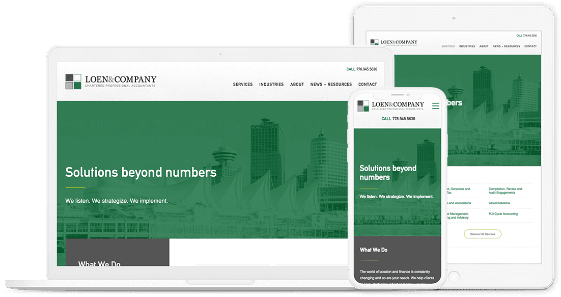
Mobile web design is a big deal, since mobile search traffic has overtaken desktop searches and Google now places huge weight on mobile-friendly ranking factors. We’re extremely proud of the mobile menus we’ve created for our clients. These menus ensure that users can easily navigate your website on any device, and facilitate the same user experience they would get on a desktop.
As all smart business owners and marketers know, responsive web design isn’t just an “added feature”. It’s a necessary requirement to reach your digital strategy goals. Google now penalizes websites that aren’t responsive, because user experience is such an important ranking factor.

Find out everything you need to know about responsive websites in Mobile Design: What It Is and Why It Matters.
2. Favicons
Favicons are a small icon that represents your website. They appear in a few areas, but the most common place to see them is the desktop browser bar. This little bit of branding allows your site to be easily — and memorably — identified in a browser tab. As a person opens more tabs the text area shrinks, but the favicon remains visible
Favicons aren’t a new thing; in fact, they have been supported since WordPress 4.3, allowing users to update their own site’s icon. The problem is that the WordPress implemented solution is a ‘one size fits all’ deal — and we know that doesn’t always work out.
We craft custom icons for several sizes of favicon. As you see below, a 180×180 pixel iPhone favicon won’t always work simply sized down to the 16×16 size suited to browser tabs.
BONUS TIP: Love your site and want to show it off on your phone, or just want to test if your site has an iPhone icon? Open the website on your iDevice or Android and select “Add to Home Screen” in the browser options.
Here are a few favicons we’ve designed for our client sites:
3. WordPress dashboard icons
Our developers create several post types to help manage the content sections on your site. Some common examples are resources, careers, case studies, posts, and team.
The content contributors for your site will spend a lot of time in the WordPress dashboard updating, editing and managing the content. Dashboard icons are a visual cue that help users to navigate the different sections — so they can get where they need to go more quickly (trust us, we spend lots of time working in the WordPress dashboard).

4. Custom 404 page
A 404 page is where your user will land if they click on a link that no longer works, or enter an incorrect URL into the search bar. 404 pages can be either a useful navigation portal, or a frustrating and off-putting experience that drives traffic away from your site.
Having a well-thought-out and useful 404 page will help keep users on your site by offering them other options to find what they’re looking for, and encouraging them to stick around. All of our builds include a dashboard to manage and create a customized 404 page for your site.
BONUS TIP: We suggest including links to sections of your site that the user may be trying to locate (such as the blog or services), a button to the homepage, and even contact details or a content offer.
5. Social sharing
Social media marketing is an essential part of any digital strategy. Giving readers the ability to quickly and easily share your content with a one-click button is one of the easiest ways to increase your reach — for free.
All of our websites include the option to have custom social sharing buttons, as well as custom social images (which are pulled when the content is shared to different networks), Twitter cards, and Facebook previews.
6. Custom forms
Forge and Smith uses the Gravity Forms plugin to allow our clients to create complex, highly customizable forms in a simple point-and-click interface.
Our developers have put a lot of work into making custom form experiences that go above and beyond what’s available out-of-the-box. Their modifications make drop-downs, radio buttons, and conditional logic all work like a breeze thanks.
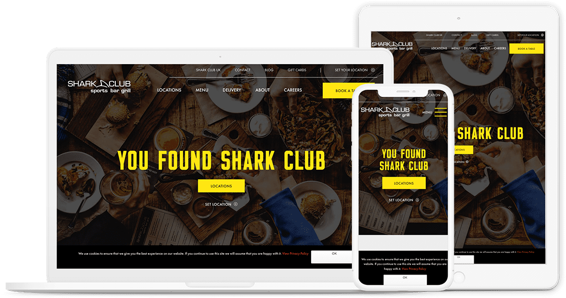
This means that our clients’ style, typography and branding can all be incorporated into forms — as well as some pretty awesome custom design. It also means I get to have fun designing engaging forms.
Read more on how one of our lead developers reworked the styling of Gravity Forms: Custom WordPress Design: A Developer’s Perspective.
All of these finishing touches will help ensure that your website is a positive user experience for both your team members and your customers. If you’re curious about how or why we care so much about the finer details of custom business websites, check out our quality assurance process.
