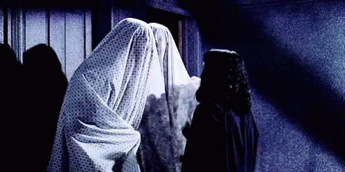
People all around the world enjoy scary movies, spine-tingling horror stories, and haunted houses. They give you a thrill, and keep you eagerly wanting more.

But nobody actually wants to BE that person getting inconvenienced by a poltergeist or sewer clown or chainsaw enthusiast. In our day-to-day lives we just want to get the things we need – as quickly and easily as possible. This is especially true about using websites.
We want websites to make it so effortless to accomplish tasks that even a murderous child’s doll could do it.
If you have a low conversion rate, it could be a sign that your site is unintentionally giving customers the heebie jeebies and sending them running for the hills – or at least back to Google search results.
Today we’re going to explore the factors that impact conversion rate, and outline 15 perilous website mistakes that hurt your leads and sales.
What’s a Good Conversion Rate?
There’s a general agreement that 2-5% is healthy for ‘most’ business websites, repeated regularly by authorities like MailChimp, WordStream, and BrightEdge. Any business earning a 6% or higher conversion rate is probably pretty happy, regardless of your goals.

But conversion rate has tons of nuances that make its success (or failure) unique to each of us. Here are eight key factors that can influence your website’s conversion rate:
- Number of actions being counted as conversions
- Type of actions being counted as conversions
- Your industry
- Your user experience (UX) design and strategy
- Your customer service
- The average order value of your offering
- Ease of making contact directly through other sites or search engines
- Traffic targeting
What’s a Bad Conversion Rate?
If the general belief is that 2-5% is healthy, and 6% or higher is really good, then logically a website conversion rate of under 2% is cause for concern. But for many businesses, anything under 5% may not be good enough either.
A good or bad conversion rate has to depend on what your business needs to stay profitable and nurture business growth. You can determine your conversion rate needs by using your own financial figures for average order value, revenue per visitor, and other metrics you have.
Low Conversion Rate: What’s Scaring Your Customers?
Are you ready to face the Puppies of Purgatory and any other monstrous conversion killers that might lurk in your content and web design? Let us begin…
1. Dark and Sinister Images!
There are few things in life more horrifying to our team than seeing a great web design ruined by crappy images.
Cheesy stock photos. Blown-up grainy pictures. Images stretched the wrong way to fill a space like they’re on some medieval torture rack. Every smartphone takes pretty solid photos nowadays, and there are tons of royalty-free stock sites with diverse imagery. There’s just no excuse to put low-quality images on your site.
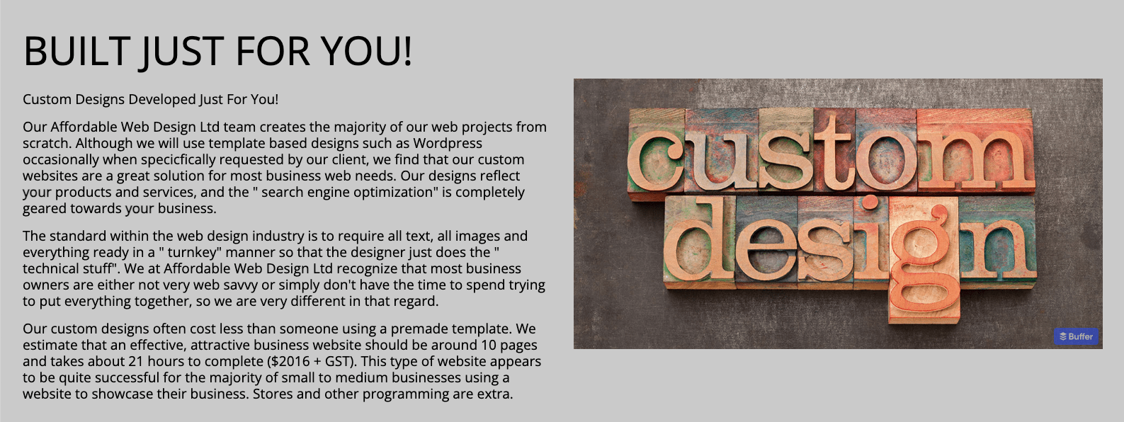
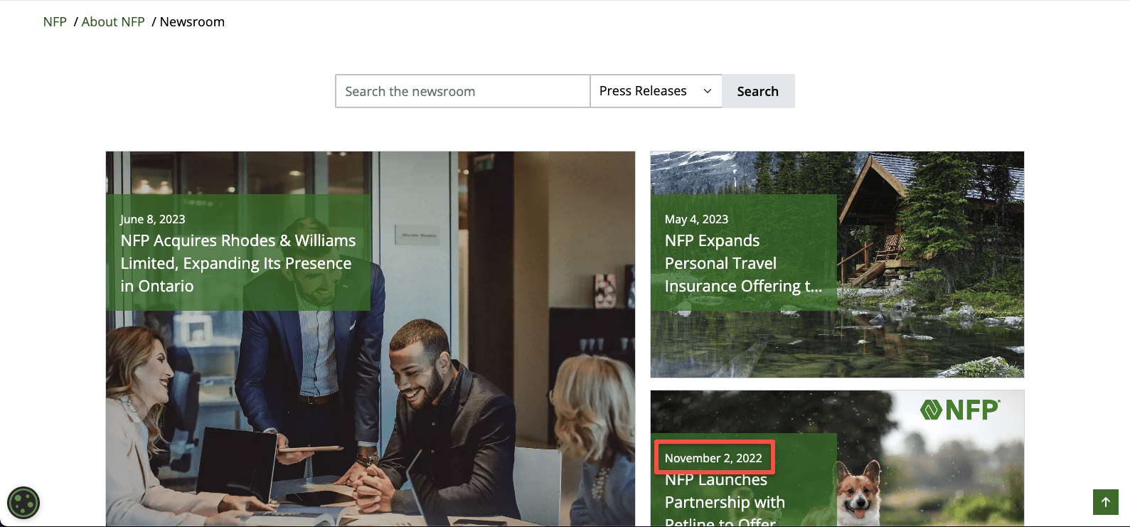
Look at this group of white people in forced poses, pretending to be enthralled by the screen. Bonus point for the incorrectly capitalized “Our” in the copy. Do better.

This next site belongs to a web design company and it’s one of the worst I’ve ever seen. The copy is way too long and is riddled with mistakes, and then they use a stock photo to illustrate their custom design skills?! It’s madness.
2. Zombified Page Speeds!
We’ve all had the experience of visiting a website that doesn’t load right away. What do we do? We usually bounce right back to the search results to click the next one in the list.
Who knows what was on that first site? Maybe it was a great business with awesome products. Doesn’t matter. There are plenty of other websites offering the same exact thing – and those companies put effort into making sure their websites work well, so they get the conversions. If even a few of your pages walk like zombies, take the time to analyze and fix them!
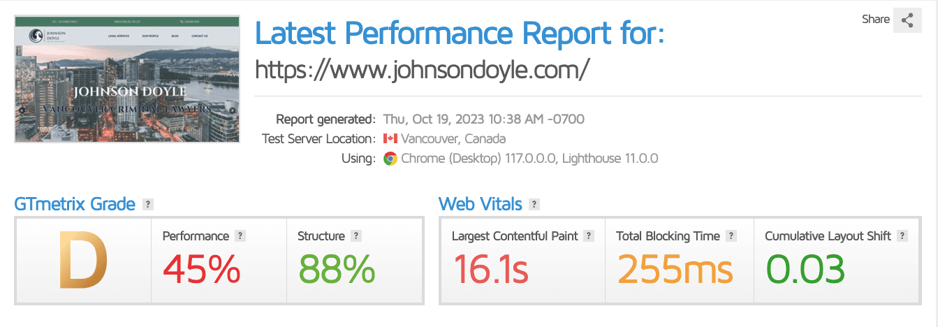
This example below has a massive video in the banner and a ton of theme code and plugins that caused it to take 16 full seconds to load.
3. Abandoned Hotel of Content!
Nothing says ‘we give zero Fs about the details’ like a business that starts a blog and then abandons it, leaving the desolate, hollow shell lurking on the outskirts of their website. It’s even worse if your latest blog post is featured on your homepage, and it’s more than six months old.
If you can’t keep up with even one new blog post a month, think about why you have a business blog in the first place. If you can’t take proper care of it, consider taking it down (with proper redirects, of course).
4. Franken-Grammar!
The odd typo is forgivable. We’re all human. But multiple spelling mistakes, awkward sentences, and SEO phrases tacked onto every section of the page will cast a long shadow of doubt upon the credibility of your business.

Your customers have all used AI content writing tools, from the default spell checker and grammar assistants in writing apps and our phones to the robots like ChatGPT trying to take over the world. The point is, your customers know how easy it is to proofread copy, so mistakes on your website make you seem highly suspicious.
5. Paranormal Accessibility!
Our agency owner, Shawn Johnston, once watched a blind user test one of our websites using only a screen reader and keyboard tab navigation. The experience was shocking, and changed how we build and test websites.
If you haven’t considered website accessibility, you’d better get on board. Making your content accessible to people with physical, intellectual, cognitive, and other disabilities and impairments will soon become a legal requirement.
Accessibility factors that hurt your conversion rate include unclear labels on CTA buttons, illegible text, tappable elements too close together, inability to navigate by keyboard, and lack of alt text to describe images.
6. Slimy Sales Copy!
Nobody likes being accosted by a pushy sales associate in stores, and it’s also unacceptable online. This is a major conversion killer in the B2B space.

The era of using websites as brochures and saying ‘above the fold’ to refer to web design has thankfully sunk to the bottom of the Black Lagoon. Yet still we see businesses trying to make that sale or get that lead on every element of the page.
If your site is seeking conversions way too early in the user journey, or demanding them instead of demonstrating the benefits, you probably reek of desperation – and a little swamp muck.
You know that dream where you can’t complete a task, and you keep failing over and over again until you wake up in a panic? A bad user experience can create similar feelings of frustration, anger, and anxiety in your customers.
If you have a low conversion rate, walk it back and consider the path to conversion. Is it cheerfully illuminated and lined with flowers, or a brambly trail that leads into darkness and certain death?
Analyze potential navigation issues like too many menus, too many options in any area, hidden menus or unfamiliar structure, unclear labels on menus and buttons, unclickable buttons and links, or content that’s buried where your primary audience can’t find it.
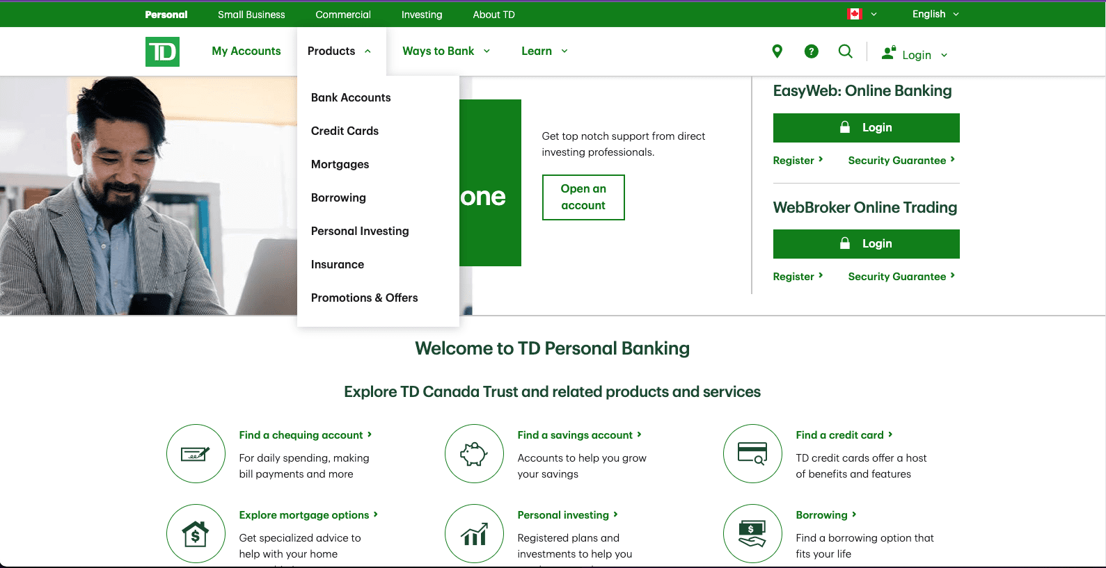
How many clickable options do you count on the screen below?
8. Invasion of the Personality Snatchers!
I like to tell our brand strategy clients that exploring your website should feel the same as talking to your sales team in person. If the copy, visual elements, or general colour psychology of your website give people the ‘no’ feeling, they definitely won’t convert.
Keep an eye out for copy that doesn’t align with your professional voice and tone, especially in the case of promotional content like ads or social posts that sound and feel totally different from the page those visitors will land upon.
And please, for the love of dogs, make sure your brand personality is appropriate for your offering. Beware the impact of mistakes like trying too hard to be cool, being too stiff, being too light when your audience is likely upset or stressed, or being tone deaf.
9. Mummified Design!
Does your website look and feel like a modern business, or is it a shambling relic of another time? Your site represents your business and your offering 24/7 to people who may or may not want to give you their money. It absolutely has to be your best-dressed salesperson.
If you have broken images, walls of text that look ghastly and intimidating, a dated design, older branding, or missing content because it’s too hard to update your site – you need to consider a website redesign.
10. A Shadowy Presence!
Whoooooooooo are you? No, seriously – if it’s not immediately clear who you are and what you do from the content in the first visible parts of a page, visitors may not stick around long enough to find out.
This is a pitfall of overly minimalist web design, but we’ve also seen it plenty of times on all sorts of designs and structures. If you use a lot of buzzwords or jargon to describe what you do, use uncommon words for labelling, or get too creative or clever with your copy, you’ll hurt not only your conversion rate but also your SEO.
11. Tales from the Responsiveness Crypt!
We are living in a material world, and we are material ghouls – who expect websites to work perfectly on our phones. If your website doesn’t have a responsive mobile design that looks good on devices of all shapes and sizes, it may as well crawl back into the crypt.
Try out your site on different phones and tablets, and see if it’s easy to explore – and to accomplish goals.
Some conversion-crushing blunders include pages that require side scrolling, clickable elements being too close together or too small to tap, menus and drop-down filters being tricky to use, or text that’s too small to read. Google Search Console will warn you about all of these things and more.
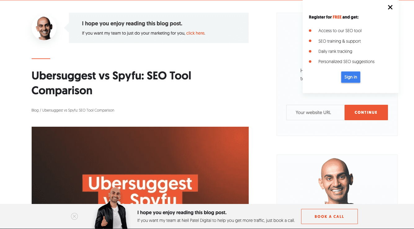
12. Psycho Pop-Ups!
When you’re trying to use a website, few things are more annoying than pop-ups. The more pop-ups and other intrusive interstitials, the more likely I am to quit
You can use pop-ups, as long as they don’t significantly harm the user experience. Some examples of pop-ups done wrong include placing them too soon in the journey, placing multiple pop-ups in one session, hiding the ability to close the pop-up, using misleading language to imply it’s wrong NOT to opt in, and pop-ups that obstruct the entire page.
I will never not shame Neil Patel for his intrusive interstitials (don’t worry, he’s rich and doesn’t care what I think). The screen below is the top of a blog post – you can’t even see the first line of the article. There was a full-page pop-up that I had to close multiple times while just going from his homepage to this blog post.
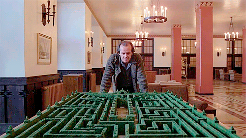
13. Haunted Checkout Maze!
A high abandonment rate is truly horrifying for business owners. If your checkout process feels like a labyrinth (with or without an angry Minotaur or axe-wielding Jack Nicholson), you’ll suffer a low conversion rate.
Lots of tools can help you analyze the biggest drop-off points in your checkout process, so you can figure out where you’re going wrong. Other missteps in the checkout process that squash conversions include an unclear path to even get to checkout, hidden fees, requiring an account, asking for too much information or too many fields, and not enough payment options.
14. The Pit of Proof!
People care more than ever about buying from businesses with strong reputations that share their values – but they need to see it for themselves. Whatever your product or service might be, it will be way harder to earn conversions if your website is a dreary dungeon devoid of all proof.

The more reassuring you can be, the more likely you are to make sales. This means featuring evidence ranging from trust and credibility content (About page, case studies or projects, client or partner logos, author bios, contact details, security badges) to social proof (reviews or testimonials, user-generated content, media mentions, influencer recommendations),
15. Lights Out!
I’ve saved the most obvious conversion killer for last, and I speak from experience because this happened to me recently with my own website. Nobody can convert if your site is down.
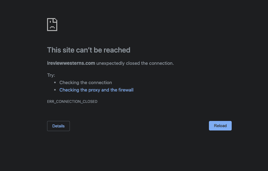
Lots of problems can cause outages, like issues on the server side, problems with hosting, DNS issues, cyber attacks, the code breaking from incompatible plugins or theme issues, too many customers flooding it during a sale, and more.
If you don’t look at your business site or your analytics often, you run the risk of finding out that it’s down from upset customers. You can’t know how many leads or sales you lost in the meantime.
That concludes our guide to conversion rate killers. I hope you found it spooktacular.
The key takeaway is that if you have a low conversion rate on your site, there’s no need to scream and call the exorcist. It may be something easily fixed without redesigning your entire website. The best thing to do is identify potential causes and start to test fixes. Make sure to give each fix time to yield results.
If you do need a redesign, we’re happy to be your monster squad.
Share post:
About the Author
More by This Author