Building a high-converting B2B website is no easy feat.
It needs a unique approach to web design that will successfully attract high-value prospects, build brand credibility, and encourage conversions. On top of that, the B2B buying journey is a long cycle that can take its toll on all parties involved.
If we look at the available data on the nature of the buyer’s journey, 77% of B2B buyers describe it as complex. Moreover, the typical B2B purchase involves between six and ten decision-makers.
Compare this to B2C, where up to 95% of shopping decisions are subconscious, and it becomes clear that designing an effective B2B website necessitates a highly strategic approach to drive conversions.
If you’re looking for ways to boost your site’s effectiveness, here are eight critical principles of B2B design, plus tips on how to apply them to your site.
1. Optimize Sales Propositions to Communicate Value
One of the most essential web design strategies for B2B organizations is that they need to convince prospects that a purchase, or engaging a service, will solve a pain point.
According to the Gartner B2B Buying Report, 99% of B2B purchases are driven by organizational changes, 66% of which are overwhelming. In other words, B2B buyers often have to make buying decisions to remove frustrations. And to invest in a solution, they need to know how it can help them solve a pain point or improve company performance.
The good news about this aspect of B2B buyer behavior is that you can effectively meet your audience’s needs by optimizing your sales proposition to instantly highlight value.
To apply this principle to your website, start by doing something as simple as placing value propositions in the right spot. User behavior research shows that the topmost section of your web pages attracts the highest amount of web visitor attention, so placing your value proposition in the ‘hero’ area of key pages (especially the homepage) will effectively show B2B buyers that your organization offers the solution they need.
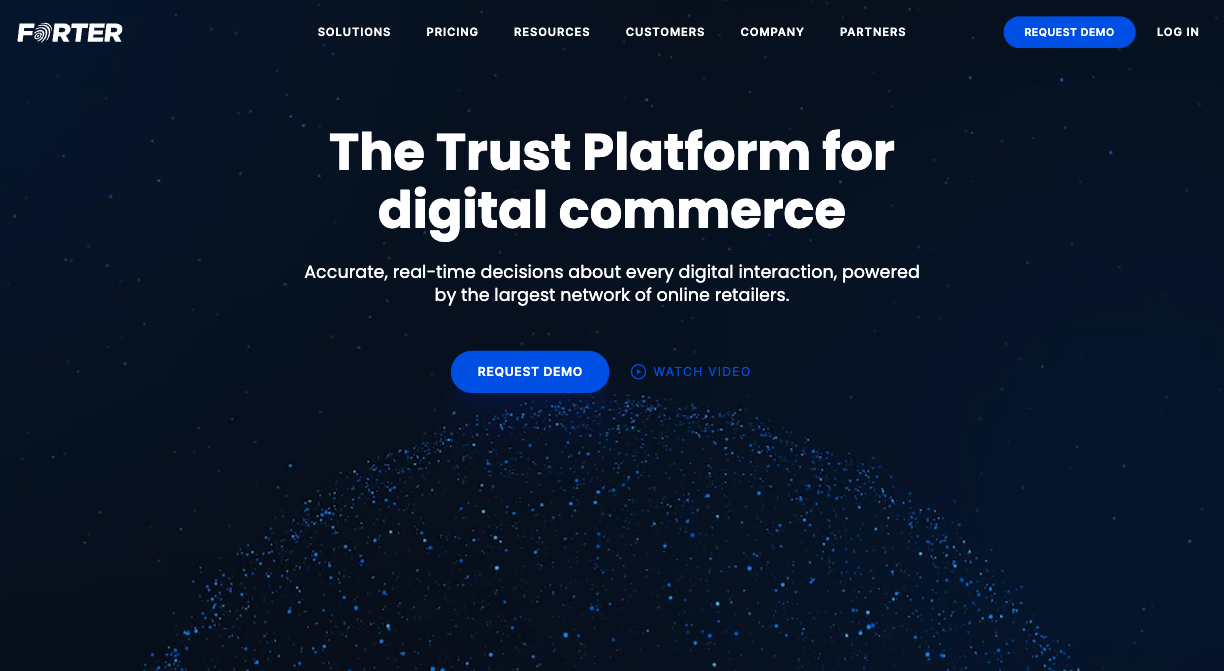
For instance, if you check out the Forter homepage, you’ll see that the entire hero section of the homepage is reserved for the value proposition.
This design choice ensures that B2B buyers can’t miss the value offered by the brand. It removes all distractions, encouraging web visitors to read the copy and watch the explainer video to get them as invested in the product as possible.
If you want to take things a step further, remember that B2B buyers have specific results in mind. So, consider framing your value proposition in real-world terms and quoting measurable outcomes.
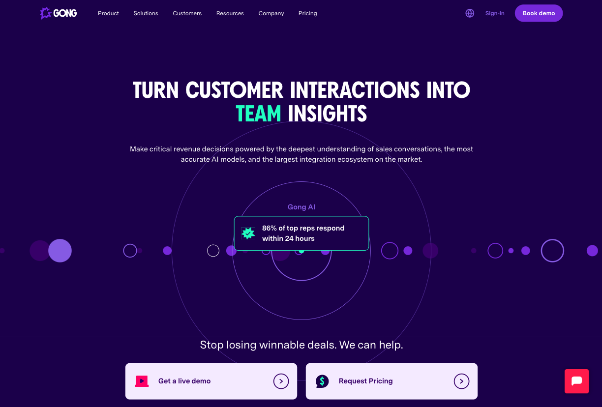
For instance, you can take inspiration from Gong, a business that does this beautifully throughout its homepage. The brand highlights the outcomes of using its AI tool on the page banner and in the benefits section below. Plus, the page includes a series of case studies that spotlight specific results achieved by well-known businesses.
2. Highlight Peripheral Benefits
One of the best ways to apply the principles of B2B web design to your website is to understand the factors that inspire decision makers to consider a purchase.
In its 2023 Global Software Buying Trends Report, Gartner uncovered the main reasons for purchasing new software in the last 12 months:
- Wanting to improve productivity (37%)
- Trying to meet growing technology needs (32%)
- Improving cybersecurity (30%)
- Expanding product offerings (27%)
- Targeting new customer segments (26%)
This doesn’t just relate to SaaS purchases – B2B customers consider much more than your main value proposition, whether your offering is a product or service. It’s essential for your website to effectively communicate all the things that make your product the right choice for your target audience’s needs.
One effective strategy is to position your benefits in a wider sense than just the apparent reason your B2B prospects have come to your site.
For example, do your best to present additional benefits on your product or service detail pages, as this could be the key factor in swinging a business lead your way. Once a prospect is this deep into your site, they are open to more detail and more persuasive copy.
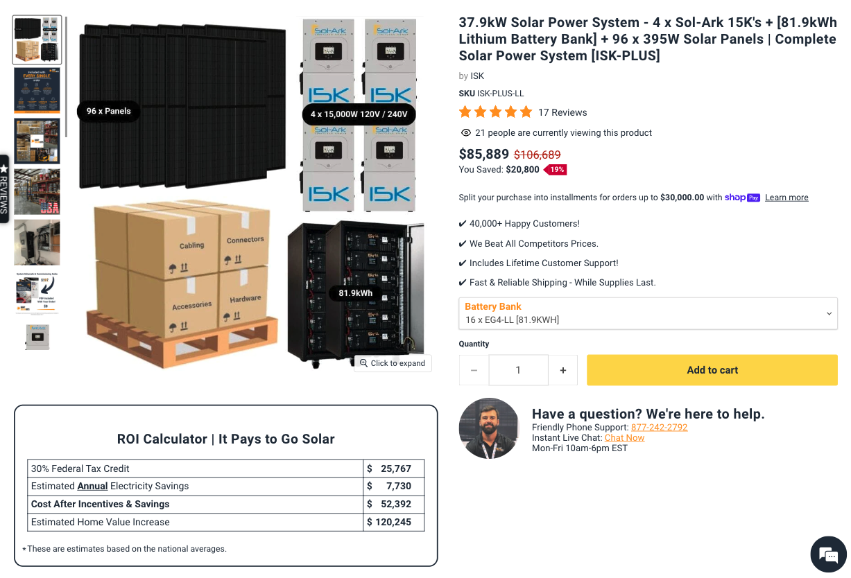
Check out the Shop Solar Complete Industrial Solar Kit product page. The brand fully commits to showing industrial businesses that investing in one of the brand’s kits comes with both self-evident and additional (hidden) benefits.
The section just below the product photos features an ROI calculator. The page also includes a video on earning tax credits, which is the type of benefit that will effectively persuade on-the-fence B2B buyers to convert.
3. Grant Exceptional Access to Your Product
Another tactic that can help convert B2B prospects on your website is to adhere to the “show, don’t tell” principle.
A 2021 survey by Statista revealed that 68% of B2B buyers want sellers to show them how to solve a problem, and communicate all the possibilities behind a purchase. This is why it’s such a popular practice for B2B websites to drive visitors toward product demos, trial periods, or demonstrations.
Unfortunately, the words “book a demo” can make some buyers balk. It’s a big commitment that might land them in a pushy sales call, when all they want is a better understanding of the product before they make contact.
A great way to work around this challenge is to utilize explainer videos. As 96% of video marketers claim that explainers boost product understanding, one of the best ways to enhance your B2B website is to include them on relevant pages.
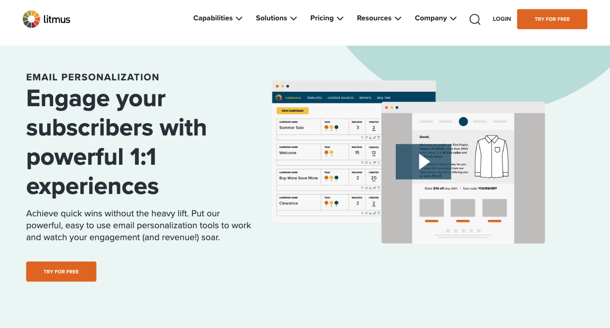
To see a great example, check out how Litmus does it on its Email Personalization product feature page. In this area of its website, Litmus utilizes a two-minute video to explain the benefits of email personalization and how the brand’s product makes it possible.
For prospects in the early stages of the buyer’s journey, this video represents a great introduction to getting the most out of an email marketing client. For those who are further along in the sales cycle, knowing that Litmus understands the importance of personalization in making campaigns successful is a reassurance about the brand’s capabilities.
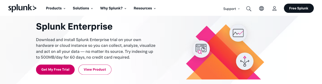
Another excellent strategy you can implement on your site is to lengthen your trial periods.
Although scientific research shows that providing users with a 7-day free trial is sufficient to maximize conversions and reduce churn rates, B2B users have more complex use cases. With this in mind, doubling, tripling, or even quadrupling your trial periods could be crucial for ensuring your prospects have sufficient time to explore your solution, and test integrating it into their workflows.
For example, knowing that big companies need more time to embrace novel SaaS solutions, Splunk offers a 60-day trial for its Splunk Enterprise pricing plan, understanding that solid integration is essential for converting long-term customers.
If you can’t afford to give access to your solutions for free, consider creating walk-throughs like the ones used by eTraining.
This B2B company created an insightful product demo that gives prospects an actual sneak peek at the courses, so new clients looking for convenient safety training and certification can see exactly how it will work and the benefits of signing up.

4. Highlight After-Sales Support
In the B2B sector, customer experience and support are everything.
According to research from Deloitte, 80% of the highest-performing B2B organizations credit an increase in customer lifetime value (CLV) to their CX strategy. Since professional users expect brands to deliver smoother buying experiences – personalized to meet their unique business needs and customized based on previous brand interactions – that’s not much of a surprise.
But when using web design to inspire conversions and shorten the sales cycle, many B2B organizations still fail to recognize the importance of highlighting after-sale support on their websites.
One easy way to remedy this conversion rate killer is to enhance your site with self-service features that future clients will appreciate.
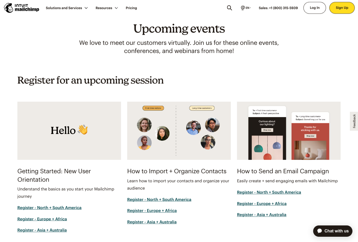
In addition to creating a Support or Troubleshooting area on your site, consider taking a page from Mailchimp’s book. This brand does a tremendous job with after-sale support, offering free virtual events that onboard new clients and help existing customers get more out of the software.
Or, knowing that 74% of B2B buyers prefer human-powered customer service over chatbots, explore ways to underline that converting with your business means working with real humans.
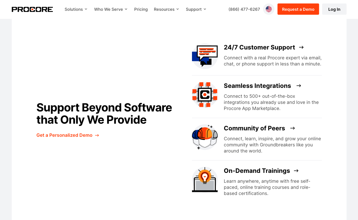
A great way to do this is to point out that your brand offers advanced support, like Procore. This organization promises 24/7 customer support (via any channel preferred by its customers). Plus, its value proposition includes access to a community of peers and on-demand training that is genuinely helpful to its target audience.
5. Social Proof Should Be Third-Party Verified
Nowadays, displaying social proof on your website is a must – especially considering that 81% of people decide whether to do business with a brand based on its credibility.
But B2B customers won’t take just any old Google review at face value. Buyer behavior research from G2 shows that 84% of software buyers use online review sites to evaluate purchases, with the most trustworthy sources for purchase advice coming from experts, colleagues, and professional networks.
If you’re going to highlight social proof on your website, ensure it’s third-party verified, as this could help it carry more “official” weight and catch the eye of diligent prospects.
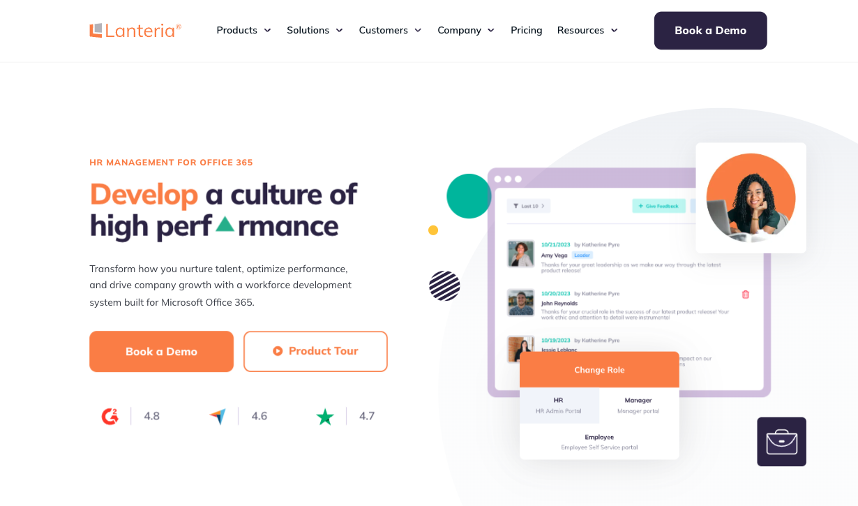
If you check out the Lanteria homepage, you’ll notice that all three featured product ratings include sources and clickable links.
This is a super-simple yet effective solution, and not just because B2B software buyers regularly take purchase advice from the featured sites (G2, Capterra, and Trustpilot). It’s also because this small design detail adds an extra layer of credibility to the brand’s claim of being the best HR management solution for Office 365.
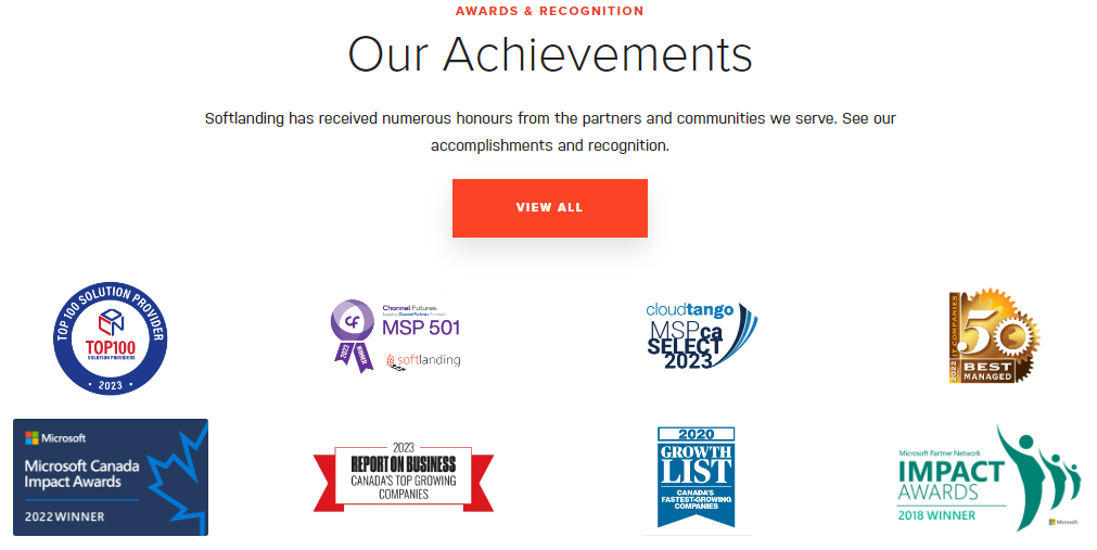
Or, if that’s not an option for your business, do your best to populate relevant website pages with official certifications. If you check out the Softlanding About Us page, you’ll see the brand proudly displays official awards that various governing bodies in their industry have bestowed on them.
6. Follow Best Design Practices for Your Pricing Page
According to research regarding the most common deal-breakers for B2B purchases:
- 41% of businesses decide against investing in a product due to pricing mismatch
- 81% of buyers think it’s essential that websites make it easy to find pricing information on their own
With that in mind, optimizing your pricing pages should be toward the top of your list of design priorities. In general, these are best practices for pricing pages:
- Ensure that the page is easy to find from any page on your site. Ideally, visitors should be able to access it from the main (upper) menu and the footer menu.
- Use a simple, uncluttered design on the page itself and a design structure that’s easy to understand. Tables and cards are excellent structures for pricing pages, as they make it easy to quickly read information and support comparison tasks. Moreover, they create a visual separation between different pricing tiers, making it easier for users to find the ideal choice for their needs.
- Utilize tier names that align with different buyer personas. Your B2B prospects may not all fall into the same persona category, or have the same goals from using your product. What matters is that it’s super easy for web visitors to instantly identify with one of the presented options.
- Make it easy for buyers to get in touch. When optimizing your site to appeal to B2B customers, you must remember that most decision-makers prefer to make buying decisions after having direct contact with a vendor. Your pricing page should have at least one clear “contact sales,” “get in touch,” or “book a demo” CTA, so that prospects know they can get the level of personalization that they require.
- Encourage long-term commitment. Data shows that B2B SaaS churn rates are at a record high (20.5% higher than in 2022), making it more important than ever for businesses to encourage customer loyalty with the right incentives. Something as simple as offering a significant discount on annual subscriptions is an excellent tactic to boost CLV and ensure your business has sufficient time to ensure the loyalty of new clients.
- Make signing up a breeze. Last but not least, don’t forget about the importance of CTA buttons. Make it super-easy for web visitors to convert on the page itself by positioning CTAs in logical spots, keep the copy clear and direct, and support the incentive with risk-diminishing microcopy.
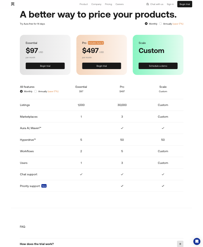
One excellent example of a pricing page that does all of these things comes from Amazon repricing tool Aura. The brand’s pricing page doesn’t just look good. It’s structured in a way that prioritizes informational value while making it easy for prospects to find the best plan for their needs, or get in touch for a custom solution.
7. Embrace Clean UI & UX Design
Research shows that one of the biggest conversion killers for B2B websites is cluttered web design.
According to a survey from Statista, the most annoying B2B vendor website elements include animated ads, poor design or navigation, automatic audio and video, intrusive live chat, and sliders.
If you’re looking to improve your site’s functionality and conversion potential, keep the UI and UX as clean and usable as possible.
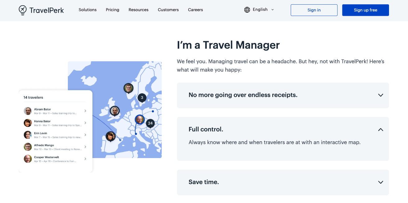
The TravelPerk site is an excellent example of a B2B SaaS solution winning over web visitors through simple web design. If you check out the Business Travel Manager page, you’ll see that it was created to deliver the smoothest, distraction-free experience.
Each page element serves a purpose in informing web visitors about the brand’s products. The menu is structured in a way that helps any prospect find the solution they need. The flow of the pages is further laid out to align with buyers’ priorities, with each CTA proposing a logical next step in the buyers’ journey.
8. Align Website Content With Social Channels
As you explore principles of web design that you can apply to your site, keep in mind that the B2B purchase decision-making journey keeps evolving.
Third-party interactions can truly boost buyer’s purchase confidence. In fact, more than half of Gartner’s surveyed B2B buyers turned to channels like YouTube, Facebook, and Instagram to inform their decisions in 2022. This shows just how essential it is for you to align your site content with your social media strategy.
The data shows a growing need for B2B sites to be populated with a variety of engaging and informative content that can help attract visits from social media. In addition to evergreen articles aiming to attract new prospects, produce resources for buyers in the mid and lower stages of the shopping journey, and to support the post-purchase customer experience.
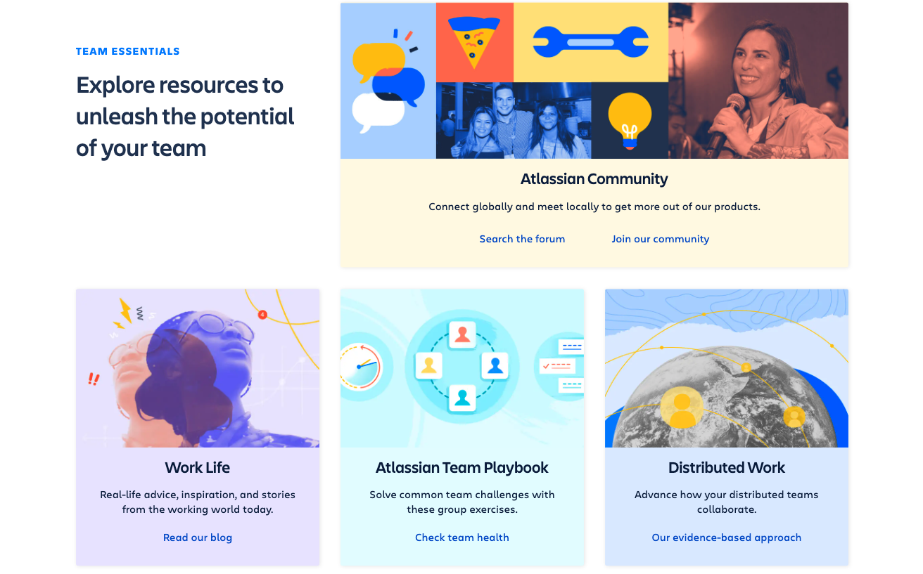
For a great example of how to do this, check out the Team Essentials section of the Atlassian homepage. The resources section gives web visitors a valuable opportunity to explore on-brand content categorized based on what aspects of running a team it covers.
This is the type of content Atlassian shares on its social channels, where it employs the same visual branding and recognizable voice to guarantee a unique and seamless experience for all prospects, no matter where they’ve chosen to interact with the brand.
Final Thoughts
These eight principles of B2B web design are all essential for boosting conversions and sales. And what’s great about them is that you can apply every single one to your site without much hassle.
Of course, as you work on changing up your brand’s site, remember to do it gradually. That way, you’ll have the chance to test how each adjustment impacts performance, which is ultimately the goal of any changes to content, design, or structure.
Share post:

About the Author
John Hurley
John Hurley is a marketing consultant, freelance writer and professional geek. He loves overdelivering to his mostly SaaS & e-commerce clients. And romantic comedies are his not-so-guilty pleasure.
Contact Us More by This Author