Your website introduces your business to strangers, answers their questions before they call, and either moves them closer to a conversation or sends them somewhere else.
Typically, it’s quite easy to assume it is doing that job reasonably well because the traffic numbers look okay, the design seems good enough, and nobody has complained directly.
But all of that can be happening while your lead flow is blank, requests for proposals barely trickle in, and the pipeline feels thinner than it should for the amount of traffic you’re getting.
If your traffic isn’t converting into leads and revenue despite your marketing and sales teams putting in their best efforts, there’s a chance your website might be the problem.
Here are seven signs your website is costing you leads, and what to do about each one.
Sign 1: Your Bounce Rate Keeps Climbing
Bounce rate represents the proportion of traffic that gets to your website without taking an extra action. That is, a visitor lands on your page, then they exit almost immediately, without visiting a second page, submitting a form, or clicking through to anything else. They arrived, looked for a reason to stay, and did not find one fast enough.
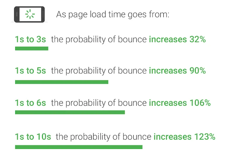
Your page speed is often a leading cause. According to Google’s research, when page load time increases from 1 to 3 seconds the probability of a visitor bouncing increases by 32%, and the numbers worsen significantly from there.
If your page gets 1,000 visitors a month, a three-second load time sends hundreds of them away before they read a word of your content.
Another reason for a high bounce rate is message mismatch. For instance, if a procurement manager clicks an ad for “nonprofit accounting software for mid-size organizations” and lands on a homepage hero that leads with your company’s founding story, they leave.
In this case, the page did not deliver on the click’s promise immediately. To fix that, you should rewrite the headline to reflect the intent that brought someone there in the first place, and do that for every key traffic source.
Other things to check:
- Run your key landing pages through Google PageSpeed Insights and look at your Core Web Vitals scores, particularly LCP (Largest Contentful Paint) and CLS (Cumulative Layout Shift)
- Compare the headline on your landing page to the ad copy, email subject line, or search query that sends people there. If they don’t match closely, fix the headline first
- Check that your above-the-fold content immediately tells visitors what you do, who you do it for, and what they should do next
Sign 2: Visitors Can’t Find What They Need
After you have lived with a website long enough, you stop seeing it the way a stranger does, and poor navigation gradually becomes invisible to you. At this point, you basically know where everything lives.
However, the same can’t be said of your new prospects. They might be visiting your site for the first time, or have only browsed it a couple of times before. And if they find it difficult to move around or find the resources they need as quickly as possible, they leave and go to another website where there’s clarity.
Some examples of navigation failure include:
- Service pages are buried three clicks deep when a buyer is comparing you against two other vendors on the same afternoon
- Pricing information hidden behind a contact form when a decision-maker just wants a ballpark before they bring your name to their committee
- Forms that ask for company size, annual revenue, and current tech stack before the visitor has seen enough to know whether you are even a realistic fit
The same principle applies to every B2B website. Your buyers are already evaluating multiple vendors simultaneously. If your site makes them work for information, you risk losing them.
Samuel Charmetant, Co-Founder of global online art marketplace ArtMajeur, knows what happens when UX breaks down at scale.”The question every business should ask about their website is how many clicks it takes for a visitor to get the answer they came for,” Charmetant says.
“Every unnecessary step is a drop-off point. That’s why you should audit your site from the outside, map the path a first-time visitor takes to your most important information, and cut anything that does not serve that journey. Most sites have at least three steps that exist for internal organizational reasons, not for the visitor.”
Sign 3: Your CTAs Are Doing Too Little Work
Generic buttons like “Submit,” “Learn More,” or “Get Started” give visitors no reason to click because they describe an action without connecting it to a benefit.
On the other hand, specific, benefit-led CTAs with well-designed UX perform better because they tell visitors exactly what they get by clicking. For instance, “Get Your Free Site Audit” outperforms “Contact Us” because one is a transaction and the other is an obligation.
Also, placement matters just as much as copy. A single CTA in the footer of a long service page is easy to miss, whereas a CTA that appears immediately after a section of compelling proof, a case study result, or a client testimonial, catches someone at the moment their confidence in you is highest.
Eric Yohay is the CEO of Outbound Consulting, a B2B lead generation agency that helps businesses build and convert pipelines more systematically. He treats the CTA as a diagnostic tool. “When I look at a client’s website for the first time, I read the CTAs before I read anything else,” Yohay says.
“They tell me immediately whether the site is built for the visitor or for the company. A good example is a CTA that says ‘Get a Free Strategy Session.’ That tells a prospect exactly what they’re getting and removes the risk. In contrast, a CTA that says ‘Contact Us’ tells them nothing and makes them do all the work. Most sites that struggle to convert are sitting on this problem and don’t know it.”
Quick CTA audit:
- Read every CTA on your site and ask what the visitor actually gets for clicking it
- Check whether your primary CTA appears above the fold on key service and product pages
- Add a secondary, lower-commitment CTA on pages where the primary ask may feel premature
Sign 4: Mobile Visitors Are Having a Bad Time
According to HubSpot’s Web Strategy Survey, 53% of SEOs and marketers rank mobile as the most-used device by their website visitors. If your site does not work well on a phone, you are creating a bad first impression for more than half of your visitors.
Ryan Beattie, Director of Business Development at UK SARMs, the UK and Europe’s leading SARMs supplier, sells entirely online in a competitive market where mobile shopping is the norm. “Our customers are browsing on their phones between sessions at the gym, comparing products, checking reviews, and making purchase decisions in a few minutes.”
“If our product pages don’t load quickly, if the checkout process is frustrating on a small screen, or if anything about the experience creates friction, they go to a competitor. That’s why mobile experience is a must-have.”
The same pressure applies to B2B. Procurement managers and decision-makers are looking up vendors on their phones before meetings, sharing links via mobile, and checking your site from wherever they are. The moment your site causes friction on their device, it reflects poorly on your attention to detail.
To avoid that:
- Test your site on actual phones of all screen sizes to see if it looks good and functions correctly
- Check load times on a cellular connection
- Run Google’s Mobile-Friendly Test on your key pages and work through the flagged issues
Sign 5: Your Site Looks Like It Was Built for a Different Era
A site with dated visuals, statistics from 2021, case studies from client relationships that ended years ago, or a pricing page referencing a feature you no longer offer are red flags for a prospective client. B2B buyers will draw a reasonable conclusion that your business either has not grown, is not active, or does not invest in its own presentation.
None of those conclusions helps you win a deal.
If you want to jack up your lead pipeline, then your site needs to accurately reflect where your business is today. Of course, this does not mean chasing every design trend. Focus on aligning it with your branding, and making it visually appealing without reducing usability.
A minimal maintenance and design checklist includes:
- Review page content and design structure yearly
- Update statistics and screenshots on your highest-traffic pages once per quarter
- Review case studies annually and refresh outcomes, metrics, and client context
- Check every form and every link on a scheduled basis. A broken contact form is the quietest lead killer on any website
- Do an annual pass on your About page, team section, and service descriptions to ensure they reflect the current reality
Sign 6: There Is Nothing to Make Strangers Trust You
According to Gartner research, 61% of B2B buyers prefer to conduct independent online research before making a purchase, and they complete a significant portion of their decision-making process before a sales conversation ever begins.
Part of what they look out for are trust signals. These include client names, testimonials with real outcomes, case studies with measurable results, SSL, physical address, team bios, and data-backed claims that sound unique in the space. In B2B, the lack of these trust signals makes your leads doubt the value of your offer. And in most cases, they bounce.
Reviews from third parties about your business also matter. According to G2’s research cited in Forge and Smith’s UX guide, 92% of B2B buyers are more likely to purchase after reading a trusted review.
Grant Aldrich, Founder at Preppy, an online certification training platform, builds trust signals into every stage of the student decision journey.
“People choosing a certification program are making a meaningful investment in their career. So, they need to know that the credentials are accredited, the platform is legitimate, and that others have successfully completed the program and seen results.
“We put accreditation information, graduate outcomes, and student reviews where prospective students look first. Removing doubt at those decision points is what converts our visitors into enrolled students.”
To implement similar changes, we suggest:
- Ensuring that HTTPS is active on every page, not just the homepage
- Adding at least three specific testimonials with name, role, and company to your key service pages
- Including at least one case study with a measurable outcome per core service area
- Making your About page feel like a real account of how the business got here and who is behind it
- Adding clear contact information, including a physical address if relevant, to your footer
Sign 7: Your Best Prospects Cannot Find You
All of the signs above assume visitors are actually reaching your site. But the truth is, if your SEO fundamentals are weak, a significant share of your potential audience never finds you.
BrightEdge’s research found that organic search drives 51% of website traffic across industries, and for B2B companies specifically, organic search generates twice as much revenue as any other channel. That means SEO is not optional for your website.
To ensure your SEO is in the right place, check if your page titles are describing what prospects actually search for, if meta descriptions are missing or duplicated across pages, if there’s no content strategy around the questions buyers ask while evaluating vendors, if internal linking does not signal which pages matter most, and if load times are slow enough to affect how often search engines crawl the site.
Get more advice on how to increase organic search traffic in Forge and Smith’s article.
Do a technical audit to identify crawl issues, speed problems, and missing metadata. Then map your key service pages to specific search queries your buyers are actually using, and close the content gaps where you have no presence for topics you should own.
Wrapping Up
Websites do not usually fail in one dramatic way. It starts with a little slowness here, a stale page there, a CTA that made sense three years ago but no longer fits your offer. This cumulatively results in a site that underperforms relative to the traffic it receives.
To avoid that, start by running your site through analytics and identifying where the drop-off points are. Where do visitors leave? What pages have the highest bounce rates? Which forms are abandoned mid-completion?
Check why those drop-offs are happening and fix them. If it’s speed, cache your files, use a CDN, and remove excess elements from your page. Add trust signals like testimonials, security badges, and expert endorsements. Even small changes to critical areas can have a big impact on your conversion rate.
Share post:

About the Author
David Abraham
David Abraham is a tech lawyer with extensive experience in artificial intelligence, financial technology, human rights law, and digital marketing.
Contact Us More by This Author