+22 %
Engaged Sessions
Built With Refoundry
Blenz
Blenz needed a fresh new website to reflect their updated branding, and to help customers more easily find their way to online orders, app downloads, and perks.
Keep ReadingStanscott is a new brand launched by the trusted Stansfeld Scott company, to distribute health and wellness products in the Caribbean.
The Stanscott brand was created to separate their health and wellness product portfolio from the parent company’s wine and spirits offering. The new brand needed a website that would retain Stansfeld Scott’s cachet as an expert in Caribbean product distribution.
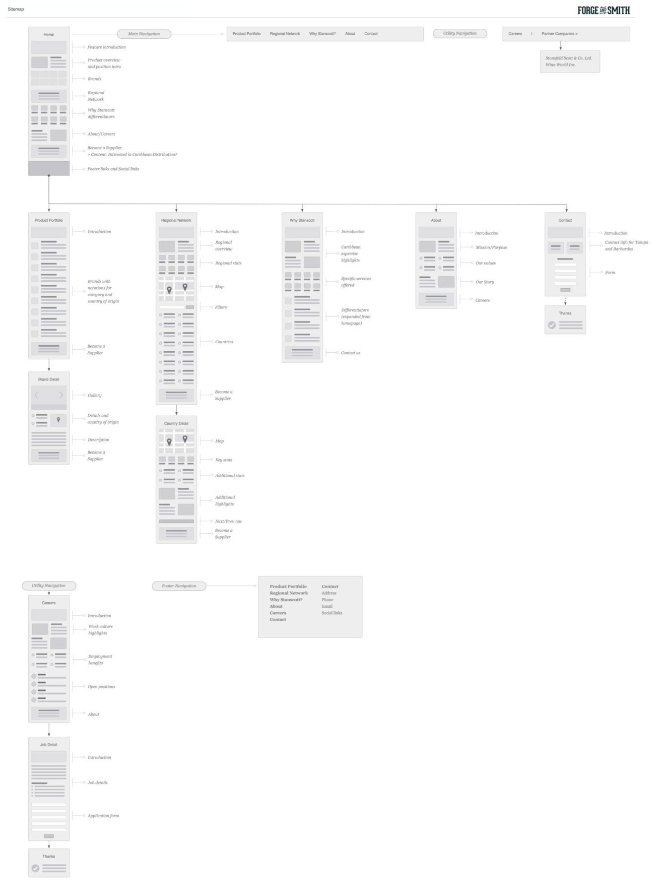
This website design project was driven by careful content planning for site visitor needs. The goal was to help potential brands understand marketing opportunities in the area, while also showcasing the brands and products currently available for distribution.

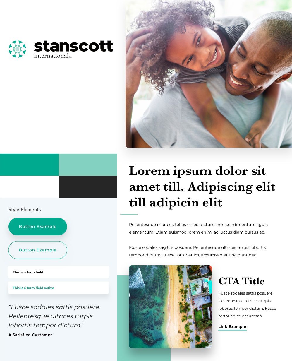
Taking clues from the brand’s new logo, the new colour palette uses a tropical blue in a slightly muted tone to evoke the Caribbean’s specific sense of place, while drawing the eye to important information through complementary greens. Subtle overlays of the logo’s shape lend texture and continuity to landing pages.

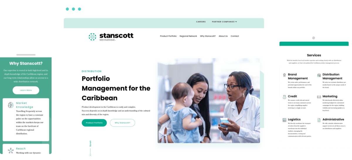
The new Stanscott website showcases available wellness products among welcoming imagery of the Caribbean and smiling health professionals. The regional network map allows for filtering by different data sets and access to individual country landing pages with relevant distribution information. Product brand landing pages display relevant facts such as country of origin, and available products smartly display images and info in scrolling form. The vibrancy and varied markets of the Caribbean are represented not only visually but in credibility-reinforcing facts and figures.

Check out more of our web design case studies, to see the results we’ve helped our clients achieve.
Blenz needed a fresh new website to reflect their updated branding, and to help customers more easily find their way to online orders, app downloads, and perks.
Keep ReadingAxis Insurance needed an all-new website to support a huge rebrand. The goal was to launch a visually powerful site that would significantly improve usability, navigation, and showcasing their specialized expertise.
Keep Reading