About the Organization
Launched in 2022 as an initiative of Outward Bound Canada, the Training Academy addresses the representation gap within the outdoor sector. They provide technical skill development and social and emotional competencies for Canada’s future outdoor leaders.
Objectives:
- Improve reach and engagement through branded storytelling
- Design a site architecture and navigational flow that enable easier browsing
- Drive conversion of site visitors into leads and registrants
- Implement a search-friendly blog to improve brand storytelling, engagement, and SEO
- Establish SEO foundations to increase search engine traffic and drive future growth
- Implement a fully responsive solution backed by WordPress CMS
Results
Organic Search Traffic
+
0
%
First Month After Launch
Average Engagement Time
+
0
%
First Month After Launch
PHASE 1
Prototyping
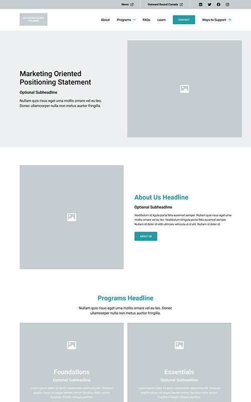
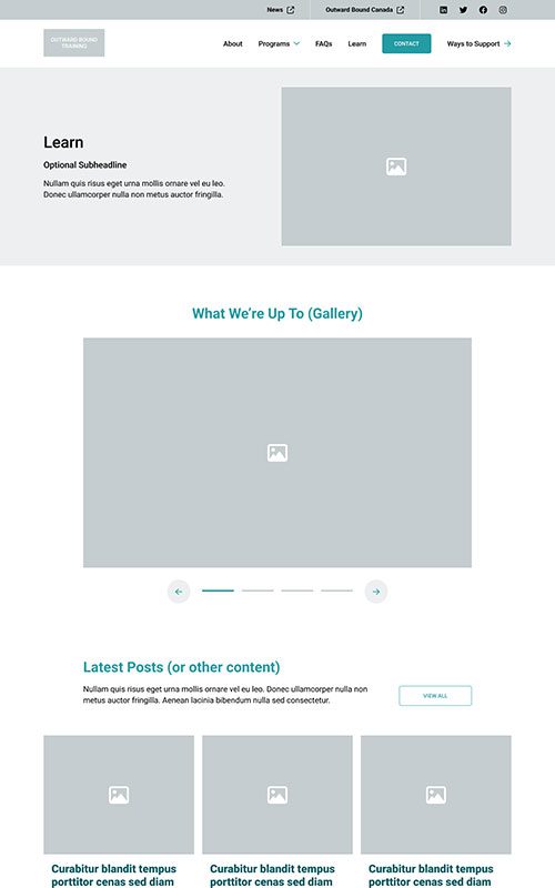
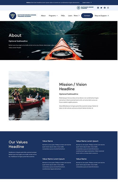
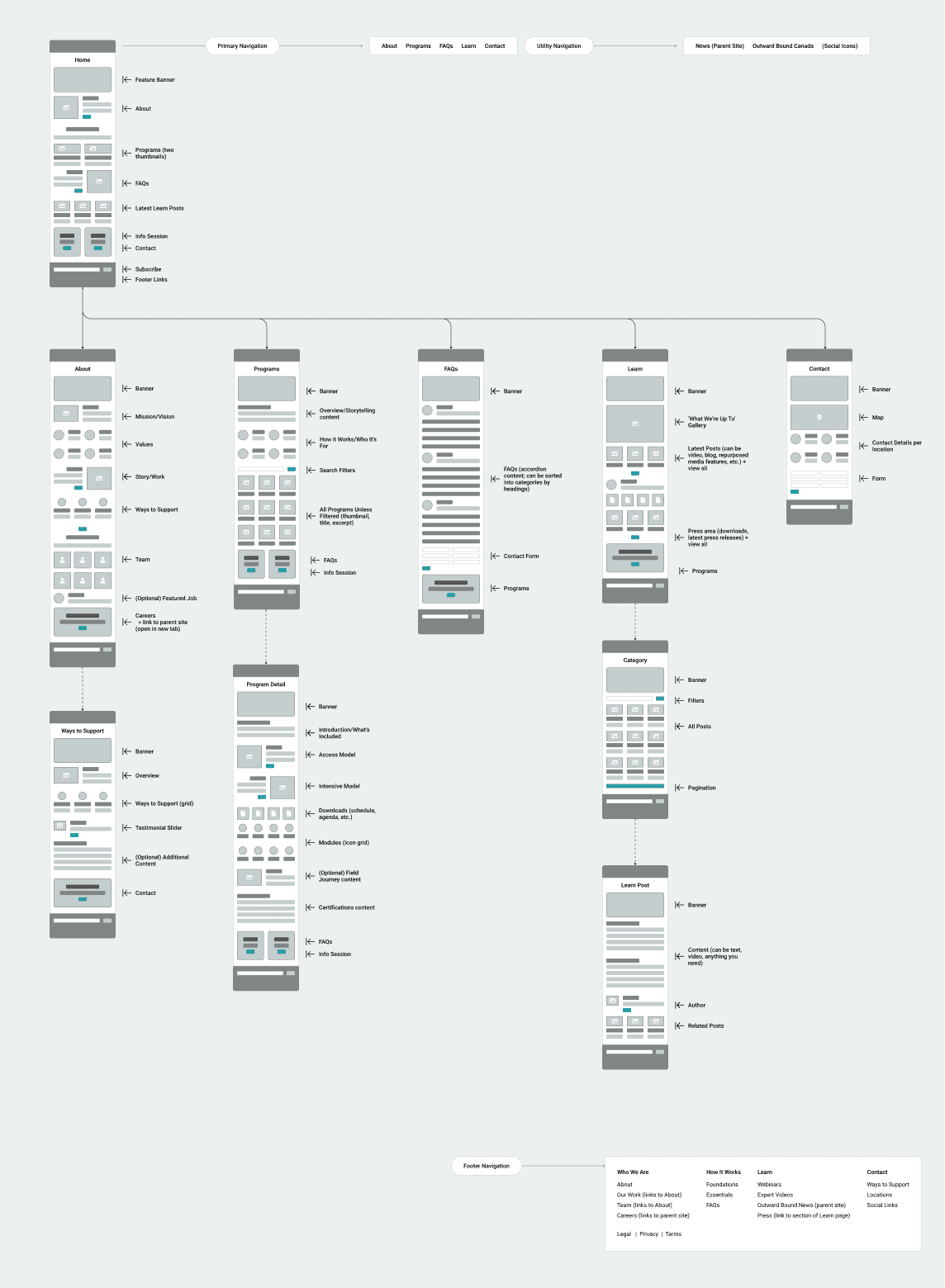
Outward Bound Canada has been creating access to youth outdoor adventures since 1969. Their training academy had grown too big for their main website, and needed a home of its own to showcase their programs and courses.
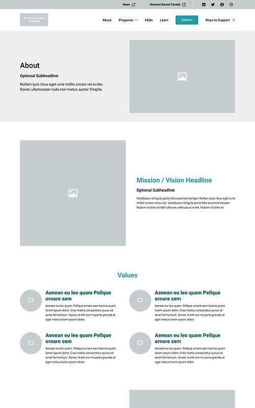
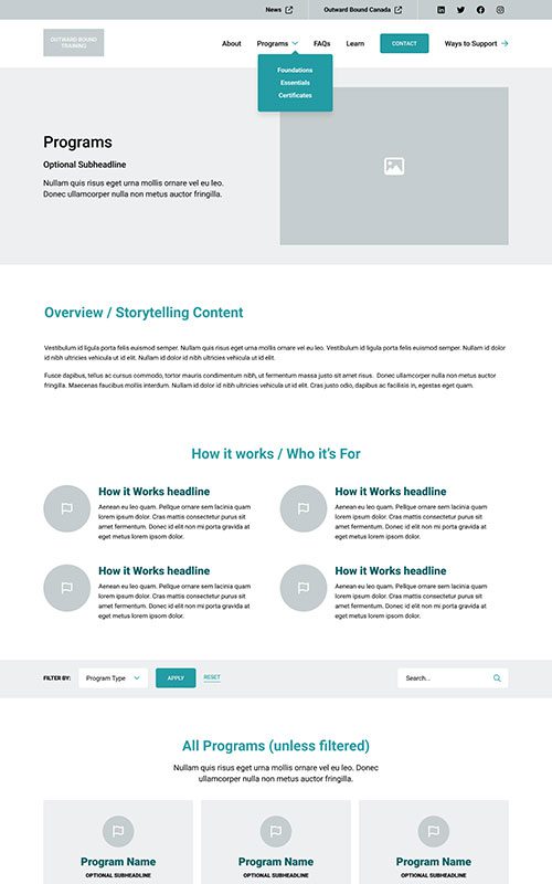
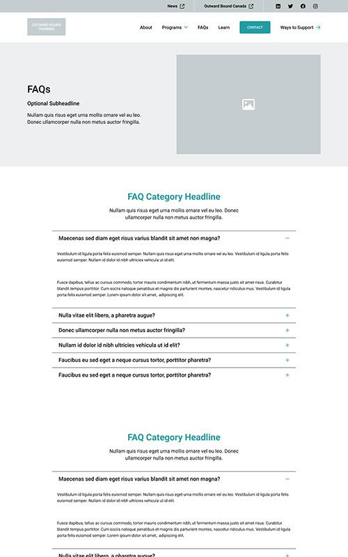
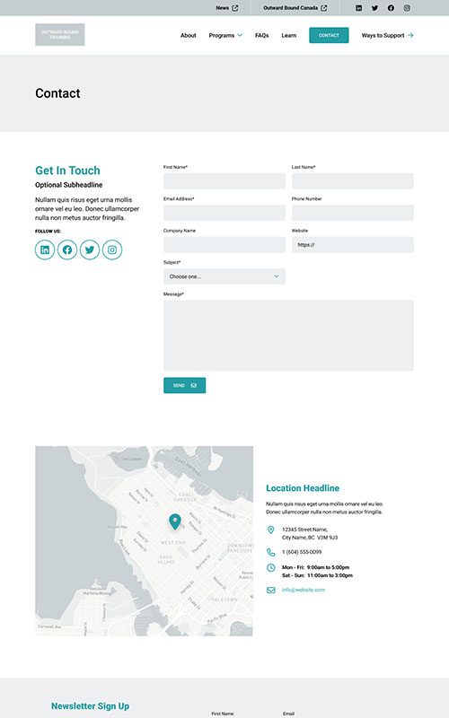
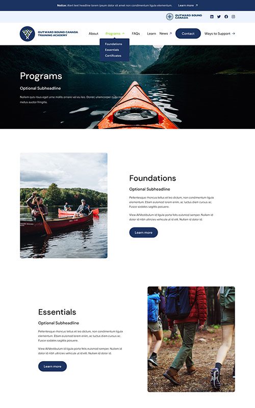
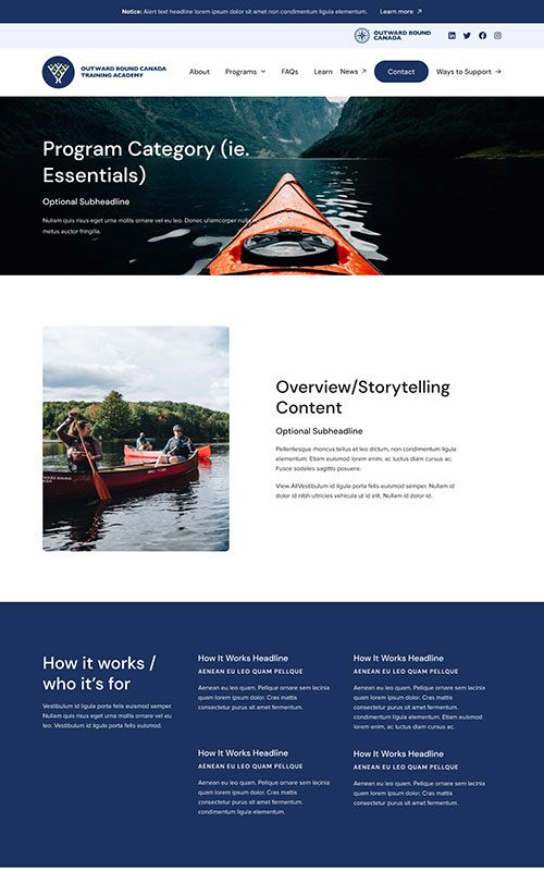
The primary focus of this web design project was building a clean, simple structure that’s engaging for their audience to navigate and explore – and just as easy for their team to manage, as courses need frequent updates. This website was also one of the first to be built on our proprietary site builder plugin, Refoundry.
PHASE 2
Style
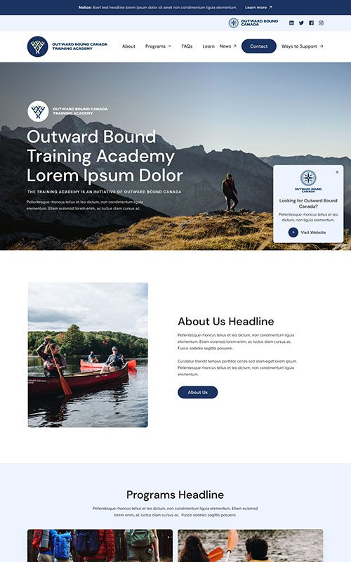
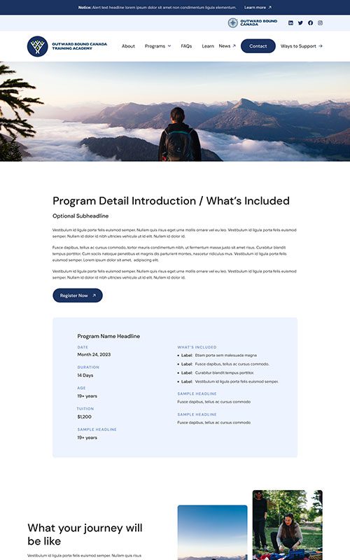
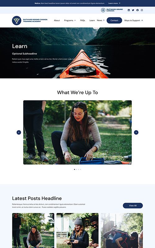
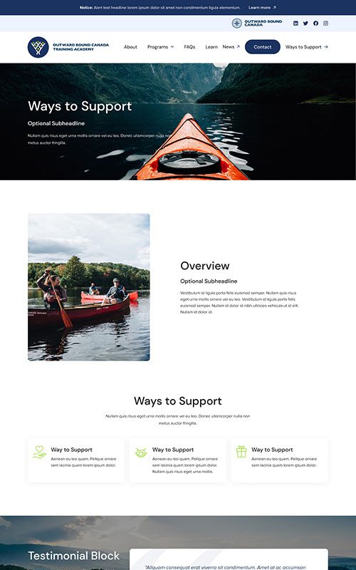
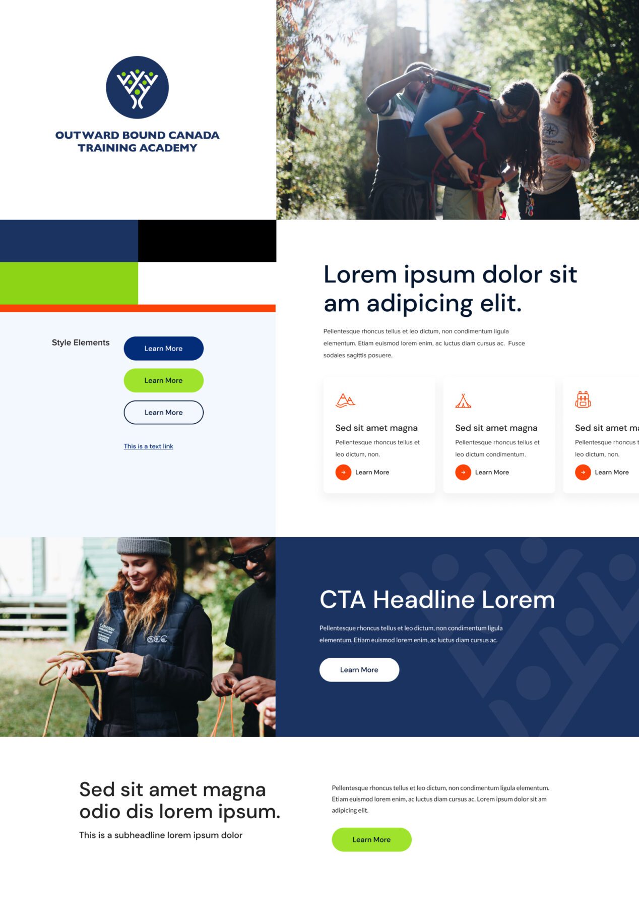
The new Outward Bound Training site needed to look and feel similar to the main Outward Bound site, so that users would feel reassured that it’s the same organization and trusted reputation. We took care to match their branding, but gave the new design unique touches like rounded edges on the photos, geometric backgrounds, and vivid green accents and hover effects.
Phase 3
Bringing it All Together
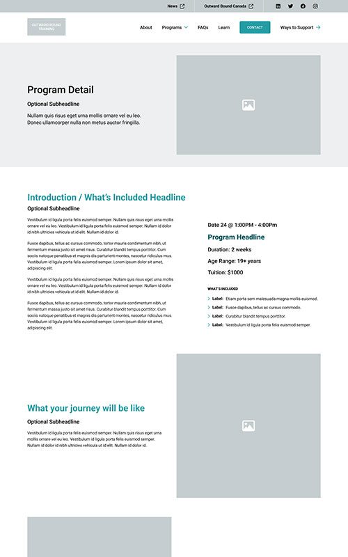
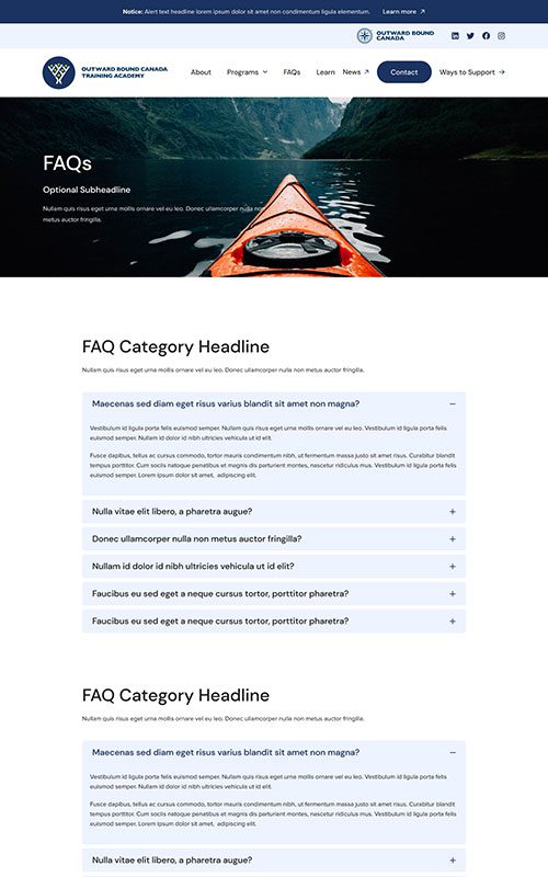
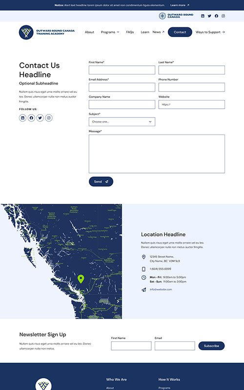
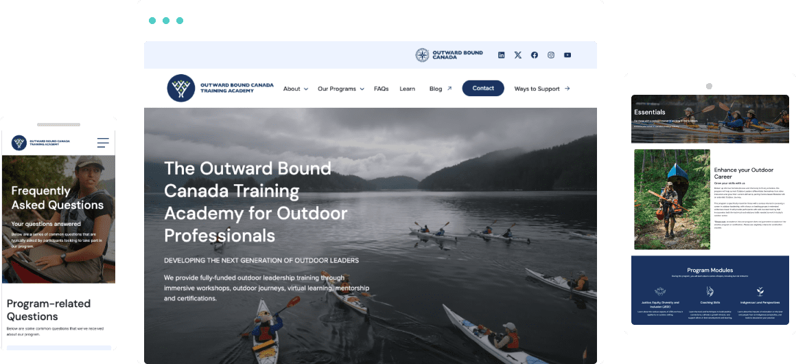
The all-new Outward Bound Training site feels like a breath of clean outdoor air with its earthy palette and bright, authentic photography. Finding answers or learning about information sessions is quick and easy to do. The new program and course pages give their team content to amplify as part of their marketing strategy. And the site is built on our site builder plugin, Refoundry, making it incredibly flexible and customizable. This is a big benefit for their team, to quickly update existing courses and add new ones as the academy grows.
Related Case Studies
Check out more of our web design case studies, to see the results we’ve helped our clients achieve.
+22 %
Engaged Sessions
Built With Refoundry
Blenz
Blenz needed a fresh new website to reflect their updated branding, and to help customers more easily find their way to online orders, app downloads, and perks.
Keep Reading+347 %
Organic Search Traffic
Built With Refoundry
Axis Insurance
Axis Insurance needed an all-new website to support a huge rebrand. The goal was to launch a visually powerful site that would significantly improve usability, navigation, and showcasing their specialized expertise.
Keep Reading