About the Organization
Neighbourhood Small Grants supports people who want to make their communities better places to live. Today, their programs are available in 26 communities across BC.
Objectives
- Align website with new branding and positioning
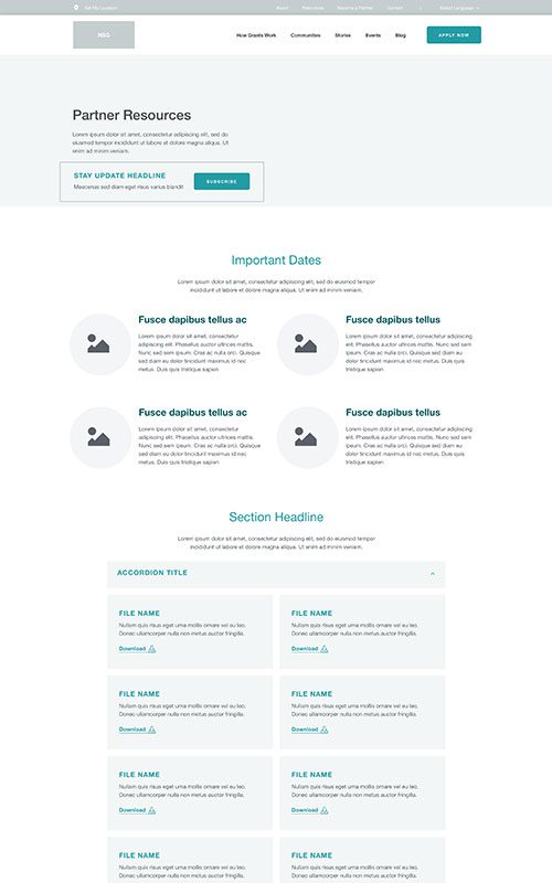
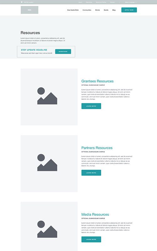
- Improve content strategy and site navigation for better accessibility
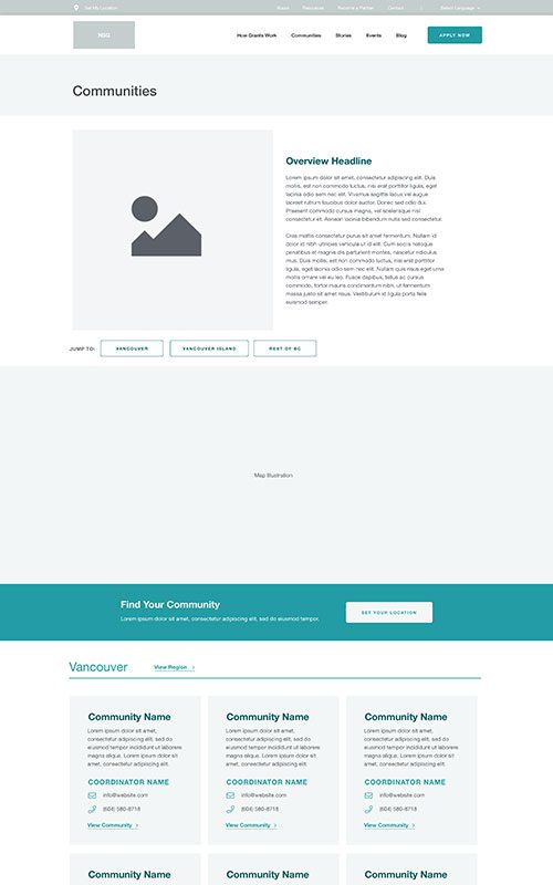
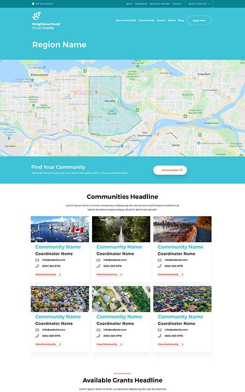
- Improve the experience and usability of the Communities Finder via Google Maps API integration with search and filter functions
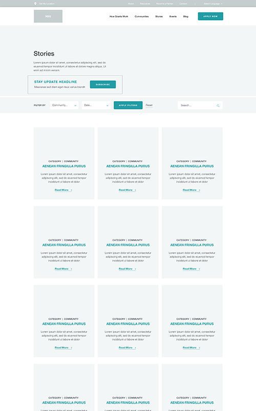
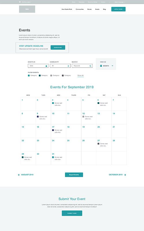
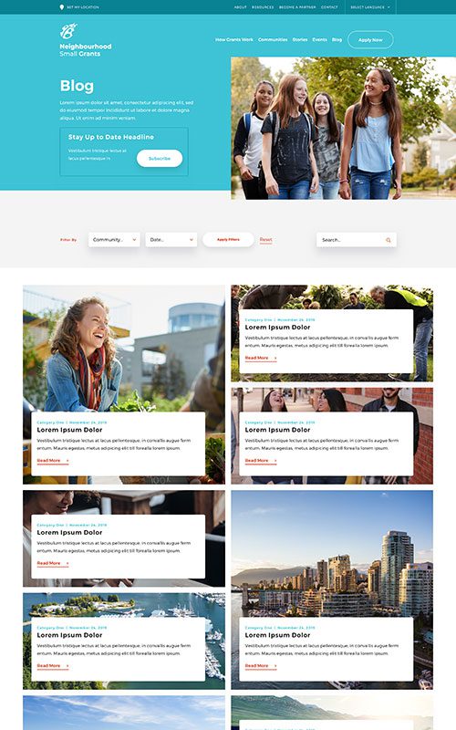
- Create a more user-friendly and more visual Events and Stories areas with improved navigation and filtering
- Grow social engagement and referral traffic through on-page AJAX sharing functions and dynamic Open Graph functionality
- Implement a fully responsive mobile-first solution backed by WordPress CMS
Results
Phase 1
Prototyping
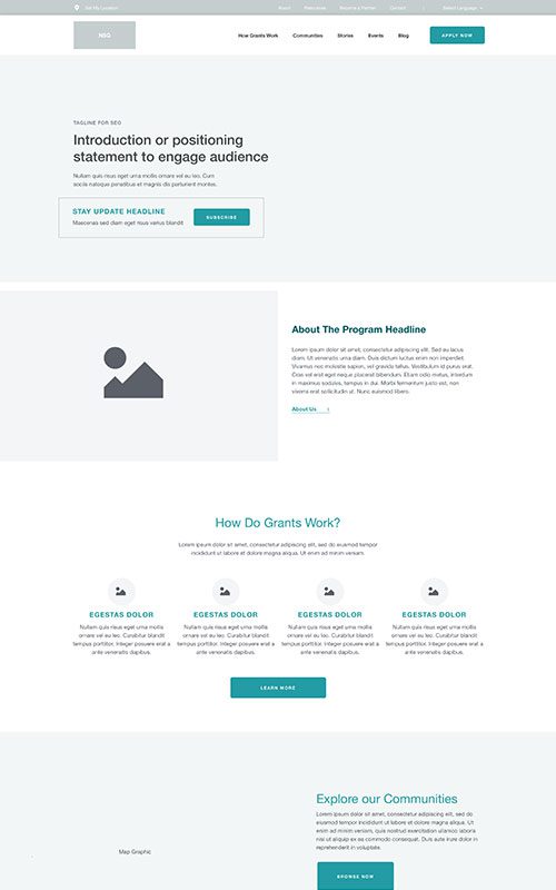
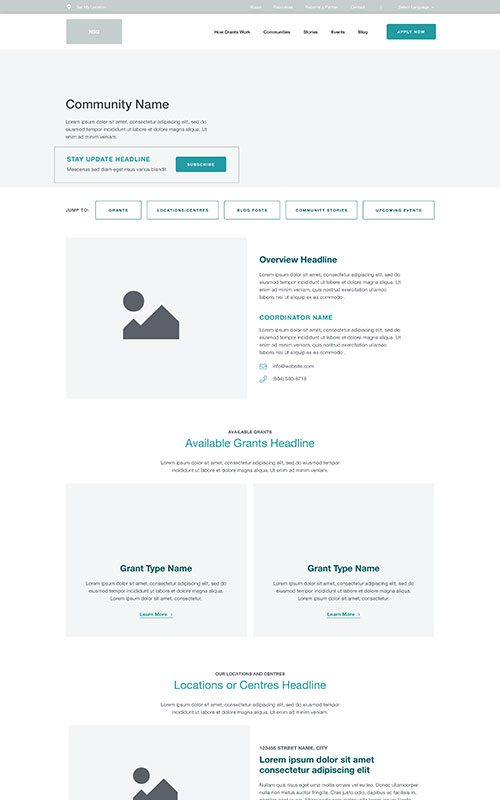
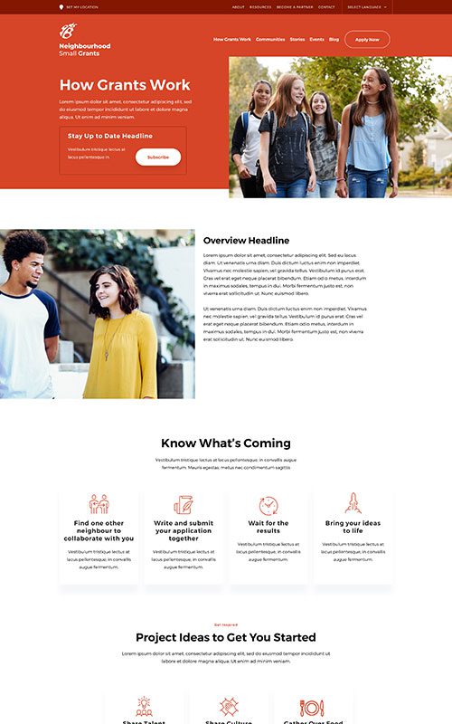
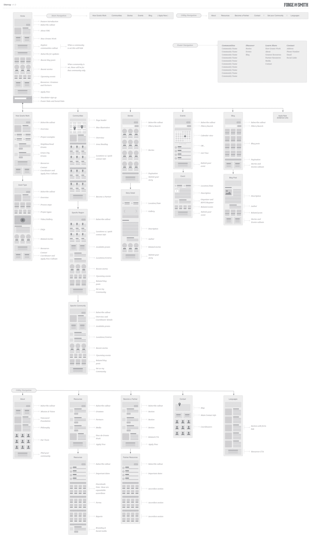
Neighbourhood Small Grants (NSG) went through an exciting rebrand that included a fresh brand strategy, logo, and digital personality. This gave their new web design and development project some big, exciting goals. The new multilingual website needed to capture their new tone and storytelling. And functionally, it was all about content mapping.
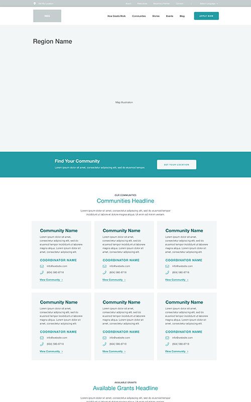
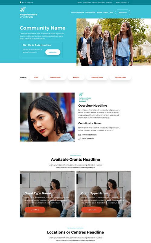
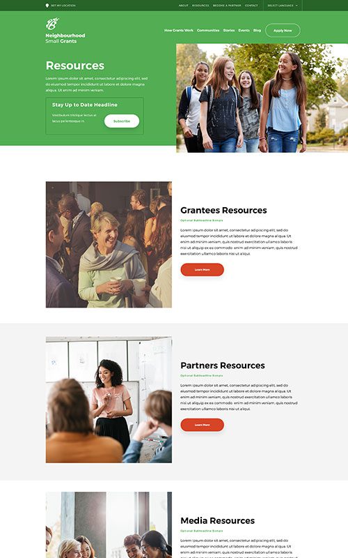
Because their service is so community-based, we needed to create more obvious paths for visitors to see local content. This meant developing a new structure, using Google Map APIs, and strong location-based filtering to deliver customized experiences. NSG also has community managers for each of the areas they serve, who all need to be able to easily manage their respective content.
Phase 2
Style
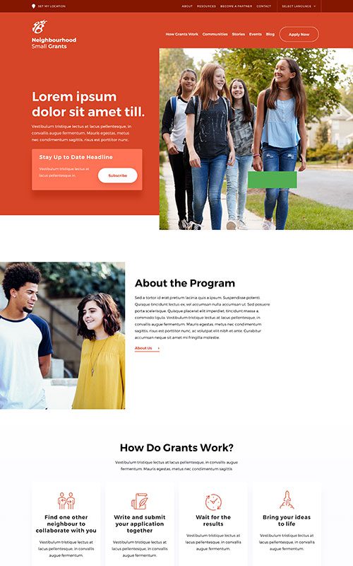
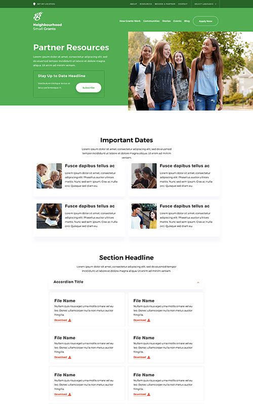
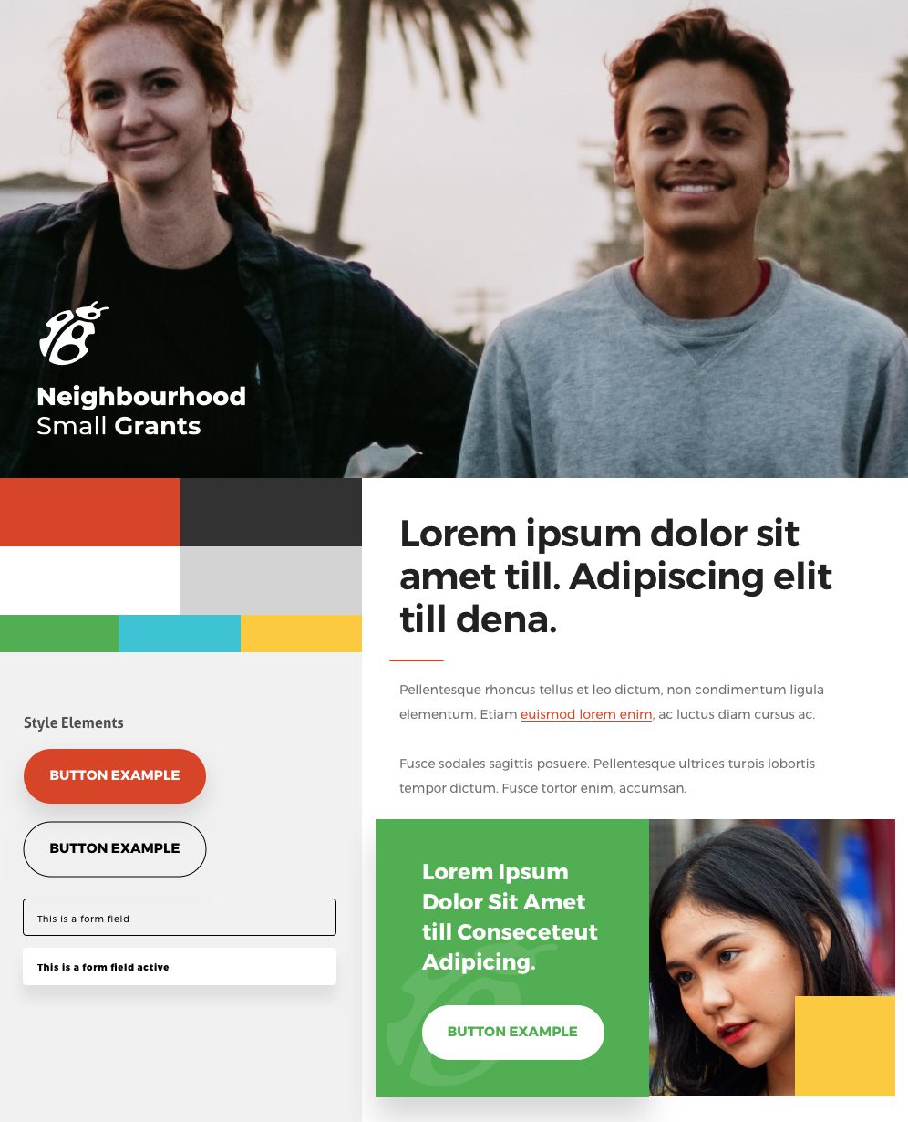
NSG had a brand new look, and the redesigned website needed to show it off to the world. We played up their bright, friendly new colour palette, and created a significantly stronger visual story through emphasis on space and fresh photography. The objective for new site copy was to seamlessly guide visitors while matching their new voice and tone.
Phase 3
Bringing it All Together
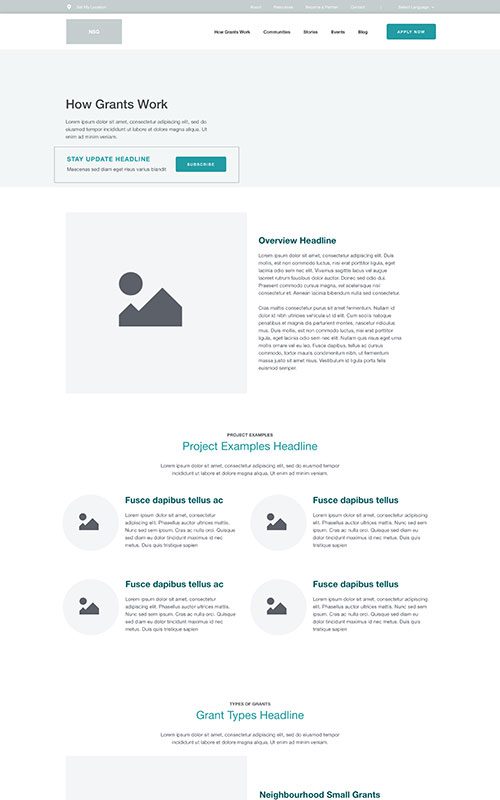
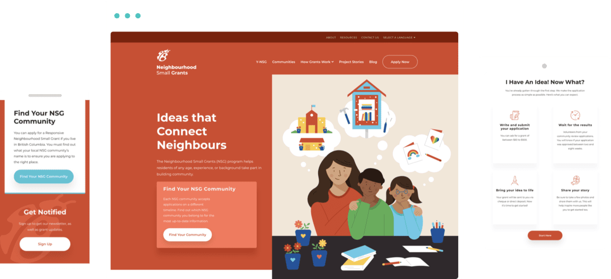
The new NSG website is a welcoming visitor experience. It’s significantly easier for people to find local content – all they have to do is set their location, and they’ll always see the latest for their community. The grant application process is also easier to find and understand. And because the site is built on our flexible, low-code site builder, Refoundry, it’s easy for their team to add and manage grants. In the short time since launch, audience engagement has already significantly improved on both desktop and mobile devices compared to last year.
Related Case Studies
Check out more of our web design case studies, to see the results we’ve helped our clients achieve.
Non-Profit
BC Dairy
A new web design with vastly improved structure and navigation help BC Dairy’s different audiences discover their array of tasty content.
Keep Reading+986 %
Conversion Rate
Built With Refoundry
Pacific Public Health Foundation
PPHF’s resource and campaign content had become difficult to navigate. They needed a full website redesign to improve site architecture and content discoverability – and on a short timeline.
Keep Reading