+22 %
Engaged Sessions
Built With Refoundry
Blenz
Blenz needed a fresh new website to reflect their updated branding, and to help customers more easily find their way to online orders, app downloads, and perks.
Keep ReadingHappy Planet’s food and beverages taste great, and strive to make you feel great by using only the freshest, highest quality ingredients that are ethically sourced and organically grown.
Happy Planet is a popular food and beverage brand known for its natural ingredients and passion for the environment. They like to keep their website and its content simple, but they had recognized a need to improve their digital strategy and content marketing.
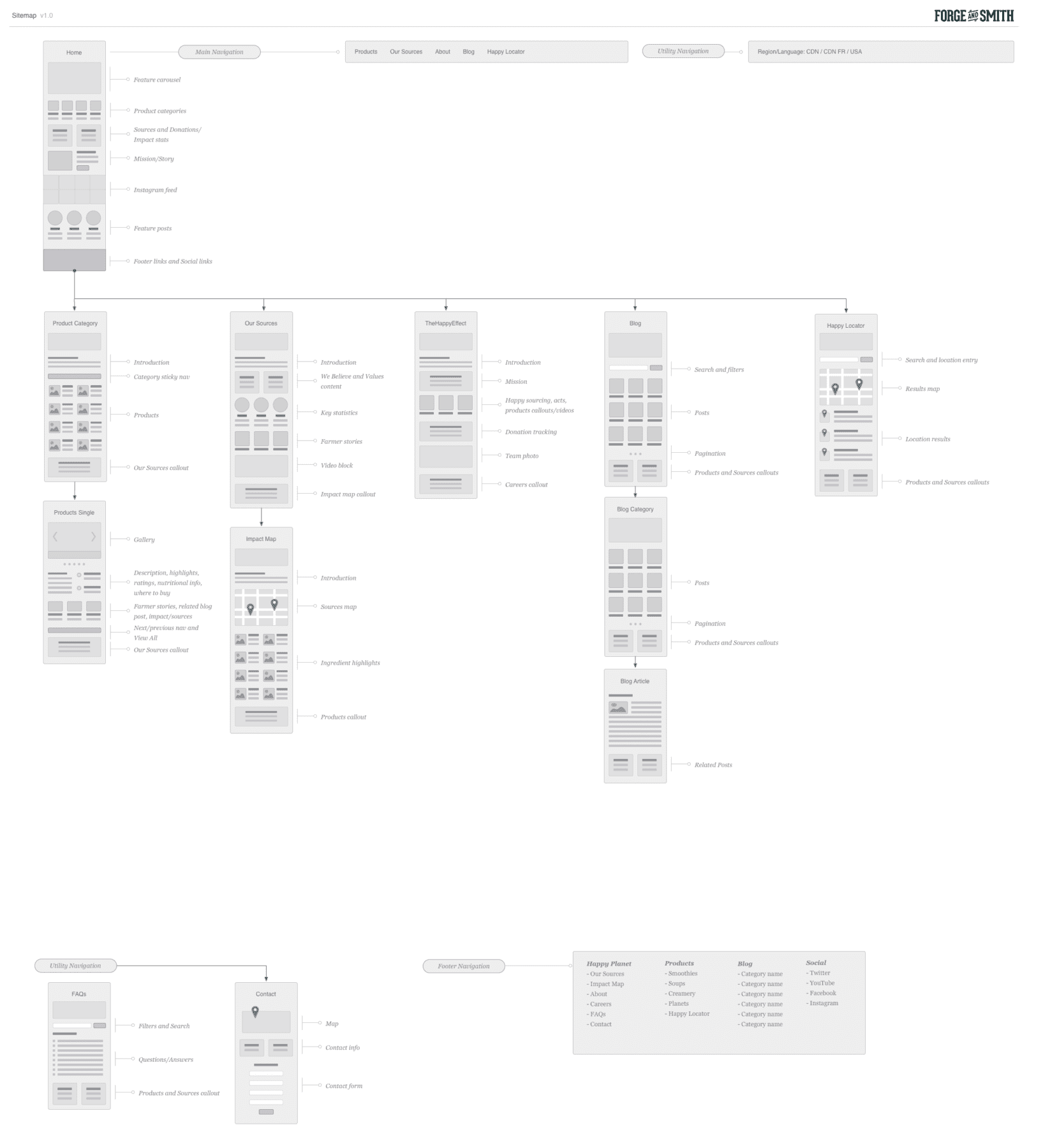
This web design project was driven by content strategy: creating an engaging product catalogue site, and deepening their existing content for both search and user experience. We wanted to provide more opportunities for visitors to get to know Happy Planet, with more content around sustainability, environment, and community involvement. The update also included creating unique experiences for customers in the US and Canada (in both English and French) — different homepages, and different products.

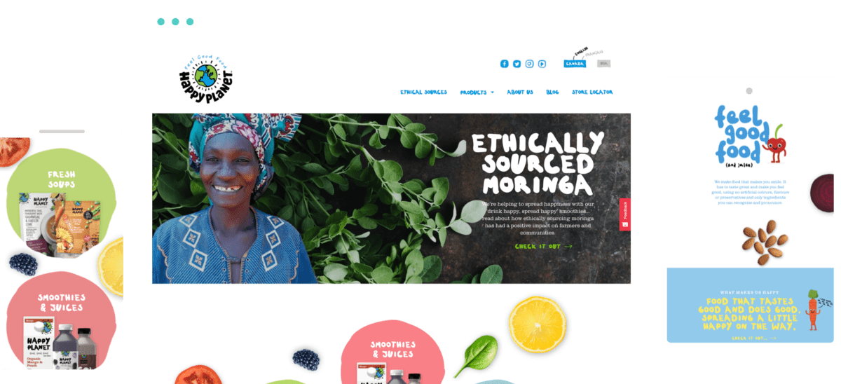
The new Happy Planet website design included a slight brand reposition. The logo, colours, and typography would remain the same, but the overall style needed to be updated to match their fresh new product packaging. The objective was to keep the website simple to stay true to their passion for simple ingredients, while adding vibrant splashes of colour, more illustrations, and more photography.
The new Happy Planet website feels youthful and fun, and as fresh as their ingredients. We were able to use WPML to deliver custom experiences to different regional audiences, and create a powerful ‘Where To Buy’ functionality to drive conversions. The content strategy is significantly stronger, with improved lateral navigation opportunities between products, blog posts, and ingredient information. Their brand storytelling is further elevated through Instagram activity integration onto their homepage.

Check out more of our web design case studies, to see the results we’ve helped our clients achieve.
Blenz needed a fresh new website to reflect their updated branding, and to help customers more easily find their way to online orders, app downloads, and perks.
Keep ReadingAxis Insurance needed an all-new website to support a huge rebrand. The goal was to launch a visually powerful site that would significantly improve usability, navigation, and showcasing their specialized expertise.
Keep Reading