About the Company
Established in 1998, the Centre for Advancing Health Outcomes is a group of experienced health outcomes researchers and support staff. Their work helps improve health in populations, and transforms health systems for the future.
Objectives
- Improve overall aesthetic and user experience and to make the site more engaging
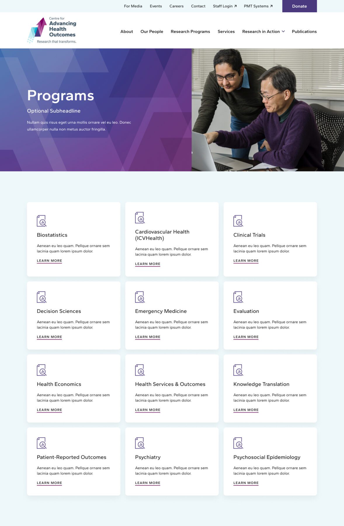
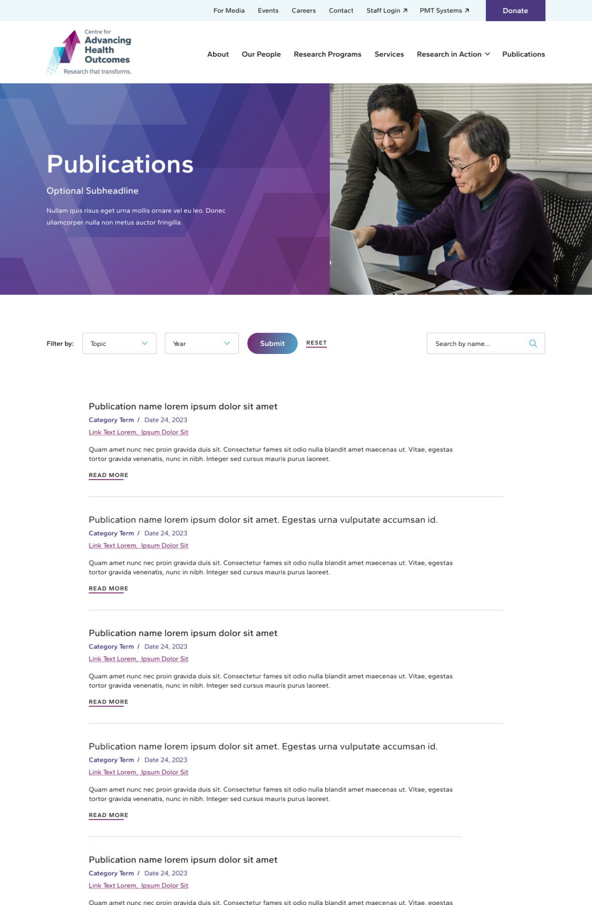
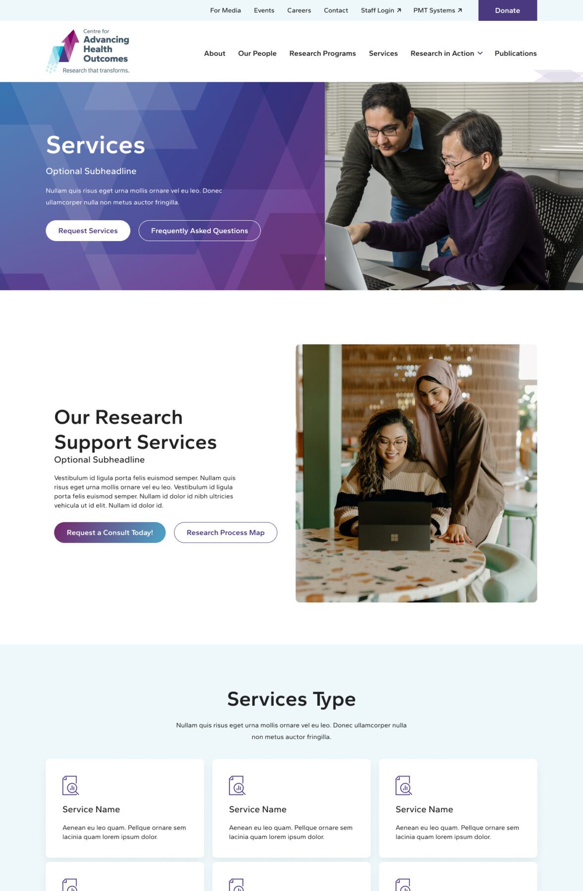
- Improve site architecture and navigation to enable easier browsing and a more frictionless experience
- Build on SEO foundations to increase search engine traffic and drive future growth
- Implement a fully responsive solution backed by WordPress CMS for easier content management
- Re-skin the design post-launch to reflect a new rebrand
Results
Avg. Session Duration
+
0
%
Year-Over-Year
Phase 1
Prototyping
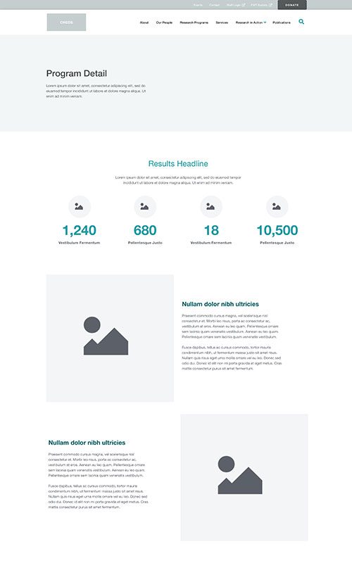
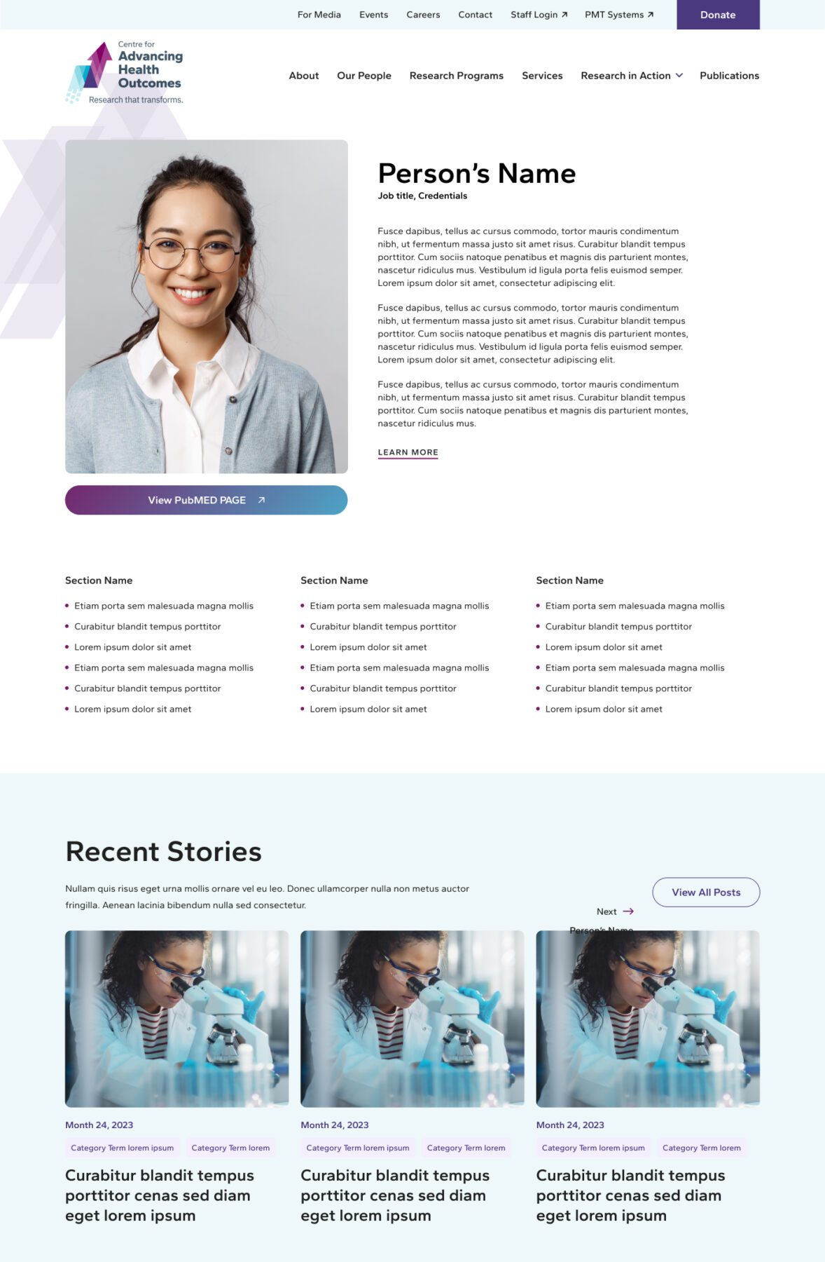
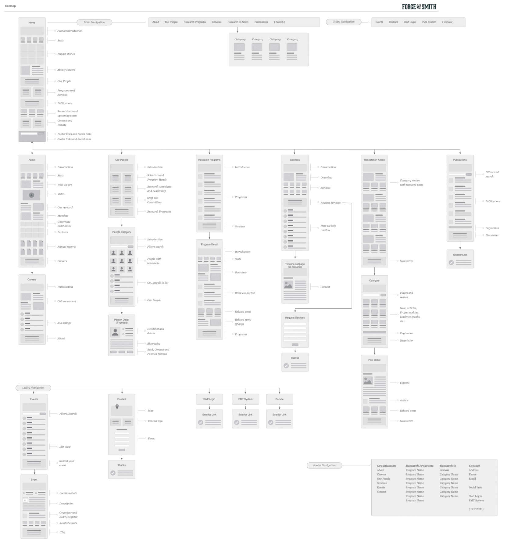
The Centre for Advancing Health Outcomes reached out to us after our successful web design work on another UBC-connected site. Their site is home to a wealth of valuable resources, but it needed a much stronger structure for all that content.
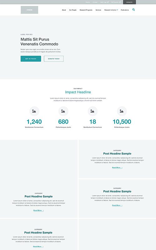
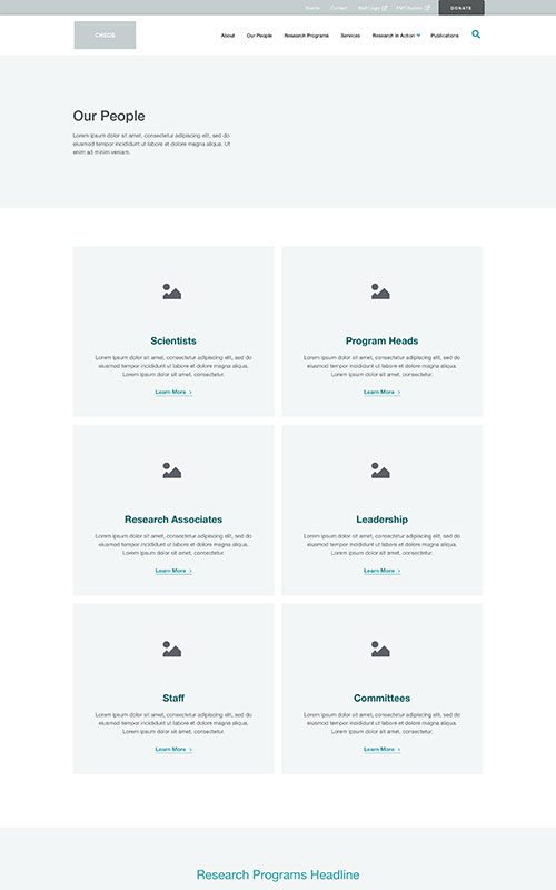
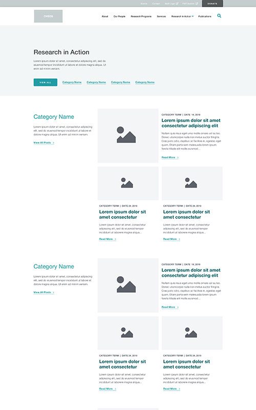
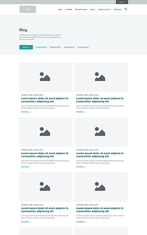
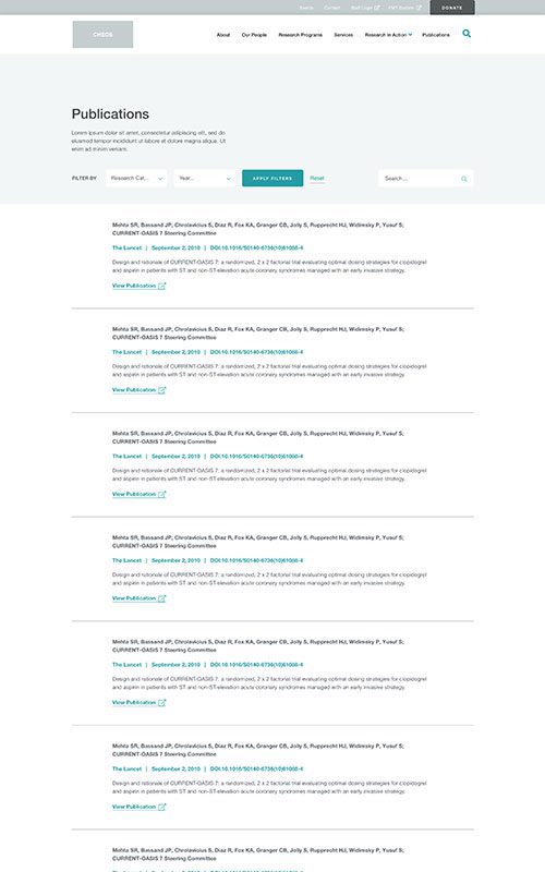
Our focus for this project was heavy on the user experience – planning a more logical information architecture to make all that content easy to search and browse. There was also an opportunity to improve their storytelling, and really showcase their vital work.
Phase 2
Style
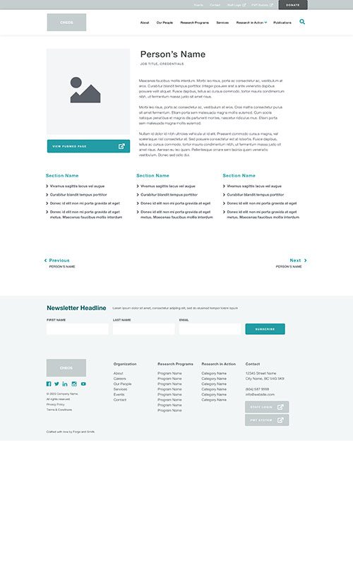
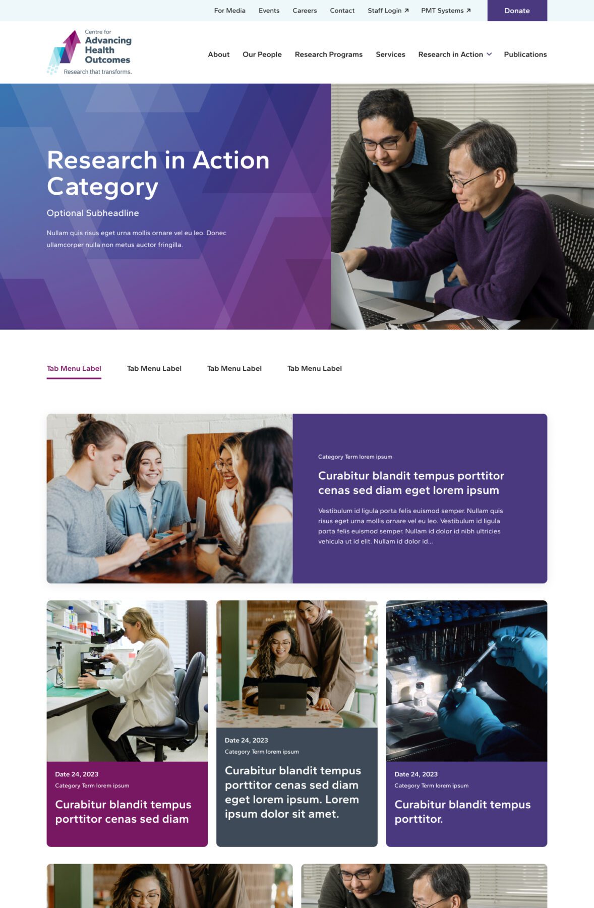
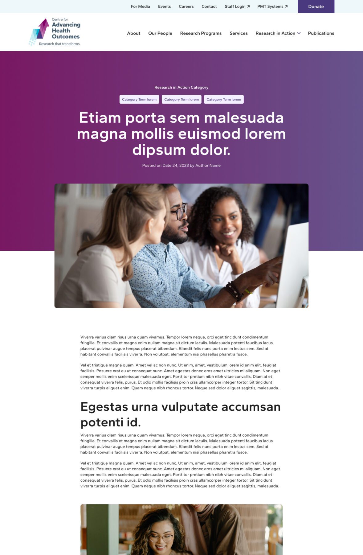
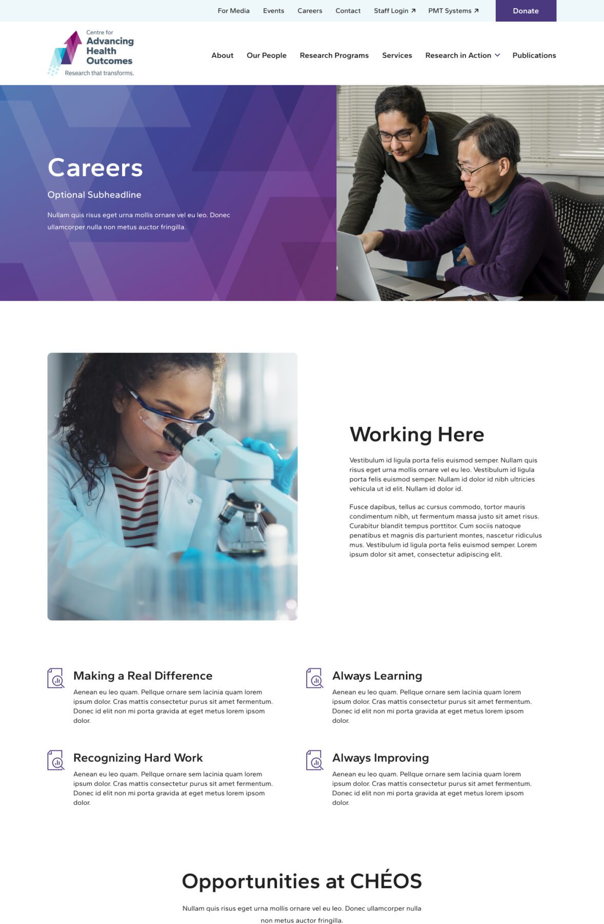
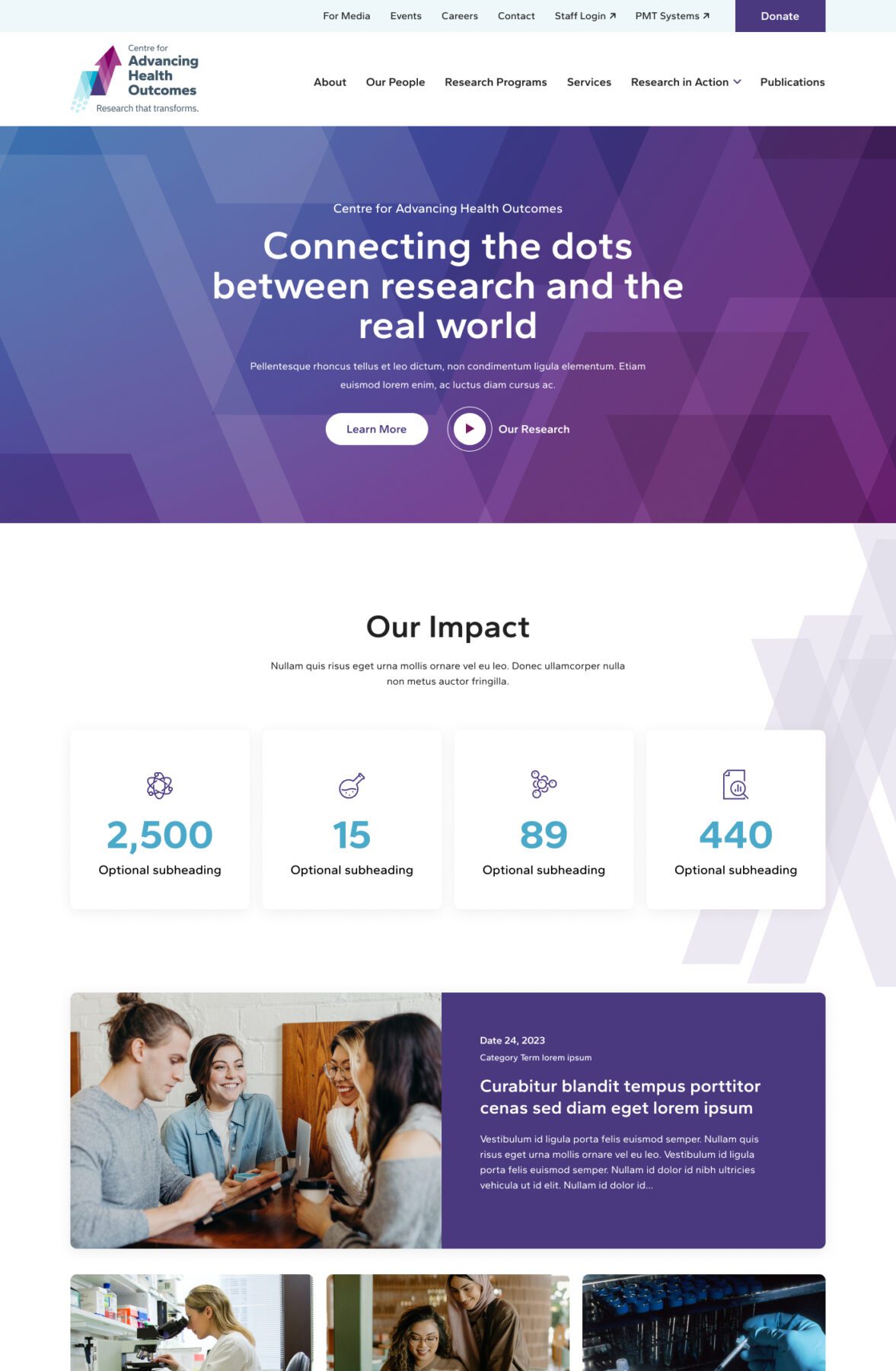
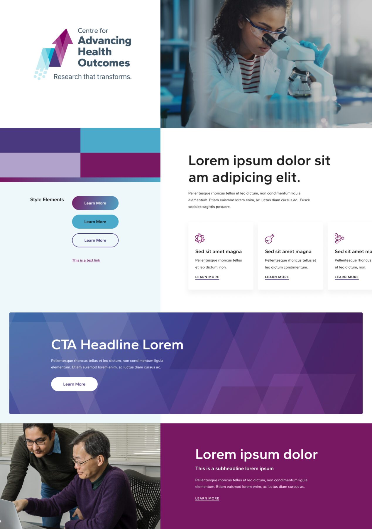
The old Centre for Advancing Health Outcomes site felt cluttered, which isn’t the right image for a powerful team of researchers! The main goal for the new design was to create more space, so that elements vital to the user experience (like navigation options and headlines) would stand out. We also incorporated more authentic photos of the people who make up their organization, and played up the use of their brand colours.
Phase 3
Bringing It Together
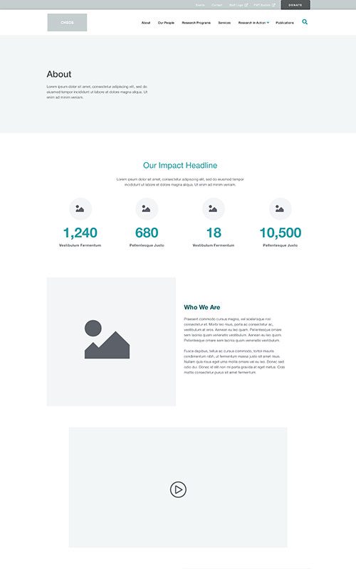
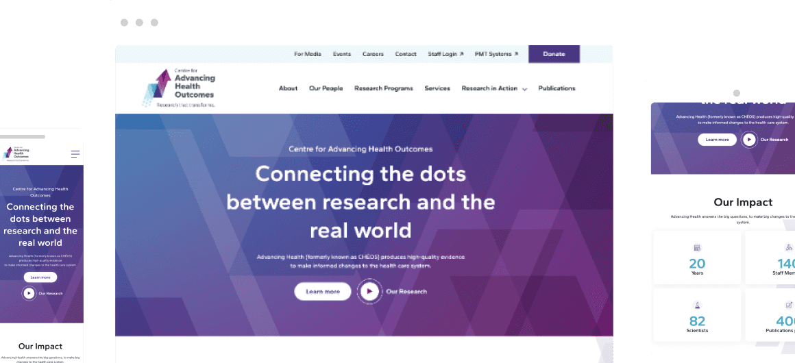
The new Centre for Advancing Health Outcomes website is a much cleaner and more appealing experience for visitors. Paths to content for each of their key audiences are immediately clear, and the power of their work is given a boost through new content like the ‘impact’ stats counter area on the About page. It’s much easier for their team to add and manage content, now that the site is built on our site builder plugin, Refoundry. And we have since done a redesign of their site’s look and feel atop the existing UX, to match their 2023 rebrand.
Related Case Studies
Check out more of our web design case studies, to see the results we’ve helped our clients achieve.

Built With Refoundry
BC Alliance for Healthy Living
BCAHL needed a big restructure of their high-volume educational resource content, which had become difficult for their team to manage – and for users to navigate.
Keep Reading+46 %
Engaged Sessions
Built With Refoundry
MIRA
MIRA’s high volume of resources had outgrown their old site. They needed a full redesign to drastically reorganize all that content around multiple newly clarified audiences – while meeting high accessibility standards.
Keep Reading