About the Project
Bright Health, formerly AIHS, is a not-for-profit organization that aims to inspire transformation in healthcare. They design and build software products and solutions for optimum patient care and improved outcomes.
Objectives
- Improve overall site architecture and navigation to enable easier browsing and a more frictionless experience
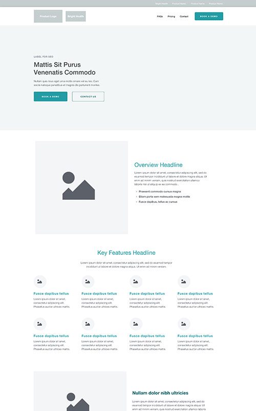
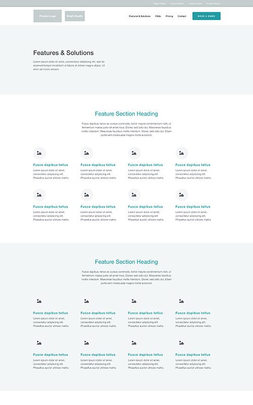
- Build out more robust product specific sub-sites to help focus SEO and marketing initiatives for greater engagement and conversion
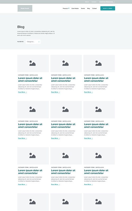
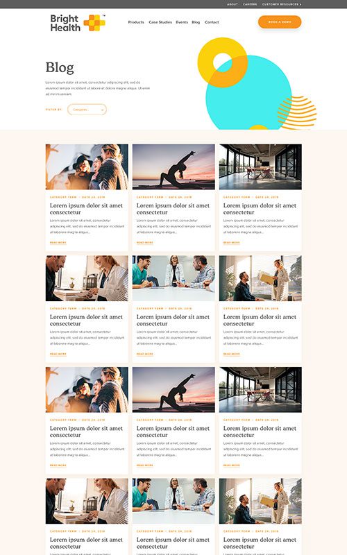
- Implement a more search friendly and socially-focussed Blog to drive user engagement and value
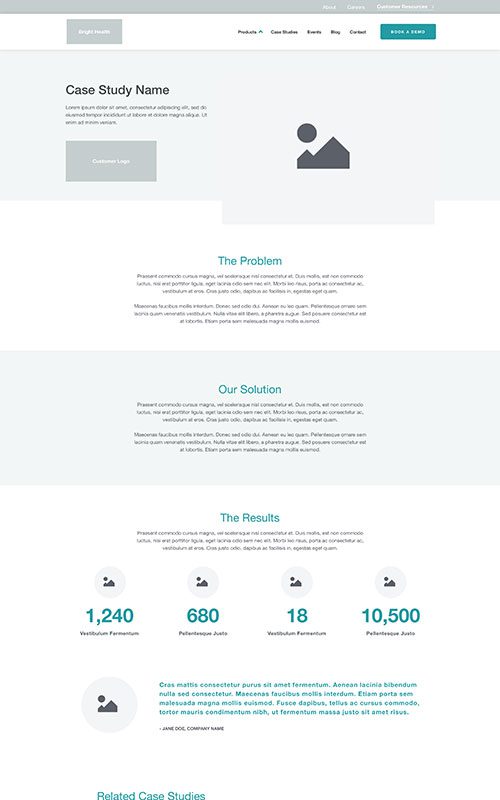
- Implement case studies to improve trust and credibility and create better conversion through results
- Establish SEO foundations for future growth and leverage organic traffic
- Support social media activity and engage referral traffic
- Implement a fully responsive solution backed by WordPress CMS
Results
Bounce Rate
–
0
%
Year-Over-Year
Faster Page Loads
+
0
%
Year-Over-Year
Phase 1
Prototyping
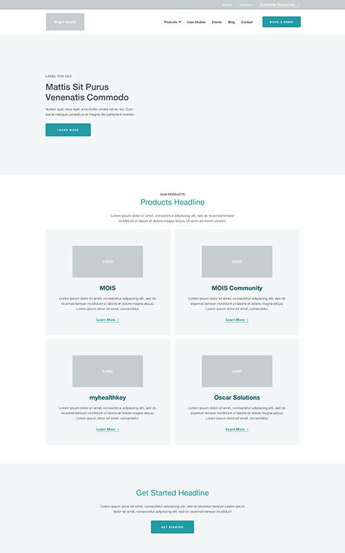
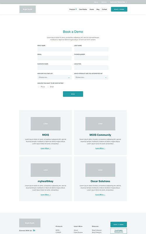
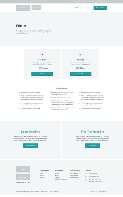
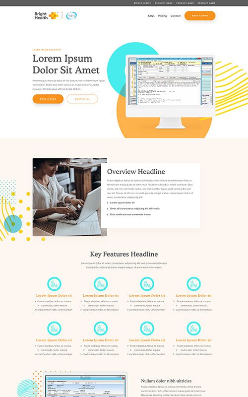
Applied Informatics for Health Society (AIHS) came to us approaching a rebrand, to Bright Health, and needing a fresh website to support their helpful healthcare software products. Their existing site was text-heavy, and didn’t effectively communicate their story or have clear paths to conversion.
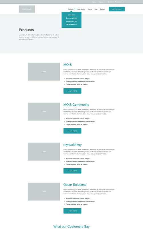
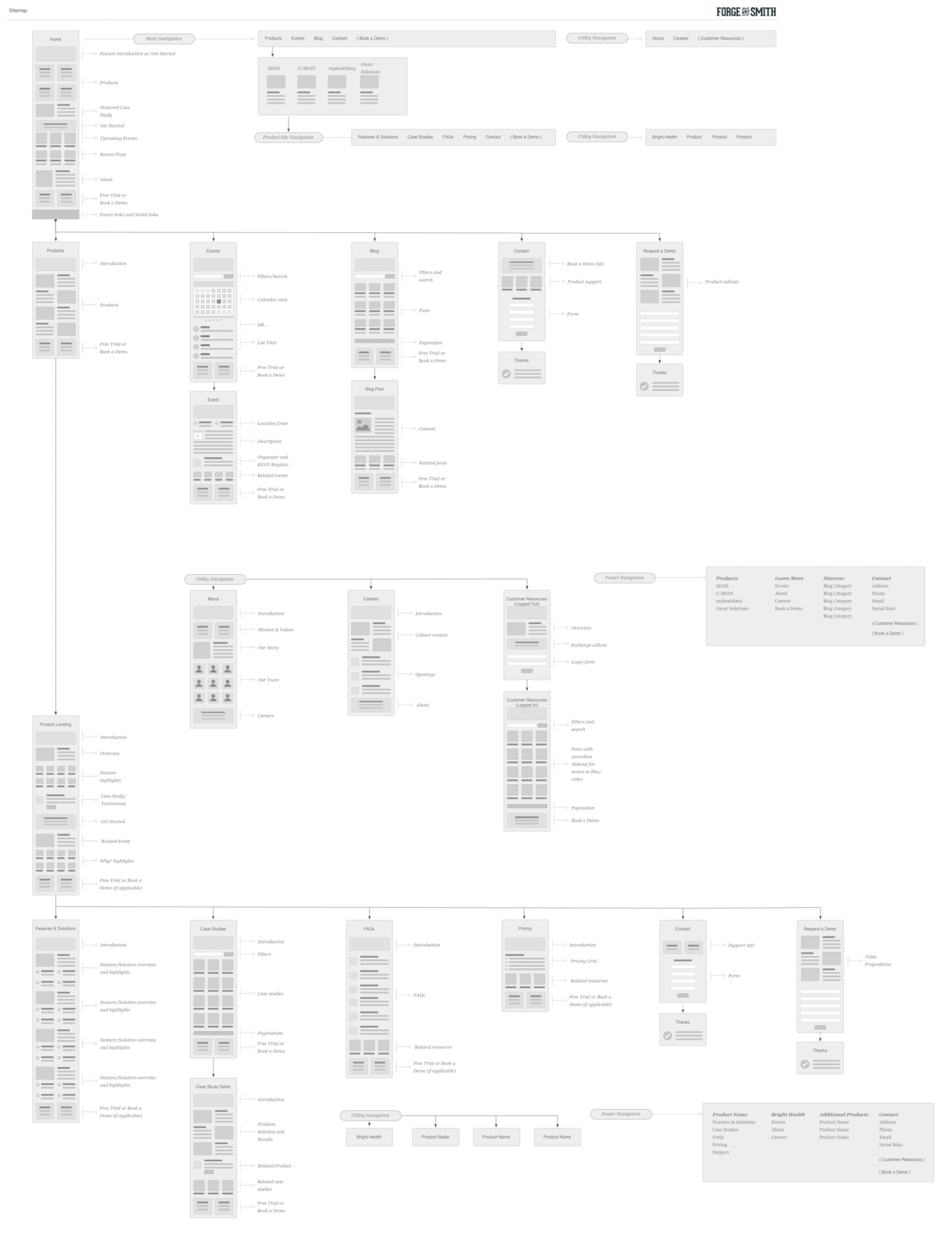
The goal for the new website design was to both deepen their content and to reduce clutter – not an easy task! Each of the software products would get its own micro-site on a subdomain, using the same designs and branding. We’d also add a case studies area for credibility, and a blog area to drive business growth and SEO.
Phase 2
Style
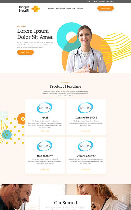
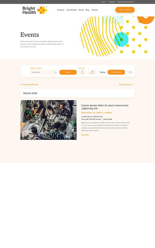
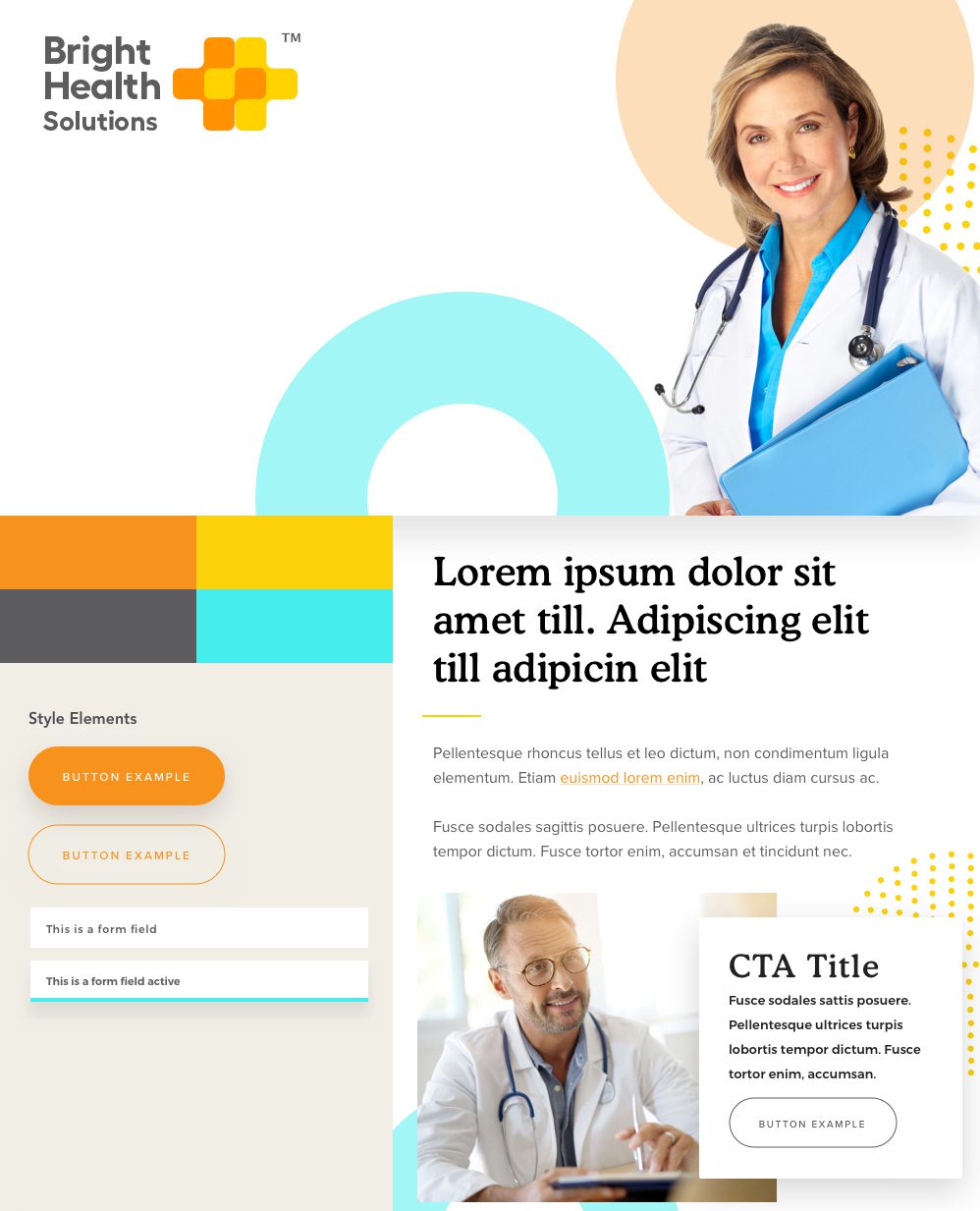
The AIHS rebrand to Bright Health included a new palette and more exciting colours to work into the design. We leaned into the orange and yellow, which feel fresh and welcoming. The aqua accents and new typography are youthful and modern, which evoke their ambitions to transform healthcare with newer, better software.
Phase 3
Bringing it All Together
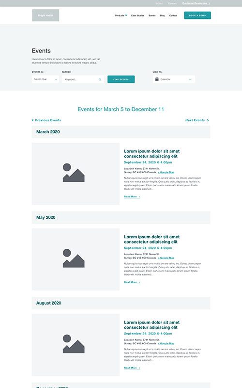
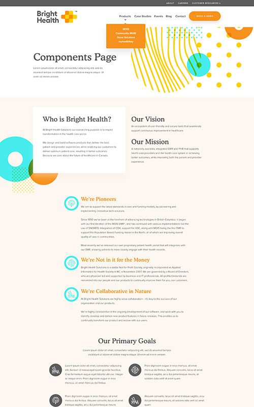
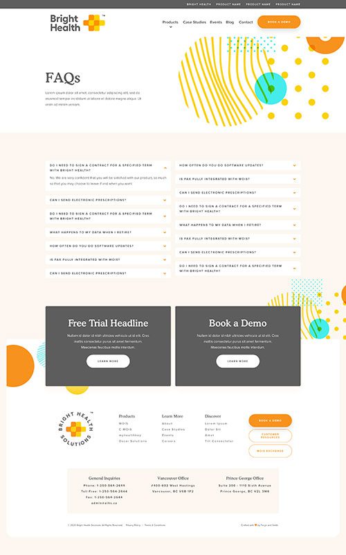
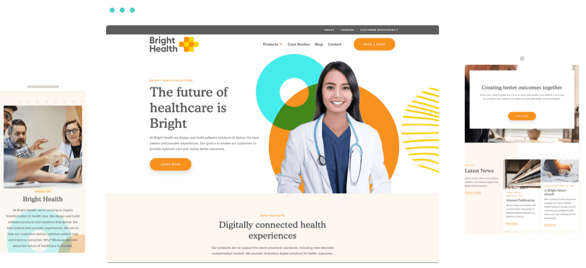
The new Bright Health website is a significantly stronger user experience, with improved navigation and content. The vast amount of technical information about each software product is balanced through visuals and accordion-style sections that can be hidden or expanded. There are new page components for related content and next steps to help drive trials and demos. And their case studies area now showcases their success stories in greater detail.
Related Case Studies
Check out more of our web design case studies, to see the results we’ve helped our clients achieve.
+166 %
Conversion Rate
Built With Refoundry
Sandstorm Gold Royalties
Sandstorm Gold needed a complete redesign to increase investor appeal. We designed and built multiple new custom features to give the site engaging movement, and help drive content discovery.
Keep Reading+43 %
Faster Page Loads
Technology & Investment
Forestry Innovation Investment
The new website we crafted for Forestry Innovation Initiative helped them significantly improve their page speeds, engagement, and traffic – but most importantly, it made it easier for their team to manage their content.
Keep Reading