About the Project
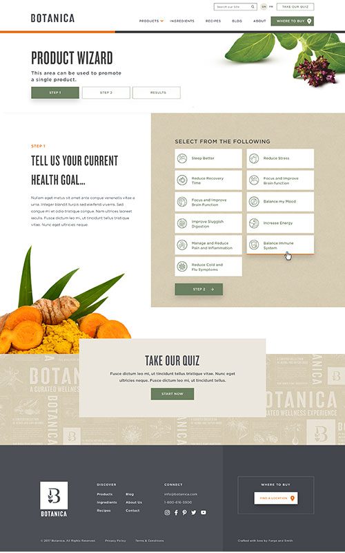
Botanica is a Vancouver-based nutrition and wellness brand, distributing globally curated natural health products. Their selections use whole herbs and ingredients, and are free from fillers, artificial flavours and colours. Their goal is to inspire natural wellness through mindfulness, choice, and education adapted to their customers’ unique health journeys.
objectives
- Improve overall site architecture and navigation to enable easier browsing and a more frictionless experience
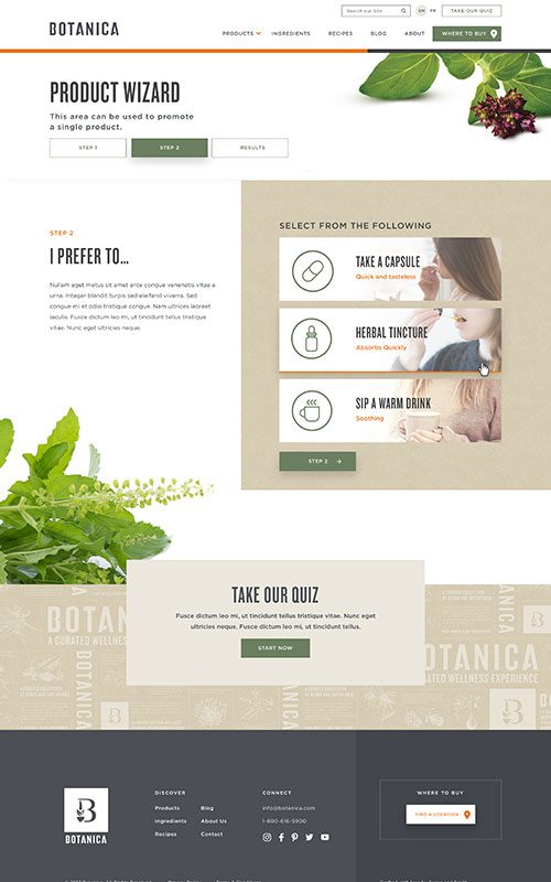
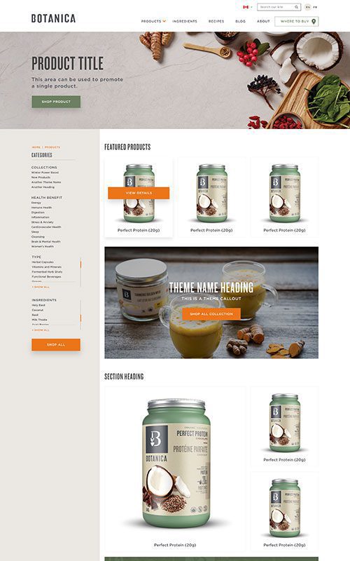
- Create a more user-friendly and more visual product story with improved navigation and filtering
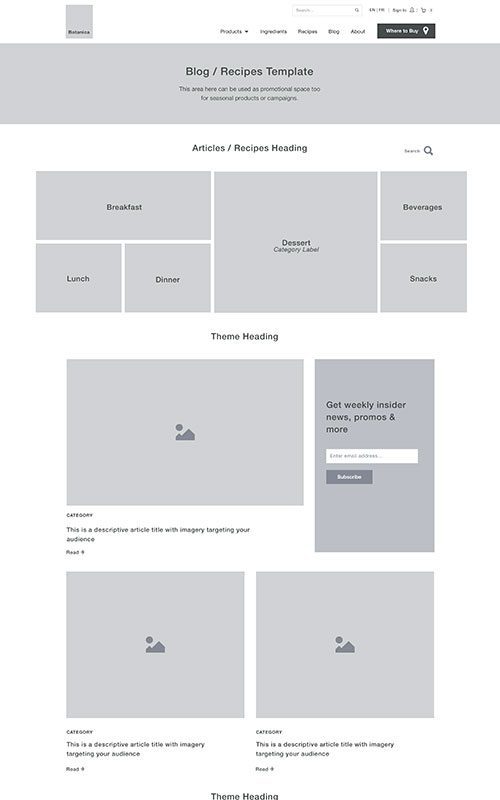
- Reorganize and more thoroughly integrate blog content throughout the product story to improve conversion and trust-building
- Dramatically improve SEO performance
- Decrease bounce rate to a healthy number through stronger content strategy and engaging inter-site navigation
- Implement a fully responsive solution backed by WordPress CMS, including WPML for French integration
Results
Pageviews
+
0
%
Year-Over-Year
Mobile Traffic
+
0
%
Year-Over-Year
Conversion Rate
+
0
%
Year-Over-Year
Phase 1
Prototyping
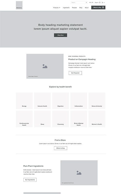
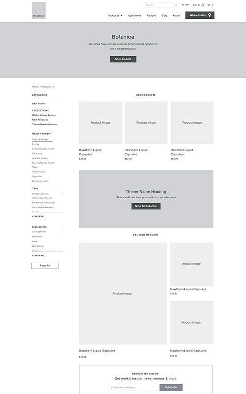
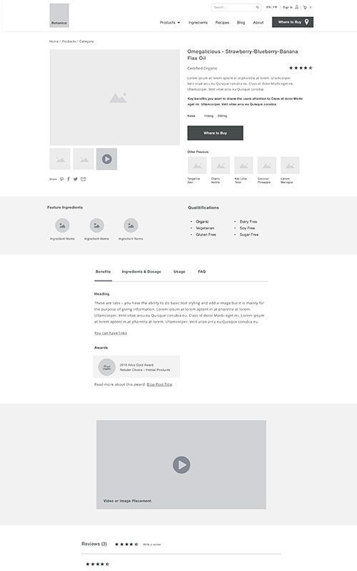
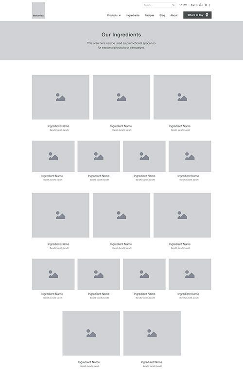
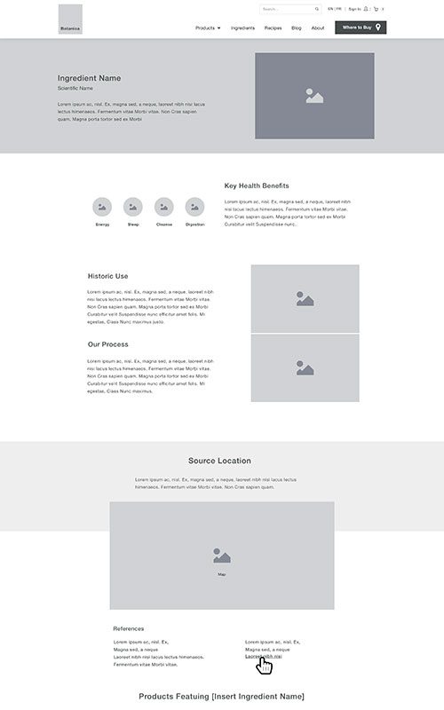
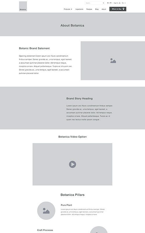
Botanica came to us with a lot of great content and a compelling brand story. Where they needed help was helping visitors find relevant content quickly and effortlessly, and communicating their dedication and commitment to wellness through site-wide branded storytelling.
The biggest challenge would be implementing the right combination of browsing filters, galleries, featured content, embedded recipes, and lateral navigation opportunities, while still weaving that passion and purpose into new and existing pages.
Phase 2
Style
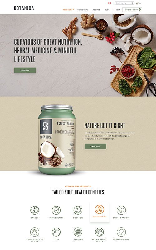
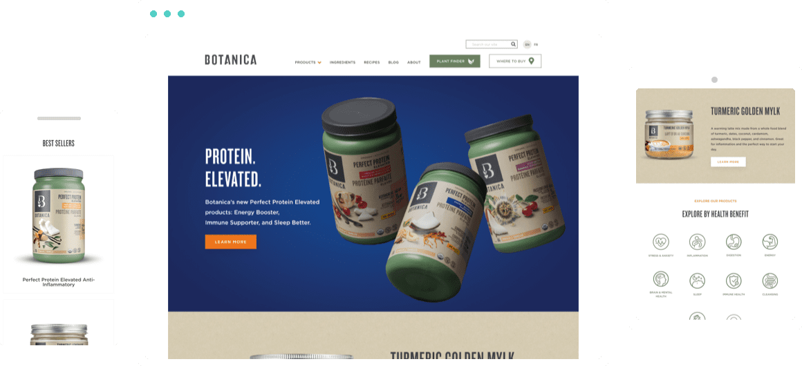
When we approached designing Botanica’s new site, we adopted same holistic style that is present in their new branding. We used the earth-tone colours from their packaging and photography campaign, as well as their bold typography to create a site that is clean and usable.
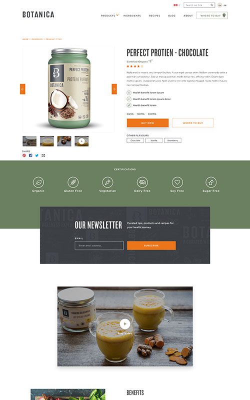
We took the ‘less is more’ approach, keeping the colour palette simple and subdued to showcase their beautiful product shots. Our goal was to showcase the products and to guide users to get the information they need, to encourage conversions.
Phase 3
Bringing it All Together
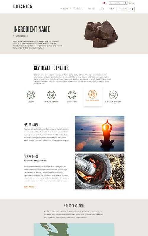
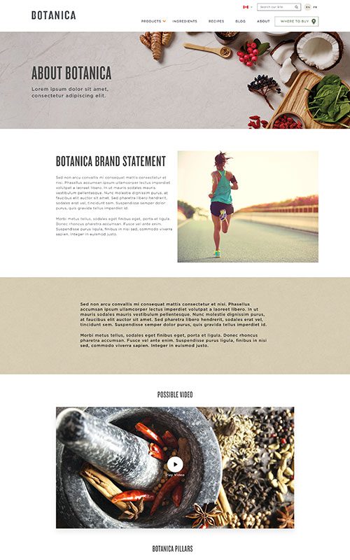
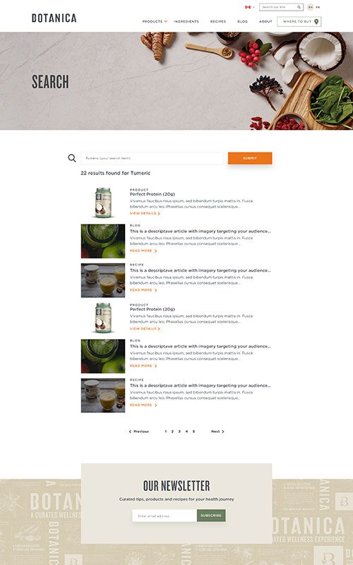
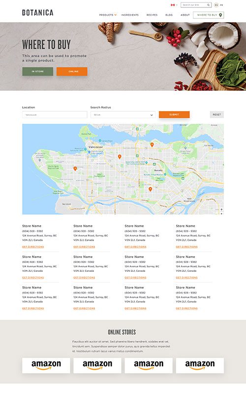
The new Botanica site brings their brand story to life through advanced home and product pages, as well as new pages that connect with visitors by sharing their mission, ingredient insights, and processes. A custom contact form and an improved Where to Buy section were developed for easier conversions. User experience is dramatically improved through intuitive search capabilities and related content recommendations. The new site elevates Botanica’s English and French content as a trusted educational resource on nutrition and wellness, and delivers a seamless e-commerce experience.
Related Case Studies
Check out more of our web design case studies, to see the results we’ve helped our clients achieve.
+22 %
Engaged Sessions
Built With Refoundry
Blenz
Blenz needed a fresh new website to reflect their updated branding, and to help customers more easily find their way to online orders, app downloads, and perks.
Keep Reading+347 %
Organic Search Traffic
Built With Refoundry
Axis Insurance
Axis Insurance needed an all-new website to support a huge rebrand. The goal was to launch a visually powerful site that would significantly improve usability, navigation, and showcasing their specialized expertise.
Keep Reading