About the Company
Axis Insurance provides bespoke, innovative insurance solutions. Their unique organizational structure is crafted around specialized practice groups, each dedicated to key Canadian industries. This allows for nuanced insights and tailored solutions aligned with each sector’s challenges and opportunities.
Objectives:
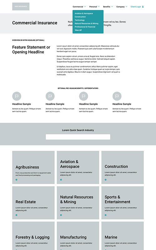
- Improve site architecture and user experience for vastly improved browsing and content discovery
- Support a larger brand refresh with the goal of creating an award-winning design
- Drive conversion of site visitors into customers
- Implement robust landing pages for Industries and Products
- Establish SEO foundations to increase search engine traffic and drive future growth
- Implement a fully responsive solution backed by WordPress CMS
Results
Engaged Sessions
+
0
%
Year-Over-Year
PHASE 1
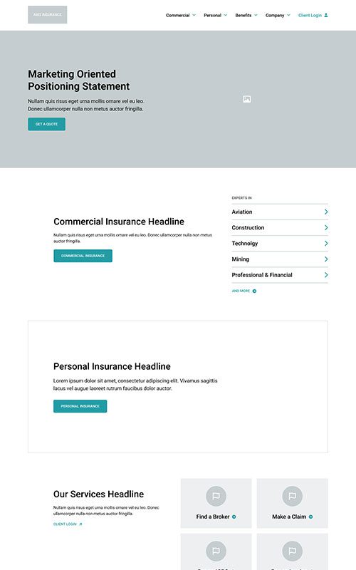
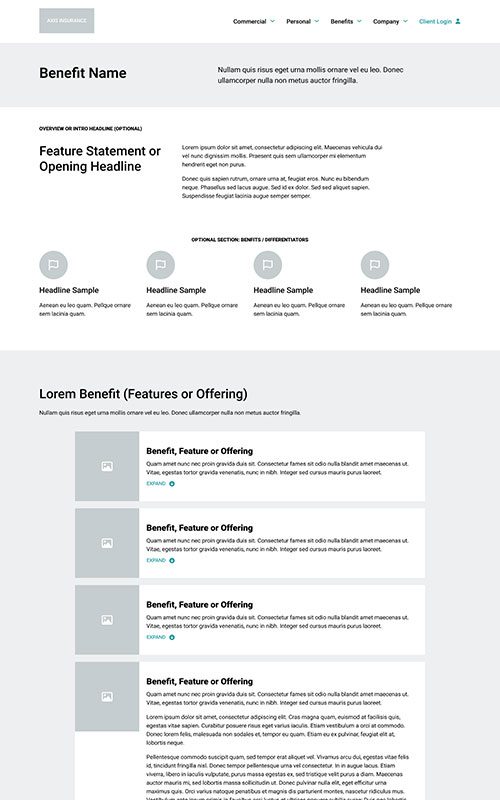
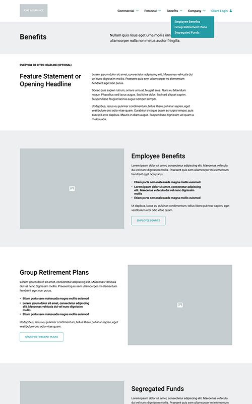
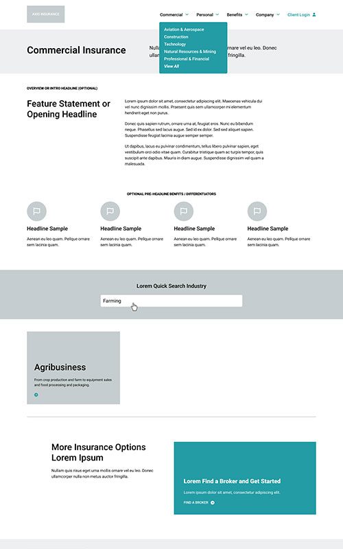
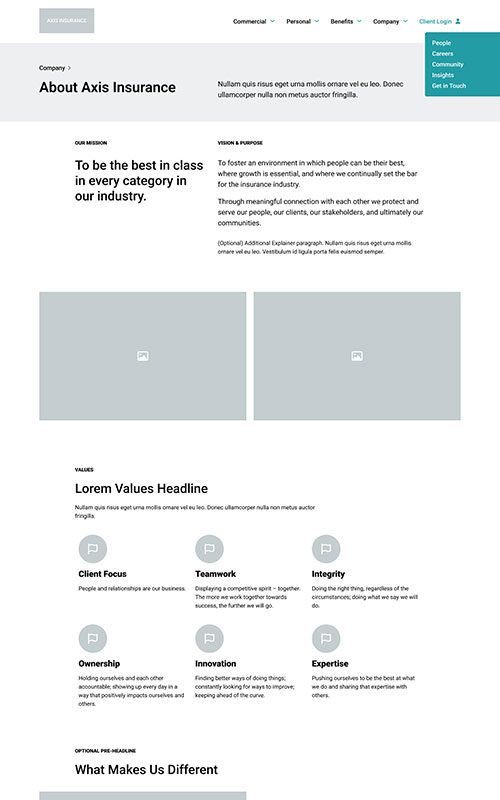
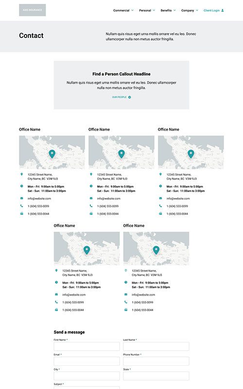
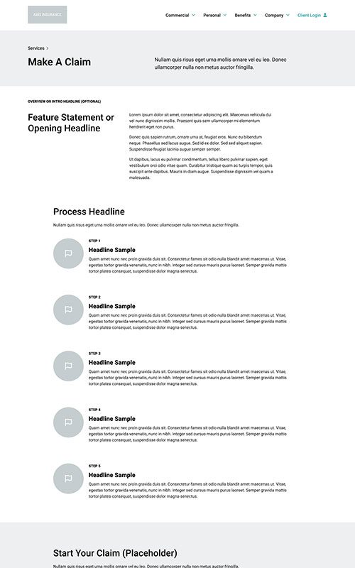
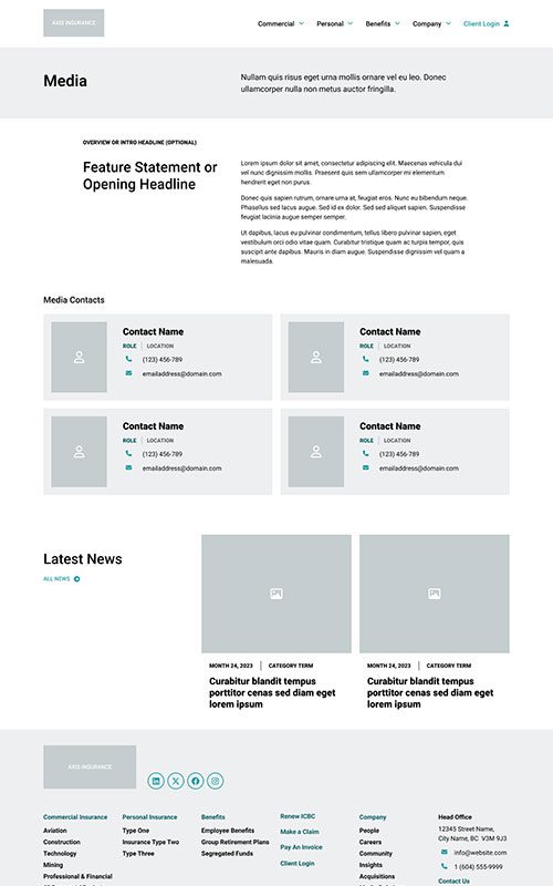
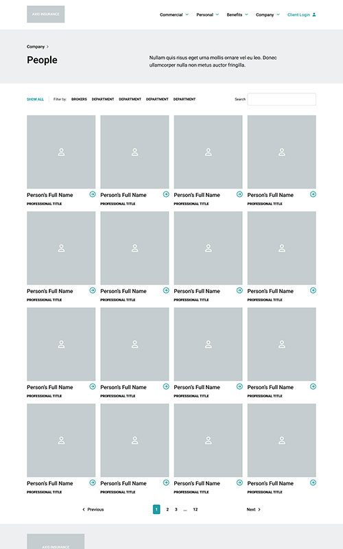
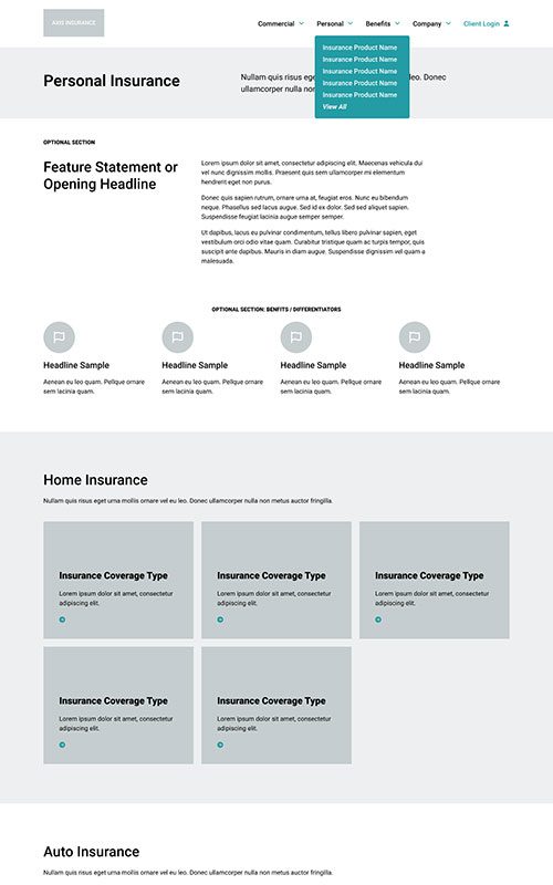
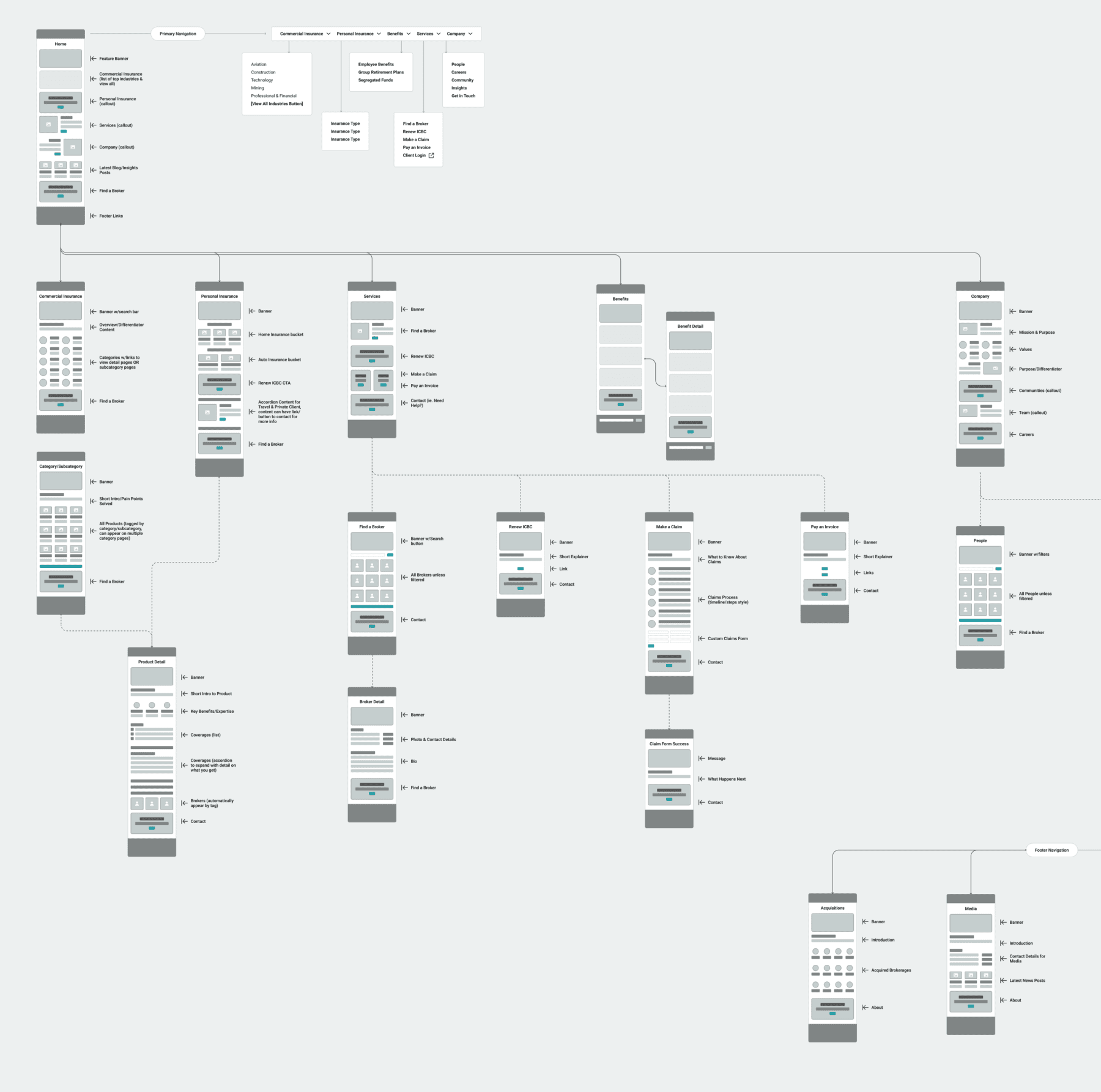
Prototyping
Axis Insurance formed in 2010 as an amalgamation of several BC brokerages with strong reputations and roots tracing back to 1928. It wouldn’t require risk insurance to back up the statement that they know what they’re doing! The trouble was that their website felt dry and outdated, and wasn’t telling the full story of their offering and capabilities.
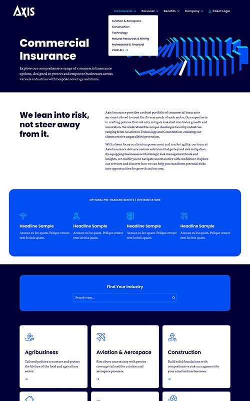
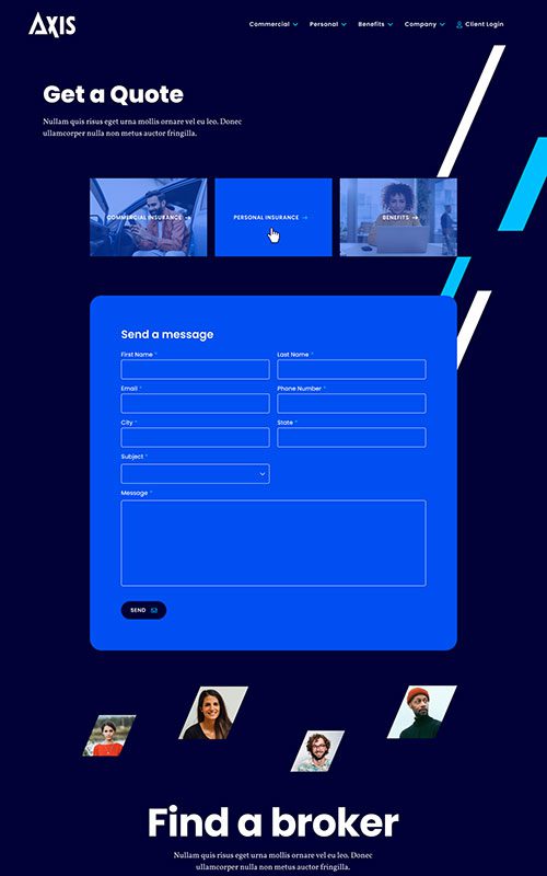
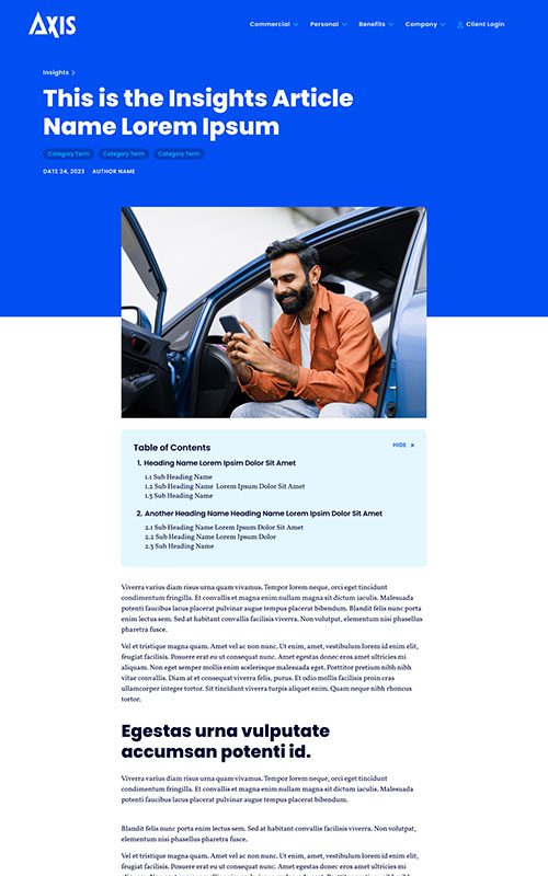
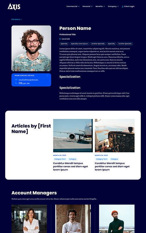
That’s why the biggest goal of this website redesign was deeper storytelling on the insurance products, and creating relationships between content to improve discoverability. There needed to be a clear path from viewing content to connecting with a specialized broker.
PHASE 2
Style
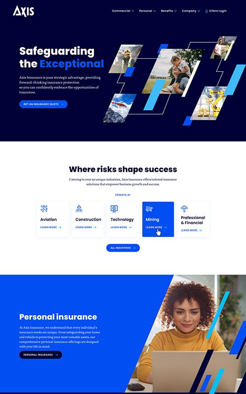
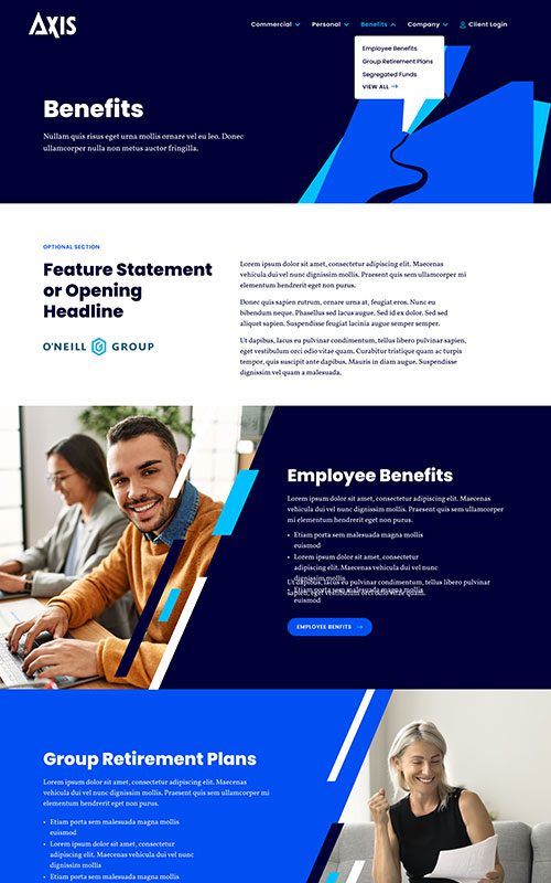
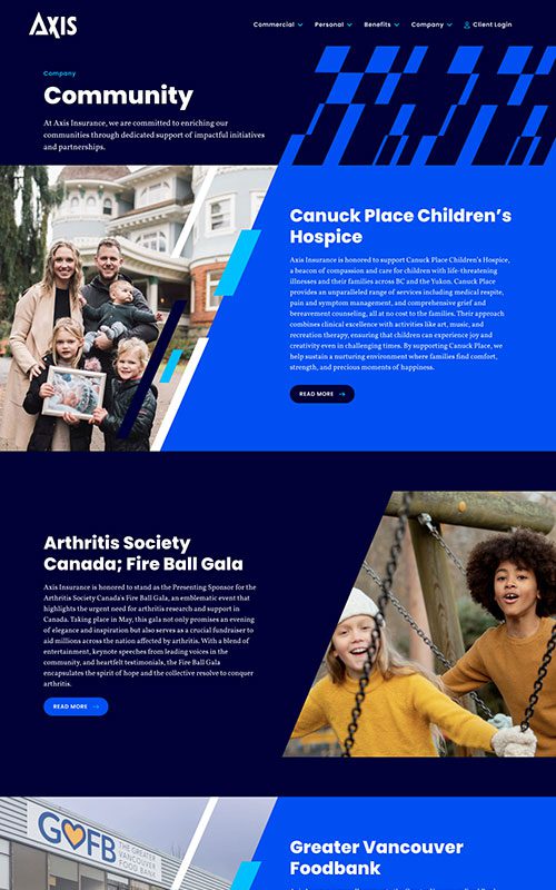
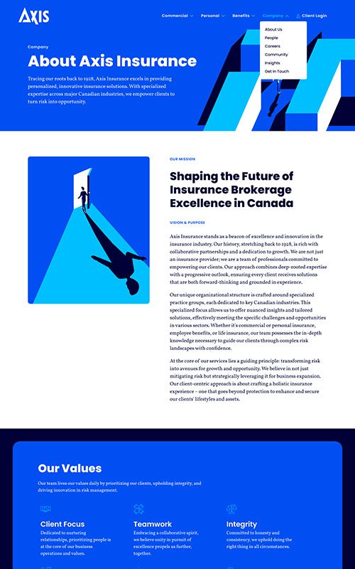
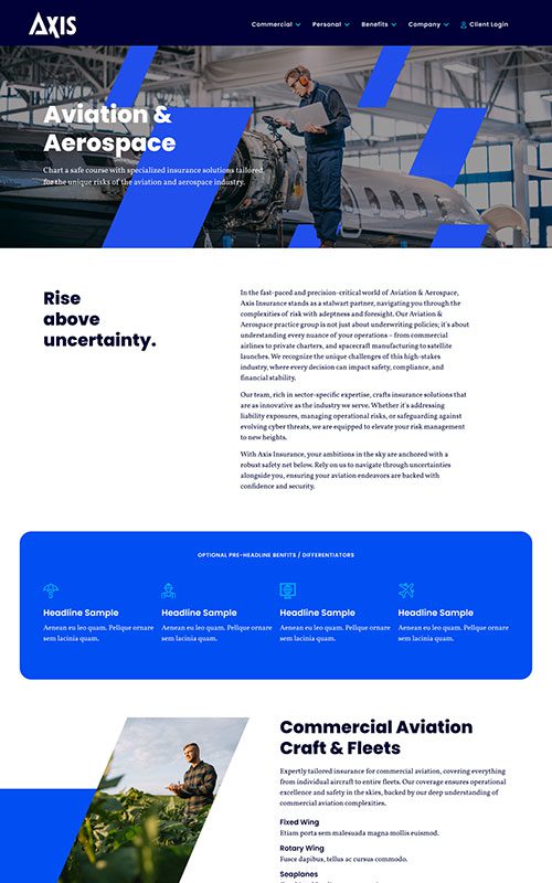
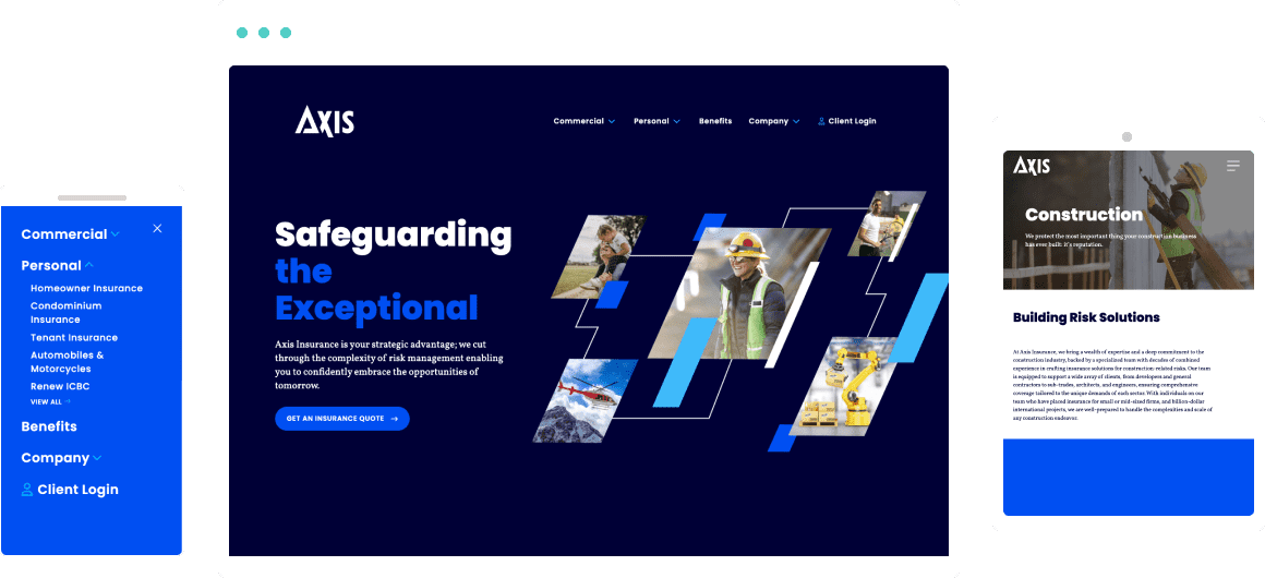
Axis had gone through a full rebrand, so we had a lot of fun exploring that in fresh web designs. Their colours are brighter, and their typography more welcoming. We emphasized their new, energized visual brand with bold shapes that draw the eye along their content, without distracting from the messaging.

Phase 3
Bringing it All Together
The new Axis Insurance website is full of opportunities – for content discovery, demonstrating their expertise, and converting visitors. It’s incredibly easy for users to quickly find their way to a broker who specializes in the type of insurance they need. At the same time, the site is built on our lightweight, low-code site builder, Refoundry, making it significantly faster and easier for their team to control settings and edit content as their company grows.
Related Case Studies
Check out more of our web design case studies, to see the results we’ve helped our clients achieve.
+22 %
Engaged Sessions
Built With Refoundry
Blenz
Blenz needed a fresh new website to reflect their updated branding, and to help customers more easily find their way to online orders, app downloads, and perks.
Keep ReadingBuilt With Refoundry
Coastal First Nations
A full redesign helped Coastal First Nations turn their website into a visually stunning, highly usable source for educational content and community storytelling.
Keep Reading