Website footers are essential for a positive browsing experience.
If you browse a variety of strong web designs, you’ll see they have a highly usable design and layout for their footer. That’s no coincidence, as the footer is crucial to the overall user experience.
The website footer is excellent for keeping people on-site once they’ve reached the bottom of a page. It usually displays menu items to discover more about the company and its products or services. It can include information like contact and support details, or it can just be focused on navigational items.
It is critical for SEO to provide visitors with essential information such as contact details and site policies. You should also include conversion points, such as special deals or discounts.
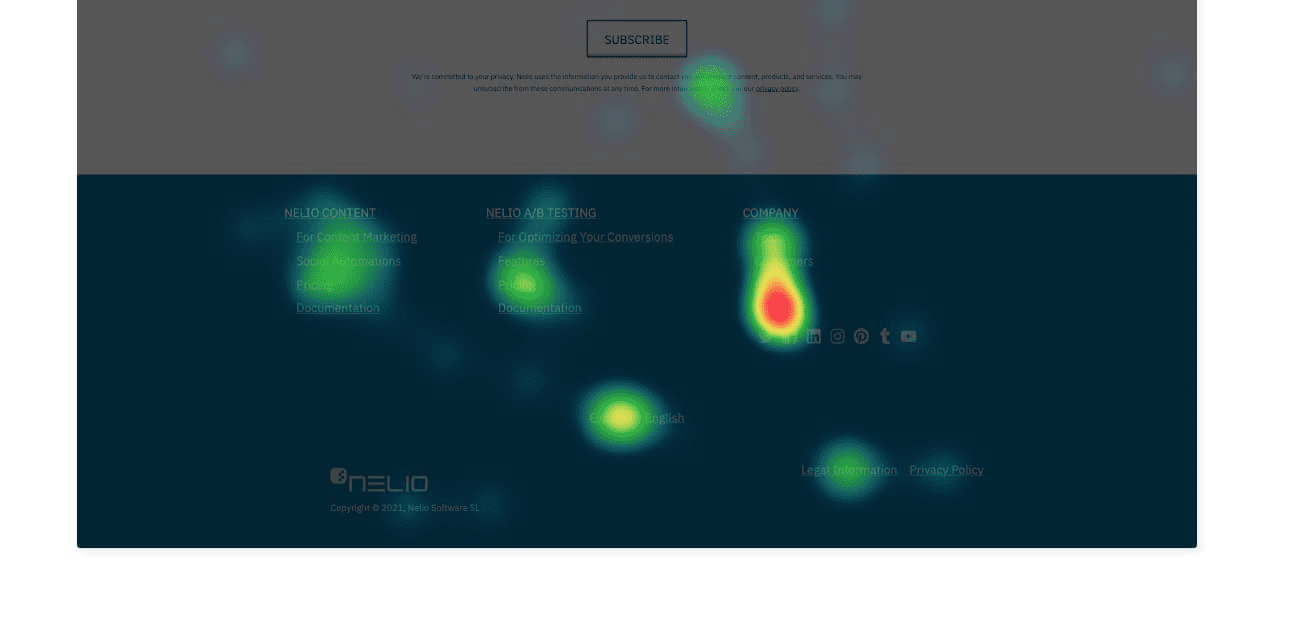
A heatmap can give you lots of useful insight into which parts of your footer are used most. You may be surprised at how much it’s used:
Most importantly, the footer is the final impression that visitors have of any page they might land on when first discovering your site. This makes it vital to ensure that it is easily accessible, user-friendly, and informative.
As a result, a well-designed footer can significantly improve visitor retention and effectively guide them to other parts of the website.
This guide will teach you website footer best practices to enhance the user experience.
1. Keep Them Simple
Your website footer should be well-structured for easy navigation. The goal is to ensure your visitors can effortlessly find everything they need without having to scroll all the way back up to the top – or they might lose interest.
Focus first on the essentials, such as your main pages, contact information, and social media links. When there are numerous links, such as product categories or services, vertical alignment is a useful method for organizing them on the screen.
If you include an image, choose one that is easy to read and understand in a small size. Avoid complex graphs and statistics.
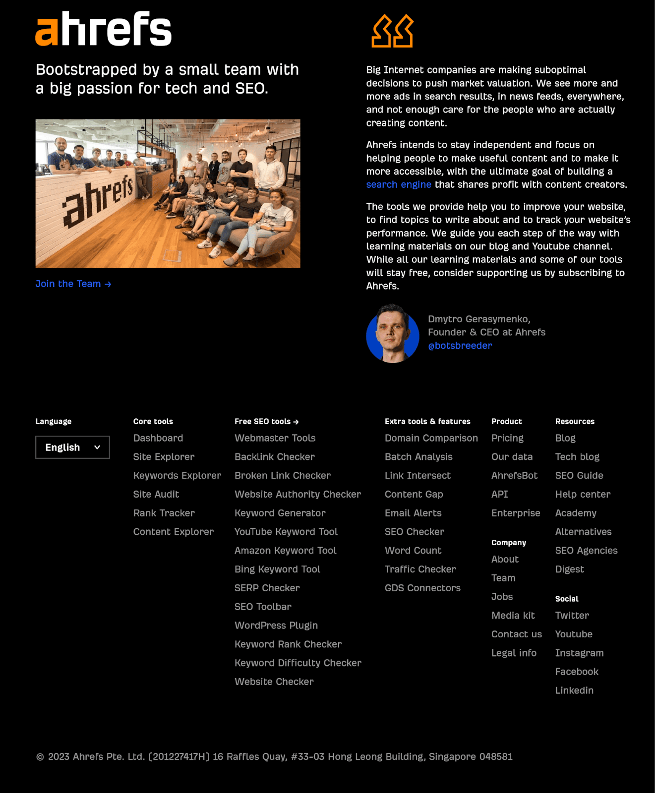
Take a look at the footer content of Ahrefs’ website. They have included a clear image of their team along with a hiring link that is well-organized and easy to navigate. They organized additional links in a vertical style, in logical buckets.
You will also see that their About content is in the footer menu, but not in their main menu. Footer menus are a great place to link to content that is not relevant to the primary goal of most people using the site.
The design shouldn’t be complicated. Use colors and typography that create a cohesive look and feel across your site – they should match your brand strategy, and be the same elements used in your social media, emails, ads, and any other online materials.
The right content spacing and padding can make a website’s footer look simple and more readable on various devices. A consistent font size, weight, line height, and letter spacing will help you create an appealing visual effect while making your site look more professional – and achieve website accessibility goals.
2. Include Links to Basic Pages
This website footer best practice is about navigation. A great footer should reflect the key options and groupings of your main menu, so a user doesn’t have to scroll all the way back up.
These navigation options include internal links to your homepage (usually a linked logo), about us page and careers content, and products or services.
To organize your links effectively, group links into categories with clear, relevant labels like Products, Services, or Company.
For example, if you have a large collection of case studies and blogs, you might use ‘Learn’ as a heading and link to categories. This will make it easier for visitors to navigate your site and find useful information.
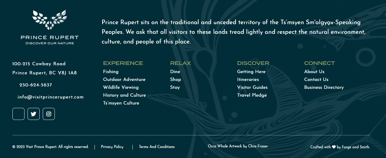
If you check out Tourism Prince Rupert’s website footer, it’s divided into clearly labeled link categories.
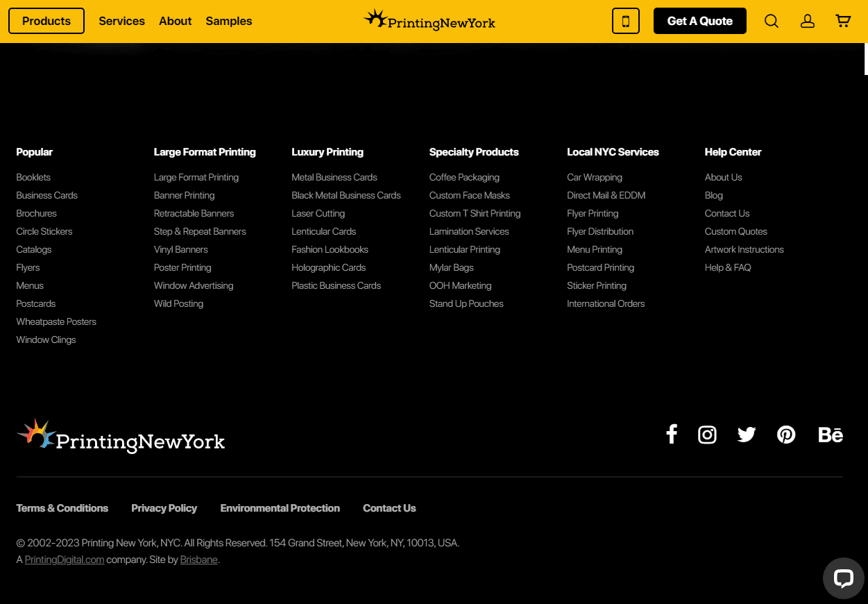
Another good example is Printing New York’s website footer below. The company has neatly organized a high volume of services in its footer.
By carefully choosing the primary content and structure of your important footer links, you won’t just help boost website navigation. You can also help boost your SEO. A well-structured navigation will help search engine crawlers understand your most important pages. These help shape your authority and trustworthiness, which is important in SEO.
Remember that footer links shouldn’t be the be-all and end-all on a page. They supplement the website’s main menu navigation – they shouldn’t aim to replace it for a minimal look and feel. Oversimplification is harmful to the user experience.
3. Include Newsletter Signup Form
You can also include a newsletter signup form in the website footer, to efficiently collect and verify email addresses for your subscriber list. Footer placement makes sense because of how website visitors typically behave – they’re more likely to scroll down to the bottom of the page to look for blog links or ways to contact you. When they do this, they won’t miss your lead-generation form.
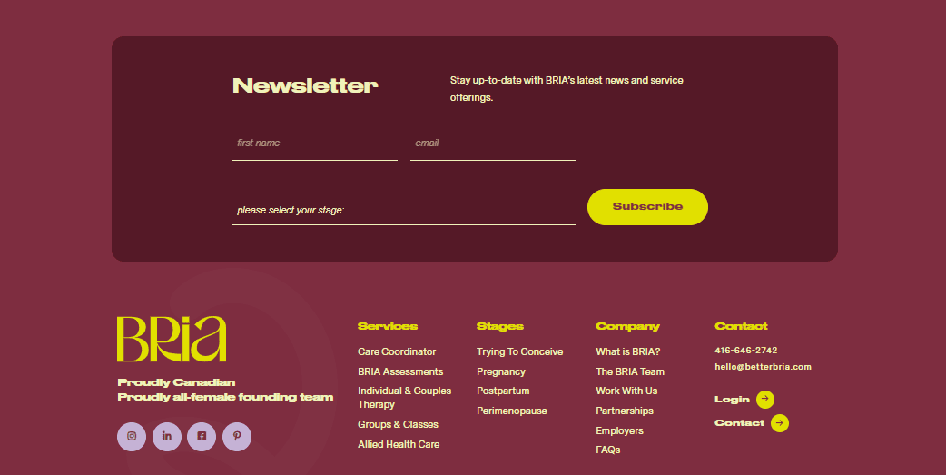
Check out this example from Bria, a virtual mental health clinic:
Even as a footer element, your newsletter form must stand out. If your form blends in with the rest of the elements, your visitors might still miss it.
You can make your form stand out in several ways. Bria, for instance, opted to place its own right in the middle of the website footer. The form occupies a large chunk of the space, too.
If you opt for this strategy, don’t get carried away. Your form should only have a limited number of fields. You wouldn’t want your visitors to get turned off by the many fields they have to fill out. Gartner recommends up to just five form fields for higher conversions.
As a final tip, make sure you have a compelling and easy-to-understand call to action. Your CTA should stand out, too. For example, you can choose a CTA color that contrasts with the color of the rest of the form, as shown in our Bria example.
4. Insert Legal Information
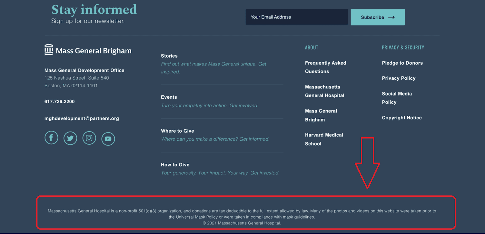
The footer area is a standardized place to clearly state the authorship and ownership of a website.
Your privacy policy is critical to SEO, and it is crucial to include legal details in your footer. This information serves to protect your creative works, as well as provide essential details about the site’s ownership and usage rights.
Some legal options that are commonly included in website footers are:
- Privacy Policy
- Cookie Policy
- Return Policy
- Terms and Conditions
- Business licenses
- Accessibility
- Security
- Credits and/or copyright details
Here’s HubSpot’s footer as an example:
Including these links in the footer builds trust with your viewers. It shows them – and search engines – that you’re a legitimate and registered business that complies with regulations.
5. Introduce Contact Information
Another critical footer piece for SEO is your contact details. It’s one of the website footer best practices that will help build trust in your business, while giving users clear paths to reach you.
Your contact information should consist of the following:
- Name, address, and phone number: These details directly impact your local SEO efforts, and need to be present and accurate. They also must match all of your other online listings such as maps, review sites, social profiles, and business directories.
- Email address: Provide an email address where potential clients can contact you.
- Social media icons: Social links can help you increase engagement. Through social media SEO, you might also improve your ranking. Social media icons can also help grow your email list.
- Maps: Brick and mortar businesses can add a map of their physical location within the footer. It helps customers find the business and improves accessibility.
Just make sure you arrange the footers in an understandable format.
6. Incorporate Additional Supporting Content
There are other elements you may include in your footer to boost the user experience, apart from the ones we mentioned above.
Acknowledgment statements, for instance, are short snippets of text that give proper credit to the original creators of the content on your website. These can include photographs, written content, videos, or any other creative work that isn’t otherwise credited on individual pages. For example, if all content is written or photographed by an individual, one credit in the footer would be appropriate.
These statements show you’re an ethical business that gives the proper credit where necessary. Here is an example of a creative acknowledgment statement:
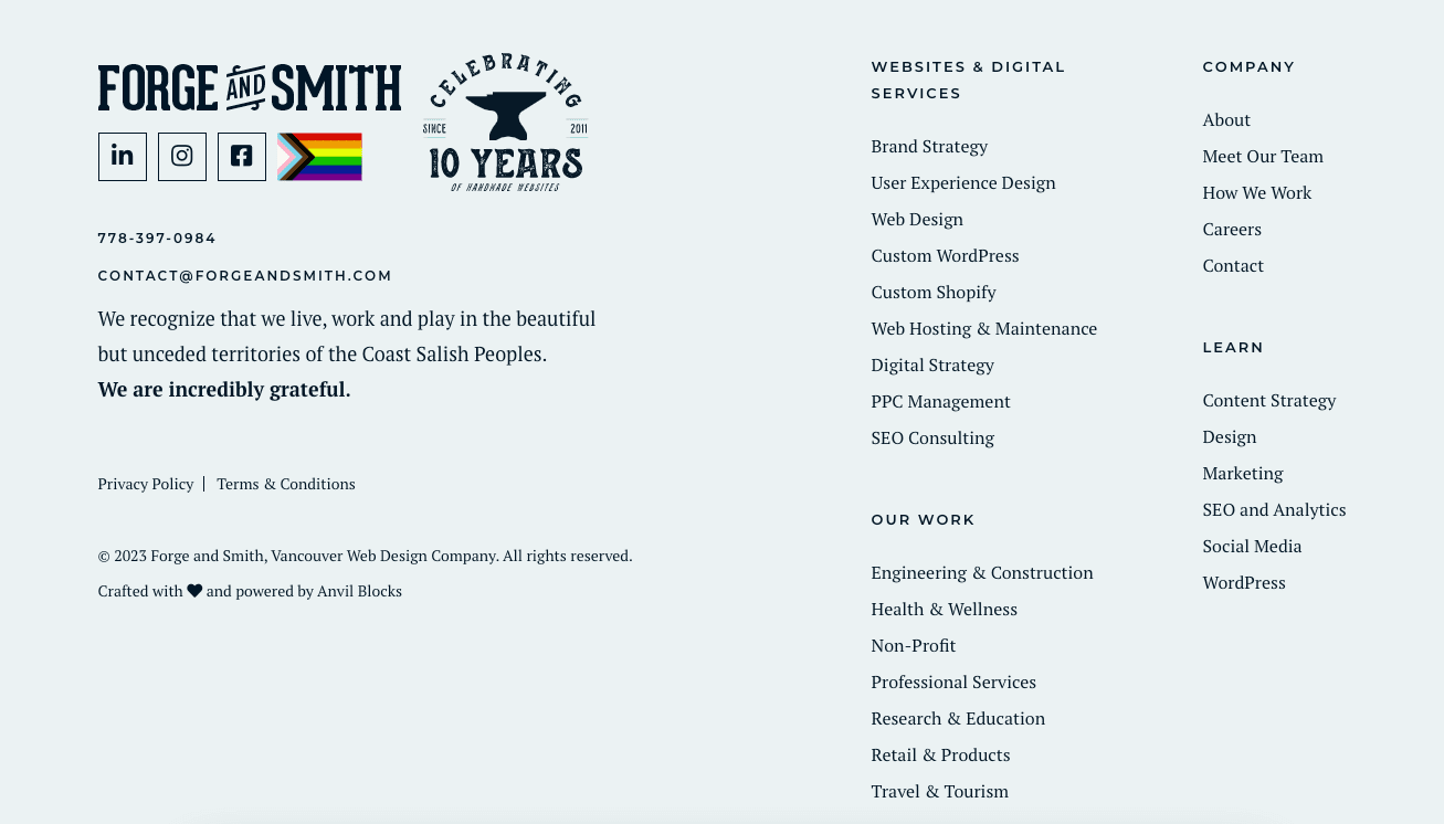
Another element is a land acknowledgement statement. It is increasingly common for Canadian businesses to include a script in their footer that acknowledges the First Nation land where their business is located.
Including logos is a great way to showcase your brand identity and use social proof in your footer.
You might include logos of partners, funders, or media where your business has been featured.
Miracon devotes specific sections of its website footer to logos.
The position and size of logos in the footer section can also impact user experience, as well as how you represent the featured organizations. Make sure the logos are good quality, appropriately sized, and are organized so that they don’t look like random stickers.
In Closing
Businesses now recognize the crucial role of website footers in modern web design. No longer just an afterthought, they are a key piece of a great UX design.
Keep them simple and include links to important pages. Use your footers as a way for readers to easily access legal information about your site and its governance. Also, include a newsletter signup form.
Your contact information is important, too, as are social links and email addresses. Finally, insert additional supporting elements like logos and acknowledgements.
Follow these user experience tips, and you’ll keep visitors exploring your site and coming back for return visits.

