Creating high-quality content packed with tons of relevant information is a must if you want to attract and keep your readers. However, it’s not the only factor that will keep them glued to their screens.
To maximize reader engagement, you’ll need to pay attention to the design and structure of your content.
No matter how your blog looks, which CMS you’re using, or what the general feel of your site design is, there are ways to make your content more accessible and engaging.
Here are eight content structure tips that will be useful to site owners with tight budgets and those who can afford significant investment into their content.
1. Break Down Walls of Text
An intimidating piece of writing with no paragraph breaks, bullet points, images, and other formatting elements, will overwhelm your audience and cause them to lose interest in reading it. Even if they try, it will be difficult for them to follow your points and grasp your message – especially on mobile devices.
A research study found that almost 80% of people only scan web pages, while only 16% read the whole page. In other words, if you fail to optimize content readability, website visitors won’t stick around.
This will affect not only your conversion rates but also your rankings. Google will notice a high bounce and a low dwell time, thus concluding that your page doesn’t provide users with what they’re looking for.
Here are tips for dismantling those text-heavy barriers to reader engagement. Go deeper in this complete guide to long-form content writing.
Use Plenty of Visuals
If you pair a piece of information with an image, people will retain about 55% more of it than if you simply communicate your message via text only. The human brain is hardwired to process visuals better. So when structuring your content, make sure to add images, infographics, diagrams, charts, or gifs between paragraphs.
But this tactic comes with a word of caution: heavily relying on stock images isn’t a good idea. They tend to be generic and somewhat impersonal, not to mention that they only serve the purpose of breaking down the text without adding value to your content.
So, whenever possible, include visuals that are relevant to the content and help readers better comprehend it.
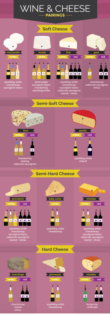
Take a cue from this blog post about cheese and wine pairings by Fix. Instead of scaring off their readers with a never-ending list, the brand translated it into an easy-to-digest infographic and made the information flow smoothly like Merlot.
Experiment with Content-Background Color Blocks
Visuals are super effective, but creating high-quality images, infographics, or videos can be quite an investment. Luckily, brands that can’t splurge on top-notch imagery have an affordable option to make their content look attractive and readable – background color blocking.
This simple trick will allow you to highlight the important parts of your blog post and direct readers’ attention where you want it. You don’t have to be a designer to make this work.
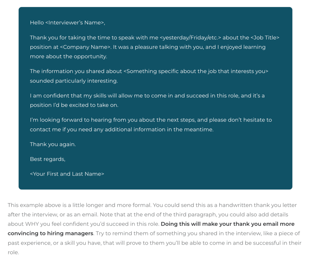
Take a look at how Career Sidekick shines a spotlight on email examples in their blog post about the four best sample thank-you emails after an interview. The brand accentuates these useful customizable templates by putting them against dark green background blocks. Besides helping readers identify high-value content, such color blocking also relieves visual monotony.
Leverage Headings and Subheadings
Another structural tactic for making your content more reader-friendly (and SEO-friendly) is organizing your main ideas around headings and subheadings. By doing so, you’ll allow your readers to navigate the content more easily and quickly find the information they need.
Headings and subheadings also summarize what each section is about, letting readers – and search engine crawlers – know what they can expect to learn.
Focus on Typography Best Practices
We discussed eliminating the risk of monotony, but when it comes to typography, it’s actually better to curb your creativity if you want to stay on the safe side.
Rules to adhere to are:
- Don’t use more than three fonts across your website
- Stick to traditional fonts, as they’re designed for readability and won’t distract your visitors’ attention from your content
- Set the line spacing to 1.5 the font size
- Don’t use similar colors for the text and background (this is vital for accessibility)
- Stay away from using all caps since this styling greatly hinders scanning speed
- Limit the body line length to 50-60 characters (spaces included) for better readability
Tap into the Power of White Space
White or negative space can have a tremendously positive impact on the readability of your content. Don’t be afraid to declutter your web pages, even though you might be under the impression that they will come across as empty.
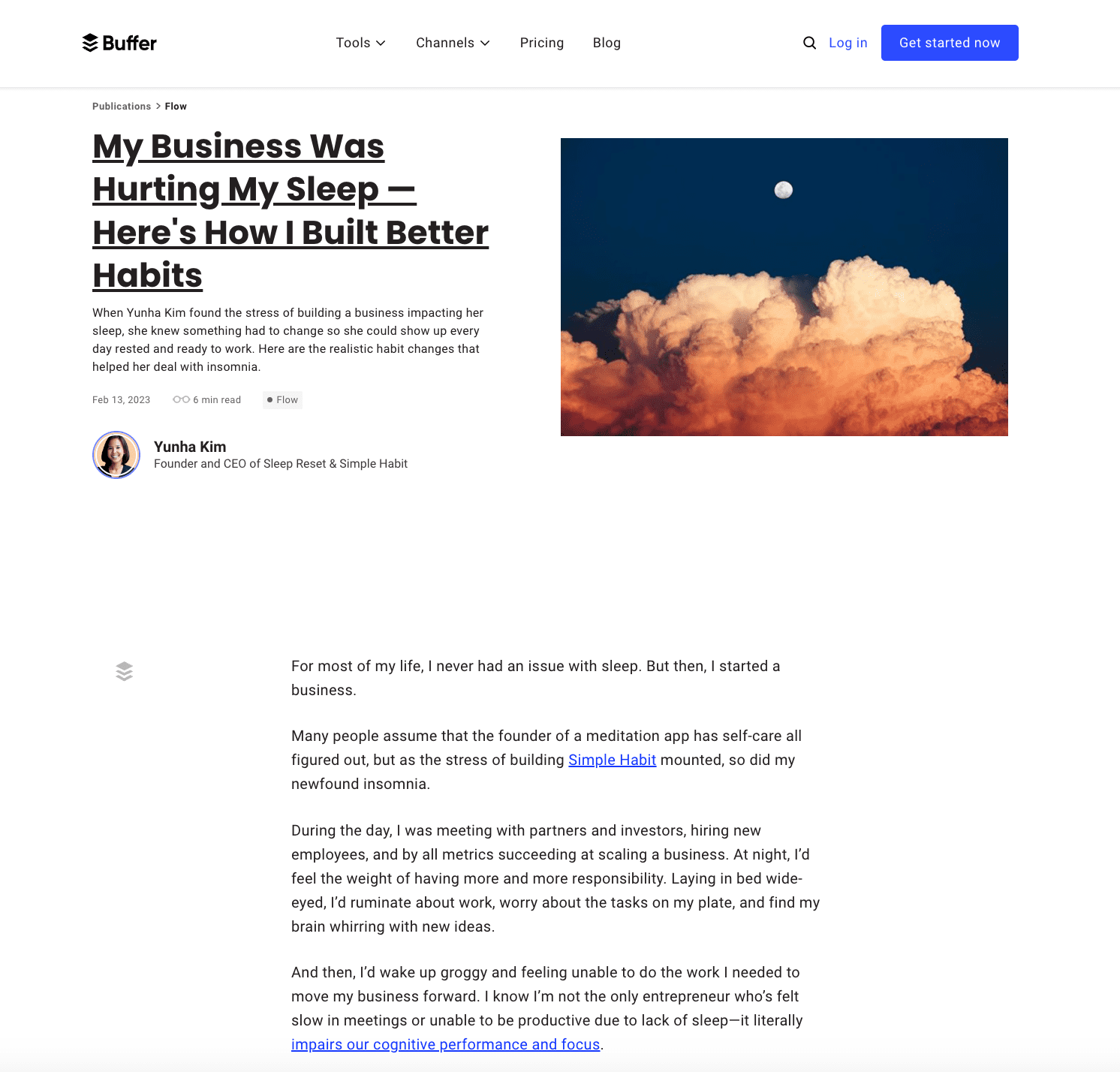
Check out how Buffer makes the most of the white space in structuring their blog post about making better habits. The layout is fairly simple and there’s a lot of white space around web page elements, which allows for a balanced look and gives readers’ eyes a vantage point of the content.
Create Jump Links
Jump or skip links are hyperlinks that link to a specific part of the web page, such as section subheadings or something you previously mentioned. They make it easier for readers to navigate a detailed, long-form piece. They’re especially useful when creating lengthy guides. To make your content more accessible, create a table of contents (like the one in this post) with jump links leading to different article sections, and place it beside or near the introduction.
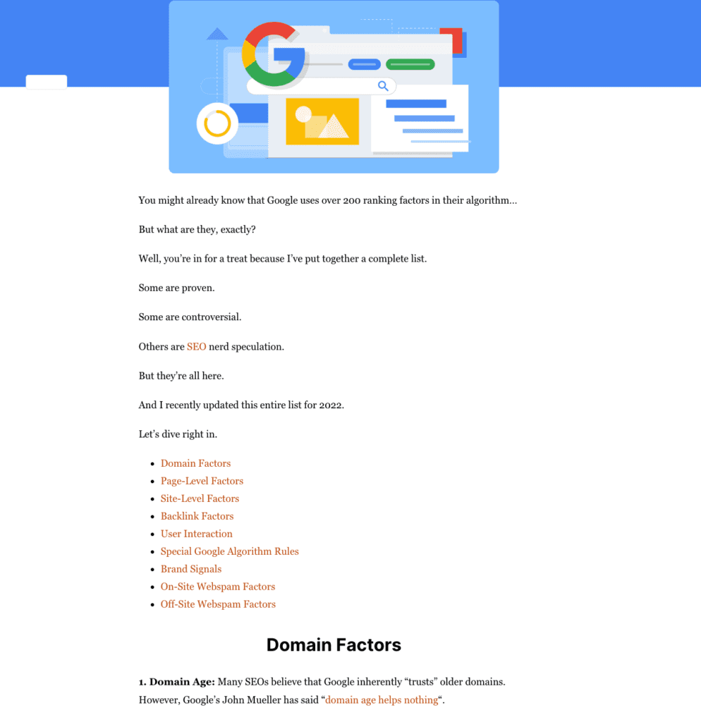
Backlinko is a resource known for its ultimate guides on all things SEO, and this article on 200 ranking factors is no different. But the structure of the content is well-planned, so even such a comprehensive piece is reader-friendly and engaging, thanks to jump links splitting it into several clear categories.
2. Separate Your Sales Message from Your Content
Overly promotional content that brags about your products or services is a surefire way to alienate your website visitors and ruin your chances of engaging them. People who land on your blog are looking for answers and solutions to their issues, not thinly disguised advertising.
The first step is understanding your audience, their pain points, needs, and interests. This will give you the right context and a basis for creating helpful content that will educate and inform them. Remember that your readers’ needs should be at the core of your content marketing strategy – not your attempts to generate a sale.
The trick is in addressing their pain points objectively rather than trying to find a way to insert your call-to-action button and pitch your product or service. Prioritizing your audience’s needs and providing free tips and advice won’t immediately result in conversions, but it will do wonders for reader engagement. Plus, your blog will become a go-to resource for your potential customers.
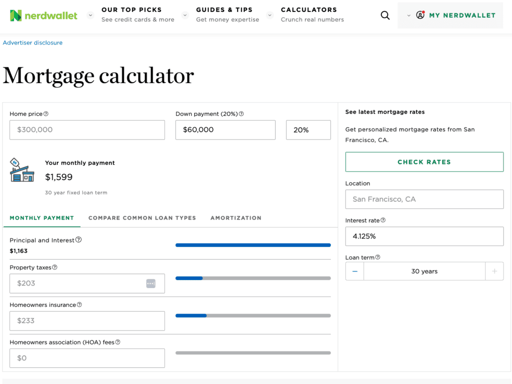
You can even go the extra mile and jazz up your content with a free interactive tool that will catapult your engagement rates. Intuitive and easy to use, these widgets will give visitors personalized answers to specific questions.
NerdWallet’s Mortgage Calculator is a perfect example – it’s super helpful, user-friendly, and free from any salesy messaging.
3. Answer the Main Question Early
According to some studies, technology makes us increasingly impatient by taking instant gratification to the next level, and leaves us craving short-term rewards and pleasures. In the context of content marketing, this tendency translates to readers’ growing impatience and shrinking attention span.
Many blog visitors won’t even start reading your carefully crafted pieces brimming with valuable information if they struggle to quickly find answers to the questions that brought them to that post.
To avoid high bounce and low engagement rates, give people the answer they want early on. Don’t force them to read through an entire long-form post if you can summarize the main takeaway for them right off the bat. In journalism, this type of structure is known as the inverted pyramid.
You’re probably wondering whether this approach will get in the way of your sales intent and reduce your odds of converting new leads. It would be unfair to claim that it won’t, but the truth is that 92% of website visitors don’t buy on their first visit. However, respecting your readers’ preferences and tackling their pressing issues instantly will definitely encourage them to come back in the future and explore your website further.
On the other hand, if you force someone to read through a 5,000-word blog post before they get the answer they so desperately need will seriously damage your credibility and engagement potential. Not to mention that readers will seriously question whether you genuinely want to help them or you have some ulterior, sales-related motives in mind.
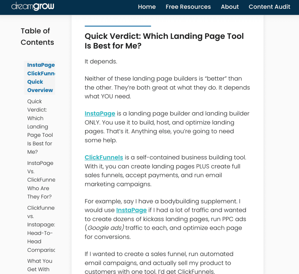
In their side-by-side comparison of InstaPage and ClickFunnels, DreamGrow does a great job of accommodating readers who need an answer ASAP. There’s a Quick Verdict section right below the Overview, and it sums up the entire article in a couple of sentences.
For more tips on great blog structure, check out this article that includes a winning blog post formula.
4. Don’t Always Force Your Visitors to Read
Besides not forcing your audience to read lengthy blog posts in their entirety, it’s also a good idea not to always force them to read. Period.
Include other content formats in your marketing strategy and watch your metrics go up. One big benefit to video and podcast is that you can also polish and share the transcripts on your site, giving you two content formats.
Video
Nothing boosts engagement like video, and this is not just an assumption – 91% of people say they would like to see more video content from brands in 2023.
There are various reasons for this trend, and some of them are:
- Video can combine movement, sound, images, and text, which makes it highly attention-grabbing and engaging
- Video is capable of evoking a certain emotion by appealing to both auditory and visual senses, which makes it more immersive and memorable than written content
- Thanks to its ability to illustrate more complex ideas and processes, video is an excellent vehicle for educating your audience and demonstrating product features and benefits
- People can watch videos while doing something else such as commuting to work, waiting in line, or exercising
- It’s easier to get the message through since video doesn’t rob communication of its non-verbal cues, body language, and prosody; the tone of voice, facial expressions, and gestures add to the overall authenticity of your messaging and captivate viewers’ attention
It’s safe to conclude that video has tremendous educational potential.
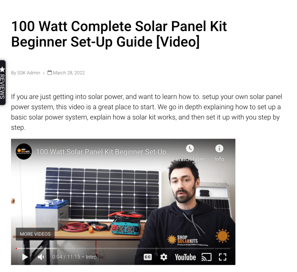
Though the majority of Shop Solar Kits’ learning center content is text, the brand still occasionally leverages video. And when that happens, their audience is delighted. For example, their beginner set-up guide for a 100W solar panel kit amassed 770,000 views and 15,000 likes. The comments praise its simplified, step-by-step approach that makes it easy for laypersons and tech-unsavvy viewers to understand a complicated installation process.
Infographics
We already mentioned how powerful infographics can be for diluting your text-heavy content and making it more palatable to your audience.
This particularly applies if there’s a lot of data to include, and such pieces can be hard to comprehend.
Aesthetically appealing and colorful, these visual representations of information and knowledge will transform your potentially tedious and hard-to-read blog post into a compelling resource that will engage your readers.
As an added bonus, infographics are shared three times more than other types of content.
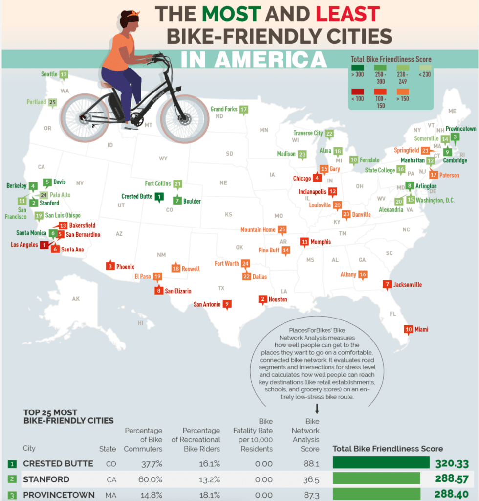
Tower Electric Bikes’ infographic about the most and least bike-friendly cities in America rounds up all the facts and figures that would otherwise seem discouraging as a blog post and turns them into an engaging format. It’s a great example of how data-driven content can be served as eye candy that won’t make readers feel inundated with information.
Podcast
Predictions say there will be around 504.9 million podcast listeners globally by the end of 2024. This figure makes a strong case for introducing this type of content in your marketing arsenal.
What makes podcasts so powerful and popular?
- It’s an affordable and low-hanging fruit – you don’t need expensive equipment and complicated software to compete with industry big shots, and there are numerous distribution platforms
- While other types of content require the audience’s undivided attention, people can listen to a podcast episode in a way that matches their lifestyle: at work, in their cars, at the gym, or while riding their bikes
- It’s highly conversational, which explains high engagement – 88% of listeners tune in for almost every episode
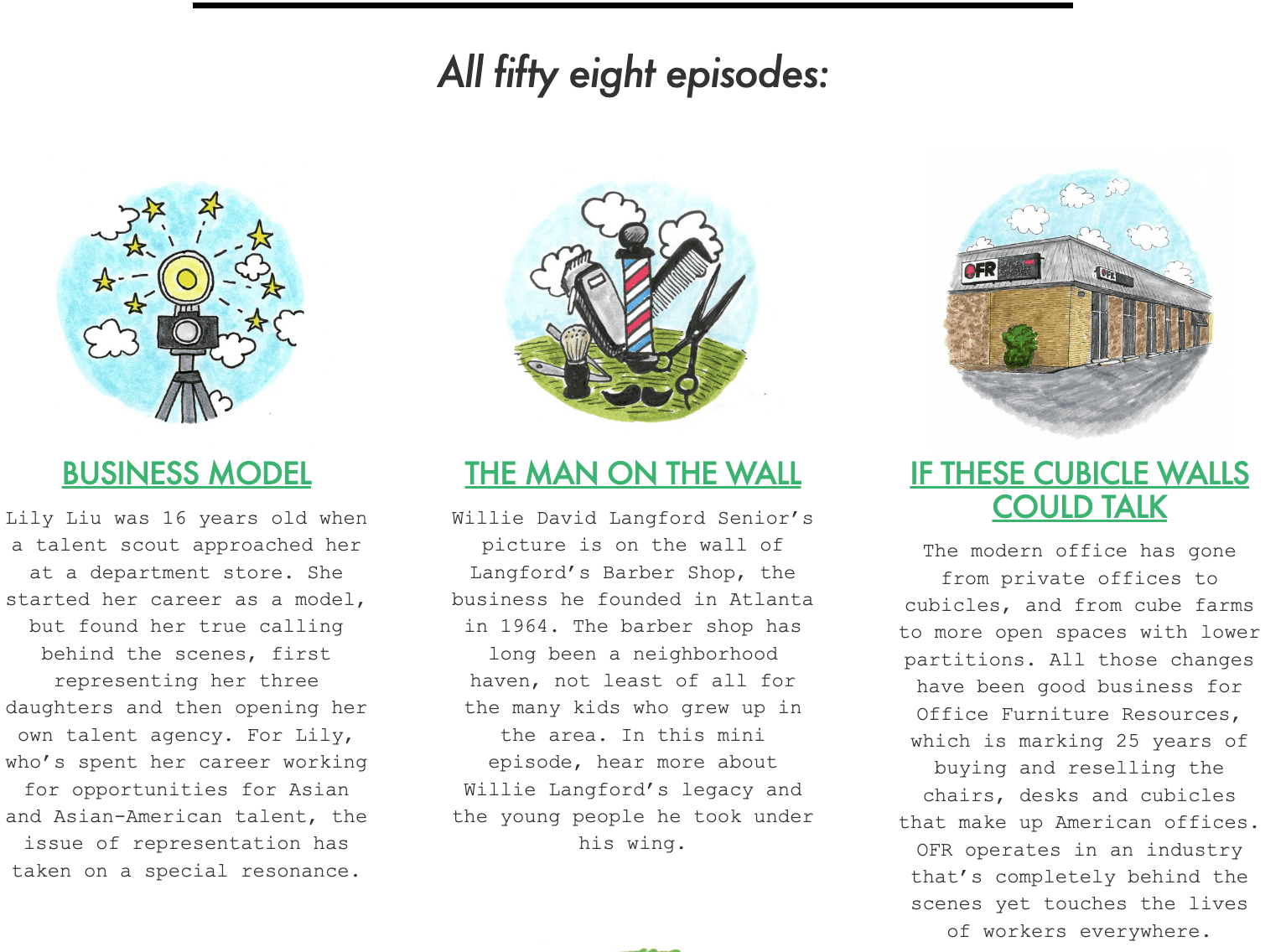
Basecamp is committed to helping founders run their businesses, and their podcast, The Distance, reflects this. It consists of 58 episodes in which seasoned entrepreneurs reveal their secrets to success in a competitive landscape. This “fireside chat” format is more suitable for success stories than any other.
5. Enable Skimming
How do people read online content?
They actually don’t! An average website visitor reads only 20% of the words on a web page during a single visit. They are skimming your content.
If you don’t want your hard work to go down the drain, it’s essential to adjust your content to skimmers’ needs and preferences.
Here are quick tips:
- Use short, punchy sentences and concise paragraphs
- Split your content into bullet points
- Provide an easily navigable, hyperlinked table of contents
- Collapse certain content pieces to hide sections with details that not all people might find relevant
- Summarize core content visually, and do it early and often
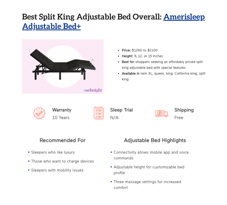
Can you put all this into practice and allow skimmers to make the most of your content? Take a look at how Eachnight structured their guide on the eight best-split king adjustable beds.
Each product in their review has a visual breakdown of the main points. Although these TL;DR sections essentially repeat the review content, they make it easy for people to get the gist of what makes each product unique without having to read the long text.
6. Watch Your Language
Even though using industry jargon and fancy terminology might seem like a good idea that will make you come across as an expert, it can hurt your engagement. Remember that your audience isn’t your peers – except in some industries, such as SaaS sites marketing to IT decision-makers, your readers are often newbies who are unfamiliar with professional lingo.
If you don’t want your readers to feel left out, make sure to write with clarity and take your audience’s level of comprehension into account.
To be able to do this, take the following steps:
- Research and understand your audience. The tone and language you use will depend on their educational level and interests. By getting to know them, you’ll avoid sounding patronizing or confusing them with complex terms.
- Spy on your competitors and check out how their best-performing content is written.
- Use tools such as Grammarly and Hemingway Editor, which will identify and highlight words and phrases you should simplify and adjust.
- Leverage storytelling to explain a certain concept using the imagery and terminology your readers are familiar with.
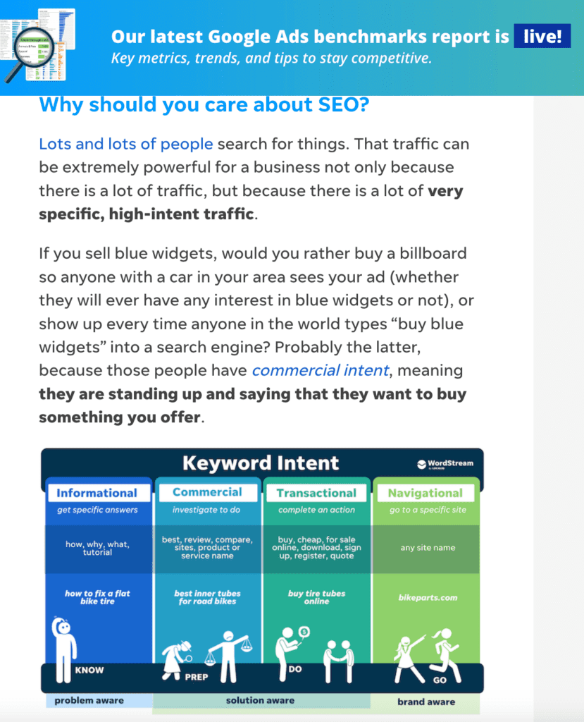
Wordstream’s beginners’ guide on SEO basics is a textbook example of content that hits the mark in terms of language. It’s adapted to their audience’s knowledge level, which means there are no high-flown words or elaborate paragraphs. The writer uses analogies with non-SEO examples and storytelling to communicate the message. Infographics and other visual elements shine a light on this topic.
7. Give Thought to Your Data-Driven Content
While infographics are an amazing way to boost reader experience and present data-driven content, they don’t work for every purpose. Sometimes you need to actually display all the numbers and value sets to help your audience compare and analyze.
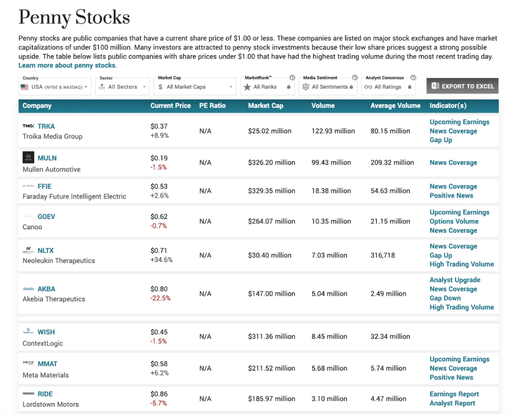
Let’s take MarketBeat’s comprehensive table listing penny stocks, and showing different parameters important to potential investors as an illustration. Such content can easily be all over the place and confusing, but MarketBeat nails it.
This example works so well from a content accessibility perspective because:
- Each row and column is visually separated without using conspicuously distracting separators.
- Dynamic content filtering allows readers to switch between different parameters and select what they want to see.
- Each row has an icon/logo image to reinforce the difference between each entry and break the monotony of numerical data.
- Text size and padding are a priority, even though this means a longer list and more scrolling.
8. Don’t Forget About Your Landing Pages
Content structure doesn’t just apply to blog posts. Landing pages also convey a ton of useful information, and they play a critical role in conversions and sales.
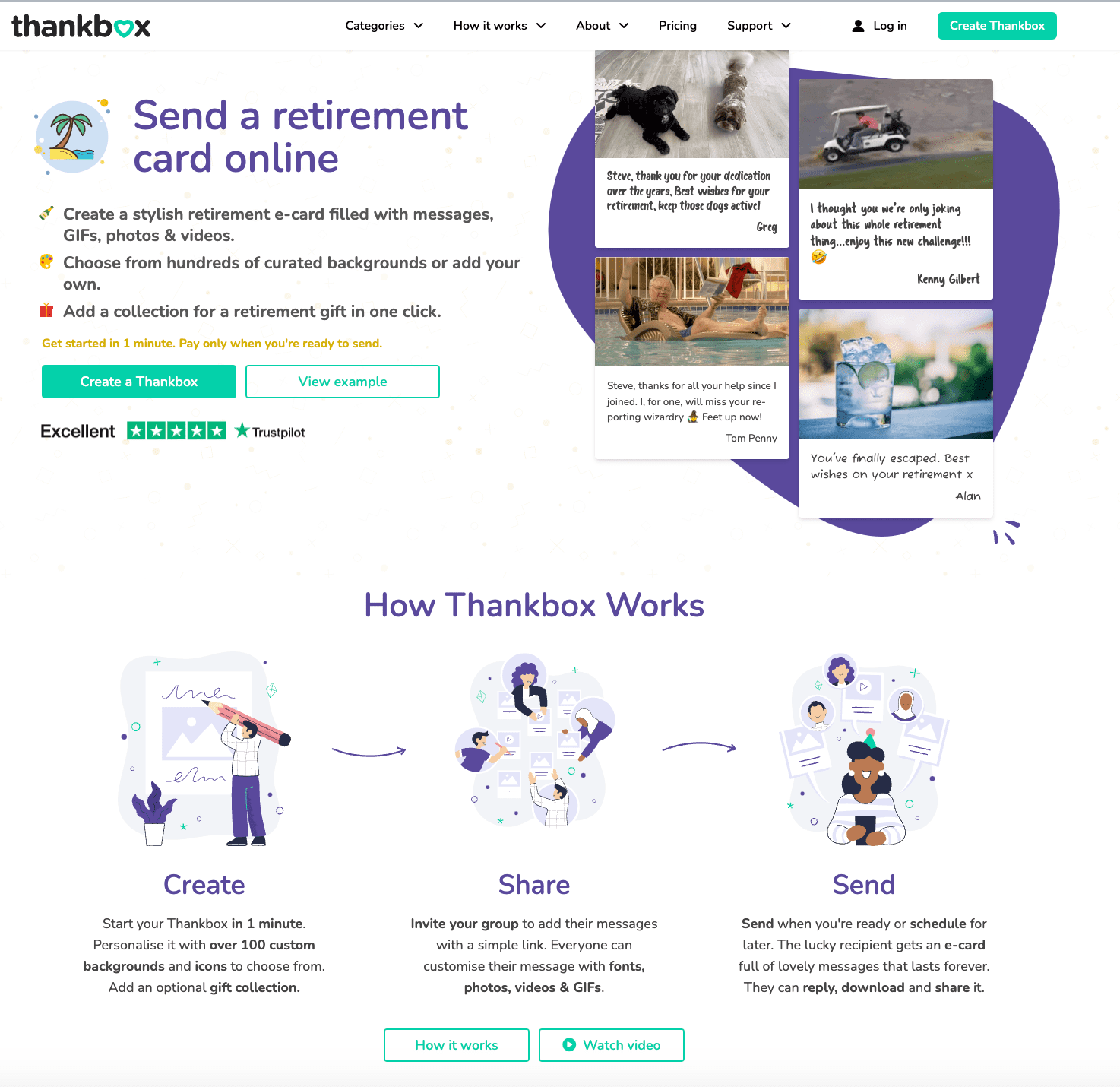
- Combine written content with video, animations, and other interactive elements – variety matters when it comes to engagement
- Find a balance between describing your product or service and not overdoing it with too much complex information
- Utilize negative space to draw focus on critical messages and prevent distracting clutter
- Double down on your CTAs, and make them stand out from the rest of the content by opting for a contrasting color
Thankbox followed all these design principles when creating their landing page for online retirement cards. There’s a lot of negative space that gives the copy some breathing room and directs visitors’ attention to key elements – CTAs and multimedia.
The brand diversified the copy by including visuals, videos, emojis, and illustrations. The “how it works” section, paired with a short video, offers just enough information about the service without confusing potential customers.
Wrapping Up
The structure and design of content can have a huge impact on reader engagement.
Although there are different methods and tactics you can implement, it all boils down to understanding your audience’s needs, improving readability, and creating content suitable for skimmers and those who prefer videos.

