Early-stage visitors can come to your website in droves. Some of them might have found you through a Google search, an eye-catching ad, a friend’s recommendation, or even a scroll through social media.
However, 96% of those early birds aren’t ready to commit to a conversion. They’ve just realized they have a problem and maybe you could help. Their fingers are hovering over the back button, ready to bounce, but there’s a chance to make them linger.
That’s because they’re in the discovery phase, unsure if your offers are the solution they seek, they’re far from becoming leads.
Your mission is to weave positive associations with your brand, planting seeds of interest and empathy. The goal is to get them to wander around your site, hit that follow button on social media, dive into your blog posts, and maybe glance at your product or service page.
Remember, this might be their first date with your site, but you’re aiming for a second, a third, and potentially a steady relationship. Before they become loyal customers, they’ll likely visit your website a few more times as they get to know you and decide if you’re a good fit.
Let’s make sure each of those visits counts. Stay tuned as we unwrap the secrets to engaging these early-stage visitors without scaring them off with a sales pitch. It’s all about the charm, the value, and, yes, a bit of wit.
1. Everything Starts with Understanding Buyer Personas
Before you can charm early-stage visitors into sticking around, you’ve got to know who they are, what ticks their boxes, and what keeps them up at night.
The best way to achieve this is through buyer personas. They’re the blueprints of your ideal customers, constructed from research, data, and a bit of educated guesswork.
Creating detailed buyer personas involves digging into demographics and understanding pain points, preferences, hobbies, and even daily routines. Surveys, interviews with current customers, and social media analytics are your best friends here, offering insights that can shape these personas into useful guides for your content and marketing strategies.
This is essential for engaging early-stage visitors. Knowing your audience inside out allows you to tailor your website’s experience to meet their specific needs and interests. From the language used in your blog posts to the images that splash across your homepage, every element can be optimized to resonate with these personas.
This personalized touch is what transforms a generic browsing session into a meaningful interaction, making visitors feel understood and valued right from the get-go.
2. Get the Basics Right
When you’re eager to charm early-stage visitors, nailing the basics is more than recommended. It’s a necessity. If your website is slow, glitchy, or as navigable as a labyrinth, you’re not just losing potential leads – you’re throwing them away.
Here’s why site speed, performance, UX best practices, and mobile responsiveness are your best friends in the early stages of the sales funnel.
Site Speed and Performance
The patience of the modern customer is as scarce as a unicorn. A delay of mere seconds in page loading can lead to a significant loss of potential customers.
Speed up your site by optimizing images, leveraging browser caching, and reducing server response time.
UI and UX
A site that’s a joy to explore is like a magnet. Its UX should be the invisible guide that gently leads visitors through your website, making every step enjoyable.
To grant them that experience, ensure your navigation is intuitive, the content is easily digestible, and CTAs are clear and compelling.
Mobile Responsiveness
With more people browsing on the go than ever, if your site fumbles on mobile, it’s game over.
Opt for a responsive design that adjusts seamlessly to any screen size, ensuring a pleasant browsing experience no matter the device.
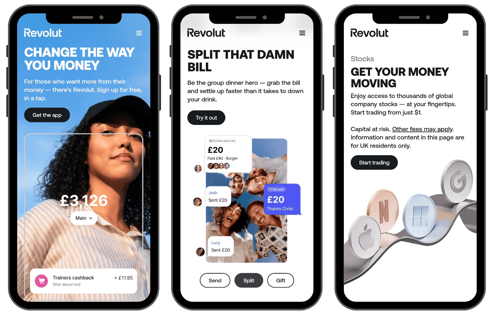
A shining example of getting the basics right is Revolut. Their mobile site is the epitome of seamless responsiveness and stellar UX.
As a fintech company offering cutting-edge banking services, their digital presence reflects their commitment to user satisfaction. Visitors are greeted with a swift, intuitive, and hassle-free experience, setting the stage for a lasting relationship.
3. Don’t Be Vague with Your Value Proposition
Clarity can be one of the most powerful weapons in your marketing arsenal.
Early-stage visitors land on your site with a cloud of questions. Your value proposition is your chance to clear the air, making a lasting mark on their minds. When using it, you shouldn’t push for an immediate sale but ensure they remember you – now and when they’re ready to take the next step.
This is key because, in the brief moments a visitor spends on your site, you need to imprint your brand’s essence. A clear, compelling value proposition does just that – bridging the gap between their problem and your solution.
Here’s how to craft one that sticks:
- Use simple, jargon-free language to explain what you do and why it matters. Your visitors should grasp your offer in seconds.
- Focus on how your product or service improves their life or solves their problem. Benefits should be front and center.
- Make it clear why you’re different (and better) than alternatives. What makes you stand out in the crowded market?
Affirm, an online payment provider, crafts a B2B value proposition with measurable outcomes. On their offer for businesses, they integrate statistics that underscore how they help brands scale.
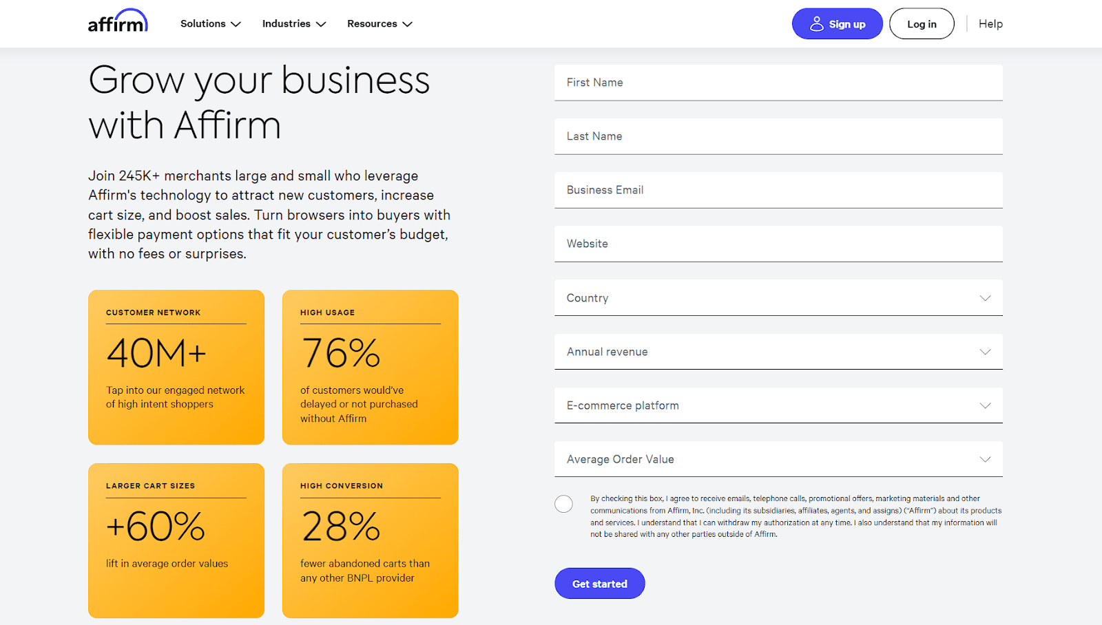
With this, Affirm not only tells but also proves its value, making a memorable impact on potential partners looking for growth solutions.
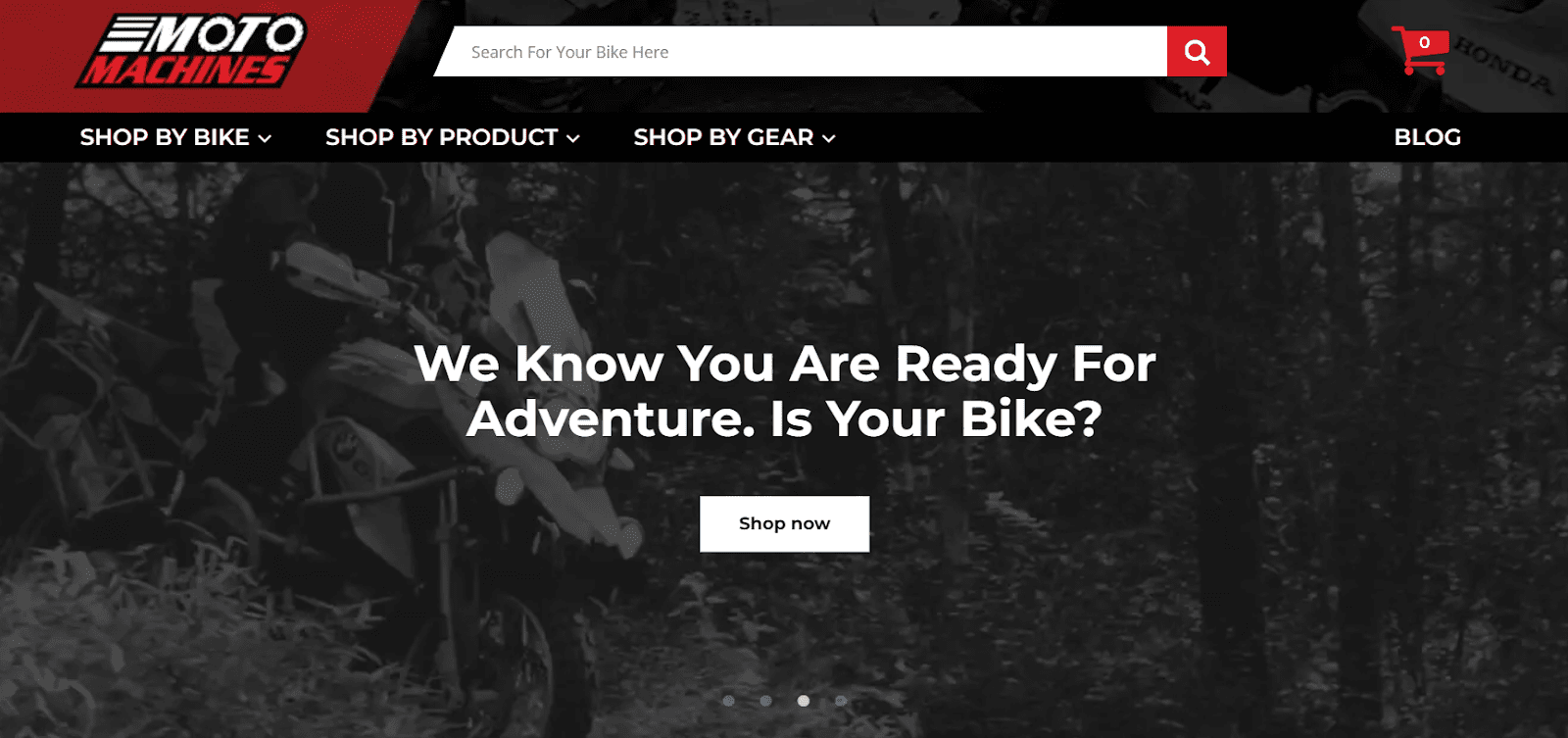
Moto Machines, a B2C motorcycle accessories brand, strikes a chord with consumers through emotive copy that resonates with the spirit of adventure.
Their proposition goes beyond selling motorcycle accessories. It speaks to the heart of the rider’s aspirations, connecting on an emotional level while clearly stating the brand’s purpose.
By being explicit about your value, you can transform your website from a mere digital storefront into a memorable landmark in the customer’s journey.
4. Make Your Product Details Easy to Grasp
For early-stage visitors, simplicity is key. Sure, they’re curious, but their commitment is pretty thin. They’re peeking over the fence, wondering if what you offer can solve their problem or fulfill their need – better than a competitor.
If the explanation of your product or service turns into a puzzle, their interest will dissolve fast. This is why making your product details incredibly easy to understand is vital.
That’s because clarity breeds confidence. When visitors can quickly grasp what you’re offering and how it benefits them, they’re more likely to remember your brand and return when they’re closer to making a decision.
Here’s how to simplify your product presentations:
- Incorporate well-made explainer videos to condense complex ideas into digestible, engaging content.
- Use images that not only attract attention but also explain your product’s features or benefits at a glance.
- Whether it’s text, video, or images, the KISS principle (keep it simple, stupid) reigns supreme. Avoid jargon and stick to the essence of what makes your product valuable.
Zendesk is an all-in-one customer service solution that knows its platform might seem daunting at first glance. Their solution is a prominently placed explainer video right on the homepage.
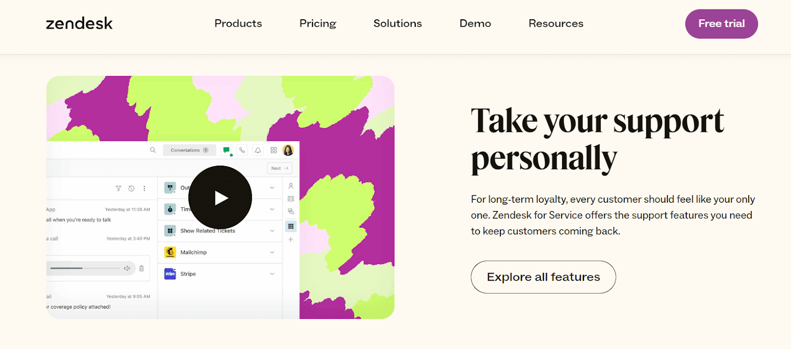
This video makes navigating their comprehensive customer service solution a breeze, inviting visitors to understand the platform’s value without getting bogged down by details.
Another example is Dropbox, a file-hosting service for both B2B and B2C. They use multiple short-but-sharp explainer videos across their website to showcase different features.
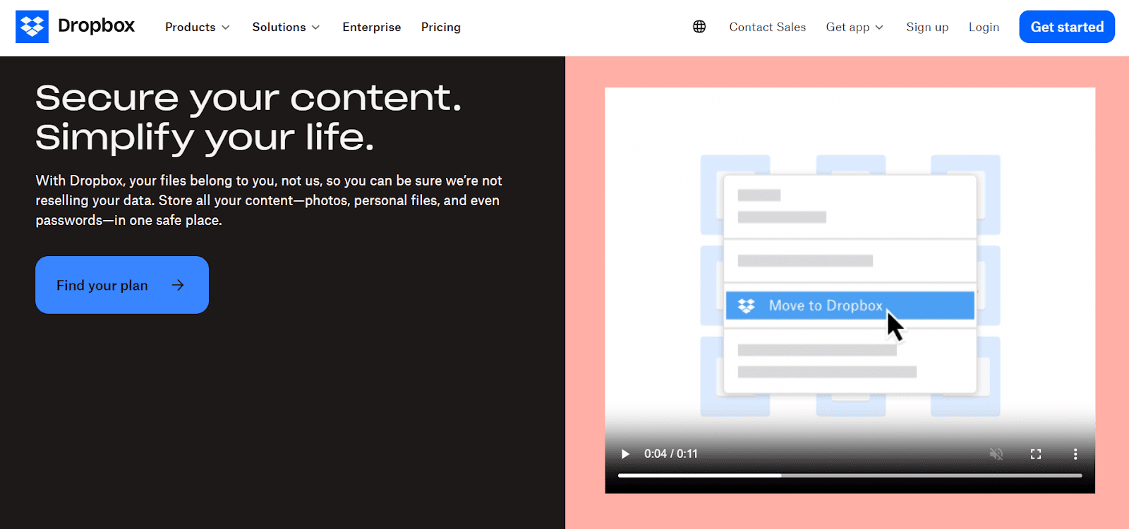
These videos are a masterclass in clarity, showing in simple steps how easy it is to use their service for file hosting and sharing.
By following the lead of these brands, you can guarantee that your product details aren’t just seen but understood, paving the way for a deeper interest and engagement from your early-stage visitors.
5. Make Product Exploration Inviting and Simple
The attention span of online shoppers rivals that of a goldfish. This implies that making your product exploration inviting and straightforward should be a top priority.
Visitors who float at the top of the sales funnel often engage in a casual glance rather than a deep dive. But this casual glance can transform into a meaningful exploration, with the right triggers.
It’s all about creating a positive, memorable experience that whispers, not shouts, the value of your offer.
Here’s how to engage visitors to explore your product:
- Employ interactive elements such as calls-to-action (CTAs) that invite users to click through for more information in a fun and engaging way.
- Ensure that your site’s navigation is intuitive, leading visitors effortlessly towards product discovery.
- Attract visitors with engaging visuals that highlight your product’s benefits, making exploration a visually rewarding experience.
A prime example of making product exploration both inviting and simple is Academic Influence, a website ranking academic institutions. This brand understands that its audience, primarily students and educators, seeks information without the pressure of immediate decisions.
Their homepage features three highly interactive CTAs, each inviting visitors to delve into the rankings of academic institutions. These CTAs serve as gentle guides, encouraging exploration and interaction with their product in a pressure-free environment.
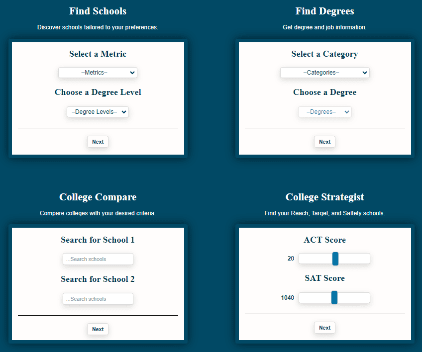
This is a clever way to spark curiosity and engagement, leading visitors down the path of discovery without overtly trying to make a sale.
By emulating Academic Influence’s approach, brands can create an environment that enhances the visitor experience and sets the stage for deeper engagement and future conversions.
6. Answer Their Pain Points without Sales Pressure
In the initial stages of the sales funnel, your audience isn’t looking for a sales pitch, and pushing too hard will send them away. They’re just starting to seek solutions to their problems.
Providing genuine, detailed answers to their questions without overtly selling your brand is what’s needed here. This approach positions you as a trustworthy source of information while subtly aligning your brand with the solution they’re seeking.
This tactic is vital because new visitors are often in research mode, not purchase mode. By offering valuable, in-depth content that addresses their concerns, you’re building a relationship based on trust and authority. This goodwill can translate into brand preference and loyalty over time, as visitors remember who provided them with the answers they needed when they needed them.
Here’s how to show your audience that you care for them:
- Use customer feedback, forums, and keyword research to identify the questions your target audience is asking.
- Write blog posts or articles that answer these questions comprehensively, providing actionable advice and insights.
- Mention your brand or services sparingly, focusing instead on delivering value and building trust.
A shining example of this approach is Indeed, an online job depository. Their blog post on “How To Make a Comprehensive Resume” covers the topic in detail, offering invaluable advice to job seekers.
The brand is mentioned only once throughout the entire post, ensuring the focus remains on helping the reader rather than promoting Indeed’s services.
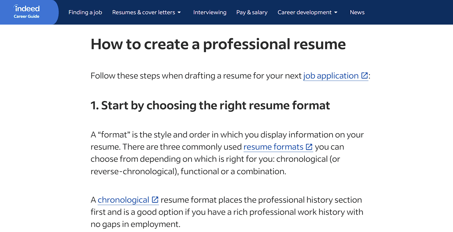
This strategy effectively addresses the audience’s pain points while subtly introducing them to the brand, fostering a relationship based on trust and utility.
7. Establish Credibility Clearly and Early
Building trust with visitors who are just entering the sales funnel includes making them feel secure and welcome.
Let’s dive into four key areas where establishing credibility can significantly impact their journey on your site.
Incorporating Trust Signals for Transactions
In an era where cyber threats are a common occurrence, ensuring transaction security is a must. Visitors need to feel safe the moment they land on your site, especially if future transactions are on the horizon.
To achieve this, implement SSL certificates, display security badges, and ensure your checkout process is encrypted. Highlighting these security measures reassures visitors of the safety of their data.
Golf Cart Tire Supply, a supplier of golf cart tires and accessories, is an example here. They place trust badges above their header, instantly communicating their commitment to secure transactions. This small gesture significantly boosts visitor confidence from the get-go.

Provide Social Proof
Social proof acts as a mirror reflecting the positive experiences of others. It reassures visitors that they’re in good company and that your product or service is tried and trusted.
To get this aspect right, make social proof elements like customer reviews, ratings, and endorsements from well-known brands highly visible on your site.
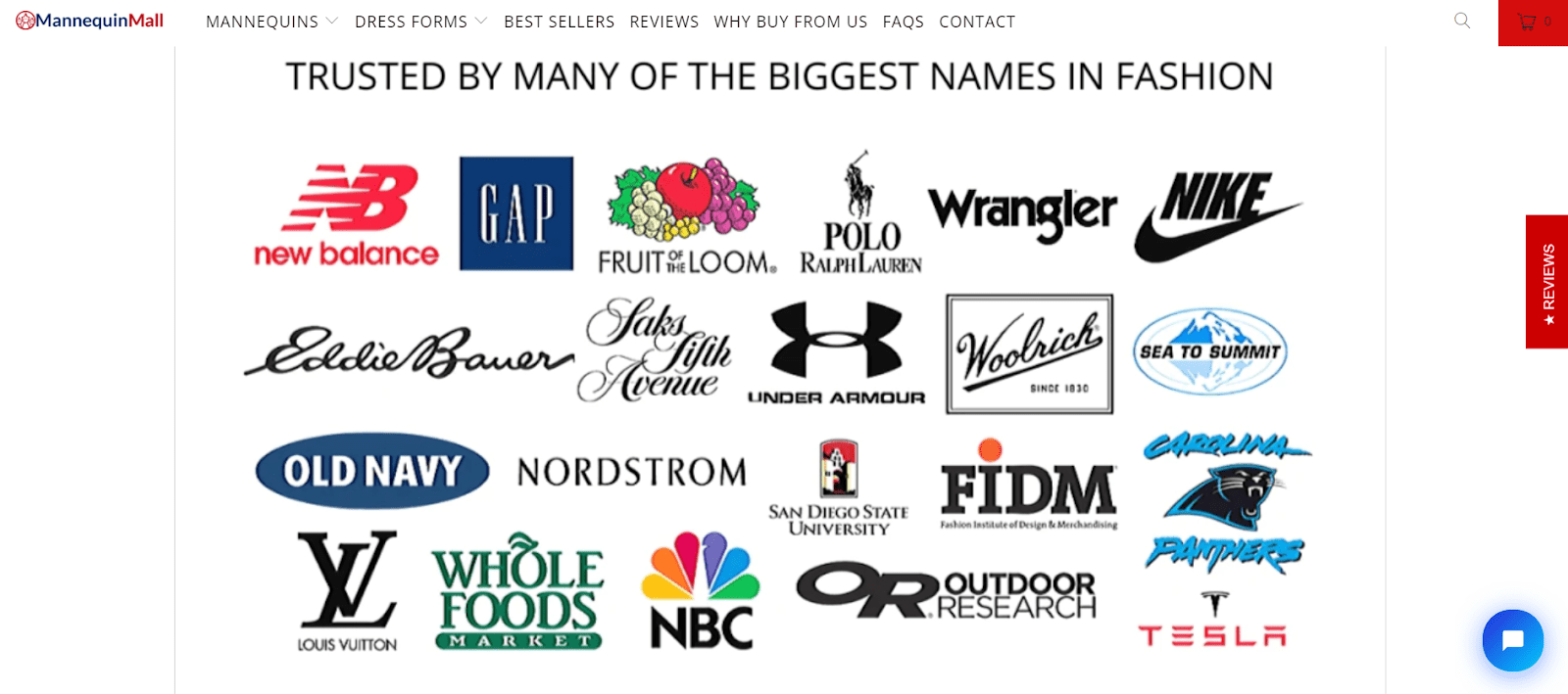
One successful instance of this tactic is Mannequin Mall, a fashion mannequin retailer.
They embed social proof into their fabric with a reviews side button, product star ratings, and a section showcasing logos of reputable brands they’ve worked with, making trust hard to miss.
Showcase Testimonials
Testimonials are the personal stories that paint a vivid picture of your brand’s impact. They connect on an emotional level, showing real-life applications and satisfaction.
To leverage their power, feature your most compelling testimonials prominently on your homepage or product pages. Choose stories that resonate with your target audience’s desires or challenges.
Transparent Labs, a natural sports nutrition supplement brand, displays an enticing testimonial right on its homepage with an athlete’s praise. This endorsement creates an emotional and aspirational appeal that resonates with their fitness-conscious audience.

Leverage Strategic Partnerships
Showcasing strategic partnerships can broaden your brand’s appeal and credibility. It signals that reputable entities or individuals have put their trust in your brand.
There are several ways you can form strategic partnerships:
- You can start your own podcast and feature industry experts or successful clients to amplify the value of your product or service.
- Guest posting is a great way to be seen and heard apart from your website. It’s a strategy that can underscore your brand’s reliability and success.
- Partnering with influencers offers multiple benefits for establishing credibility. It broadens your reach, attracts new audiences, and represents a tool for educating early visitors on what it is that you’re selling.
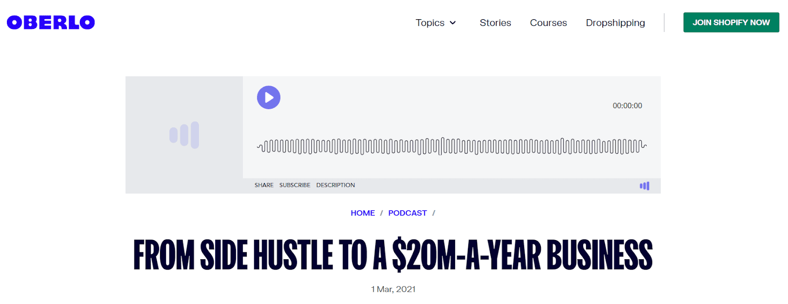
Oberlo, a dropshipping app for Shopify, uses its podcast series to feature stories of successful entrepreneurs who have used their platform. It’s how they demonstrate the tangible success achievable through their partnership.
Episodes like turning a side hustle into a multimillion-dollar business inspire trust and aspiration among early-stage visitors.
8. Generate Positive Emotions
Generating positive emotions is both about making your visitors feel good and, more importantly, about creating a memorable experience that resonates with them on a deeper level.
When visitors associate your brand with positive feelings, they’re more likely to remember and trust your brand, paving the way for future engagement and conversion.
This works because emotions drive decisions. By evoking positive feelings, you’re enhancing the user experience while building a connection that transcends the transactional. This emotional bond can differentiate your brand in a crowded market, turning casual visitors into loyal advocates.
Here’s how to make your visitors fall in love with your brand:
- Align your brand with social causes that reflect your values. Communicate your commitment to these causes through your content and actions, showing visitors that you stand for more than just profits.
- Craft content that tells stories, celebrates successes, or even shares challenges that have been overcome. Use narratives that your audience can relate to, fostering a sense of community and shared experience.
- Choose images and words that evoke warmth, happiness, aspiration, or other positive emotions. Your visual and textual content should work together to create an uplifting environment that encourages exploration and engagement.
Alexander Tutoring, offering math and physics tutoring services, beautifully encapsulates this tactic. Besides tutoring services, their website header sells dreams and aspirations as well.
With emotionally charged language that highlights the joy and wonder of learning math and physics, paired with imagery of a person gazing up at a starry sky, they perfectly convey the boundless opportunities that their tutoring can unlock.

This potent combination of words and imagery captures the imagination and instills a sense of optimism and curiosity at the same time. This makes the offered experience an exciting adventure rather than an intimidating task.
9. Understand That Some Early-Stage Visitors are Ready to Convert
Believe it or not, not all early-stage visitors are just browsing. Some are on the cusp of conversion, teetering on the edge of decision-making. Recognizing and catering to these visitors can significantly boost your conversion rates.
This is where the art of seamlessly blending high-quality information with strategic product mentions, service descriptions, and CTAs comes into play.
Offering visitors valuable information positions your brand as an authoritative source in your industry. When you couple this with tactful product mentions and CTAs, you provide a pathway for conversion that feels natural and unforced.
This strategy respects the visitor’s need for information while guiding those ready to take the next step. Here’s how to excel in it:
- Ensure your blog posts are informative, well-researched, and genuinely helpful. Quality content is the foundation that earns visitors’ trust and interest.
- When mentioning products, ensure they’re contextually relevant. Links to products should feel like a natural extension of the advice being given.
- Encourage conversion with soft CTAs that invite visitors to learn more about a product or service rather than pushing for an immediate sale.
Chewy, a supplier of pet products, exemplifies this approach perfectly. Their blog, aimed at pet owners, is brimming with helpful advice and information.
In their post about allergy meds for dogs, Chewy masterfully intersperses links to relevant products. These links are integrated so naturally that they enhance the article’s value, offering readers a direct avenue to solve their problem without feeling like a sales pitch.
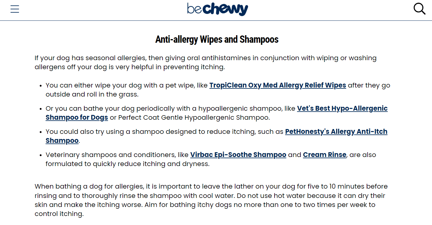
By mirroring Chewy’s approach, you can cater to those early-stage visitors who are just a nudge away from converting without sacrificing the integrity of your content or the comfort of your audience.
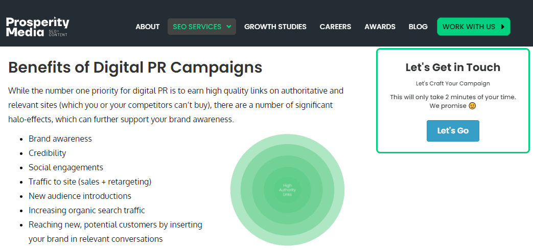
SEO specialists, Prosperity Media, offer us an example of how to present a CTA to an early-stage visitor who might be ready to convert.
In their post covering the finer points and of benefits of digital PR, the agency displays a floating CTA that’s eye-catching without being intrusive or feeling like a hard sell.
The agency manages this by framing the CTA as an interactive, personalized experience rather than the start of their sales process. The CTA label (along with the surrounding text) is friendly and engaging, while at the same time making the benefit of the process extremely clear to early stage visitors with an interest in getting the sales process started.
Final Thoughts
Before you dash off to implement these strategies, here’s one more golden nugget: always personalize the experience.
Use data to tailor your site’s experience to match the interests and behaviors of your visitors. Even something as simple as addressing returning visitors by name or recommending content based on their browsing history can significantly increase engagement and leave a lasting impression.
Remember, the journey of a thousand conversions begins with a single click. By understanding and implementing these tactics, you’ll be selling products and building relationships in a heartbeat.


