Did anybody else weigh in on the colour of that dress that kept popping up across the social media channels last week? Was it blue and black, or was it gold and white? How did you see it? Turns out it was blue and black. Go figure. Taylor Swift was right.
Regardless of the correct answer, the popularity of this gone-viral question once again confirms the subjective nature of people’s visual perception.
Did the colour of the dress affect the way we thought about the dress? Not necessarily. But if you applied those colours across the entirety of a website, chances are they would elicit a stronger response.
That’s why at Forge and Smith, we use style tiles to help guide the visual planning of our clients’ new websites.
Presenting your site’s first web design elements
When it comes to successful user experience, the visuals are obviously a key component. As a WordPress web design company here in Vancouver, we create exciting designs that accentuate the content and adapt to existing branding. As you can imagine, that’s not always a simple task when all the stakeholders start to weigh in on each little element of the page.
For many clients, wrapping their brain around the wire frames of a website at its earliest development stage — with no design elements at all — is a difficult thing. It’s especially tricky in the case of a content site with numerous landing pages and countless links.
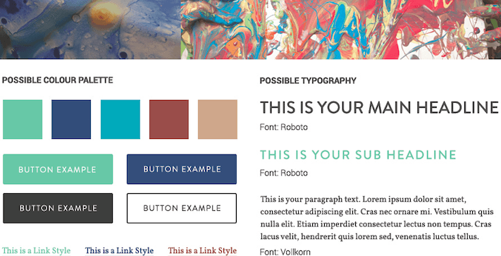
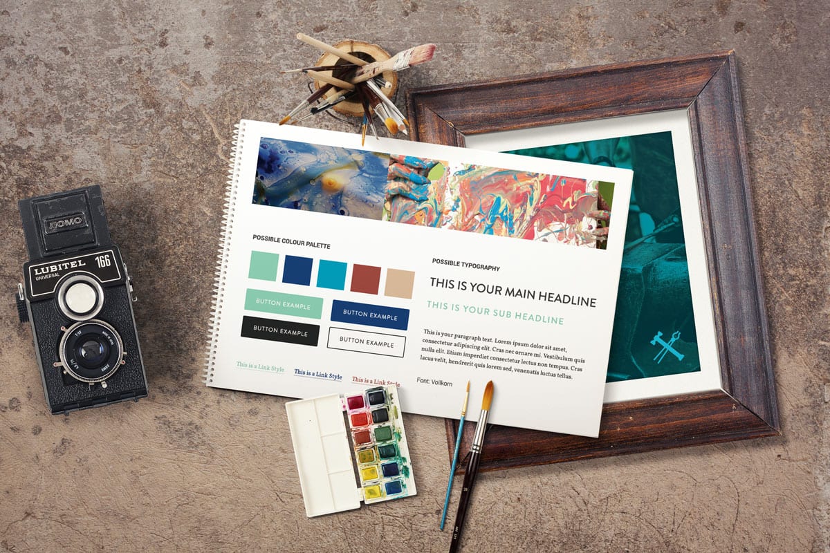
The style tile is the client’s first actualization of what their new site will be. It’s all about creating the proper “feel.”
Style tiles are a structured presentation of a website’s fonts, image types, colours, icon treatments, styles, button types, logos, and typography. More refined than a moodboard’s collage, and less definitive than a mockup, style tiles are an introductory deliverable at the design level.
Style tiles are an effective tool as they aid in the decision-making process. They make the not-so-easy task of selecting visual components so much simpler. Simplicity is a good thing in a complex process such as web design. Of course, creating effective style tiles is the domain of talented and experienced art directors.
When done right, style tiles kickstart the mind’s eye, and green light the work flow process.

What specifically makes style tiles so darn effective?
They offer imagination: Style tiles work because they are the visual culmination of a client’s existing assets juxtaposed with the new design. In other words, the client can more easily envision their brand in a new light.
They engage the client: Style tiles initiate dialogue between designer and client. This exchange establishes trust and conveys to the client that their voice has been heard. Style tiles are an exercise in cooperation, showcasing the web agency’s ability to take direction. It’s another opportunity to shine.
They offer freedom of choice: Everybody likes having options. Style tiles offer selection, without overwhelming and burdening the client with too many choices.
They are decisive: Style tiles are a good litmus test. There are psychological properties associated with every colour; and each possesses both positive and negative connotations. For example, the colour red is associated with strength (hey, that’s good!) and aggression (oh, that’s not so good). Whatever the response, people’s reactions are usually immediate and perfectly honest. Good designers will present a contrast in the tiles they present, so as to provide clear direction for the project moving forward.
To sum it all up, style tiles are an important part of the design process here at Forge and Smith. Whether you prefer the blue dress or the white dress, when it comes to website development, style tiles enable you to make the right decision in the first place.
Check out our web design case studies section for a closer look at our diverse range of clients and their distinct visual palettes.


