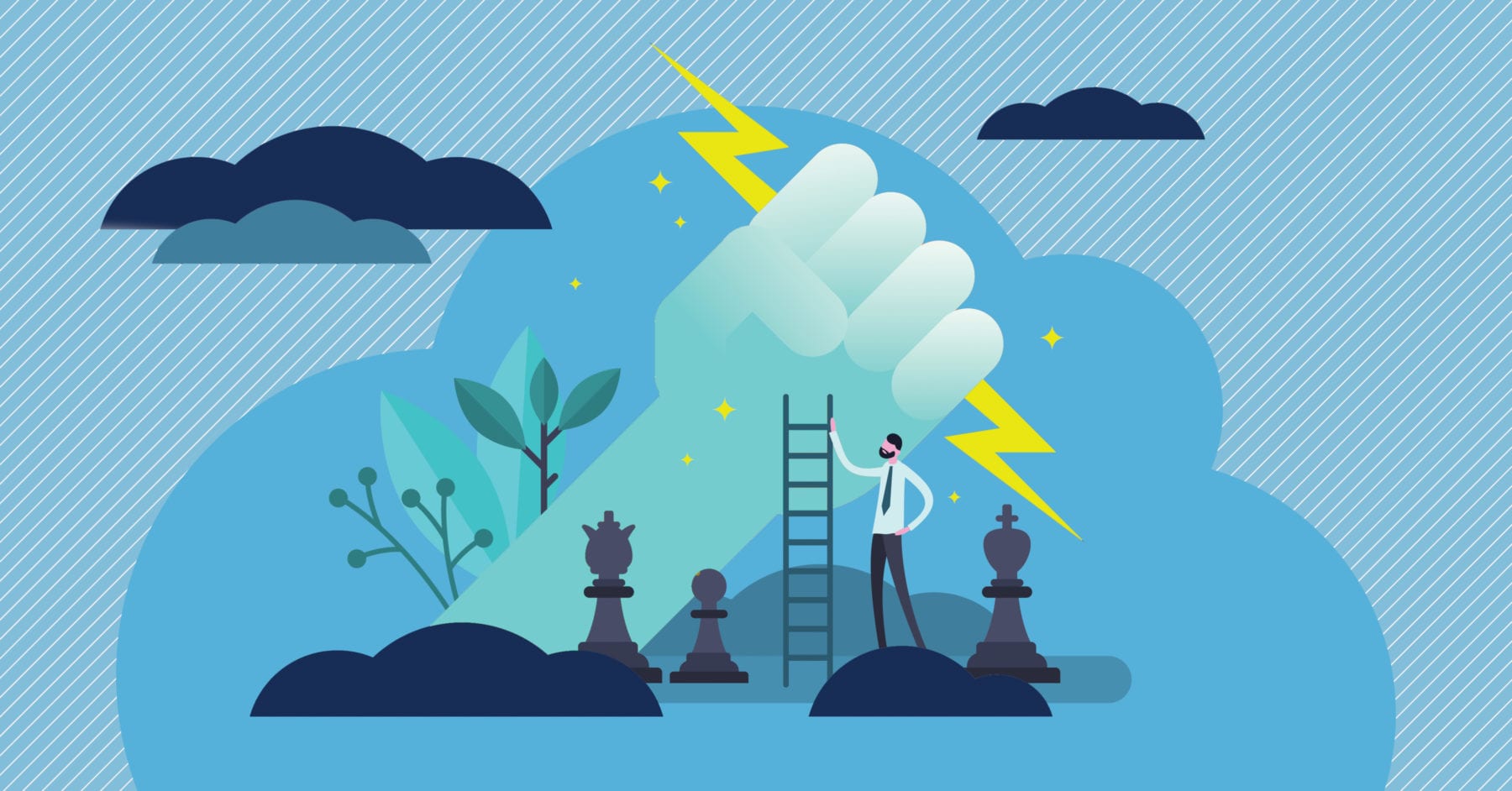
The majority of websites are built with one moment in mind: the conversion.
But most people who land on your site aren’t there yet. They’re still figuring things out – what you offer, whether they trust you, and if you’re even relevant to their needs.
That in-between space is where most sites fall flat. They assume visitors are ready to act when most are still deciding if they should care.
Your site shouldn’t just be a final stop. It should work at every stage, from initial acknowledgment to early intent, eventual action, and long-term retention. That means showing the right thing at the right time and making sure each click, headline, and page has a job to do.
When done right, your site won’t push people but help them move forward, one small decision at a time. This article breaks down how to make that happen with solid examples of brands that already did.
1. Awareness Stage
In the awareness stage, people are seeing your brand for the first time. They’re not ready to buy, but trying to understand who you are and whether you’re worth their attention.
Your website’s job here isn’t to sell. It’s to make a clear, solid first impression. That means showing what your brand is about, who it’s for, and why it matters. If that’s unclear or buried, visitors will leave before they ever bother finding out what you actually offer.
Build Trust Through Educational Content
When visitors don’t know your brand, they won’t trust you with their wallet right away. But they will trust you with their attention if you prove you know what you’re talking about.
Educational content does exactly that. It positions you as the expert while helping people understand their problems better.
Blog posts that tackle frequently asked questions in your field work incredibly well here. So do step-by-step guides that walk people through complex processes and explainer videos that break down confusing topics.
Research shows that educational content makes consumers 131% more likely to convert compared to promotional material. People remember brands that taught them something valuable, and they’re more willing to do business with companies they see as helpful authorities.
Resolute Legal, a Canadian law firm that handles employment and disability cases, nails this approach. Instead of filling their website with lawyer bios and case results, they created an entire learning center packed with free resources.
Visitors can access online calculators to estimate claim values, download comprehensive guides about their rights, watch YouTube videos explaining legal processes, and join forums to discuss their situations with others.
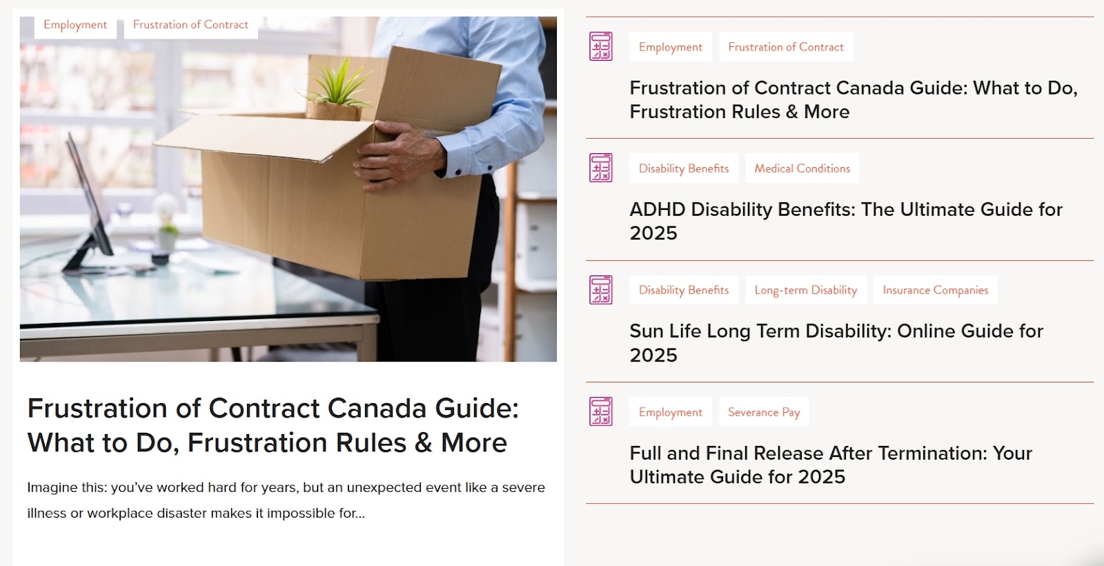
This way, visitors leave the site feeling more confident about their situation, whether they become clients or not. That’s how you create a lasting first impression.
Make Your Value Crystal Clear from Second One
When someone lands on your homepage for the first time, they’re looking for quick answers: What is this? Who is it for? Why should I care? If your site doesn’t answer those within a few seconds, you lose them.
That’s why clear brand positioning matters so much in the awareness stage.
Your headline and intro copy should tell visitors exactly what you do and how it helps them, not in vague slogans or broad mission statements but in simple, benefit-focused language that shows value right away. Improving your value proposition, even slightly, can lead to a major lift in customer interest.
To do this right:
- Start with the essentials. Focus on the problem you solve and the result people can expect.
- Skip jargon.
- Avoid listing features.
- Use short sentences.
- Back it up visually.
The Lifesaving Society, a nonprofit that focuses on drowning prevention through training programs like swimming, lifeguarding, and first aid, gets this right.
Their homepage opens with a direct, benefit-driven headline: “Drowning Is Preventable.
Swim for Life. Save a Life.” Right below, this is followed by clear pathways for different audiences, whether you’re looking for training, certifications, or resources.
The imagery supports their message, and there’s no confusion about what the organization does or who it serves.
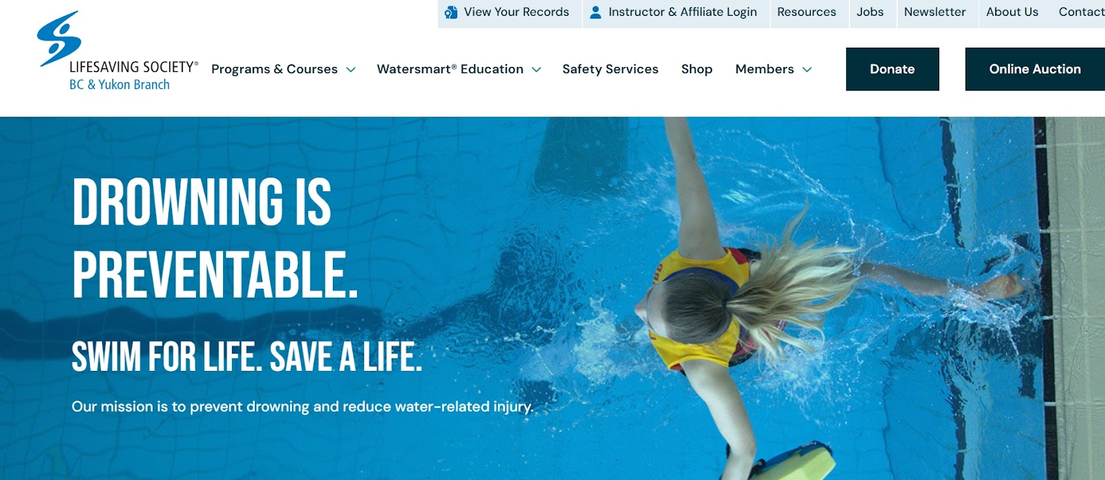
This kind of positioning informs visitors and gives them a reason to stay. It also makes it easier for them to remember you.
Let Your Reputation Speak for Itself
At this stage, trust is low. People don’t know your brand yet, so they look for signs that others know it and that those people had a good experience.
That’s why social proof matters. It gives your site credibility from the start. Whether it’s press mentions, client logos, or testimonials, these signals help first-time visitors feel more confident sticking around.
Virtually everyone who shops online reads customer reviews, at least sometimes. Even if they’re not buying yet, they want reassurance that your brand is real, established, and worth paying attention to.
This only works if it’s done right:
- Don’t bury your social proof at the bottom of a page.
- Place it where people will actually see it: on your homepage, near CTAs, or right after introducing your brand.
- Use real names, job titles, and photos if possible.
- Make your testimonials specific. A vague “great service” won’t do much.
- Go for stories. What was the problem, how did you help, and what changed afterward?
- Add credibility with recognizable names or logos when you can.
Fieldhouse, a firm that builds tailored investment strategies for high-net-worth individuals, families, and institutions, uses this approach well.
On their homepage, they highlight testimonials from actual investors, portfolio managers, and financial planners. The quotes compliment the service and explain how Fieldhouse solved specific challenges and helped them reach financial goals. It’s detailed and focused, and it gives new visitors a reason to trust them.
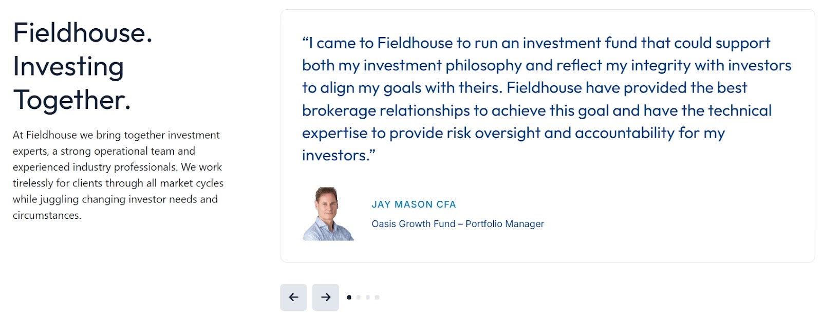
This approach works because potential clients can see themselves in these stories. When someone reads about another investor’s success, they start imagining similar results for their own portfolio. That’s social proof doing its job.
2. Consideration Stage
In the consideration stage, visitors know who you are and what you offer. Now they’re weighing their options. They’re comparing, digging into details, and deciding whether you’re the right fit.
At this point, your website needs to make evaluation easy. That means giving people clear, helpful information that answers their questions and removes doubts. The goal isn’t to push for a sale but to help people feel confident in their decision to move forward with you, or at least keep you on their shortlist.
Build Confidence with Detailed Solution Pages
At this point, general info isn’t enough. People want details. They’re trying to figure out whether your product or service is right for them, so your website should help them break that down.
That means clear product or service pages that explain features, benefits, use cases, and how you compare to other options.
Where possible, real-world examples and comparisons can push people closer to a decision. That’s why case studies work so well. To be more precise, about 47% of B2B marketers say case studies are the most effective format for B2B content marketing. They let potential buyers see themselves in the story and understand what success can look like.
To craft effective use cases:
- Start with a clean structure.
- Break content into sections.
- Use plain language.
- Link to related information like pricing, FAQs, or demos.
- If you offer multiple options or packages, help people compare them easily.
- Keep the focus on what the customer cares about, not internal jargon.
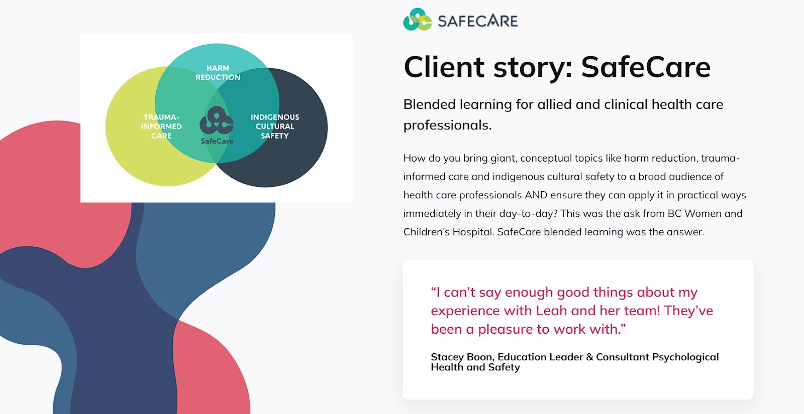
A great example of this strategy is Leah Chang Learning, an online learning consultancy. Their homepage features an excerpt from a case study showing how they helped a large group of healthcare professionals adopt blended learning.
It covers the client’s challenge, the tailored solution, and the results, all in a way that’s easy to follow. Visitors get a clear sense of what the company offers and how it delivers real results. That’s exactly what people need at this stage.
Use Video to Show, Not Just Tell
Website visitors are often looking for more than claims. They want proof.
Video content helps bridge that gap. Whether it’s a demo, a quick walkthrough, a customer interview, or a short founder intro, video builds trust faster than a wall of text.
It gives people a better feel for what you offer, how it works, and who’s behind it. It also keeps them engaged longer. And it works – 88% of video marketers say video has helped them generate leads.
To use video effectively:
- Focus on clarity and relevance.
- Keep videos short and to the point.
- Every video should have a purpose to explain, demonstrate, or reassure.
- Avoid long intros, overproduction, or vague messaging.
- Embed videos where they’re most useful, such as on product pages, landing pages, or in your resource hub.
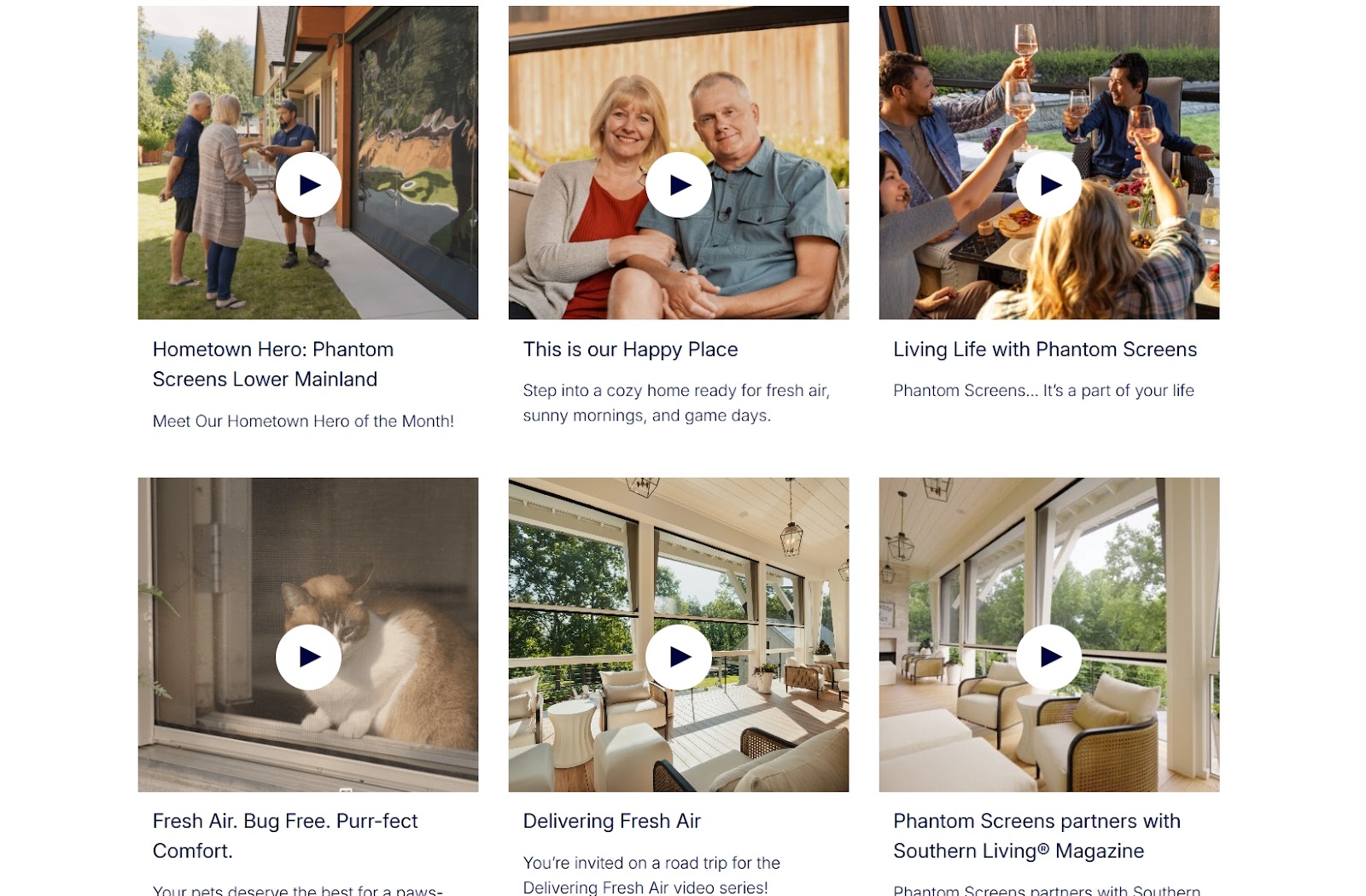
Phantom Screens, a company that creates retractable screen solutions for homes and outdoor spaces, does this well. Their website includes a dedicated page featuring videos from real project installs.
The videos are brief but effective. They show the product in action, how it was installed, and how homeowners interact with it in daily life. You also see client reactions, which adds credibility and trust. It’s a simple but strong way to help people picture the product in their own space.
Remember that video isn’t just nice to have. It’s one of the most persuasive tools you can use to help people move forward.
Capture Leads with Valuable Free Resources
Visitors in the consideration stage are open to learning more, but they’re still cautious. Offering downloadable resources, like whitepapers, checklists, or ebooks, gives them something useful while giving you something in return: their contact info.
When done right, these gated resources are a smart way to continue the conversation and qualify leads without pushing for a sale too soon.
The key is to offer real value:
- Don’t just repurpose a blog post into a PDF. Give people something they can apply right away, like a step-by-step guide, industry insight, or practical checklist.
- Make it relevant to the problems they’re trying to solve.
- Keep the form short. Name and email are usually enough.
- Be clear about what they’re getting, and avoid over-promising.
One example that uses this tactic is Signature Edits, a brand that offers marketing tools and presets for photographers. On their homepage, there’s a clear section inviting visitors to get a free pack of tools and presets by entering their email. It’s positioned as a useful starter kit, not a sales pitch.
The offer is specific, actionable, and relevant to their target audience. Once downloaded, the free pack introduces users to the kind of high-quality resources Signature Edits sells, while giving the brand a way to stay in touch.

Downloadable content works best when it solves a real need. It builds trust, starts a relationship, and keeps you in the running when the visitor is ready to decide.
3. Decision Stage
Now your visitors are ready to buy. They just need that final push. They’ve done their research, compared options, and decided you’re probably the right choice. But “probably” isn’t enough to get them to pull out their credit card.
Your website needs to eliminate every last bit of friction and doubt. Make the buying process so smooth and reassuring that saying yes feels like the obvious next step. This is where you turn interested prospects into paying customers.
Quantify Value with Interactive Calculators
When your service involves complex benefits or savings, telling people about results isn’t enough. You need to show them their specific numbers.
Interactive calculators transform abstract concepts into concrete dollar amounts that make the decision obvious. Instead of wondering “how much could this help me,” visitors see exactly what they stand to gain.
This works especially well for service businesses with specialized offers where benefits vary dramatically by situation.
Here’s how to make it work:
- Build calculators that ask for real data your prospects already know, such as annual revenue, square footage, current expenses, or similar metrics.
- Keep the input fields simple and the results immediate.
- Don’t ask for contact information upfront. Let people play with the numbers first.
- Make sure your calculator produces realistic results based on actual client data. Inflated projections will backfire when prospects dig deeper.
- Include disclaimers about assumptions and variables, but don’t bury the results in legal language.
RE Cost Seg, a firm that helps real estate owners reduce taxes through cost segregation studies, uses this approach perfectly.
Their free cost segregation calculator lets property owners input basic information about their real estate investments to estimate potential tax savings from depreciation strategies. Prospects can see their specific numbers within seconds – often thousands of dollars in annual savings.
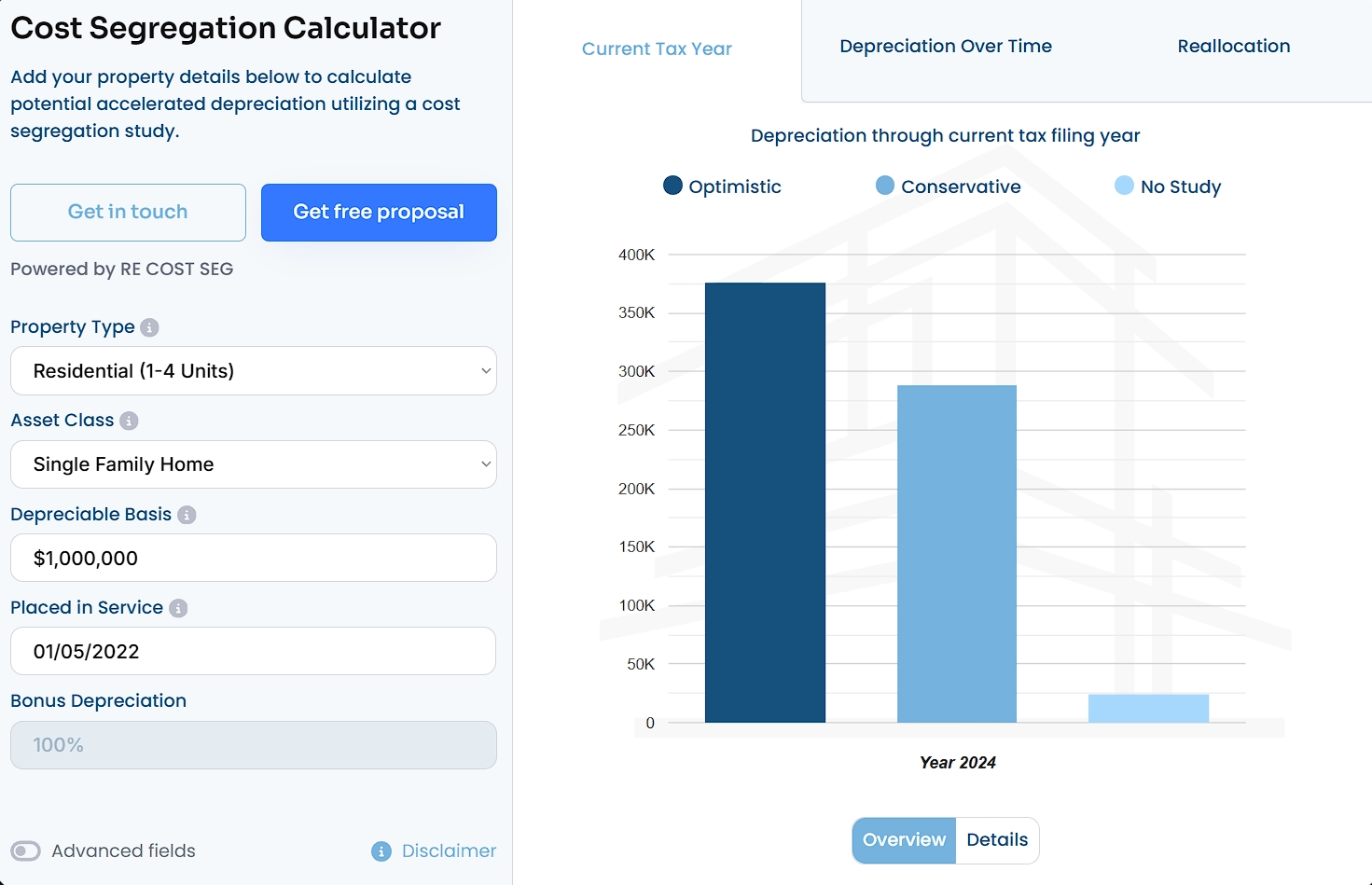
This calculator does the heavy lifting of demonstrating value before any sales conversation begins. When prospects see their potential savings, scheduling a consultation becomes the logical next step.
Seal the Deal with Laser-Focused Landing Pages
When visitors reach the decision stage, they’re ready to take action. Your landing pages need to match that urgency with clarity, focus, and a strong push toward conversion.
A well-designed landing page removes distractions and answers final questions quickly, guiding visitors to complete the desired action, whether that’s signing up, booking a consultation, or making a purchase.
To build an effective landing page:
- Start by clearly defining who it’s for and what it offers.
- Use simple, benefit-driven headlines and concise copy that focuses on the outcomes your service delivers.
- Include trust signals like client testimonials and social proof, but keep everything easy to scan.
- A single, prominent CTA should stand out and be repeated without overwhelming the visitor.
- Avoid clutter, unnecessary links, or anything that could distract from the goal.
CapitalPad, a platform connecting investors with investment opportunities, excels at this. Their landing page on investing in independent sponsor deals specifically clearly states what CapitalPad does and the benefits investors can expect.
It features testimonials from satisfied clients, giving credibility and reassurance. The layout is clean and straightforward, making it easy for visitors to quickly understand the offer and take the next step.
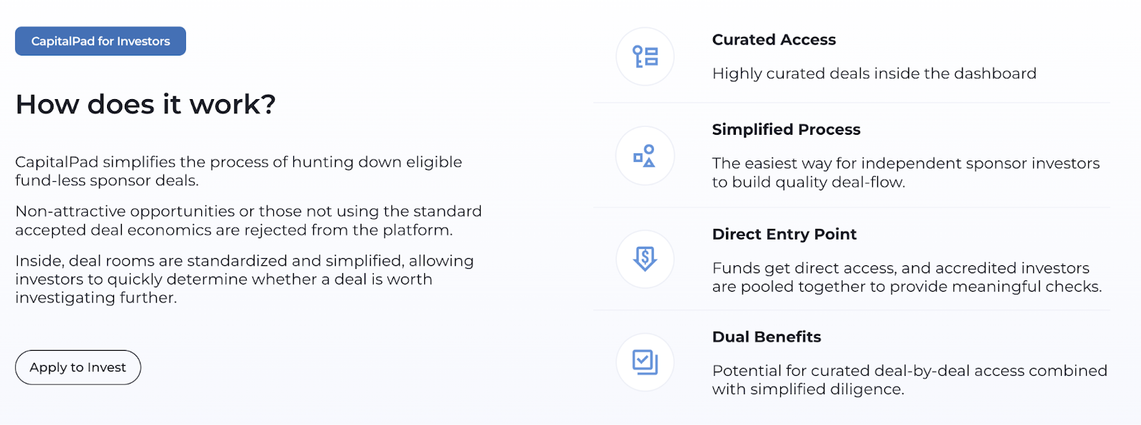
When you’re ready to convert leads, this is the approach you want your landing pages to follow.
Remove Price Guesswork with Clear Transparency
At this stage, pricing can be a major sticking point. Visitors want to know exactly what they’ll pay and what they’ll get for it.
Transparent pricing helps remove doubts and builds trust, making it easier for prospects to say yes.
To do pricing right:
- Keep your pricing page straightforward.
- Break your offers into clear tiers or packages that match different needs or budgets.
- For each tier, list exactly what’s included so visitors understand the value behind the price.
- Avoid vague descriptions or hidden fees.
- Use simple language and clean design to make it easy to scan and compare.
- If you offer custom pricing or add-ons, explain how those work upfront.
Start in Wyoming, which offers Wyoming LLC formation and registered agent services, provides a strong example. Their pricing page breaks down plans into clear tiers with detailed descriptions of what’s included in each.
The prices are upfront with no hidden fees, and everything is presented neatly and honestly. Visitors can easily compare options and pick what fits their needs without second-guessing.
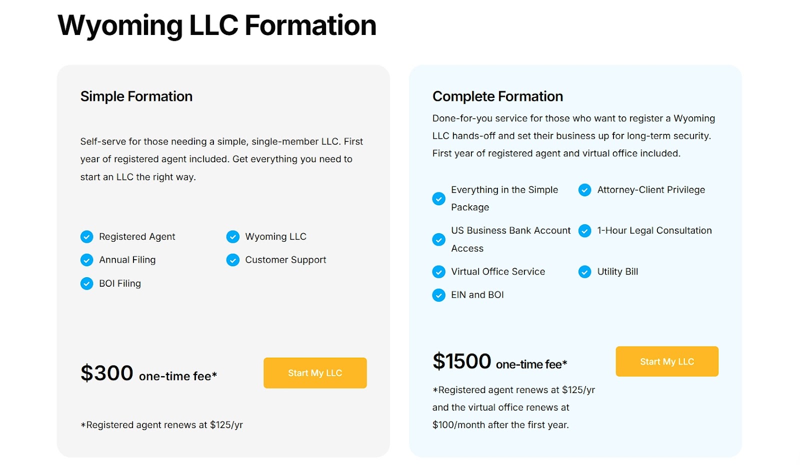
When pricing is clear, visitors feel more comfortable moving from consideration to purchase. It’s a small step that makes a big difference at the final stage.
4. Loyalty Stage
Your customers have bought from you, but the relationship doesn’t end there. Now your website needs to keep them engaged, satisfied, and coming back for more.
This stage focuses on delivering ongoing value that makes customers stick around and tell others about you. Happy customers become your best marketing asset.
Turn One-Time Buyers Into Recurring Revenue
If you sell products that customers regularly use, offering a subscription option can significantly boost retention.
Subscriptions reduce friction for repeat purchases and keep your brand top-of-mind. They also offer predictable revenue and help deepen long-term relationships.
To do them right:
- Don’t bury the subscription offer.
- Make it visible on your product pages, right next to the one-time purchase option.
- Use simple UI elements to show the value, whether it’s convenience, discounts, or perks like free shipping.
- Let customers know they’re in control by making cancellations or changes easy.
Transparent Labs, a natural sports nutrition supplement brand, gets this right. On this product page for their casein protein, shoppers can choose between a one-time purchase or a subscription.
The subscription UI clearly highlights its benefits: 10% off, free shipping, and the flexibility to cancel anytime. It’s positioned well and gives buyers a strong reason to stick around.
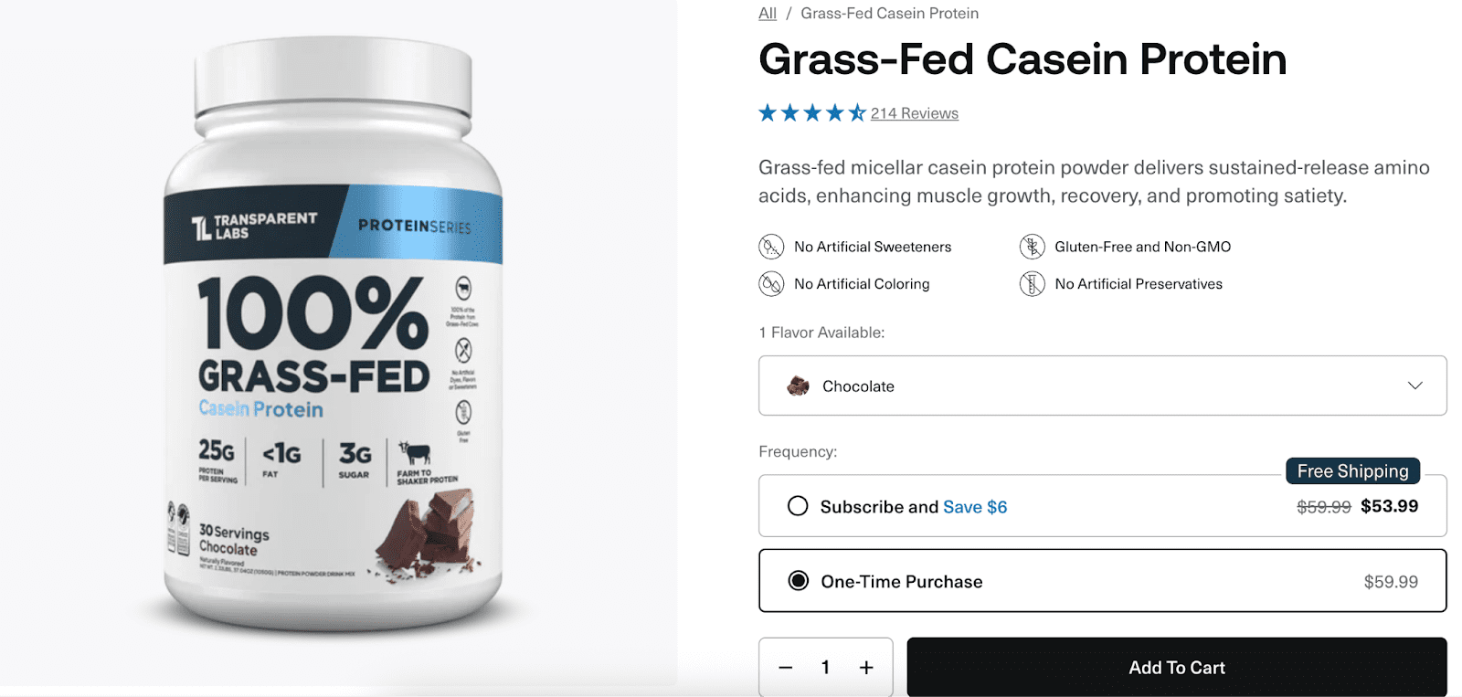
When done with transparency and value, subscriptions can strengthen loyalty without adding pressure.
Boost Retention with Value-Added Content
After a purchase, your website should continue helping customers succeed.
Adding blog content, tutorials, and guides tailored to buyers creates valuable post-sale touchpoints that improve product satisfaction and reduce churn. When customers know how to get the most out of what they’ve bought, they’re more likely to return and recommend you to others.
To do this effectively:
- Create content that answers common post-purchase questions, showcases advanced features, or shares ideas for using the product in new ways.
- Organize this content so it’s easy to find, ideally linked from product pages, order confirmations, or your main navigation.
Sewing Parts Online, which sells sewing supplies excels here.
Their blog is filled with useful posts, many backed by video, showing creative projects, advanced techniques, and how-tos. These resources teach customers how to tackle specific sewing projects and maximize their equipment’s capabilities.
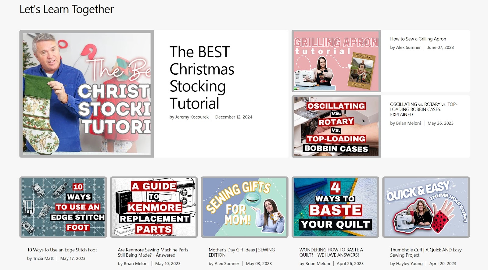
Ongoing support like this keeps customers engaged and builds real loyalty.
Turn Happy Customers Into Your Sales Team
If you want customers to spread the word, make your referral program impossible to miss, especially for people already using your product.
Promoting it inside your logged-in experience keeps it front and center for those most likely to refer you.
To do this well:
- Include clear, friendly messaging about the referral benefits where users are already active: dashboards, account pages, or after completing key actions.
- Explain exactly what they’ll get, what their referral gets, and how to share.
- Keep the process fast, with no unnecessary steps or friction.
Dropbox, a file-sharing and cloud storage service, nails this approach. Their referral program is always close at hand within the user dashboard.
Customers are reminded that they can earn free storage by inviting others and that their friends will get the same. It’s a simple, mutual benefit that encourages sharing.
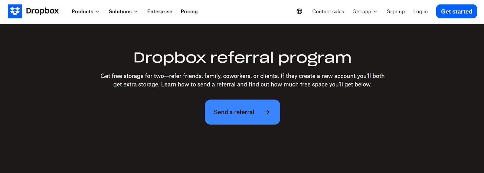
A referral program is only useful if people see it. Make it part of the experience, not an afterthought.
Final Thoughts
Every stage of the customer journey offers a chance to build trust, deliver value, and move people closer to action.
Your website can be a support system from first visit to long-term loyalty. The more intentional you are with each stage, the more likely visitors are to stick around, buy again, and tell others why they should, too.
About the Author
More by This Author
About the Author
John Hurley
John Hurley is a marketing consultant, freelance writer and professional geek. He loves overdelivering to his mostly SaaS & e-commerce clients. And romantic comedies are his not-so-guilty pleasure.
Contact More by This Author