
As a professional writer of over 25 years, it pains me to say this: nobody fully reads our website content.
When you spend several hours creating an article (which is how long it takes me to research and write, because I didn’t get a journalism degree to use AI), you expect people to read every word. The same is true for case studies, resources, and regular website pages. Those words have meaning. They carry your message, prove your expertise, and set you apart from competitors.
How could people just skim them?!
Until recently, I got deeply offended whenever somebody said, “nobody reads the whole thing,” or when someone clearly scanned a report that I had laboured over for hours. I thought there was this small subset of people with short attention spans who had the nerve to ignore my precious words, and that I must be better than them.
But it turns out only 13% of people read whole articles more often than skimming, and 52% will skim headlines first to decide if they want to keep reading. Nielsen Norman Group’s widely cited data on how much of a regular webpage gets read is heavily outdated (a 2008 article), but it states that “users have time to read at most 28% of the words during an average visit; 20% is more likely.”
And when I started researching the topic, I realized that I’m every bit as guilty of a short attention span when it comes to everyone else’s content.
This doesn’t mean that we shouldn’t write those words on our pages and in our articles. It just means that we have to consider both the full experience and how to get our message across if only part of it is read.
I’ll share what I’ve learned, and recommendations on how to design, write, build, and optimize your website for distractible audiences and short attention spans.
Why is your website’s audience distracted?
The most important takeaway is that people who don’t read every word aren’t one category among your audience—it’s the majority of your visitors across various demographics and pain points. There are many reasons that they scan instead of fully reading, including:
- Neurological conditions and learning differences
- Being busy, in a rush, or overwhelmed
- Reading in a distracting environment (for B2B audiences this can be everything from a noisy office to interruptions while working from home)
- Multitasking, such as having multiple tabs open while comparing products or services
- Accessing the site for a specific goal, such as an event date or a download
- Not finding the information they want or not liking what they find
- Technical or design issues that pull attention
- Clicking a link that takes them off-site and not returning
And then there’s the fact that our collective attention spans have shrunk from two-and-a-half minutes in 2004 to 47 seconds as of 2023.
How did it happen?
Our World is Increasingly Designed for Short Attention Spans
Micro-content has been around at least since the Ancient Greeks, with their aphorisms and epigrams. Fast forward a couple thousand years and you get the invention of the telegram, and in 1958 Cliff Notes were invented.
But over the last two decades, designing for short attention spans noticeably sped up:
- Listicles
- GIFs and memes
- Stories and Snaps
- 140-character Tweets
- Tumblr and other microblogs
- Games that give quick gratification
- News aggregators like Ground News
- Gamified learning apps like Duolingo
- Reels, Shorts, TikToks
- Book summary apps
- Email summaries
- AI Overviews
- Threads
Our Project Manager, Stace Chouinard, had a long career in film before coming to Forge and Smith, and the same thing has been happening in that industry. “There’s definitely psychology behind how shot planning and editing has evolved. It used to be all about sustained, cinematic steadycam shots, and now we’ve migrated to fast cuts, and so many of them.
“The oversight has moved beyond director and cinematographer control. Network algorithms mandate shot length, number of cuts, and required content within certain timestamps of the show. We expect that people will have a TV show on in the background, while simultaneously scrolling on their phones.
“We even for a short time had Quibi, a mobile-optimized streaming platform that was entirely ‘Quick-Bites’ meant to be consumed by folks with mid-range transit times. Episodes were created to be high-value storytelling that was easily consumed by viewers whose attention spans were split between the video and where they were in transit.”
How to plan, design, and write for short attention spans
The good news is that a website with a strong information architecture and UX design, accessible visual design, and clear copy is exactly what you need to help distracted visitors find what they need on your site. But not all sites have that, so let’s dig into what it really means.
Information Architecture
Your website’s visitors won’t notice your site’s information architecture (IA) unless there’s a problem with it. And an issue with your IA will be heightened for anyone who doesn’t read every word.
IA is how your site is organized, usually planned through a sitemap. The sitemap needs to plot every single page, subpage, and post in your site to a clean hierarchy. The hierarchy nests pages and posts under logical parent pages, creating natural paths to find content. If the hierarchy doesn’t make sense, people will get lost (and frustrated).
Think of it like the non-fiction section at a library. Books are filed under specific topics and sub-topics. You expect to find books about pets in one section, and within that section, groups of books on cats, dogs, and hamsters. But if the hamsters are filed with books on outer space, nobody can find the hamsters. And if you’re browsing cats and dogs and suddenly there are books on the French Revolution, it will be confusing and may even make you think it’s your fault that you’re in the wrong section.
To help visitors with different attention capacities find what they need:
- Link all key pages in the main menu, in a logical order
- Provide quick access to subpages through drop-downs and in the footer menu
- Minimize overwhelm by keeping menu items to six or seven max
- If you need more menu items, use a utility menu for secondary pages to keep the focus on key pages
- Use clear labels in the menu, with words your audience would use
- Nest subpages under logical, familiar areas – no hamsters in space
- Link all key pages and subpages in the footer menu (some people skip right to it)
Menu labels are pretty uniform across industries and websites in general – Services, Solutions, Projects, About, Resources, Get in Touch, Donate. Most people understand these words, even if they’re only partially focused on the page.
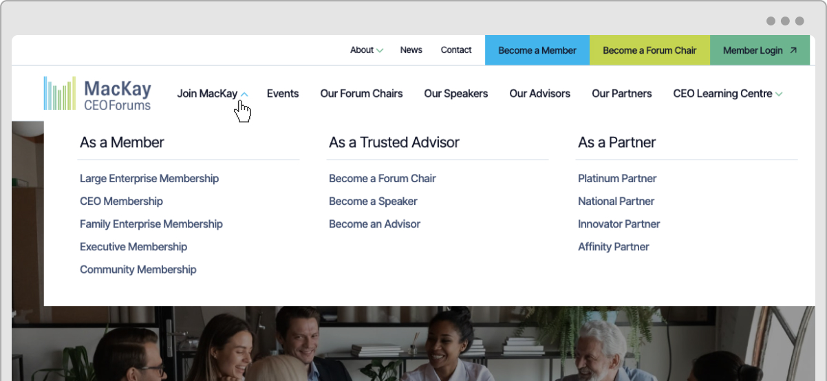
But for some sites, it’s better to instead group content under an audience that people can quickly identify as. When I was planning the sitemap for MacKay CEO Forums, I split their ‘Join’ area into three distinct audiences. This was represented in the hierarchy, the permalinks, and most importantly for users, in the Join drop-down menu.
UX Design
Like IA, your site’s visitors won’t notice your user experience design (UX) unless there’s a problem. That’s because a great UX makes it so easy to use your site that a person never has to pause or think hard.
Usability issues and obstacles in the flow through the site are major problems for all users. A focused person may persevere and still find what they need, but a distracted, overwhelmed, or rushed user (or one with a cognitive disability) is likely to give up and bounce off your page – probably to a competitor’s site.
These are just some examples of good UX decisions for an easier experience:
- Every page has a content area at the top that confirms its purpose
- Jump links exist at the tops of long pages
- Page layouts help content flow naturally
- Content sections don’t require seeing or remembering other content to make sense
- Section layouts present content in a digestible format
- Proper heading structure is followed (H1, H2, H3)
- Short text sections are mocked up, broken up with plenty of space
- Pre-headings or subheadings support sections that need more context
- Breadcrumbs help orient users on more complex sites
- Consider the F pattern for people scanning the page
- Forms don’t ask for any unnecessary information and include clear microcopy
- Longer forms have a progress indicator
- Page sections are all responsive to various screen sizes (like our Refoundry components)
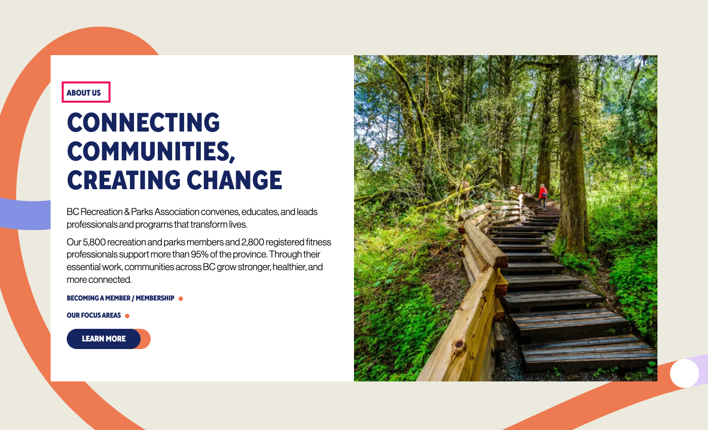
“I love an eyebrow heading,” said Forge’s Director of Creative and Strategy, Damian Jolley. “Many clients choose to remove them for aesthetics, but they have an important purpose when used consistently.
“These small pre-headings are perfect to help users find and understand content as they scan the page. Larger headings can then use more branded and marketing language to set the tone and engage users in the sections that they do read.”
UI Design
Your website’s interface is what people actually see and engage with, so it has a lot of heavy lifting to do when it comes to guiding distracted users in the right direction.
Visual design or user interface design (UI) also sets the tone. It can subtly soothe visitors who are experiencing overwhelm or emotional distress that’s causing them to be distracted. At the same time, it provides visual clues that make it easier to process information.
Here are a few important ways that UI design can serve users with varied attention spans:
- Designing elements to lead the eye towards key information
- Creating backgrounds that don’t distract from content
- Adding visual cues to actions, like icons and buttons
- Picking icons that align with the content
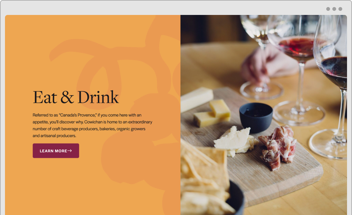
- Using accent colours to draw attention to CTAs
- Designing with enough contrast between elements
- Selecting typography that’s readable on any screen size
- Choosing appropriately sized headings for scanning
- Creating clear visual cues for interactive content
- Using visual cues to show an element’s status, such as an active tab
- Nesting longer or complex content in accordions or tabs that a user can control
- Ensuring appropriate spacing and padding between sections and elements
- Preventing auto-play content from jarring or distracting the user
- Avoiding unnecessary pop-ups that interrupt the experience
Copywriting
Even if most of your site’s visitors aren’t reading every word on the page, or in an article, you still need to give them the information they need. There are copywriting techniques you can use to make sure that whether a person reads the whole page, reads multiple pages, or only looks at parts of one page – they are satisfied with the experience.
The best advice is what I learned in journalism school: use the inverted pyramid style. That means front-loading the important details and benefits, and putting the least important content last. It works for almost all types of web content, except guide-style articles (like this one) that cover sub-topics section by section….
Here are my other writing tips that serve scanners and distracted readers:
- Use the simplest language that’s still professional and on-brand
- Make menu labels, page titles, and button copy extremely clear – it should say what it does
- For regular webpages, assume it’s the first page a person has seen on your site
- Use a consistent voice and tone across all site content to improve comprehension
- Write short paragraphs of two or three sentences (this is especially important for mobile)
- Avoid off-putting mistakes: wrong spelling, blatant keyword usage, text that sounds like AI
- Use plain language in headings that describes what the section is about – and only write about one topic per section
- Answer question-style headings in the first couple of sentences directly under them
- Use visual breaks between paragraphs like lists or images
- Write an appropriate word count for the topic – not too fluffy and long
- Limit complex or technical copy (like specs) to pages where a user has a high intent and is likely to read thoroughly
Technical tips to reduce distractions
A gorgeous, well-organized website with concise copy can still create issues for a low-focus or rushed audience, and for people relying on assistive technology to support a cognitive or learning disability. As with usability problems, you can’t rely on most visitors to persevere through these barriers. They’ll go find a competitor’s site that doesn’t require so much effort.
Here’s what to keep an eye on about your site’s build and optimization:
- Pages load quickly
- No broken images on pages, and no 404 pages
- No broken links in menus and on pages
- Overlays and interactive content, like drop-down menus, don’t block important content
- No content off the edge of the screen on mobile devices
- External links are set to open a new tab, not replace your site in the current tab
- Too many options in filters
- Session timeouts or settings that wipe out form data
- Misleading page titles, article titles, or meta descriptions
- Optimizing pages for the wrong audience or the wrong search intent
- No redirect chains or loops
Forge and Smith’s founder, Shawn Johnston, said, “Clients usually come to us worried about how their site looks. The problems that actually cost them visitors are the ones nobody catches in a design review: a page that loads slow on a phone, a menu link that broke after a plugin update, a form that wipes itself when someone switches tabs to answer an email.
“A focused visitor might push through one of those. A distracted visitor is gone after the first.”
This heading is the least important
Words go here, doesn’t matter what they are, nobody will make it this far.
I’m kidding, but also not really kidding, given the data. And that’s okay!
These conclusions are usually just summaries of takeaways and a CTA. And if I’ve done my job well, by giving this article a good heading structure and scannable sections, then you’ve already got what you needed. There’s no purpose to tacking on a couple of paragraphs just to tell you what was important about it.
But if you did read this entire article, you deserve a reward. Here’s a fun fact about attention span: it’s inaccurate to liken a short attention span or memory to a goldfish. In 2022, a team of researchers taught a group of goldfish to drive a vehicle. We should really stop insulting goldfish.
Share post:

About the Author
More by This Author