Even after placing items in their carts, the majority of shoppers don’t become customers.
According to research, cart abandonment rates stand at 70.22%, and that only reflects the state of buying decisions in the ecommerce industry. For B2B, service, and SaaS businesses, capturing and converting new leads could be even more challenging than what these numbers reveal.
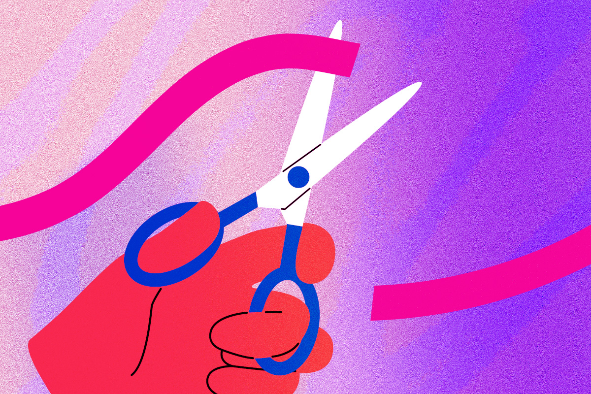
From a business-optimization standpoint, this reveals an essential task: easing consumers’ journey through the sales funnel.
Fortunately, there’s plenty that you can do to prevent your sales funnel from leaking. Smart marketing and branding decisions, along with a well-thought-out pricing strategy, can be exceptionally effective at attracting, engaging, and converting new customers. But one of the most powerful methods to make decisions feel easy to buyers is great web design.
Consumers form brand opinions based on website appeal, and further use this factor to judge a company’s competence and trustworthiness. Web design even influences their purchase intent and price sensitivity.
This guide explores the best tactics for designing websites that make conversion decisions feel logical. It covers a wide range of strategies applicable to different industries, and will help you make high-ROI choices regarding your online presence.
1. Put Social Proof Front-And-Center
When it comes to removing common conversion obstacles and guiding customers closer to a purchase decision, nothing works as effectively as high-quality social proof. Why? Humans naturally seek out the advice of others when they feel insufficiently competent or experienced to make the right choice.
From a psychological standpoint, informational social influence helps individuals copy the actions of others (usually those they consider more qualified than themselves) in situations that feel new or overwhelming.
In fact, if you look at the typical buyer’s journey, you’ll find that it’s heavily influenced by social proof.
- 98% of consumers say reviews are an essential resource when making purchase decisions (PowerReviews)
- 45% of shoppers won’t purchase a product if it doesn’t have sufficient reviews
- 90% of buyers consider social proof (in any of its various formats) influential information affecting buying decisions (Gartner)
The portion of shoppers who rely on social proof is even higher in B2B sales funnels, where purchases carry far more (practical and financial) risk than in traditional retail.
With this in mind, one of the most effective design strategies you can use to make buying decisions feel easy for your target audience is to position social proof in prominent areas of your website.
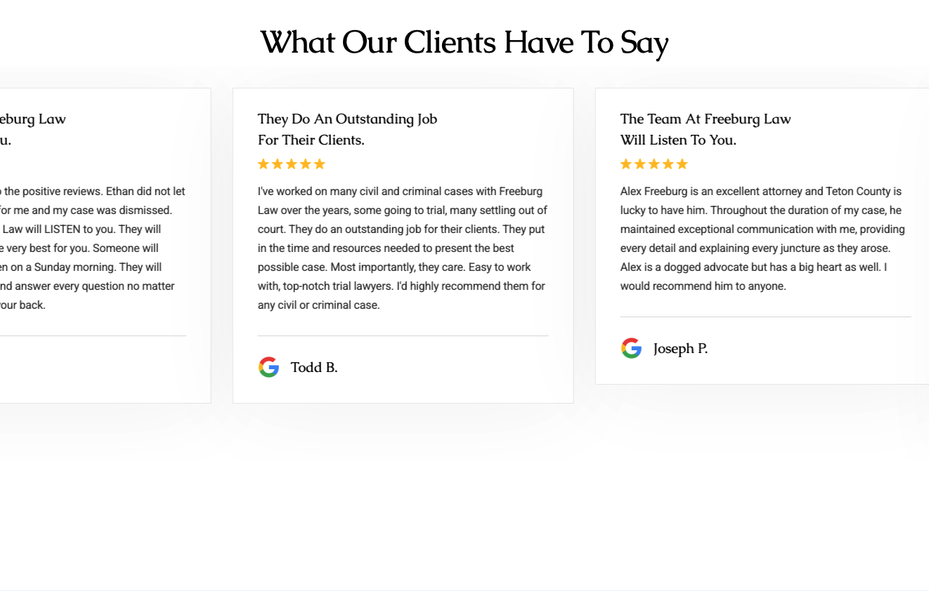
For inspiration, you can check out Freeburg Law. This brand places a scrolling social proof element beneath the header section of its homepage. This is a smart design decision, considering the importance of brand trust, competence, and experience in the law sector.
By choosing to emphasize credibility so prominently, they effectively remove a major customer doubt before it even arises. This makes it easier for potential prospects to confidently move through the buyer’s journey. Plus, it positively influences their conversion intent, helping the business secure more clients — which then breeds more social proof.
2. Answer Frequent Customer Questions Clearly
Making buying decisions feel easy for your web visitors requires an in-depth comprehension of the typical customer journey — and the factors that influence movement through it.
If you think about what makes consumers hesitate when moving from one stage of the funnel to the next, you’ll discover that poor product understanding is a common culprit.
Most people need a strong understanding of a solution before committing to a purchase. In fact, more than half of consumers research products online and offline before a purchase, while 59% conduct online research before shopping in-store.
Detailed product information (including reviews) raises conversion rates by as much as 380%, particularly for big-ticket items and B2B solutions. Ensure you’re providing prospects with all the product information they need to feel confident in their buying decisions.
Answering frequent customer questions in detail can be exceptionally effective at elevating product understanding, building brand trust, and inspiring conversions.
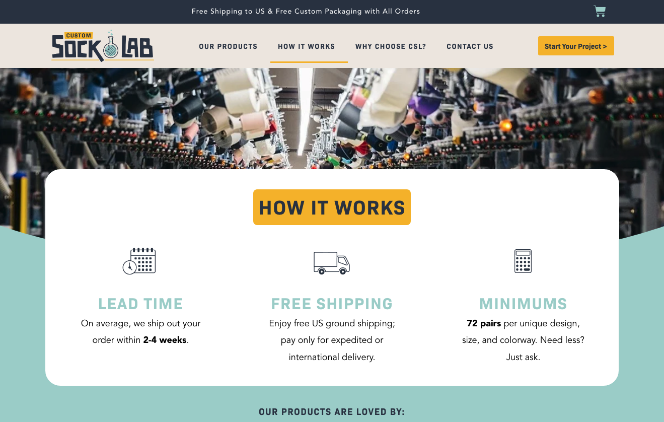
Custom Sock Lab implements this conversion-boosting strategy in several ways. In addition to a handy FAQ section on its homepage, the business created an entire “How It Works” page. This type of content is highly valuable to prospects at the early-to-mid stages of the buyer’s journey. It helps them collect relevant information about the sock production process. More importantly, it sets expectations regarding lead times and order minimums, which are all crucial details for B2B buyers looking to invest in custom corporate gifts or branded merch.
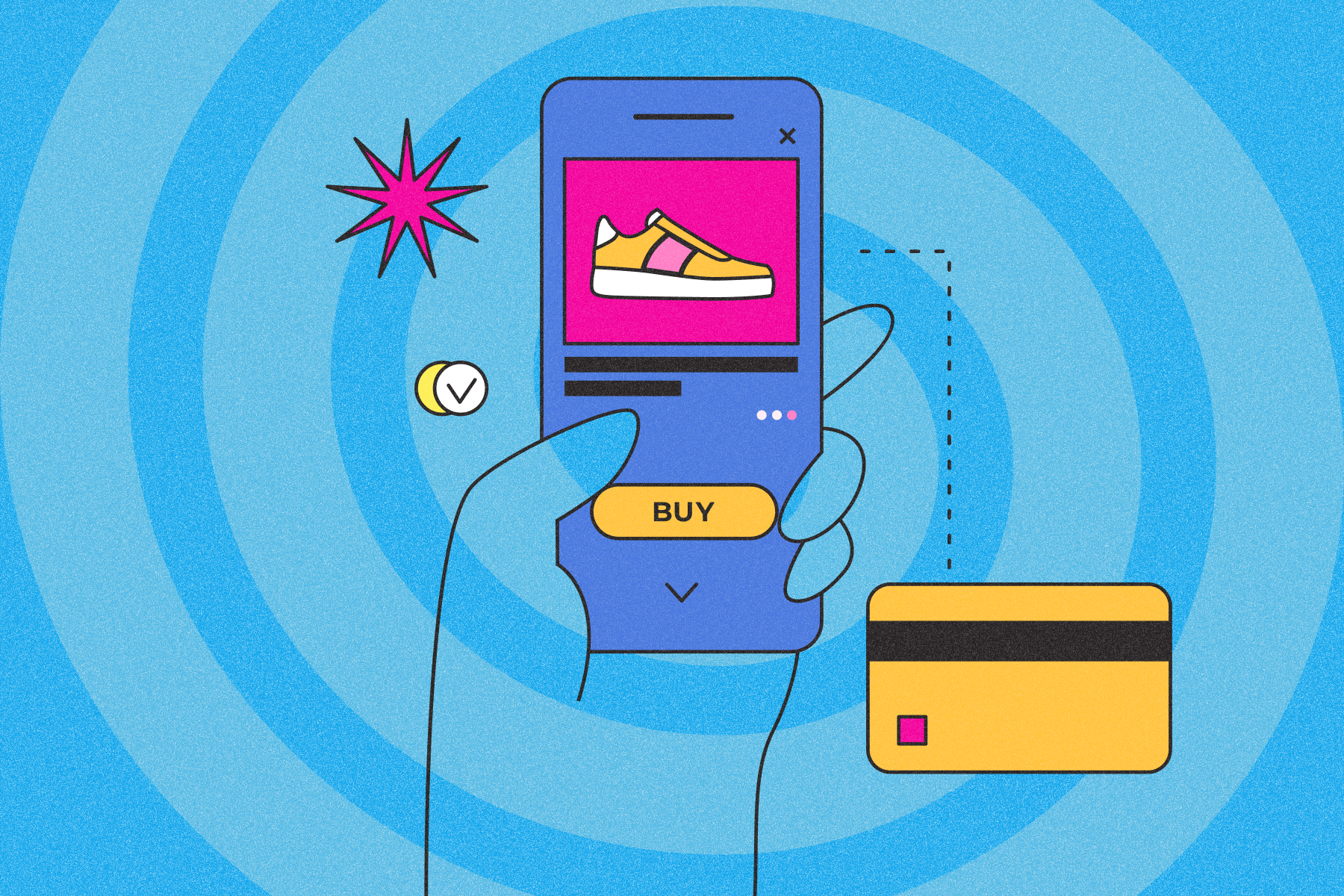
3. Don’t Make Visitors Search for Pricing Details
Cost is a crucial factor that influences both B2B buyers and end-consumers alike.
According to recent research, the financial outlook in 2026 has consumers prioritizing non-negotiable expenses. But the situation isn’t much different in the B2B sector, where shoppers demand affordability and fast ROI.
Pricing transparency now falls among the top purchase-influencing factors within the B2B buying journey.
- 74% of B2B buyers expect clear and detailed pricing upfront (Mixology Digital)
- Just 3% of buyers accept vague pricing if the solution is high-quality
With this in mind, one of the best design decisions you can make to ease prospects’ movement through the sales funnel is to provide clear and detailed pricing information in areas of your website where visitors are guaranteed to find it.
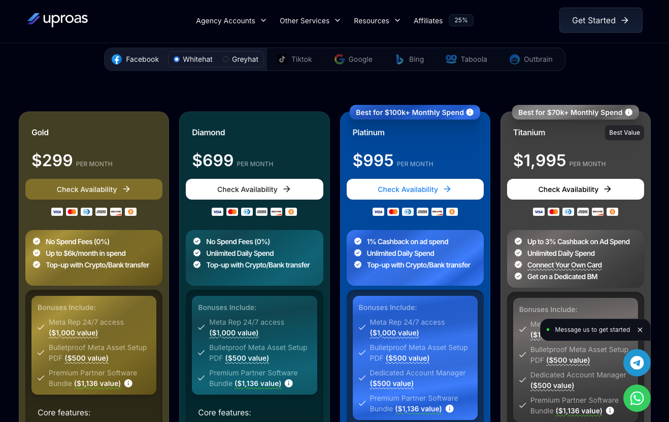
For example, Uproas does this directly on its homepage, designing a seamless and convenient user experience for leads. By not hiding pricing on a separate page, Uproas effectively reduces the need for prospects to make conscious conversion decisions during the research phase of the buyer’s journey, automatically reducing their chances of leaving the funnel. This builds credibility through the mediating impact of transparency and user-centricity, which is a significant advantage for the brand, as it operates in an industry where differentiation makes the difference between converting or losing leads.
4. Place an Entrypoint to Your Sales Funnel in Your Header
Consumers are more open to moving through the buyer’s journey in certain industries. This is particularly true on B2C sites or in situations where the offered value clearly outweighs the risks of conversions.
Placing an entry point into your sales funnel in the most prominent section of your webpages can maximize lead-generation. When supported by adequate trust-building elements, it can also shorten the sales cycle. Ultimately, it can allow you to optimize your marketing costs to reach and engage more potential customers.
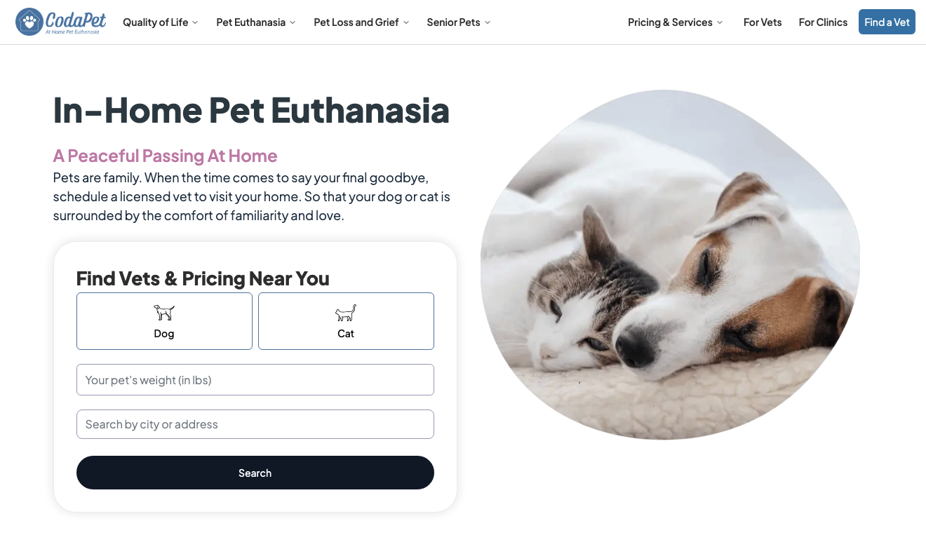
CodaPet is aware of the highly specific pain point its target audience wants to resolve, and understands that its customers have done sufficient in-depth research about end-of-life care for ill pets. Instead of serving repetitive content that offers no new value, Codapet simply invites web visitors to find vets and pricing near their location. This design choice creates a user-friendly experience, ensures speed and convenience, and most importantly, positions the brand as a provider of effective solutions.
5. Embrace Explainer Videos
Video is one of the most effective formats for customer education. And its role in the pre-purchase stages of the buyer’s journey is more than significant when it comes to boosting purchase intent.
According to research from late 2025, the majority of shoppers have watched explainer videos to learn more about products and services. More importantly, 63% of buyers prefer this content format for product research, clearly emphasizing its importance in designing websites that ease conversion decisions for qualified leads.
What’s important to note about explainer videos is that they’re especially effective in niche industries or when marketing complex solutions — particularly to non-expert target audiences.
Because product understanding directly impacts purchase intent, using video to ensure in-depth comprehension can be a great design tactic to elevate website conversion rates.
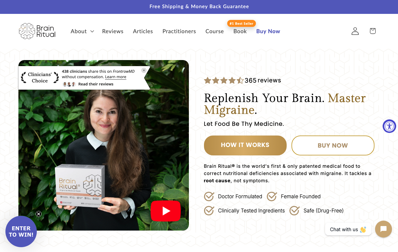
Brain Ritual understands that its ideal customers seek effective, science-backed solutions to resolve a health-related pain point. They also know that its target audience doesn’t consist of healthcare experts. That’s why the brand’s web design team places such emphasis on accessible and user-friendly product explainer resources. These include text and images, as well as a 3-minute video that perfectly summarizes the brand’s research, background, and commitment to solving nutritional deficiency-related migraines.
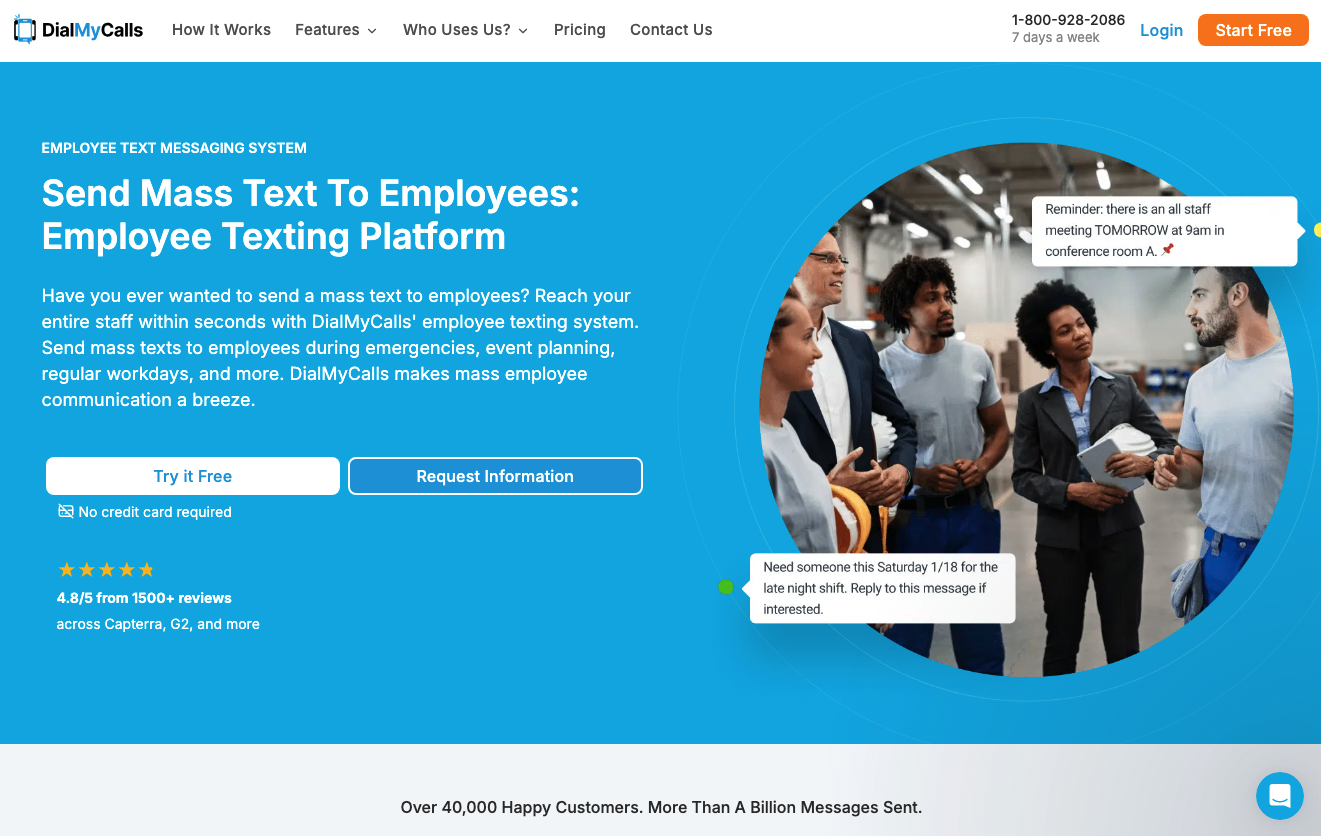
6. Create Landing Pages for Each Core Customer Segment
When it comes to factors that influence consumers’ initial willingness to interact with brands and consider solutions, relevance ranks at the top of the list.
Research clearly shows that the majority of buyers demand that brands demonstrate an in-depth understanding of their wants and needs — and present them with personalized offers. There’s also evidence to suggest that consumers actively ignore irrelevant marketing messages, while personalization elevates both purchase intent and brand loyalty.
When designing webpages intended to engage prospects and facilitate their progression through the sales funnel, user-centricity can be an exceptional tool.
By creating landing pages for each core customer segment, you can ensure that all web visitors receive hyper-relevant, case-use-specific pre-purchase information.
This design approach helps visitors recognize the concrete value offered by your solutions. It creates enjoyable shopping experiences tailored to a unique set of buyer preferences, automatically shortening the sales cycle and removing common conversion obstacles.
Check out how DialMyCalls creates separate landing pages for each unique product use-case like their staff notification service. At first glance, the approach might seem excessive. However, a closer look clearly reveals that the value offered by the brand’s solution hugely depends on how and when it’s being used, justifying the creation of multiple targeted landing pages and explaining why this highly personalized approach works for brands targeting a wide range of customer personas.
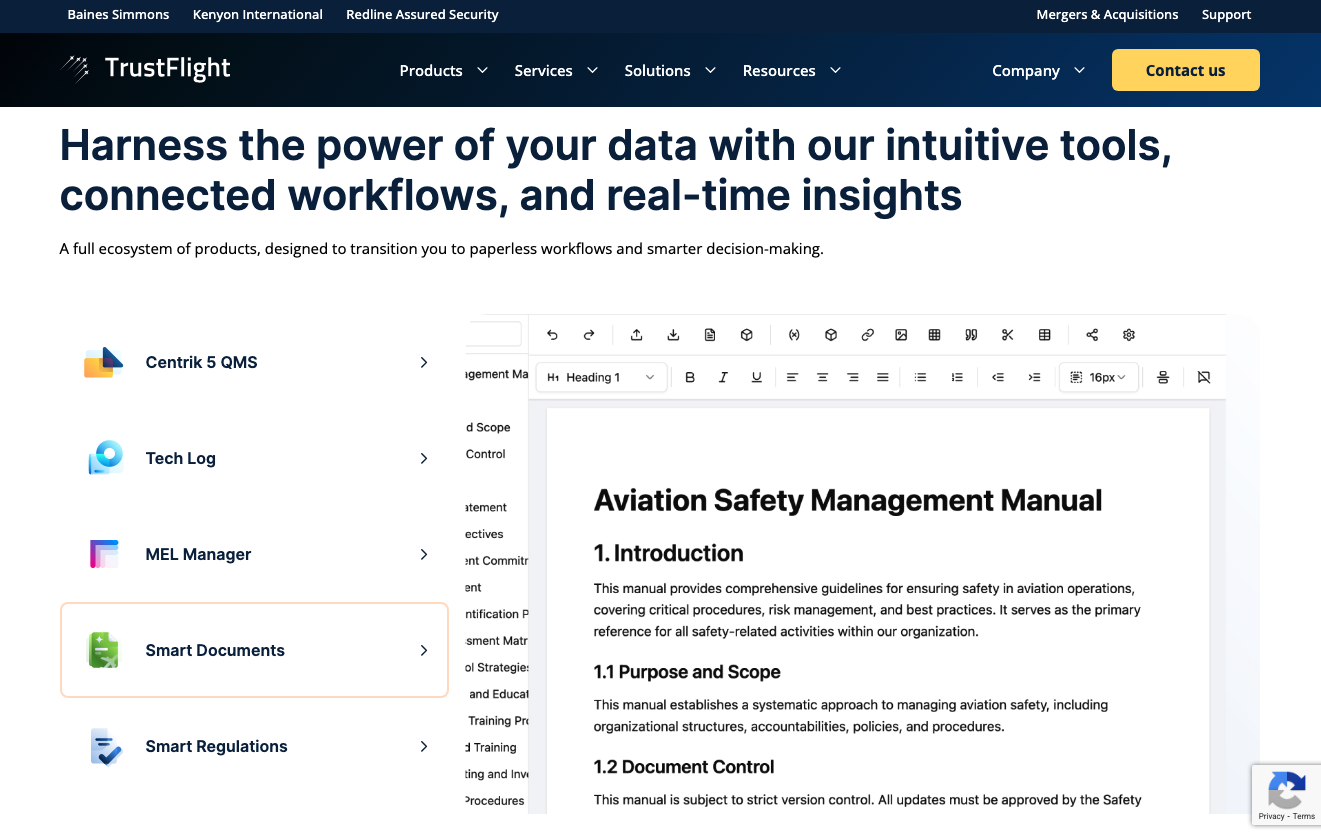
7. Use Interactivity to Frame a Complex Product Clearly and Briefly
In some cases, the biggest obstacle to driving conversions isn’t an inability to communicate product value relevant to your target audience. Instead, it’s the simple fact that most people become overwhelmed when they have to consume and process a lot of new information.
This psychological phenomenon — informational overwhelm — doesn’t just harm website user experience. It causes consumers to stall in or entirely abandon the buyer’s journey.
Fortunately, several effective design strategies can prevent informational overwhelm. The best of these is the use of interactivity to contextualize and simplify complex content.
Simply put, instead of bombarding web visitors with product information all at once, designers can create interactive product research systems that accomplish two things.
For one, they give web visitors control over the speed at which they consume content, providing them with ample time to process and comprehend each value proposition. Secondly, they minimize distractions by effectively hiding content that’s not immediately relevant, ensuring better focus and clarity during the evaluation process.
TrustFlight implements this tactic in one of its homepage sections. Instead of listing the solution’s many products and features one above another in a long scroll, the user-activated layout invites shoppers to explore its ecosystem at their own pace. This doesn’t just ensure high levels of product understanding. It also allows TrustFlight to supplement each content section with visuals and previews, all of which contribute to its prospects’ product understanding and elevate their purchase intent.
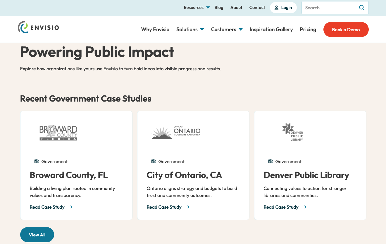
8. Make Use of Detailed Case Studies to Connect with B2B Clients
Effective B2B marketing — and sales funnel optimization — is practically impossible without using case studies. The reason for this isn’t solely that buyers demand high-quality, data-driven social proof when evaluating potential solutions for their pain points. It’s equally important to consider how businesses approach the shopping process.
The majority of B2B buyers make purchasing decisions before their first contact with a sales representative. Even more, 75% of B2B buyers prefer sales experiences that are entirely rep-free.
This tendency necessitates a unique approach toward the product selection and evaluation process, which is where detailed case studies come into play.
Essentially, case studies allow businesses to describe how and why their solutions or services work, while framing the process within real-life contexts that ensure customer relevance and boost understanding. Such an approach builds trust. And more importantly, it prevents branded content from not appealing to prospects, which can be a genuine risk for businesses that sell complex or specialized solutions.
Just look into LinkedIn’s research on trust-building in B2B markets. You’ll find that not publishing credible case studies ranks as one of the top conversion killers, with 27% of shoppers identifying it as a major trust obstacle.
So, if you’re looking for design tactics that will help you make conversion decisions feel easy for your target audience, why not boldly point out case studies and other data-based social proof in site areas guaranteed to capture visitors’ attention? You could even take it a step further and highlight that your business has many satisfied customers with a dedicated page showcasing this form of social proof.
Envisio includes a dedicated Customers page on its website, which is a great way to communicate the brand’s credibility. On the surface, the strategy allows the business to communicate the unique value it’s capable of delivering to a wide range of customer personas. But featuring a large volume of detailed case studies also allows Envisio to emphasize its consistency in producing positive customer outcomes, which is particularly important in its niche.
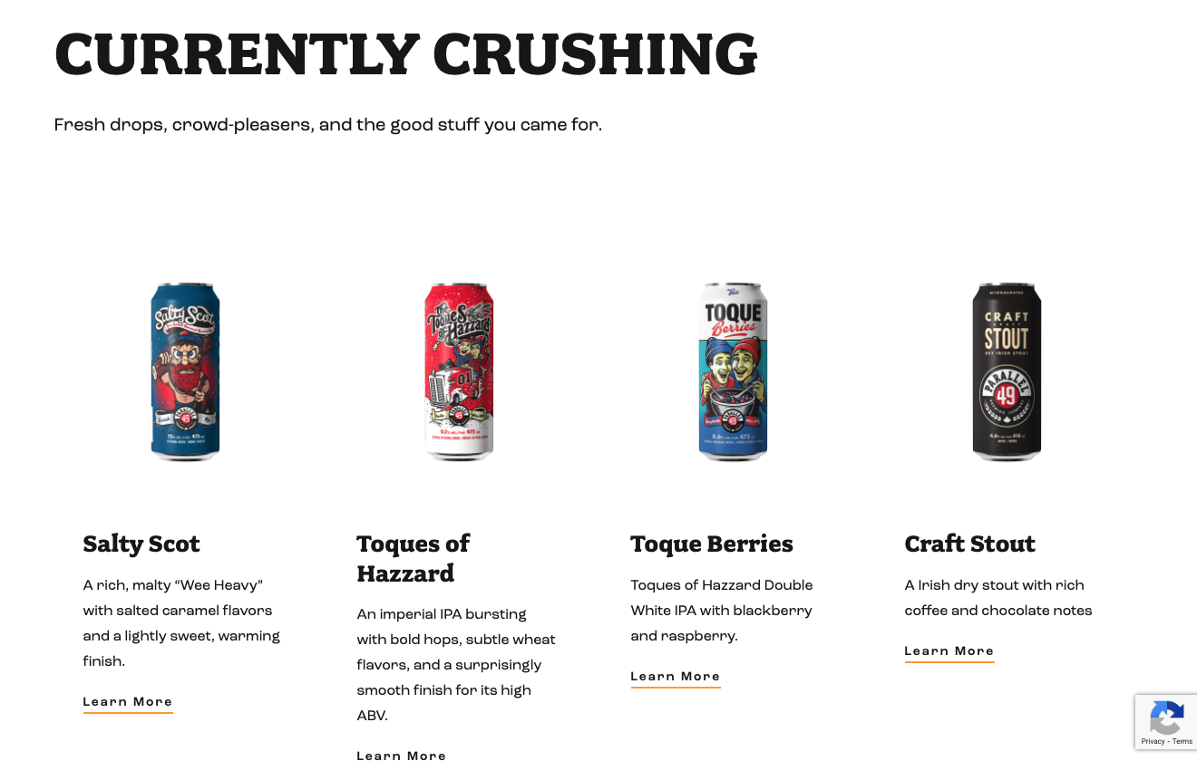
9. Embrace Negative Space to Highlight Product Visibility
In some cases, the best design strategies that encourage conversions (or movement through the sales funnel) are the basic ones that you should be implementing regardless of your business goals.
Ample negative space is one such visual, and functional, element of web design that just works. It is particularly effective in industries where visual impact sells better than value-based copy or product feature descriptions.
Furthermore, negative space can also aid product understanding by elevating readability. This design tactic is especially effective when marketing complex or innovative products, where descriptions aren’t sufficient to ensure full comprehension.
Of course, in some niches, negative space draws visitors into the lower stages of the sales funnel simply because it allows the visual appeal of certain products to stand out.
If you check out Parallel 49, you’ll see that this is precisely what the brand aims to do with its web design — using white space to ensure the unique product packaging attracts web visitors’ attention and encourages them to visit a product page (and, ideally, convert).
10. Capture Your Physical Products at Their Best
In digital commerce, product photography is crucial for engaging prospects and inspiring them to move them through the buyer’s journey. Since online shopping prevents buyers from touching, feeling, and trying out products, it’s no surprise that consumers demand next-level visuals when evaluating potential purchases.
- 75% of buyers rely on product photography to make purchase decisions (Retail Technology Review)
- 22% of all product returns happen because the items don’t match the photos used to market them online
Of course, there are several practical tips for capturing and showcasing physical products at their best.
Apart from hiring a professional photographer to take compelling shots of your solutions, you can also choose a DIY approach. However, in that case, you’ll need to prioritize photo characteristics such as information, emotion, aesthetics, and social presence.
Furthermore, in competitive industries where differentiation is key to standing out, product photos should effectively reflect your brand’s voice and identity.
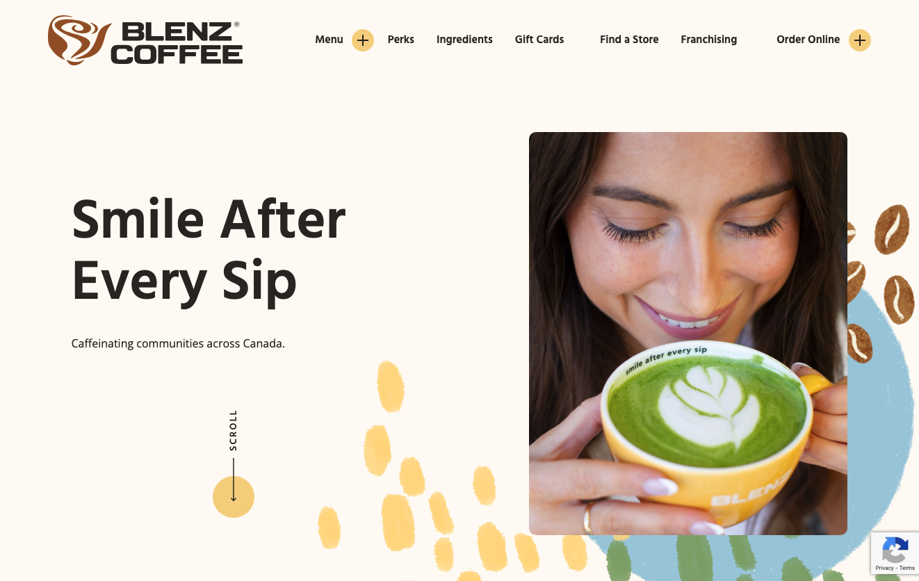
For instance, Blenz understands the importance of compelling visuals when moving prospects through the sales funnel. That’s why it utilizes product visuals that aren’t just high-quality. You’ll notice that the product photography used across the website depicts physical products and a specific lifestyle, the latter being the key to making buyers feel excited about the idea of purchasing.
11. Give Your Brand a Human Voice and Face
Brand identity is a tremendously powerful driver of business growth — particularly in industries where emotion, connection, and humanity act as core differentiation factors.
If you look at what buyers want from businesses — regardless of the type of solution they’re shopping for — you’ll discover that humanity, relatability, and originality all play important roles in the process of encouraging prospects to convert.
And, at the end of the day, the need for businesses to emphasize their humanity isn’t that much of a surprise. This simple but essential characteristic breeds trust and loyalty. Even more importantly, it’s the precursor of emotional connection, which is (often) far more powerful at inspiring conversions than any other brand characteristics.
In the pursuit of design tactics that can transform your website into an enjoyable digital space where visitors feel comfortable making buying decisions, it’s a good idea to highlight the elements of your brand’s identity that make it a bit more human and relatable.
Of course, what communicates humanity in a branding strategy can vary greatly from business to business. In some cases, this trait will be best conveyed through design elements focusing on values or purpose. In others, you might find that the strongest differentiating factor setting your brand apart is your team.
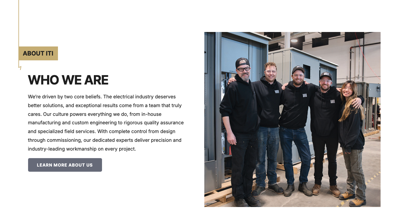
For example, ITI understands that its brand’s most attractive characteristic — its reliability — comes from its team’s expertise and dedication to customer satisfaction. That’s why the business refers to its employees throughout its online presence, including header background videos, team photos, and even a video on the brand’s About page, where the CEO shares the why behind the brand and the role the business’s people play in solving customer needs.
Final Thoughts
Great web design can be exceptionally effective at guiding web visitors through your sales funnel.
From establishing brand trust to elevating product comprehension to removing common conversion obstacles or even emphasizing attractive value propositions, the tactics described in this guide are a great method to make decisions feel easy for your buyers while browsing your site.
Of course, the tactics outlined in this guide won’t work equally well for every business. Instead, they hugely depend on your industry, brand identity, and ideal customer personas. Nevertheless, you can and should consider the benefits of implementing these design choices into your online presence, adapting them to your needs and optimizing them to serve you in reaching your conversion goals.
Share post:

About the Author
John Hurley
John Hurley is a marketing consultant, freelance writer and professional geek. He loves overdelivering to his mostly SaaS & e-commerce clients. And romantic comedies are his not-so-guilty pleasure.
Contact Us More by This Author