Typography is the unsung hero of web design.
It’s one of the key elements that profoundly shape both the user experience (UX design) and the interface (UI design). Too often overlooked or treated as an afterthought, the strategic use of typography can make or break a website’s success.
- 90% of online information is in the form of text
- Font choice is critical to accessibility because of its role in legibility and readability
- Fonts set the mood, and can instantly be welcoming or off-putting
- Typefaces also drive brand perception, recognition, and personality
To attract (and retain) the right audience, your website needs to look inviting, clearly convey your message, support navigation and exploration, and be highly readable to all of its potential users. That’s why a solid understanding of typography is crucial for website owners and marketers.
Let’s shed light on the transformative power of well-considered typography in web design.
What is Typography
Typography is the art and process of arranging letters and text in a way that is readable, visually appealing, and effective in communicating a message.
At its most basic level, typography involves choosing typefaces (fonts), adjusting the size, spacing, and styling of the text, and arranging it in a clear and easy-to-understand layout.
Effective typography focuses on aspects like legibility, which is the ease with which individual letters and words can be distinguished. Typography also focuses on readability and hierarchy, utilizing various font styles, sizes, and weights to facilitate easy reading and comprehension, while visually organizing information and accentuating key points.
The Key Elements of Typography
The key elements of typography play a crucial role in the design, legibility, and overall impact of textual content. Before launching into decisions about typography, here are the key elements to consider.
1. Typefaces and Fonts
The choice of typeface sets the tone of your design, conveying a mood or personality: professional or playful, analytical or artistic, innovative or timeless.
A typeface is the design of a collection of letters, numbers, and symbols. Arial, Times New Roman, Helvetica, and Garamond are all popular typefaces.
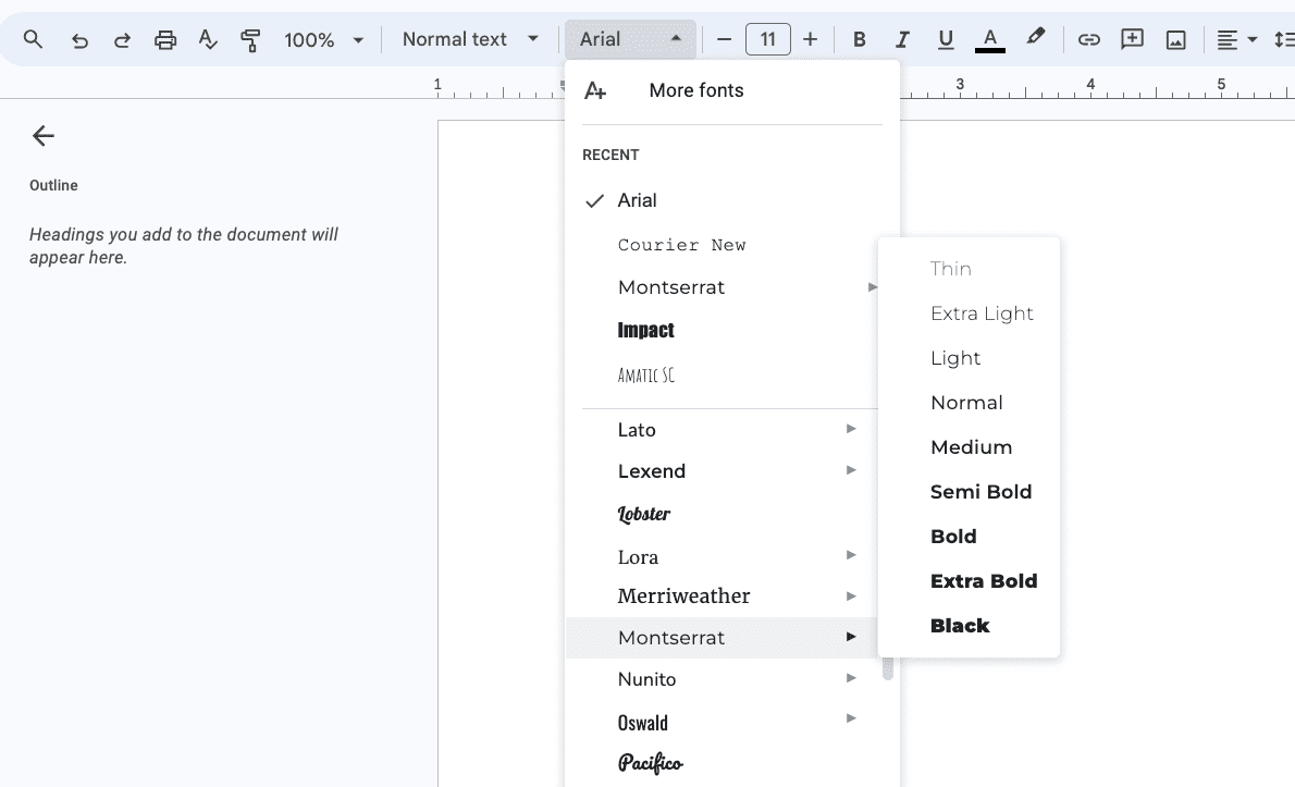
Fonts are specific versions of these typefaces for print or online use, detailing how they’re manifested through size and weight. For example, Google Docs gives you nine font options within the Montserrat font family.
Your website’s selection of typefaces and fonts plays a crucial role in design aesthetics, functionality, and the overall impression of your brand. Fonts significantly impact the readability of text that, in turn, affects all of the points we’ve touched on.
2. Hierarchy and Consistency
Effective typographic hierarchy uses varying fonts, sizes, and colours to establish a visual order, directing the reader’s attention to the most important information first.
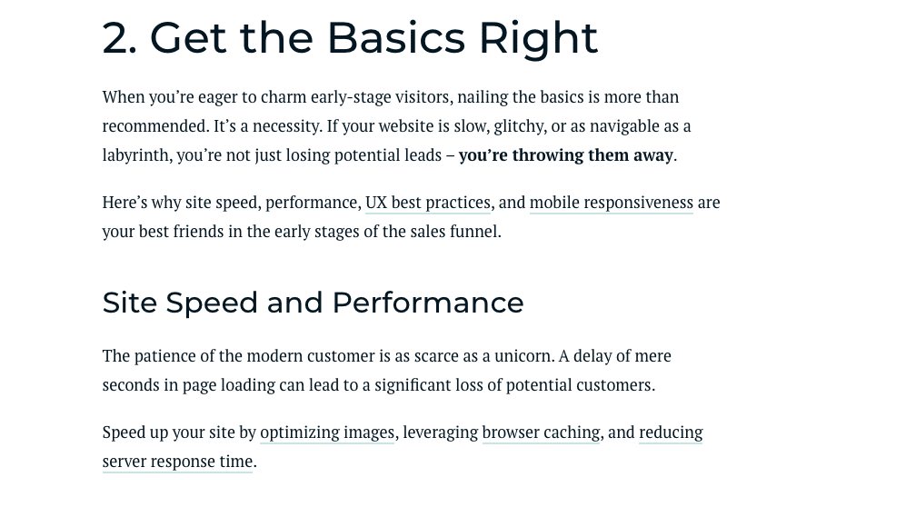
For example, it’s a best practice in long-form blog posts to use heading levels to aid the reader’s experience. This helps a person scan for information they want, easily retain their place, and understand how different paragraphs relate (or don’t relate) to the ones above and below them.
In the Forge and Smith blog we can clearly see that the larger, heavier H2 heading introduces a new section, and the smaller H3 heading is a point within that section.
Hierarchy can be further supported through contrasting typeface styles and colours, and by manipulating white space.
On the other hand, consistency in typography involves using the same typefaces, fonts, and alignment throughout your design. This uniformity helps in creating a cohesive look and feel across all text elements, enhancing the overall readability and professionalism of the design.
BC Dairy uses the same distinct, welcoming heading font across their website and all of their digital and print materials.

3. White Space and Alignment
White space refers to the empty areas around and between elements in a design. It’s not wasted space but a critical component that contributes to balance, legibility, and focus within a page.
Proper use of white space in typography is usually imperceptible to the average reader, but the result is that the page feels easy to navigate and understand, and the eye is immediately drawn to the right places.
The Acacia Health website has plenty of space between their lettering, which creates a soft, calm effect.

The alignment of the words within a page or section determines how text is positioned relative to the margins or grid lines of the page or screen.
Alignment options include left, center, right, and justified, each imparting a different visual effect and readability. The example above uses left alignment on headings and paragraphs, and centred alignment on button text.
Consistent application of alignment contributes to the visual coherence and balance of the design.
4. Colour and Contrast
Colour in typography can enhance or detract from text readability and overall design appeal. The appropriate use of colour can highlight important information and influence the emotional response of the viewer.
Importantly, sufficient colour contrast between text and its background is essential for readability and an accessible website experience, especially in digital designs.
That said, contrast in typography isn’t limited to colour. It includes the use of different typefaces, font sizes, and weights to create visual interest and hierarchy. High contrast can make elements stand out and is vital for legibility. Bold font weights are used for emphasis, whereas lighter weights convey a more subdued tone.
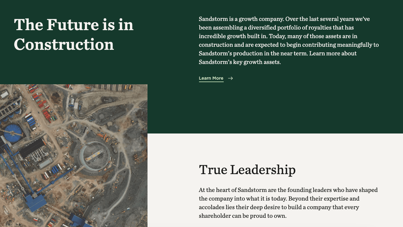
The Sandstorm Gold website expertly uses different font weights and colours to make sure all of the copy is easy to read (plus, it has a clear hierarchy and ample negative space).
The Importance of Typography in UX and UI Design
If you’ve ever used Comic Sans font, you know how much the typeface choice affects how text looks on web pages. Even small visual details like the font’s weight or the spacing between lines can dramatically change how an entire page or even a whole site is perceived.
Here are five key business benefits of good typography.
1. Enhances Readability and Accessibility
Good typography ensures that text is easy to read and understand. By selecting the right font size, line spacing, and contrast, designers can make content accessible to a broader audience, including those with visual impairments.
It’s not just about the font choice but also about how text is presented on various devices, ensuring that everyone can access the information with ease, regardless of the device they are using.
Then again, it’s how you marry the message and how it’s typographically conveyed. Sometimes, an effective message can resonate with the use of a simple PDF editor, while some, more complex messages need a typographical nudge to fully shine.
2. Emotional Connection and Brand Identity
Typography has the power to evoke emotions and reinforce brand identity. Through consistent use of specific typefaces and styles, brands can create a memorable image in the user’s mind.
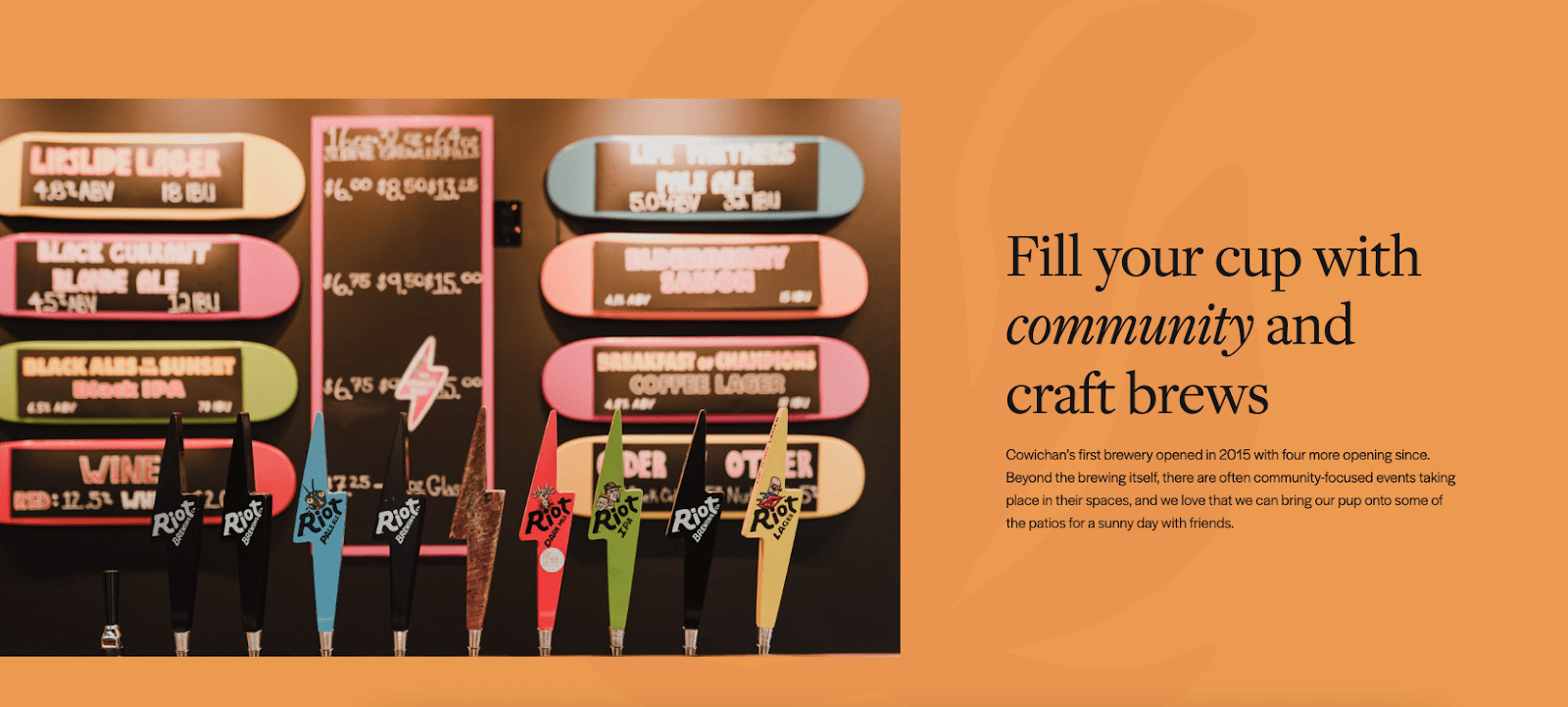
Fonts can also convey personality and set the tone for communication. This emotional connection builds trust and enhances the user’s engagement with the brand. The Tourism Cowichan font styles feel warm, friendly, and organic, like the region.
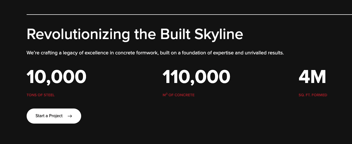
Meanwhile, Highline Forming’s fonts and styling feel innovative, professional, and bold.
Well-thought-out typography guides users through a website or app, highlighting the most important information and making navigation intuitive.
Through font sizes, weights, and style variations, designers can establish a visual hierarchy that directs users to the most important elements, improving the overall usability and user experience.
Maple Leaf Adventures uses several subtle variations in font style to easily distinguish the menu hierarchy and CTA buttons.

4. Increases User Engagement
Typography influences how users interact with digital products. Clear, legible, and visually appealing text can significantly increase user engagement.
Copy that is visually appealing and easy to read encourages users to spend more time exploring content, which can lead to higher conversion rates. Thoughtfully designed typography can make calls to action stand out, prompting users to take desired actions.
Strategizing for typography that drives engagement takes a strong understanding of your audience – or audiences.
5. Reflects Professionalism and Credibility
Professional typography reflects the credibility and reliability of a brand. It shows that a company pays attention to detail and cares about the website aspect of their customer service.
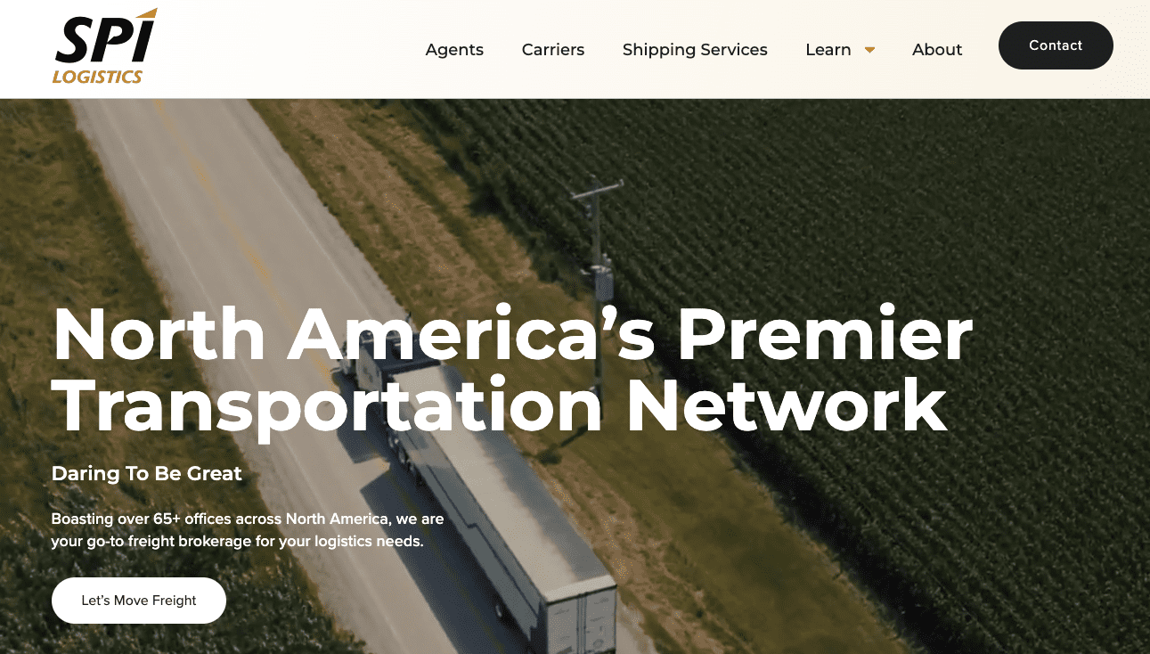
SPI Logistics’ font choices support their reputation. They use clean, simple fonts that suit their target audience, evoking a trusted and well-established brand.
On the other hand, poorly chosen fonts or cluttered text layouts can have the opposite effect, making a site appear untrustworthy and amateurish. Good typography, therefore, is essential for making a positive first impression.
Common Typography Mistakes to Avoid
When it comes to website planning or redesigns, typography is too often treated more like a fashion accessory than an essential design element. This leads to poor design decisions that don’t represent the brand correctly. Here are some of the typography mistakes businesses should avoid:
- Incorrect line spacing that makes text hard to follow.
- Overusing styles like bold or italics that clutter your design.
- Failing to establish a clear hierarchy and leaving readers lost on where to focus.
- Not considering accessibility and excluding some users.
- Ignoring the context or mood of your content when choosing a font, sending the wrong message.
- Forgetting to adjust letter spacing for readability, making text feel cramped or disjointed.
- Using decorative fonts excessively and detracting from the message.
Conclusion
Typography may be a subtle element in web design, but its impact is far from silent. It shapes how users perceive and interact with digital content, influencing everything from readability and accessibility to brand personality and emotional resonance. All of this amounts to whether visitors stay on your site, find their way around, and convert.
Well-implemented typography transcends being just a visual detail. It becomes a tool for crafting seamless and inclusive user journeys that guide users effortlessly through digital landscapes while leaving a lasting brand impression.
Embrace the transformative power of typography. Let it guide your users seamlessly through content, evoke emotions that resonate, and elevate your digital creations to new heights of effectiveness and engagement.
Forge and Smith is one of Design Rush’s Best Digital Agency Web Designs!
Share post:

About the Author
Nahla Davies
Nahla Davies is a software developer and tech writer. Before devoting her work full time to technical writing, she managed—among other intriguing things—to serve as a lead programmer at an Inc. 5,000 experiential branding organization whose clients include Samsung, Time Warner, Netflix, and Sony.
Contact Us More by This Author