Your website’s user experience design helps visitors intuitively use your site. That’s its entire purpose.
Yet too often I still see websites loaded with unnecessary copy that’s instructing people on how to use the site. In this day and age almost every living person knows how to click, tap, and scroll through a site (assuming it’s not a bad website riddled with UX mistakes). You shouldn’t have to tell users how to perform basic actions – and doing so can come across as insulting to their intelligence.
I hope you’ll join me in doing a permanent delete on all of the redundant phrases from this list.
1. “Welcome to…”
Starting off strong is “Welcome to.” It’s right out of the earliest ‘90s websites, or when we used to welcome people to our MySpace profiles.
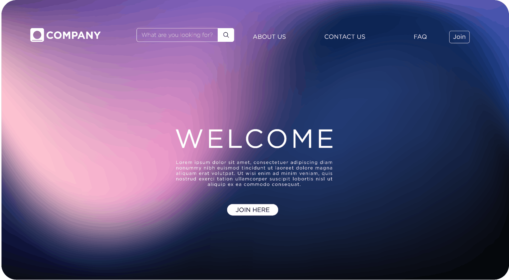

While I am a fan of orientating users on a website, there is no need to say “welcome” as if the user is a person visiting your home for the first time. A welcoming tone is great, and so is concise text that introduces who your company is and what you do – but “welcome to” has no place on a professional website.
Think about the experience of users coming to your website. There are a few common paths:
- They have typed your website directly into the browser bar
- They have Googled your organization (or a topic you are ranked for)
- They followed a link, scanned a QR code, have the page bookmarked
In most, if not all, of the ways a user gets to your website, they’ve already received some context of your website name. They know they’re on your website, because they opted to be there.
Welcoming people to your website is wasting valuable real estate on your site, and wasting their time. First impressions matter, and it takes just 50 milliseconds for a website to make an impression. Make it a good one.
Instead of acknowledging the fact that they’re on your website like an awkward greeter at a shop’s door, give them information that tells them what you do and informs them about your organization. Give them a clear reason they should stay on your website, such as a solution to a pain point.
You don’t even need to use your company name in your homepage header – your logo and HTML page title should already be providing this information, so you can use your header for SEO-friendly, benefit-driven copy.
Your website’s users are busy, and they really just want to hear how you will help them, so tell them!
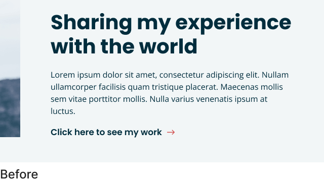
2. “Click here”
“Click here” offers your users nothing and it also dates your website.
Mobile usage now far outweighs desktop web browsing, especially for B2C brands, and with mobile and tablet devices come tapping, (not clicking). There are also various other ways to navigate a website using voice and assistive technology that doesn’t involve a mouse click.
I mentioned in the previous section that when a user lands on your site, they already know they’re there. The same principle of context applies here: they already know how to click or tap links, buttons, and menus. Your copy should focus on providing them with context of what it is that they are clicking, so that they want to click it. And “click here” gives no context at all.
Remove it. Delete it. Get rid of it.
Instead, include descriptive text that explains what the link is, where the user will end up if they click, or what happens next (such as a PDF will download, or data will be submitted).
And please, don’t let that descriptive text be “learn more.” While this phrase is designers’ most-used placeholder button text, it’s too generic. Like “click here,” it doesn’t offer the user any helpful context. More action-focused CTAs and descriptive button labels will serve your users better – which, in turn, will improve engagement and conversions.
3. “Learn more”
“Learn more” offers your website visitors no information or context – similar to “read more”, and “more info” (or “click here” that we covered above).
Learn more is often an easy fallback for link descriptions and sometimes it is a fine option; but be cautious to over-use it – and there can be better options. You’ll see throughout our own website we are guilty of using “learn more” at times.
When we review this one with an accessibility lens also – the experience for someone using assistive devices may skip over these links completely; or, for example with a screen reader, hear “learn more” over and over and over as it reads the page aloud.
Where possible we recommend more action-based link descriptions – ”read article”, “view case study”, “explore services” are slightly better labels; or even better are specific action-based labels for example: “sign up”, “see how it works”, “our process”.
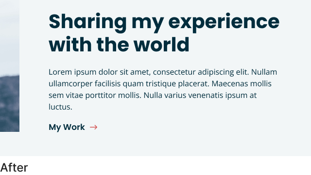
4. “Select from”
With this phrase you probably think you’re being helpful, explaining how to use filters or a drop-down menu – how could that be a bad thing?
This is another case of wasting the user’s time with extra text about a task they’re more than capable of performing without supervision. With a strong user experience and interface design, elements like drop-down menus, buttons, checkboxes, and form fields should look and function like these same elements on every other website a person has used, and not require telling the user, “do this thing.”
If you do have to explain how to use your website in that much detail, there is probably a larger issue with your website. Perhaps unclear or poorly designed elements, the visual hierarchy may be confusing, not enough contrast, too much clutter, accessibility guidelines are not being followed, or something is distracting the viewer.
5. “On the right/left side”
I see this one a surprising amount of times. Describing the location of an element using directions – specifically “left” or “right” – often doesn’t work in a responsive, flexible web environment.
What might appear to the right on a large desktop device when you’re writing your copy, might actually stack below the text on a mobile device.
This phrasing also requires someone remembering to change it, if the other content around it is updated several months or years later. With low-code website platforms like Forge and Smith’s Refoundry, which allow content and marketing teams to collaborate, make updates, and move entire sections around, “above/below/right/left” text can easily get missed – making your website content incorrect.
Language that doesn’t use the location of other elements will always be more evergreen and not cause issues for your site into the future.
6. “Lorem ipsum” placeholder text
IT HAPPENS… even for us sometimes a little placeholder text slips through and makes it into a live site. But it is a sure-fire way to either confuse users, or really devalue your website.
If your designer uses placeholder-text that starts with “lorem ipsum” (the most common option) you can try a a site-wide search for “lorem” to make sure nothing slipped through. Of course, a deep proof-read of pages and posts before they’re published should also be completed.
Did you find any of these phrases on your website? Thankfully, we build all our websites on WordPress with the flexibility of our own in-house built Refoundry plugin that makes updating these phrases easy (as it should be). Your website, your content: your control.
Looking for a new website, or moving to a new platform with more flexibility and total creative control reach out!
Share post:
About the Author
More by This Author