This resource is intended to provide rough guidelines for sizing images to place on your website, either during the content gathering stage or post-launch.
We provide these guidelines with the best intentions, hoping that they will help to correctly size 80-90% of images. But there are always going to be special cases, applications, and unique elements that might require different dimensions.
We start collecting content as soon as possible, before the visual designs are approved and the new site is built. This is because the content stage takes the longest, and we want to give you as much time as possible. But this also means that some image adjustments still might be necessary to fit how the image blocks are built and styles. And sometimes, even with the optimal image sizing and preparation, an image will still just not work or be suitable in a certain spot on a website.
How Images Work on Your Site
Before we get into image sizing, there are a few key Refoundry settings you should get familiar with. These are good to have in mind when choosing images, as they can help inform what images will work best where.
1. Responsive Environment
All of our sites are built to be completely responsive—from desktop to mobile, and all sizes in between. Unlike a print-piece which has fixed sizes, websites are flexible. To support this flexibility, image frame sizes vary across different devices.
2. Image Display Options
These can be controlled per image, and affect how content displays within an image frame

Image Cover (or Fill)
Prioritizes filling the space completely. Best for background images, header sections, or when you want to avoid empty spaces
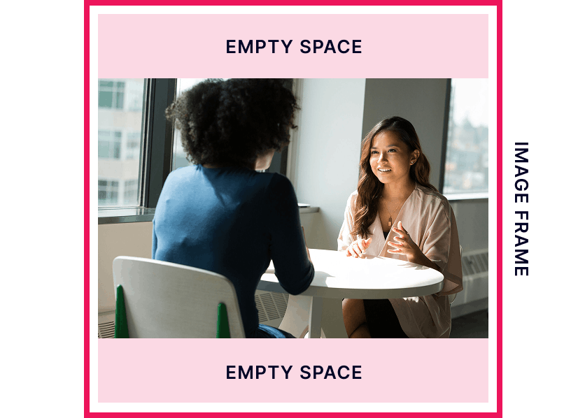
Image Contain (or Fit)
The image scales up as much as possible without being cut off. If the image’s proportions don’t match the container, you will see “letterboxing” (empty space/bars on the top/bottom or sides).
Even though this option sounds great, it isn’t used that often due to creating holes in the design because of the empty spaces.
Read more details about Image Blocks on Refoundry Support.
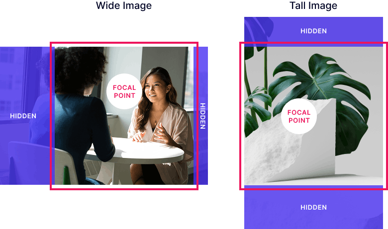
3. Focal point
A focal point can be set so that when the Image Cover setting (above) is used, you can control which areas of the image are cut off.
Sizing Images
The main goal is to size your images so that they look amazing but also perform well, the highest quality and high resolution images will decrease your site’s speed and performance—which is why images should be sized and compressed for your website.
In general, for all images:
- No image dimension should be over 2560px (in either width or height). This is the threshold where the additional pixel information does not add to the quality of the display of the image.
- Any image file should be under 1MB in size. If it is larger, there are likely sizing or compression issues. The goal should be under 600kb, with the optimal range being 80-400kb in size.
- JPG images should be compressed—see: Image Compression.
Let’s get into more specifics.
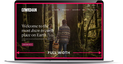
Full-Width Images
Full width images (often used for headers/banners at the top of a page) touch the farthest left and right edges of the browser window at all times. Generally these have a more horizontal orientation.
SIZE RECOMMENDATION:
2560px WIDE
The height is more dependent on the design or specific element where the image is placed, but generally 400px-1200px in height.
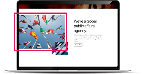
Content Images
The bulk of your images probably fit into this category. Might be storytelling content, callouts to other pages, or product and service images, team photos, or other content.
SIZE RECOMMENDATION:
By a little bit of math, we work from 100% full width images being 2560px wide to calculate:
- Half-width (50%): 1280px WIDE
- Third-width (33%): 850px WIDE
- Small images: 600px WIDE
- Tiny images: 80-200px WIDE
The height is more dependent on the design or specific element—and important to keep in mind how that image frame might behave in a responsive environment (the image size may be different on desktop and mobile).
Lightbox Images
If you’re sourcing images that will appear in a lightbox, you should supply the image in the largest size that image will appear within the lightbox. The thumbnail will be downsized (and/or cropped) version of the larger image.
For an image that appears full-width in the lightbox image – use the “Full-Width Images” dimensions. For other images we generally recommend about 1200px wide, but can go up to 2560px wide.
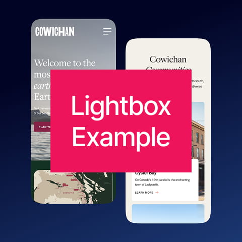
Lightbox enabled on above image
Logos
In this section we are referring to logos that are content on a page—not the logo of your own organization as it appears in headers and footers (that is handled differently).
Supplying logos for your page design (like a partners section, associations, or awards) can be a bit more complex. Ideally these would all be supplied as vector SVG files, however we understand that getting vector versions for SVG from other businesses/organizations can be difficult.
SIZE RECOMMENDATION:
600px WIDE
(with all supplied with same height frame)
A common ratio for these image areas is 2:1, making these images 600 x 300px.
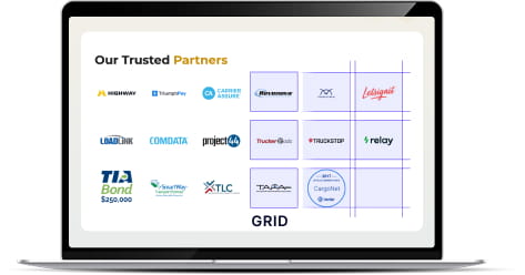
It is important to note that due to different compositions and levels of visual dominance, groups of logos can appear unbalanced. Generally they do follow a structured grid (as shown in the image above). When the image frames are all the same size, individual logos can be balanced by adding (or reducing) white space surrounding it in the image file.
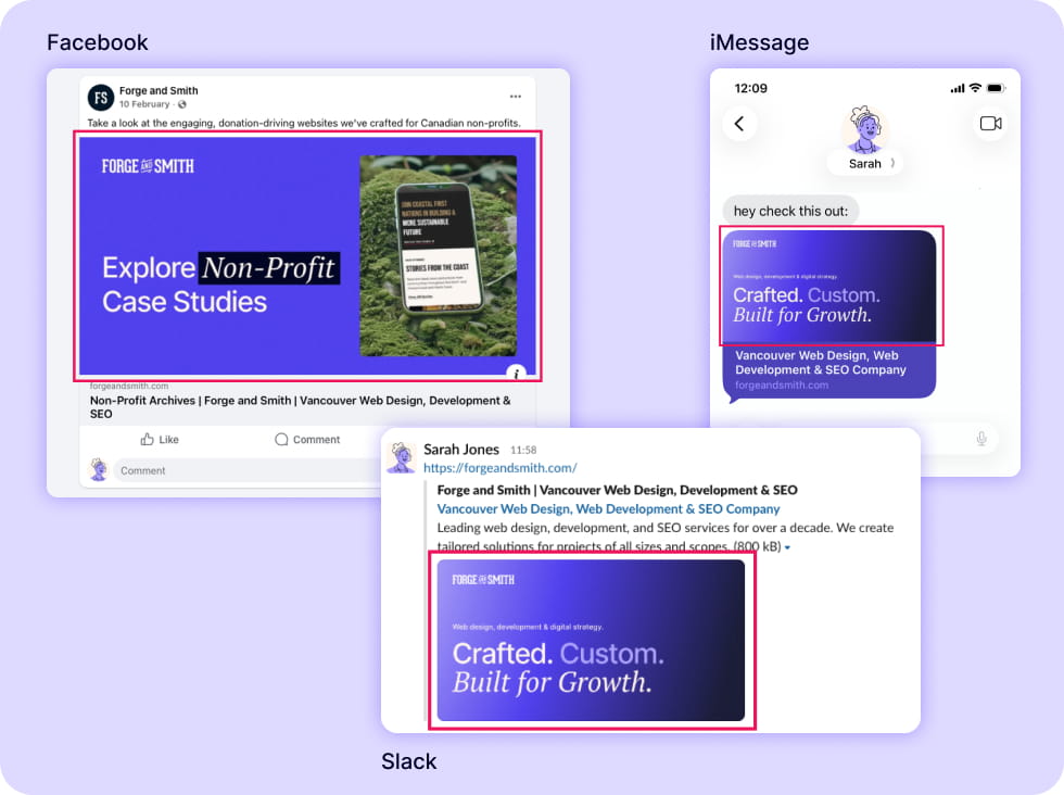
Social share images are the images that appear when links are shared on social media, DMs like Slack, and are seen in mobile search results.
These are completely optional to include in your website, but are recommended. There can be a social share image set as a default (or fallback) for your entire site, or you can set images per page as the feature image or in the Yoast SEO box under the Social tab.
If no image is set, apps will pull the first image found on the page and this often doesn’t look right. We recommend configuring at least one of these three places!
SIZE RECOMMENDATION:
1200 x 630px
This is the common image share size for Facebook and Twitter, and also works for Slack, iMessage, WhatsApp and many other platforms.
For more information on share images see: Yoast setup