
This article was fully rewritten on September 19th, 2023.
A subcategory of industrial psychology, colour psychology is the study of colour as an impactful determinant of human behaviour and decision-making.
In the business world, whether B2B or B2C, one of the biggest indicators of optimal website performance is conversions. These might be digital goals such as having a contact form filled out, new newsletter registrations, event sign-ups, or resources downloaded. Of course, one of the biggest goals is typically to have a product or service purchased.
But what does this have to do with colour, you ask? Everything.
While user interface and user experience are the primary segments in the web design process, colour psychology is a key integration into these focuses, allowing sites to optimally activate subconscious human emotions, attitudes, and reactions.
To put it definitively, colours drive sales by tapping into subconscious human emotions and generating optimal responses.
Here is a guide to psychological impacts and Western perceptions of common colours, and how best to utilize them in website designs.
Post Contents
Association, Usage and Psychology by Colour
Red
North American Association: Love, war, power, heat, blood, alerts, anger.
Recommended Usage: Sparingly in backgrounds or graphics, minor text uses.
An invigorating colour conveying importance, urgency, passion, or even aggression, red is best utilized in graphics or in certain types of copy (ex. sale prices) to attract attention to timely or crucial information. If you overdo it with red, you may raise discomfort or even panic in your website’s viewers.
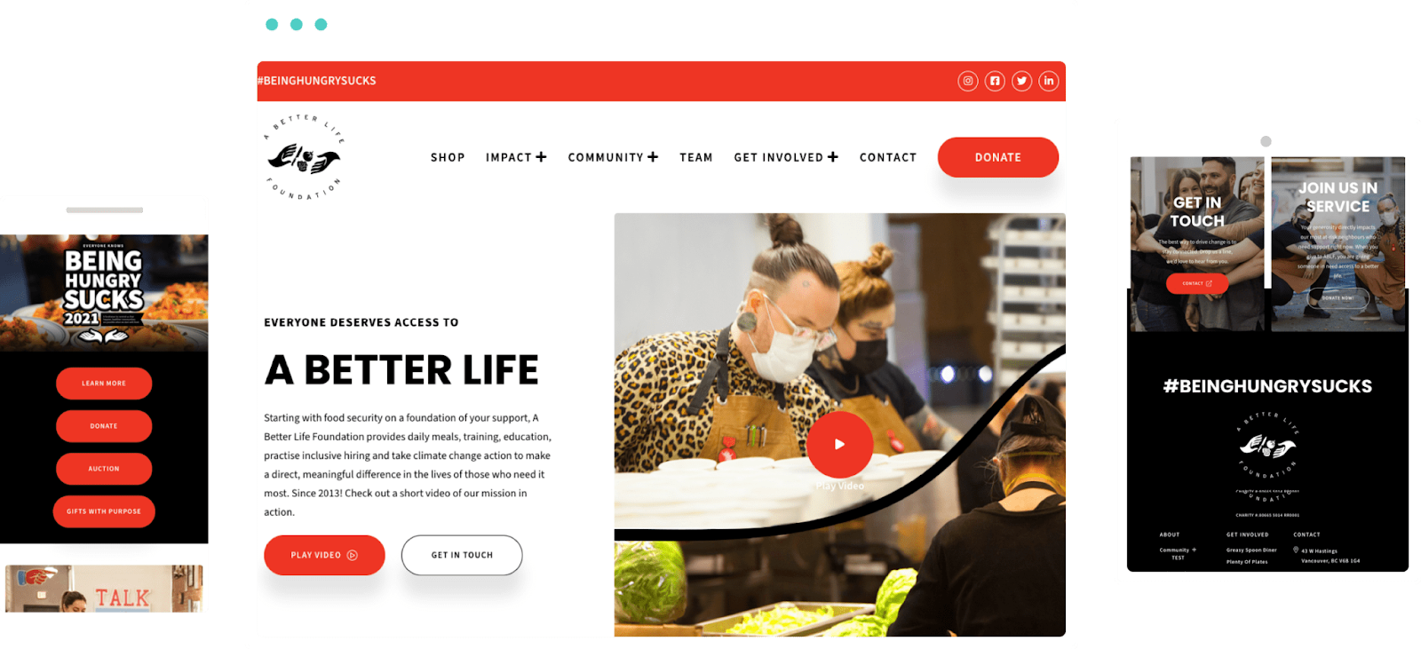
When building a new website for A Better Life, a Vancouver not-for-profit, red accents were paired with bold headings to better draw audience attention to their story, campaigns, and calls to action.
Orange
North American Association: Sunshine, caution, creativity, playfulness, youthfulness (see cartoons/cartoon networks).
Recommended Usage: Backgrounds with white text/iconography, call-to-action typography, accenting buttons.
Calmly energetic, inclusion of orange in a site design adds to the vibrancy at a lower rung than red, while still conveying warmth, energy, and playfulness.
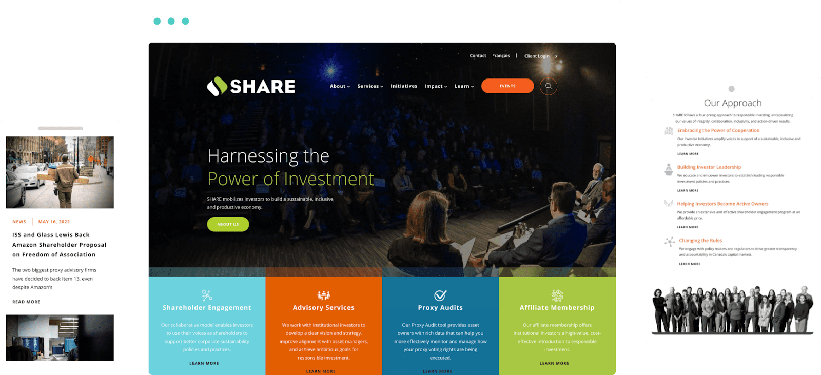
Orange accents were key in our redesign of non-profit SHARE’s website, as they were assigned the duties of subliminal user navigation toward buttons, must-know information, and conversion areas.
Yellow
North American Association: Optimism, electricity, warning, taxis, smiley faces, cheap/discounted products/prices/stores (Giant Tiger, anyone?)
Recommended Usage: Sparingly via call-to-action typography, buttons, iconography on dark backgrounds.
Evoking feelings of happiness and energy, the colour yellow can be surprisingly tricky to properly use on websites. The wrong shade of yellow, too much usage, or (subjectively) the wrong usage overall can create something that feels amateur and straining to the senses.
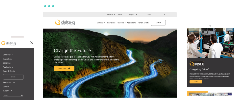
Evoking an electric feel for advanced battery charger innovator/supplier Delta-Q, we were thrilled to say hello to yellow (accents) during the site styling phase of their redesign.
Green
North American Association: Wealth, luck, nature, science, health, fertility, freshness.
Recommended Usage: Openly with few limits; backgrounds, imagery, accents, call-to-action typography, iconography.
Known as the easiest colour on the eyes, green is the most relaxing colour in your arsenal with a long lineup of positive associations; the ones above are just the tip of the iceberg. Green creates an organic feel for businesses of nearly any industry, standing out without being too stimulating.
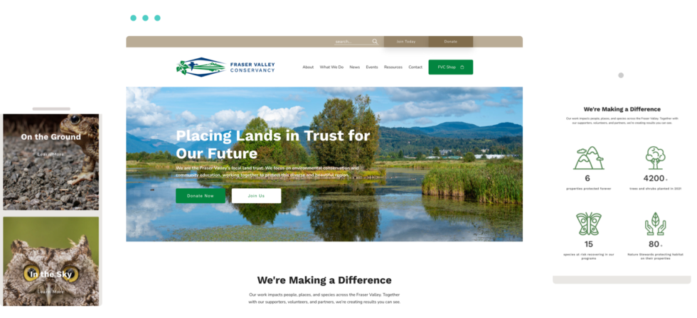
Working with Fraser Valley Conservancy on their custom WordPress site, we matched their environmental purpose with soft green iconography and buttons, a perfect complement to their wetland wildlife photography and content.
Blue
North American Association: Facebook, the ol’ Twitter bird, sadness, refreshment/water, trust, strength, calm.
Recommended Usage: Know its limits; great for backgrounds, imagery, accents, call to action typography, iconography. Overuse may make users go “brrr,” and certain blues have started to become overly associated with corporations, as many use blue to evoke strength without being too aggressive.
The most-popular and most-utilized colour in web design, blue has become that dependable go-to that has nearly any internet user able to immediately think of x sites off the top of their head that are represented by blue.
It’s versatile for a wide variety of industries and niches, it’s refreshing, and it makes business audiences feel safe and secure in their brand-selection decisions.
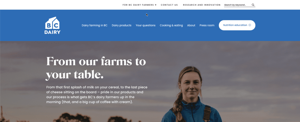
In a redesign for BC Dairy, blue was a primary component colour (green was secondary), drawing soft, easy attention to the public-friendly educational content around nutrition and dairy farming.
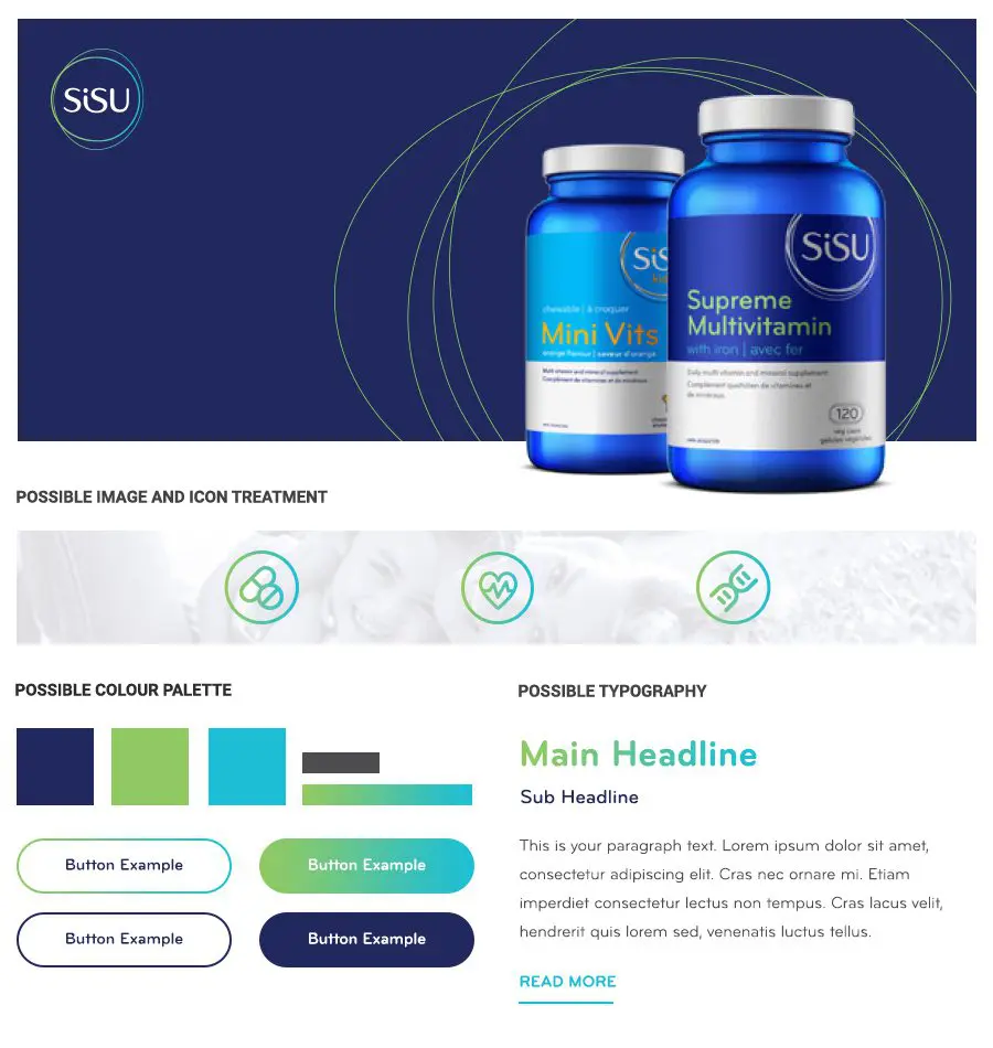
Honourable mention to our site for SISU, a Canadian vitamin and supplement company. They used two shades of blue for a calm and instantly approachable wellness experience.
Purple
North American Association: Florals, royalty, creativity, beauty, spirituality, femininity, singing dinosaurs.
Recommended Usage: Openly but balanced; backgrounds, imagery, accents, call-to action-typography, iconography.
A luxurious colour, purple can also be complicated but oh-so-appealing once figured out; it’s all in the shade and how you use it.
- Dark purple shades make for great contrast, but their sense of deepness and smoothness require balance through other page elements to ensure the eye has a place to go
- Lighter shades can feel springtime bright and airy, if not a little romantic, but require the right colour contrast pairings to not add strain to textual scrolling
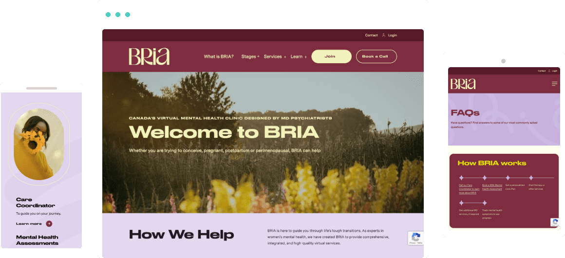
Women’s health company Bria utilized light purple in their branding, a primary palette option that made for a comforting, hopeful site to showcase their mental health services for women experiencing different stages of fertility.
Pink
North American Association: HI BARBIE! Also youth, playfulness, femininity, love/romance.
Recommended Usage: Sparingly; iconography, buttons, miscellaneous accents – unless your goal is to go big and bold on the feminine vibe!
Often an alternative to red or purple, pink can be strong (dark shades) or soft, sweet, and sincere (light shades) – but don’t use too much, users might get the eyeball equivalent of a toothache.
Ensure this “hot” colour is balanced out with light, airy areas or elements. White and pink combos, for example, are never out of style.
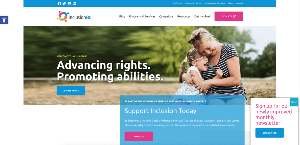
Inclusion BC has pink in their logo, and uses pink on their CTA buttons and text. Your eye is immediately drawn to places where conversion clicks happen, so it’s an effective strategy. The effect is upbeat and positive, like their organization.
White
North American Association: Cleanliness, laundry, purity, innocence, spaciousness, medicine/health.
Recommended Usage: The limit does not exist.
White is the universal web colour, impacted only by how you complement it – or dirty it. Its various shades are also just as versatile, such as ivories and soft creams.
You can pair white with any other colours for impact, user engagement, and memorability. The white canvas that is your WordPress site awaits!
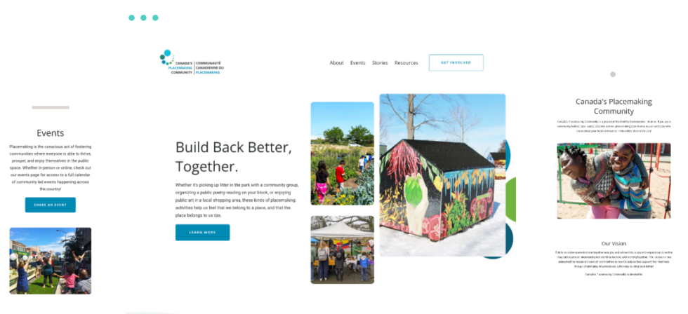
Speaking of WordPress: keeping its look “outdoorsy and open,” our site design for Canada’s Placemaking Community balanced large, clean white areas with bright photography and natural-coloured buttons and iconography.
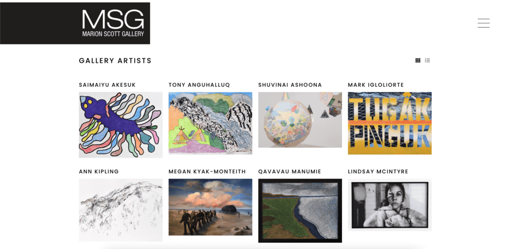
Meanwhile, in a classic example, Marion Scott Gallery creates a quiet, studious aesthetic like the inside of an art gallery with their big use of white space.
Grey
North American Association: Neutrality, balance, formal wear/workplace wear, sophistication, professionalism.
Recommended Usage: Mid-limitless, just don’t turn your website into a raincloud.
A subdued, neutral colour that can present both strength and calm, grey is best utilized when balanced with similar elements of different colours (grey-filled imagery on a white background, grey prompt boxes next to a contrasting colour box, etc).
When black may be too bold, or you feel there is far too much blank/white space, go grey!
Its allusion to strength will call users to action while remaining calm to the senses. It won’t overwhelm, but if there’s just a little too much, it might make visitors feel a little gloomy.
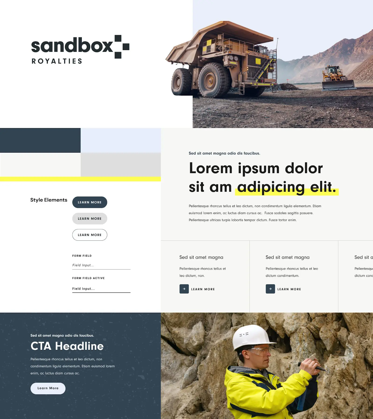
Creating a bold interface, Sandbox Royalties’ palette paired snow drift grey with pickled bluewood (dark sky blue) and solitude (light) blue for a stark yet visually appealing contrast suited to industrial work.
Black
North American Association: Sleekness (like shiny black cars), formality, mystery, drama, luxury, “it’s not just a phase, mom” Goth energy.
Recommended Usage: Boldly yet sparingly, balanced with coloured or white typography, sections, callouts, and iconography, or vice versa.
Finally, we have black. As a default text colour, black is one of the most versatile options, but you don’t want your website to be completely dark mode like a blacked out tattoo sleeve (unless dark mode is your audience, then go nuts).
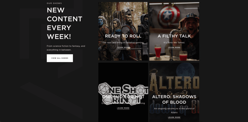
You can balance black with white and bright colours to avoid sadness and gloom (and evil), even if it’s just bold, contrasting accents. A Filthy Lot makes perfect use of black to showcase their nerdy media content, knowing that it suits their audience’s taste.
I hope you enjoyed this reading rainbow.
Casey Telford
When not writing in multiple voices as a copywriter and content specialist, Casey can be found on Twitter, in Indigo (again), watching true crime documentaries or crouched on your favourite Canadian soccer team's pitch in the camera area.
More By This Author